


Choose tile direction by the visual job of the wall. Horizontal layouts usually make a backsplash feel wider, vertical layouts can make a short wall feel taller, and feature patterns add movement when the room needs a focal point. Direction should follow the room goal, not a trend.
This article supports the Tile Design Ideas hub. Pattern direction is one of the fastest ways to change how a peel-and-stick wall feels. It also affects cuts, outlets, edges, and how busy the room becomes, so choose direction after you know the wall role.
Pick the Visual Effect First
Start with the feeling you want. A small galley kitchen may need width. A compact powder room may need height. A home office background may need a controlled focal wall. A calm rental may need restraint. Once the visual effect is clear, the direction decision becomes easier and less dependent on what is trending.
| Goal | Direction to consider | Best use |
|---|---|---|
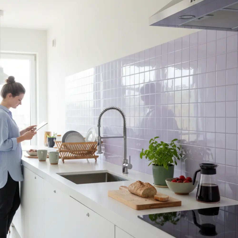
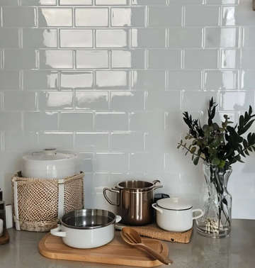
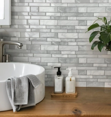
| Make a wall feel wider | Horizontal subway or linear tile | Backsplashes and narrow walls. |
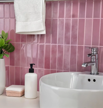
| Make a wall feel taller | Vertical stack | Vanities, nooks, and small accent walls. |
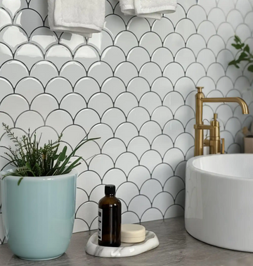
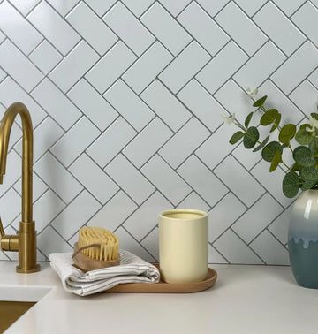
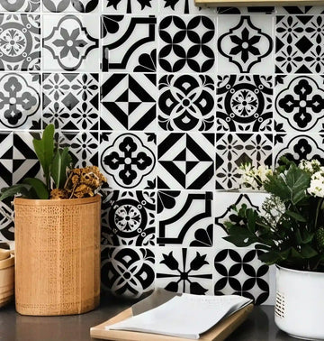
| Add movement | Herringbone or geometric pattern | Feature walls with fewer interruptions. |
| Keep the room calm | Simple repeat and low contrast | Rentals, busy counters, and small kitchens. |
Match Direction to Interruptions
Outlets, cabinet breaks, shelves, windows, and open edges all interrupt a pattern. A complex pattern can look beautiful in the center of a wall but become harder to manage when every tile needs a cut. For kitchen projects, map the wall with the backsplash layout guide before committing to a direction.
Horizontal
Usually feels stable and familiar. Good for long backsplash runs and simple edges.
Vertical
Feels fresher and taller. Best when outlets and shelves do not cut through every line.
Feature Pattern
Works when the wall is meant to be noticed and the surrounding room stays quieter.
Use Color and Grout Contrast Carefully
Direction becomes stronger when contrast is high. A dark line, strong faux grout effect, or bold color makes the layout more visible. That can be useful on a feature wall, but it can overwhelm a small backsplash. If the room already has busy counters, open shelving, or patterned flooring, choose a calmer tile direction or lower-contrast finish.
Design rule: use one main source of movement. If the tile direction is bold, keep color quieter. If the color is bold, keep direction simpler.
Check Product Size Before Deciding
The same direction can feel different depending on tile size. Narrow pieces create more lines and more movement. Larger pieces feel calmer but may need more careful cutting around outlets. Before ordering, compare styles in the Stickwoll collections and look at the wall width in relation to each tile format.
Final Checklist
- Define whether the wall should feel wider, taller, calmer, or more decorative.
- Map outlets and open edges before choosing a complex pattern.
- Balance direction with color and finish contrast.
- Use samples when lighting may change how strong the pattern feels.
- Return to the design hub for more room-by-room choices.
Compare Pattern Families Before You Commit
Subway tile is usually the easiest pattern family for long backsplash runs because the eye already accepts the repeat. Compare options in the peel-and-stick subway tile collection if the room needs a clean, steady look. Herringbone creates more movement and works better when the wall is meant to be a feature; use the herringbone tile collection when the surrounding room is quiet enough to support that energy. Hexagon tile can feel more decorative and graphic, especially in small accent zones; compare scale in the hexagon tile collection before deciding.
For kitchens, pattern direction should follow the practical backsplash plan. Open the kitchen backsplash hub if the wall includes outlets, sink splash, appliance edges, or a visible side finish. If an exposed edge is part of the design, use the edge finishes guide before picking a pattern that creates difficult end cuts.
Use Lighting as a Design Filter
Tile direction can look different in morning light, under-cabinet lighting, and evening warm bulbs. Raised texture, glossy finishes, marble veining, and faux grout lines all catch light differently. Before installing a full wall, hold the tile sample in the actual room and look at it from the entrance, the sink, and the sitting or cooking position. A direction that looks subtle online can feel much stronger when light skims across the wall.
If the room already has strong cabinet hardware, open shelves, patterned counters, or colorful decor, choose one hero. Pattern direction can be the hero, but it should not fight every other surface in the room.
Think About Viewing Distance
A pattern that looks subtle from six feet away may feel busy when viewed from eighteen inches. This matters for backsplashes, vanities, and coffee bars because people stand close to the wall. Large feature walls, entryways, and desk backgrounds can usually handle more scale because the viewer sees the whole composition at once.
Use a phone photo as a quick filter. Take a picture from the normal viewing spot, then look at the image small on the screen. If the pattern still reads clearly without feeling noisy, the direction is probably working. If the photo turns into a field of lines, simplify the pattern, lower contrast, or use a smaller feature area.
When a room has multiple possible tile directions, choose the one that supports the first thing people notice when they enter. A backsplash can follow the counter. A vanity wall can follow the mirror. A feature wall can follow the furniture it frames.
Use Pattern Direction to Support Product Choice
Pattern direction should narrow the product search instead of making it broader. If the goal is width, start with subway and linear looks. If the goal is height, compare vertical stack options and quieter grout contrast. If the goal is a feature moment, compare herringbone, hexagon, or stone-look styles after confirming the wall has enough uninterrupted space.
This helps SEO and shopper experience at the same time: the article answers the design question, then sends the reader to a product family that matches the design job instead of dropping them into a generic catalog too early.
It also reduces returns and indecision. A shopper choosing between vertical, horizontal, herringbone, subway, and hexagon options needs a room-based reason to choose, not just a longer list of styles.
Use that reason as the filter before color, finish, or price comparisons begin.
Common Questions Before Installing
Is vertical tile better than horizontal tile?
Neither is automatically better. Vertical tile can make a small wall feel taller, while horizontal tile can make a backsplash feel wider and calmer. Choose by room effect.
Which pattern is easiest for beginners?
A simple subway or stacked layout is usually easier than a strong diagonal, herringbone, or geometric feature pattern because cuts and alignment are more forgiving.
Can a bold pattern work in a small room?
Yes, if the pattern has a clear role and the rest of the room stays controlled. A small powder room or desk wall can handle more pattern than a busy kitchen with many visual interruptions.
Kommentar hinterlassen
Diese Website ist durch hCaptcha geschützt und es gelten die allgemeinen Geschäftsbedingungen und Datenschutzbestimmungen von hCaptcha.