
















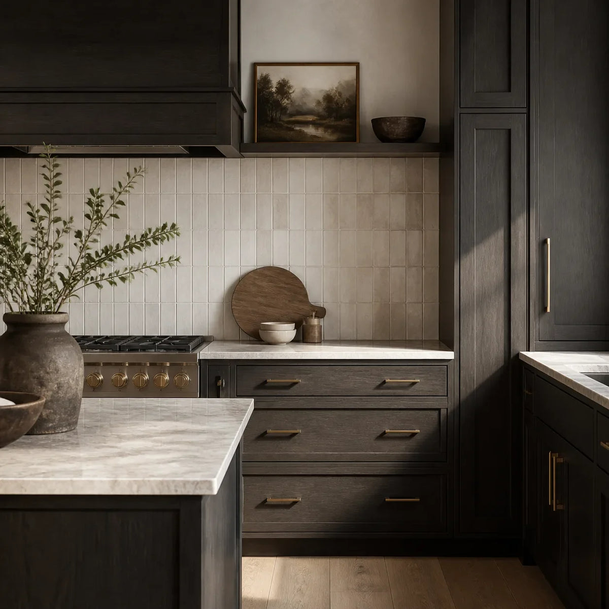
Dark cabinets can look rich and architectural in a showroom, then turn flat or heavy the moment the first backsplash sample goes up. The problem is rarely that dark cabinetry is “too dark.” More often, the backsplash is reacting badly to the cabinet undertone, countertop, room light, finish, or grout.
Explore this guide
The most reliable starting points are warm white, soft greige, pale gray, and restrained low-saturation colors. A lighter backsplash often gives black, charcoal, espresso, or deep brown cabinets useful counterweight, but white is not automatically right. The best backsplash for dark cabinets is the one that creates enough separation without fighting the countertop or producing distracting reflections.
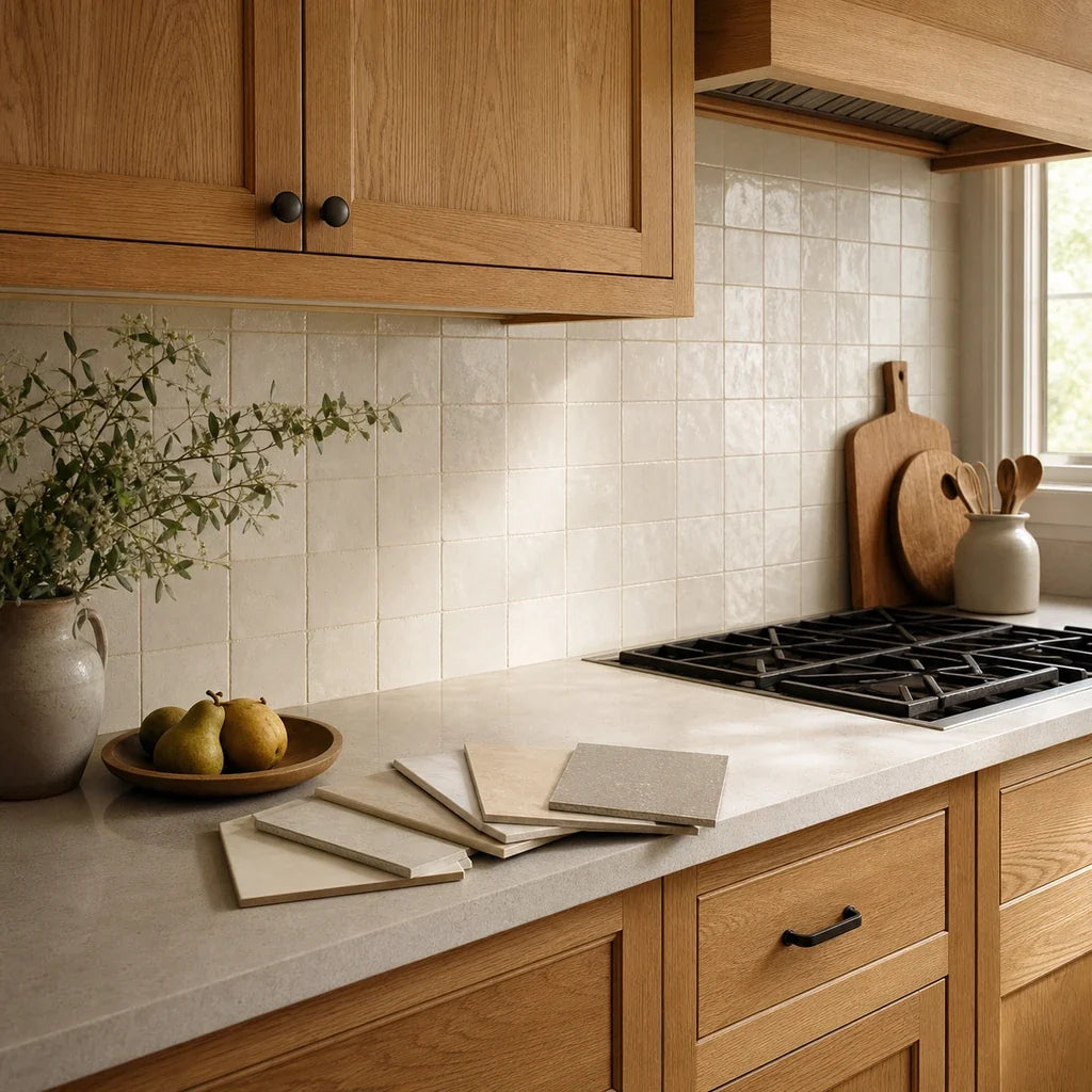
Before ordering a full wall, compare physical samples against three fixed references:
This readiness check counts only whether the three comparison references are present. It does not score color quality or predict an installed result. A complete comparison still requires the room’s real daylight and evening lighting.
Then view the group in daylight and under the lights you use at night. That simple test is more dependable than choosing from an isolated product image.
What backsplash works best with dark cabinets?
A warm white, quiet greige, pale gray, or muted color is usually the strongest place to begin. These directions create visible separation from dark cabinetry while leaving room for the countertop, cabinet grain, and hardware to participate in the design.
Dark cabinets feel polished when the room has a clear visual hierarchy. One surface leads, another supports it, and the remaining finishes connect the two. They feel heavy when every surface has similar visual weight or when several patterns compete inside a relatively small wall area.
Use this short list to begin:
- Neutral or soft white: Best when the counter already contains a clean white field and the kitchen needs clear value contrast.
- Warm white or ivory: Often more comfortable beside espresso, walnut-brown, cream-veined stone, brass, bronze, or warm flooring.
- Pale gray or soft greige: Useful when pure white looks abrupt but the wall still needs to stay light.
- Muted green or blue: A deliberate color choice for rooms that need character without a highly saturated feature wall.
- Dark tonal backsplash: Viable when the counter, lighting, texture, wall area, or surrounding finishes create enough material separation.
“Value” means the relative lightness or darkness of a color. Undertone means the quieter color bias underneath the main color, such as blue beneath charcoal or red beneath espresso. Value determines how strongly two surfaces separate at a distance. Undertone determines whether they feel related once you look more closely.
What color are your dark cabinets, really?
Do not choose a backsplash for a generic label such as black or brown. Identify whether the cabinet is neutral black, blue-black, charcoal, espresso, or deep brown, then compare that undertone with the counter.
Neutral black
Neutral black has little obvious blue, green, red, or brown bias in ordinary light. It creates strong contrast with white, but that contrast can become sharp if the countertop is creamy, heavily veined, or warm.
Start with the countertop rather than the cabinet. If the counter is clean white or cool gray, a neutral white or pale gray backsplash may connect naturally. If the counter is ivory, beige, or warm stone, test warm white and light greige before assuming pure white is the safest option.
Blue-black
Blue-black cabinets may look neutral at night and distinctly cool beside a warm counter in daylight. Cool pale gray, restrained blue-gray, or a carefully tested soft white can work, but avoid selecting from the cabinet alone. A warm cream backsplash beside blue-black cabinetry and a cool white counter can divide the kitchen into unrelated color zones.
Charcoal
Charcoal often sits between black and gray, with blue, green, violet, or brown undertones. This is why a backsplash for charcoal cabinets may look right in one photograph and wrong in another room.
Hold a clean white card beside the cabinet door during daylight. The comparison often makes the cabinet bias easier to see. Then add the countertop sample or expose its front edge. If the cabinet reads blue and the counter reads warm beige, the backsplash may need to bridge them with greige, muted stone, or a white that is neither icy nor strongly yellow.
Espresso
Espresso is a very dark brown that may carry red, orange, violet, or near-black undertones. Warm white, ivory, pale mushroom, and soft greige are common starting directions because they can acknowledge the warmth without repeating the cabinet darkness.
Wood grain changes the decision. A strongly grained espresso cabinet already contributes pattern. In that setting, a restrained backsplash often gives the grain more room to read. The sample-led method in the backsplash guide for walnut and espresso-toned cabinets explains this relationship in more detail.
Deep brown
Deep brown cabinets usually feel warmer and less graphic than neutral black, but their undertones vary widely. Some lean golden, some red, and some gray-brown. A yellow cream can exaggerate orange or red notes, while a cool gray can make a warm brown look unexpectedly reddish.
The same undertone-checking method used for gold, amber, red, and pink wood undertones applies here: compare the cabinet against neutral white, warm white, and gray references under the room’s real light.

Why a phone photo is not enough
Use online photographs to shortlist shapes and general color families, not to approve the final color. The International Color Consortium’s display guidance explains that brightness, contrast, color balance, gamut, calibration, ambient light, glare, and application-level color management can all affect displayed color. Even a well-calibrated screen cannot reproduce physical texture, scale, gloss, or directional reflections. (color.org)
How should the countertop and room light change your choice?
The countertop is the immediate transition between cabinets and backsplash, so it should guide the backsplash direction. Room light then determines whether that relationship stays convincing throughout the day.
This table offers starting directions, not universal rankings. Natural stone, printed patterns, cabinet coatings, and light sources vary too much for a single formula.
| Existing condition | Backsplash direction to test first | Finish direction | Grout or joint direction | Main problem being addressed |
|---|---|---|---|---|
| Dark cabinets with a light, quiet counter | Warm white, soft white, pale gray, or low-saturation color | Matte, satin, or controlled gloss | Close to the tile body for a calm wall | Preventing the cabinets from overpowering the wall |
| Dark cabinets with a light, strongly veined counter | Quiet solid or lightly varied neutral | Usually subdued rather than highly reflective | Low contrast | Keeping counter movement from competing with tile pattern |
| Dark cabinets with a dark counter | Light neutral, pale color, or clearly separated tonal dark | Test sheen carefully under task lights | Usually quiet unless a grid is intentional | Creating a readable counter-to-wall boundary |
| Dark cabinets with a wood counter | Warm white, ivory, pale mushroom, or muted green | Low to moderate sheen | Warm or tile-adjacent | Connecting wood warmth without making the room too brown |
| Dark cabinets in a low-light kitchen | Light neutral with enough value contrast | Satin or carefully placed gloss | Low contrast | Returning some light while avoiding reflected hotspots |
| Dark cabinets in a bright kitchen | Light, medium, or dark options may work | Choose according to window and fixture reflections | Based on desired pattern visibility | Controlling glare and excess contrast |
| Dark cabinets with dark appliances | Lighter, quieter wall color or controlled tonal scheme | Check reflections from appliance faces | Low to moderate contrast | Preventing one continuous dark mass |
Dark cabinets with light countertops
This is the easiest condition to work with because the countertop already creates a bright horizontal break. Your backsplash can either continue the counter’s light field or introduce a muted accent.
For backsplash ideas for dark cabinets and light countertops, begin by asking whether the counter is quiet or active. A plain white quartz counter leaves room for a modest mosaic, soft color, or visible layout. A marble-look counter with strong veining usually benefits from a quieter backsplash.
Do not match the brightest point in a veined countertop automatically. That can make the backsplash look cold beside warm cabinets. Compare the counter’s overall field color, not a single white vein.
What if the countertop is also dark?
A dark counter changes the job of the backsplash. The key transition is no longer just cabinet to wall; it is dark cabinet to dark counter to wall.
A light neutral backsplash is the simplest way to restore a visible work-zone boundary. Warm white can suit espresso or brown cabinets, while soft white or pale gray may fit neutral black and charcoal. For more examples of separating backsplash needs from dark-countertop needs, see the physical-sample comparisons for soapstone countertops.
A dark backsplash can still work, but it needs another form of separation: a lighter counter edge, visible texture, controlled veining, a change in sheen, open wall area, or strong natural and task lighting. There is no verified numerical contrast threshold that assures success.
Dark cabinets with wood countertops
Wood counters add warmth and visible grain. Repeating that warmth in every surface can make the room feel muddy, while a very cool backsplash can make the counter look more orange.
Warm white, pale mushroom, restrained greige, and muted green are useful starting points. Keep the backsplash pattern quiet when the cabinet and counter both show strong grain. The goal is not to match every brown. It is to give the wood a clean background.
Low-light kitchens
In a kitchen with limited daylight, start with lighter backsplash samples and check them under the installed task lights. Do not assume gloss is required. A glossy finish may reflect more visible highlights, but it can also create glare or repeated bright spots.
The perceived color of the same surface can shift under different lamps because color rendition depends on the light source’s spectrum interacting with the surface. The Department of Energy’s LED color guidance also explains that correlated color temperature, or CCT, describes the appearance of emitted light rather than assureing how a particular object will look. Two sources with the same nominal CCT can render surfaces differently. (energy.gov)
Bright kitchens
Abundant daylight creates more freedom, but it also makes finish and glare more important. A glossy white tile opposite a large window may produce stronger reflections than a medium-tone satin tile. Check the sample from the places where you normally stand, sit, cook, and enter the room.
For a more detailed treatment of viewing angles, countertop contrast, pattern density, and reflected glare, use the kitchen backsplash guide to contrast and glare.

Compare four reliable backsplash directions
There is no universal best backsplash for black, charcoal, espresso, or deep brown cabinets. Four directions repeatedly earn a place in the sample set because each solves a different visual problem.
Warm white and ivory
Warm white is often the most forgiving option beside espresso, deep brown, warm stone, brass, and bronze. It creates value contrast without the sharpness of blue-white.
This direction works best when the counter contains cream, beige, warm gray, gold, or brown movement. It can fail when the cabinet is blue-black and the countertop is a crisp cool white. In that case, the warm backsplash may look yellow rather than softly warm.
If you are comparing peel-and-stick options, the current Crisp White Duo subway-style tile page identifies a Pure White feature label and glossy 3D Mid-Subway finish. Treat those page labels as a reason to order or inspect a physical sample, not proof that the product will read neutral, warm, or cool in your kitchen.
Soft gray and greige
Pale gray can connect charcoal cabinetry with cool or neutral countertops. Greige, a gray-beige neutral, can bridge warm brown cabinets and a counter that contains both gray and beige.
The common mistake is selecting gray by name. A gray backsplash may turn blue, green, violet, or beige beside the actual cabinet. Compare at least two gray families rather than ordering the first color described as “light gray.”
Gray also needs enough value separation. A medium charcoal backsplash against charcoal cabinets may merge into one band from across the room, even if the samples look different at close range.
Pale green or muted blue
A restrained color can keep a dark-cabinet kitchen from becoming a strict black-white or brown-cream scheme. Pale sage, gray-green, dusty blue, and blue-gray are easier to integrate than highly saturated color because they leave more visual space for the countertop.
Use green when the room already contains warm wood, brass, stone, or natural colors. Test muted blue with blue-black or charcoal cabinets, cool counters, or stainless steel, but check the evening result carefully. A blue that looks calm in daylight may become dull or overly cool under a different lamp.
A named color on a product page is not enough to verify a muted accent. The physical sample should show the intended color beside the actual cabinet and counter.
Dark-on-dark
Dark backsplash with dark cabinets can look deliberate and cohesive when the surfaces do not collapse into one indistinct mass. The separation may come from a lighter counter, visible veining, material texture, sheen contrast, open wall space, or strong lighting.
A documented Toronto kitchen used black upper cabinets, meteor-gray lower cabinets, a dark quartz counter and slab backsplash, white surrounding walls, a back wall without upper cabinets, and substantial window light. That combination shows how a dark-on-dark scheme can rely on architecture and surrounding light surfaces rather than tile color alone. It is one project, not proof that the same combination works in every kitchen. See the Houzz dark-cabinet kitchen case for the full project context. (houzz.com)
The strongest dark-on-dark pairings usually contain at least one clearly readable change:
- Smooth cabinet against textured or veined backsplash
- Matte cabinet against controlled gloss
- Near-black cabinet against brown, green, or blue-black tile
- Dark backsplash above a visibly lighter counter edge
- Dark surfaces balanced by pale walls, open shelving, or daylight
For broader inspiration, the guide to texture, restrained grout, and dark-cabinet pairings can help you build a shortlist without treating a trend as a matching rule.

How do sheen, grout, and layout affect the result?
Sheen, grout, and layout control how much visual activity appears between the upper and lower cabinets. They should support the color decision, not replace it.
Gloss is a lighting variable
Gloss does not automatically make a dark kitchen brighter. It creates more directional reflection, which can look lively under one lighting arrangement and uncomfortable under another.
Stand where you cook and look at the sample with the task lights on. If you see a concentrated reflection of an exposed bulb or bright window, move the sample across the backsplash area. The glare may be limited to one viewing angle, or it may repeat across the wall.
A matte or satin surface can reduce sharp reflections, but no finish removes glare under every condition. Window position, fixture type, surface angle, texture, and viewer position all matter. The backsplash comparisons for matte-black, slate, and stainless appliances offer useful context when reflective appliance faces are part of the same view.
Let grout support the wall’s role
Grout contrast changes whether you see a surface or a grid.
- Grout close to the tile color: Keeps the wall quieter and places more attention on the cabinets or counter.
- Slightly darker grout: Defines the layout without creating a highly graphic pattern.
- Strongly contrasting grout: Makes every joint visible and should be treated as a major pattern choice.
- Warm grout: Can help a warm white tile relate to espresso cabinets or cream counters.
- Cool gray grout: May suit charcoal cabinets and cool stone, but it can look blue beside warm brown wood.
For dark cabinets with a busy counter, low-contrast grout is usually the safer starting point. For a quiet counter and plain cabinet fronts, a more visible joint pattern may have enough visual room.
Choose layout by visual activity
Running bond, stacked, vertical stack, and mosaic layouts can all work. None has been proven to make every kitchen feel wider, taller, or calmer, so judge the actual wall rather than relying on a spatial promise.
Running bond offers a familiar rhythm and works well when the room already includes several contemporary finishes that need softening.
Horizontal stack creates a precise grid. It pairs naturally with flat-panel cabinets, but high-contrast joints can make the wall much busier than expected.
Vertical stack emphasizes vertical lines. It can be useful above a short counter run or under compact upper cabinets, though it does not assure that the room will look taller.
Modest mosaic adds texture and close-range detail. Use it carefully when the countertop has dramatic veining, the cabinet has visible grain, or the wall contains many outlets and cuts.
Check the wall’s activity budget
Count one point for each visually active element:
This is an editing aid, not a scientific score.
- Zero to two points: The room can usually support a more visible backsplash color, shape, or joint pattern.
- Three to four points: Choose one backsplash feature to emphasize and quiet the rest.
- Five or more points: Start with a restrained backsplash, low-contrast joints, and controlled sheen.
If your favorite backsplash pushes the score upward, you do not have to reject it. Decide which other pattern or contrast will become quieter.
Color is only one part of the wall’s visual load. The tile color, pattern, texture, and shine guide helps you compare those variables together so the backsplash supports dark cabinetry without adding uncontrolled contrast.
How should you test a backsplash sample?
Test the same physical sample beside the cabinet, counter, and hardware in daylight, cloudy or indirect light when available, and normal evening task lighting. Do not approve a color under only one lamp or while holding it in the center of the room.
A controlled experiment with real painted three-dimensional objects found that changing the illuminant increased color-matching error and variability. The study’s average color-constancy index was 0.88 ± 0.03 across the relevant illuminant change, where 1 represented perfect constancy. The experiment used matte painted cubes and physical paint chips, not kitchens, tile, grout, or consumer preference, so its role here is limited: people compensate for lighting changes fairly well, but not perfectly. Read the Allred and Olkkonen real-object color experiment for the study context. (frontiersin.org)
Use this sequence:
- Place the sample at the actual wall plane. A sample lying flat on the counter receives light differently from a vertical backsplash.
- Include the countertop edge. Look at the horizontal top and vertical front because they may reflect light differently.
- Turn on the lights used during cooking. Include under-cabinet lighting, ceiling fixtures, and nearby pendants.
- Check direct reflections. View glossy or dimensional samples from the sink, range, main entry, and seating area.
- Step back. A sample can look quiet from 12 inches away and much busier when its pattern is mentally repeated across the wall.
- Photograph for comparison, not approval. Photos help you recall candidates, but the physical view should decide the color.
- Keep two or three finalists. Compare a light neutral, a bridge color such as greige, and one more deliberate option such as muted green or tonal dark.
A single sheet cannot perfectly predict a full wall. If possible, group several sheets or use paper to outline the intended coverage. This makes pattern scale, repeated highlights, and joint density easier to judge.
Before choosing a peel-and-stick backsplash, confirm that the wall is clean, smooth, dry, stable, and indoors. Current Stickwoll instructions identify painted walls, smooth existing tile, glass, laminate, smooth wood, and metal as examples of suitable surfaces, while excluding rough brick, textured walls, and concrete. Deep grout lines or rough existing tile may interfere with adhesion.
Near a range, oven, fireplace, or open flame, check the exact current product instructions, the appliance manufacturer’s clearance requirements, and local code before installation. Do not treat a decorative wall tile as heat-safe unless its current documentation supports that use. Stickwoll’s general and product-specific clearance wording is not fully consistent, so a generic distance should not be substituted for the instructions governing the chosen product and appliance.
A sample decision also depends on measurements, outlets, exposed edges, installation order, and the zones beside the sink or stove. Use the Kitchen Backsplash Guide to check those practical constraints before ordering the full quantity.
Frequently Asked Questions
What backsplash works with black cabinets?
Soft white, warm white, pale gray, greige, and restrained color are dependable starting directions for black cabinets. Choose among them by comparing the cabinet undertone with the countertop.
Neutral black with a clean white counter can support crisp contrast. Blue-black with cool stone may suit pale gray or muted blue-gray. Black cabinets with a warm counter often need a warmer white or greige so the backsplash does not split the palette.
Is white always the safest backsplash for dark cabinets?
No. White offers useful value contrast, but the wrong white can make warm cabinets look red or orange, make a cream countertop look dirty, or appear blue beside warm flooring.
Compare at least a clean white and a warm white. If neither connects the cabinet and counter, add a light greige or pale gray sample.
Can dark cabinets use a dark backsplash?
Yes, if the design includes readable separation. Use a lighter counter, veining, texture, sheen contrast, open wall space, strong lighting, or pale surrounding surfaces to keep the materials distinct.
Dark-on-dark is less forgiving in a low-light kitchen with a dark counter and full-height upper cabinets. In that condition, include at least one light backsplash option in the sample test before committing to the tonal scheme.
What backsplash works when the cabinets and countertop are both dark?
A light neutral is the clearest starting point because it restores a visible wall plane above the counter. Warm white, soft white, pale gray, and light greige are the main candidates.
If you prefer a dark backsplash, compare the full assembly from across the room. Confirm that the counter edge remains visible and that the wall does not disappear behind countertop appliances.
Which grout direction keeps a dark-cabinet kitchen calm?
Choose grout close to the tile color when you want the backsplash to read as one surface. Strong grout contrast turns the joints into a visible grid, which can compete with cabinet grain, counter veining, outlets, and appliance edges.
Slight tonal variation often gives enough definition without making the wall the busiest element in the room.
Choose two or three finalists, not one screen favorite
The best backsplash for dark cabinets is chosen against the whole kitchen, not by following a white-versus-black rule. Cabinet undertone tells you which color families belong in the sample set. Countertop value tells you how much separation the wall needs. Room light, sheen, grout, and layout decide whether the combination remains convincing at full scale.
Begin with three directions:
- A light neutral that clearly separates from the cabinetry
- A bridge neutral, such as warm white, pale gray, or greige
- One deliberate alternative, such as muted green, blue-gray, or a textured tonal dark
Place each candidate beside the actual cabinet door, counter edge, and hardware. Check them in daylight and evening task light, then step back far enough to judge the wall as part of the room. That test will tell you more than a generic color gallery or a product image viewed on a phone.
Use the activity budget only to compare alternatives
Counting strong contrasts, patterns and grout lines can help explain why one sample feels busier than another, but the count is not a scientific quality score. Use it to identify which element you want to quiet, then compare the revised sample in the actual room.
Color preference remains subjective; the evidence-based part is the controlled comparison under the room’s real lighting and fixed finishes.
Sources and scope
- US DOE: Color and Spectrum — Lighting and color-rendering context; not a design score.



Deja un comentario
Este sitio está protegido por hCaptcha y se aplican la Política de privacidad de hCaptcha y los Términos del servicio.