





















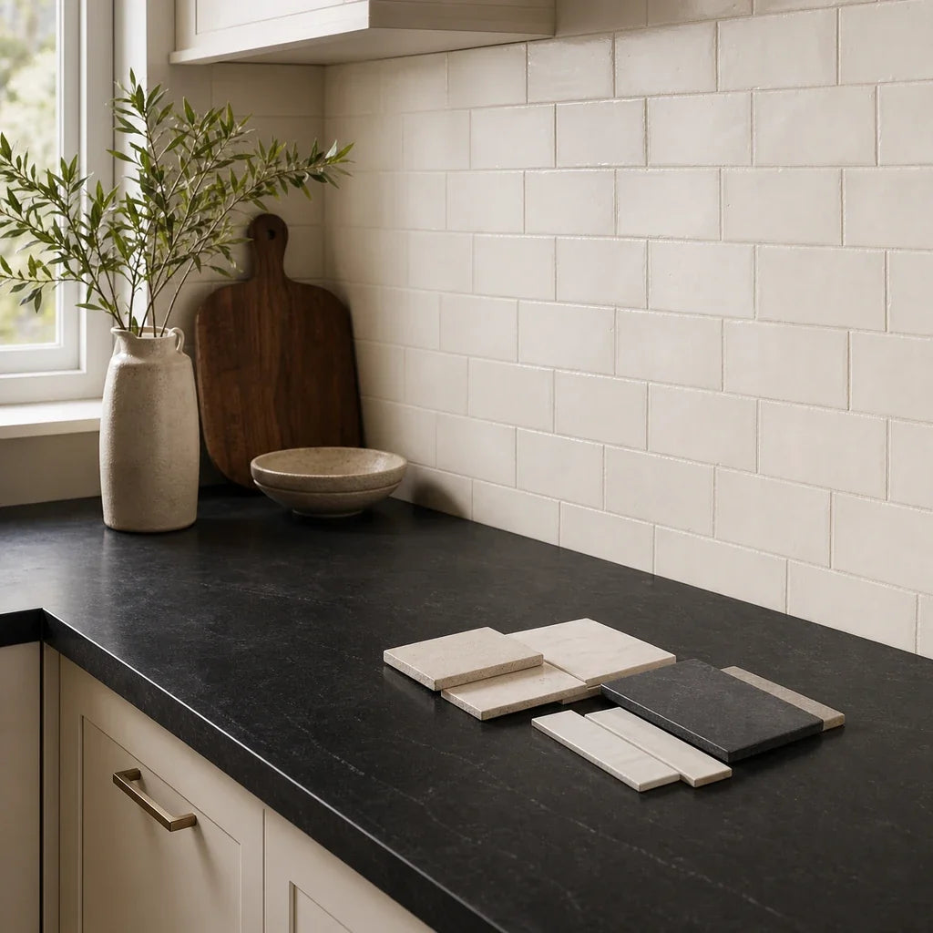
Choosing a backsplash from a small phone image is one of the fastest ways to get a kitchen finish wrong. A countertop that looked neutral online may read charcoal, blue-black, brown-black, warmer, cooler, or much shinier once it sits beside your cabinets and actual room lighting.
The short answer: Most black countertops are strong candidates for a light or warm-neutral backsplash in white, warm white, soft gray, greige, or restrained taupe. A darker or more saturated backsplash can work, but the decision should follow the countertop’s undertone, surface finish, cabinet color, grout, and available light. There is no single best backsplash for every black counter.
The most reliable process is to narrow the choice to two or three directions, then test physical samples upright against the counter edge and cabinet door. A sample viewed in daylight and under the planned kitchen lighting will tell you more than a product photo.
What backsplash works with black countertops?
A light backsplash is the strongest starting point for many black countertops because it gives the wall enough visual separation from the counter. Warm white, soft ivory, quiet gray, greige, and muted taupe can all work, depending on what the countertop and cabinets are doing.
The key is to treat “black” as a description of value, not a complete color specification. A black granite countertop may contain blue, brown, green, silver, or warm gold undertones. A solid charcoal surface behaves differently from a black counter with visible veins or speckles. A polished finish reflects the room, while a honed or leathered finish absorbs more light and shows texture differently.
Use this quick filter before comparing tile colors:
- If the counter reads neutral charcoal and the cabinets are white: Begin with warm white, soft white, or light gray.
- If the counter reads blue-black and the cabinets are cool white: Try a clean white, pale gray, or restrained blue-gray.
- If the counter reads brown-black and the cabinets are cream or wood: Start with warm white, soft ivory, greige, or quiet taupe.
- If the kitchen has limited natural or task lighting: Favor a pale, low-contrast backsplash and be cautious with dark tile, high-contrast grout, and reflective surfaces.
- If the countertop is strongly veined or speckled: Let the backsplash stay calmer so the two surfaces do not compete.

These are design starting points, not guarantees. NIST’s research on color perception explains why the same sample can appear different under different lighting, and its definition of metameric samples describes materials that appear to match under one illuminant but differ under another. See the NIST lighting and color-perception guide and the NIST definition of metameric samples for the underlying color-appearance principle.
A practical three-lane decision path
Use the lane that best describes your room, then test one sample from that lane beside the actual materials.
- Bright contrast: warm white, soft white, or pale gray tile with white cabinets and a neutral black counter.
- Warm transition: ivory, greige, or quiet taupe tile with cream, walnut, oak, maple, or other warm cabinetry.
- Controlled color: muted green, blue-gray, or another low-saturation color when the cabinets, floor, or furnishings already support that color family.
If two lanes seem plausible, compare both. The purpose is not to identify a theoretical winner; it is to find the direction that still looks balanced when the sample is viewed from across the room.
Why does the countertop’s undertone matter?
The countertop’s undertone matters because black surfaces often contain a secondary color that becomes more visible beside a backsplash. Undertone is the subtle warm, cool, or neutral cast beneath the dominant surface color.
Look at the counter edge, not only the broad top. If possible, use a clean offcut or sample piece. Place it near a window during the day and inspect it beside a plain white sheet of paper. A blue-black counter may make warm ivory look slightly yellow. A brown-black counter may make cool gray appear disconnected. A neutral charcoal counter gives you more freedom, but visible speckles or veins can still affect the decision.
Pay attention to these four conditions:
- Color: charcoal, blue-black, brown-black, or neutral black.
- Pattern: solid, lightly speckled, heavily veined, or visually active.
- Finish: polished, honed, leathered, or another textured treatment.
- Light response: reflective and bright, soft and low-sheen, or variable across the day.
A polished black surface can reflect cabinet colors, windows, under-cabinet lights, and nearby tile. A honed surface may look softer but can still show a strong relationship with the backsplash if the tile has a pronounced texture. Finish is not a minor detail to choose after color. It changes the amount of visual activity on the wall.
| Counter condition | Cabinet condition | Backsplash direction | Grout direction | What to avoid |
|---|---|---|---|---|
| Neutral black or charcoal | White cabinets | Warm white, soft white, or pale gray | Tone-on-tone or moderate contrast | An icy white that makes the room feel sharply divided |
| Blue-black | Cool white cabinets | Clean white, soft gray, or restrained blue-gray | Low to medium contrast | Yellow cream or strongly beige tile |
| Brown-black | Cream or wood cabinets | Warm white, ivory, greige, or quiet taupe | Warm neutral or tone-on-tone | Cool blue-gray that exaggerates yellow in the cabinets |
| Speckled or strongly veined black | Any cabinet color | Quiet tile with limited movement | Low contrast | Busy marble movement, bold mosaics, or dark graphic grout |
| Black counter in a low-light kitchen | Any cabinet color | Pale warm neutral with a readable surface | Low contrast | Black-on-black tile, glossy glare, and high-contrast grid lines |
The most common mistake is matching the backsplash to the cabinet color while ignoring the countertop. Your eye usually reads the counter and backsplash as neighboring surfaces, so the counter’s undertone deserves the first inspection.
Which backsplash colors work best with black counters?
Light neutrals are the most flexible starting point, but each neutral creates a different relationship with the countertop. The goal is to choose a color that gives the wall a clear role without making the kitchen feel split into unrelated bands.
Warm white and soft ivory
Warm white or soft ivory tile can brighten the wall without creating the severe contrast of a bright white tile against a black counter. This direction is especially useful with brown-black stone, cream cabinets, natural wood, brass hardware, or warm flooring.
The distinction between warm white and yellow cream matters. A warm white usually has a restrained softness, while a yellow cream can become visibly golden beside a blue-black counter or cool white cabinets. Compare the sample against the counter, not against the online product image.
Warm white is also a good place to begin if you are considering black countertops with white cabinets but want a softer look than a high-contrast black-and-white kitchen. It keeps the wall light while reducing the chance that every surface reads as a hard graphic block.
Current Stickwoll product pages list several light peel-and-stick directions, including Black Marble in its checked product configuration and Subway Marble in its listed Almond White direction. Product variants, finish names, availability, and installation limits can change, so check the product page before ordering.
Soft gray, greige, and quiet taupe
Soft gray, greige, and quiet taupe create a middle value between a dark counter and lighter cabinets. Greige is a gray-beige blend; it can bridge warm and cool materials when the specific sample is restrained enough.
This middle-tone approach often makes sense with wood cabinets, cream paint, warm white cabinetry, or a brown-black counter. It can also help a kitchen feel less stark than a pure white backsplash while keeping enough contrast against the countertop.
Gray is not automatically cool. Some gray tiles carry blue or violet undertones, while others contain beige or brown. Hold the sample beside the cabinet and counter at the same time. A gray that seems neutral alone may look noticeably blue beside a warm wood cabinet.
For a darker transitional direction, Stickwoll’s checked product documentation listed Slate City with a Deep Gray color and glossy 3D stone surface. It is best treated as a sample candidate rather than a guaranteed calming match. Visual compatibility still depends on the counter, cabinet undertone, lighting, and wall scale.

Pale green, muted blue, and other low-saturation colors
Pale green, muted blue, and similar low-saturation colors can work with black countertops when the room already contains a related color. A green backsplash may connect to sage cabinetry, plants, upholstery, or painted furniture. A muted blue may support a blue-black countertop or cool metal hardware.
Treat these colors as deliberate accents, not automatic alternatives to white. A saturated color can make the backsplash the room’s main event. That may be welcome in a simple kitchen with quiet cabinets and a plain counter, but it can feel crowded when the countertop is heavily veined or the room is small.
The checked Stickwoll product pages listed Minty Ceramic 8 in a Forest Green direction and Classic Indigo in a Retro Blue direction. These examples belong in the accent category. Test them with the actual countertop and cabinet before making a broad color commitment.
If cabinet color is driving your decision, use the dark-cabinet backsplash guide for a broader comparison of undertone, light, sheen, grout, and sample testing.
Can dark tile work with black countertops?
Dark tile can work with black countertops when the room has enough light, the backsplash and counter differ in material or sheen, and the rest of the kitchen is controlled. Black-on-black is more successful when the wall has visible relief, a subtle pattern, a different texture, or a clear shift in value.
A dark backsplash is less forgiving in a small or dim kitchen. It can make the wall visually recede, but it can also reduce the separation between counter and wall. Glossy dark tile may reflect task lighting and create bright points across the backsplash. Matte dark tile may feel quieter, but it still needs a clear relationship with the counter.
Use dark tile only after checking:
- Whether the wall receives enough daylight or task lighting.
- Whether the countertop and backsplash are visibly different in texture or sheen.
- Whether the cabinets provide enough contrast.
- Whether grout lines, outlets, and edge cuts will become prominent.
- Whether the room already contains several dark surfaces.
A plain black counter can carry more backsplash movement than a strongly veined black counter. When the countertop already supplies pattern, the wall usually benefits from restraint.
Which cabinet colors change the backsplash choice?
Cabinet color changes the balance, but it should be evaluated together with the countertop rather than treated as the only anchor. The same tile can look fresh beside white cabinets and muddy beside cream cabinets.
White cabinets
White cabinets give you room to choose either contrast or softness. With a neutral black countertop, warm white, soft gray, or a restrained greige backsplash can prevent the kitchen from becoming a strict black-and-white study.
If the cabinets are a cool, clean white, avoid choosing a strongly yellow backsplash without a sample test. If the cabinets are a warmer painted white, an ivory or soft gray may connect more naturally.
The cabinet profile also matters. Simple slab or Shaker fronts can support a more expressive tile pattern. Detailed molding, decorative hardware, or a busy countertop usually call for a quieter backsplash field.
Cream cabinets
Cream cabinets need special care because cool backsplash colors can make the cabinets appear more yellow by comparison. With a brown-black counter, warm white, ivory, taupe, and soft greige are often sensible sample directions.
A blue-gray backsplash may still work if the room already contains cool accents, but it should be tested beside the cabinet door in the actual lighting. The dedicated cream-cabinet backsplash guide can help you compare warmer and cooler directions without treating one as universally correct.
Wood cabinets
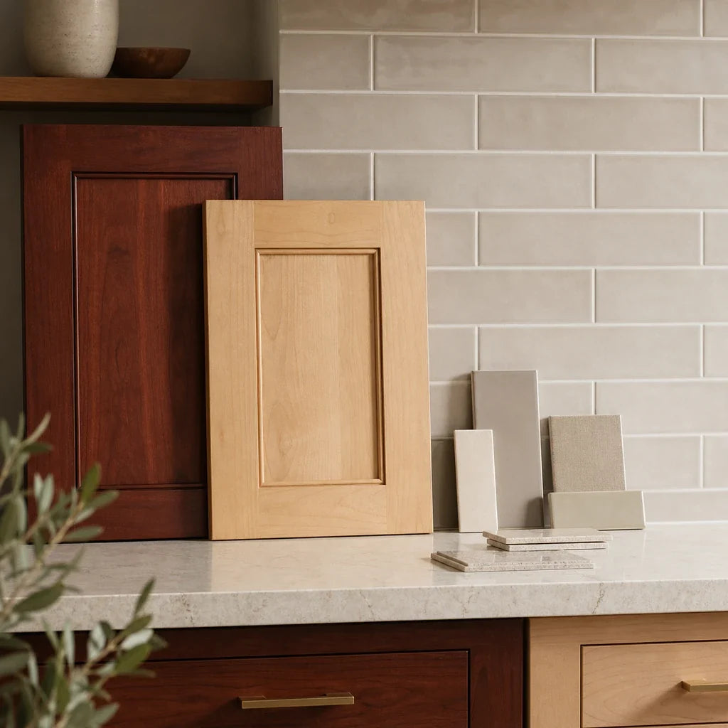
Wood cabinets bring grain, warmth, and variation to the decision. Check whether the wood reads honey, red, neutral, gray-brown, or deep brown before choosing blue, green, beige, or white tile.
With a brown-black counter and warm wood, ivory or greige may create a continuous palette. With a cooler wood tone, soft gray or muted blue may be worth testing. With strongly patterned grain, limit movement in the backsplash.
For a sample-led three-surface comparison involving wood cabinets, countertop undertone, grain movement, and lighting, see the backsplash guide for walnut cabinets.
Do not choose grout last. Grout can make a quiet tile field look much more graphic than the tile itself. Decide whether you want the joints to recede, define the tile shape, or become part of the pattern before you approve the backsplash.
Should the backsplash finish match the countertop?
The backsplash finish does not need to match the countertop finish. The better goal is enough difference for the wall and counter to remain readable without creating unrelated visual noise.
A polished black countertop beside glossy tile can look coordinated, but it can also multiply reflections from windows and under-cabinet lighting. A polished counter beside a matte or lightly textured backsplash creates more contrast in surface response. A honed or leathered counter may pair well with a softly textured tile, but a glossy accent can provide a deliberate point of light.
Compare three finish relationships:
- Glossy counter with glossy tile: Coordinated and reflective. Check for glare at night.
- Glossy counter with matte tile: More contrast and a calmer wall surface. Confirm that the tile still has enough texture or variation to avoid looking flat.
- Honed or leathered counter with lightly textured tile: Subtle and layered. Check whether the combined texture looks intentional from across the room.
Stickwoll’s checked examples such as Pristine White, Slate City, Minty Ceramic 8, and Classic Indigo were documented with glossy 3D surfaces. That product description tells you how the listed surface is presented; it does not establish that glossy tile is better or worse beside a particular countertop finish.
Photograph the same sample twice: once in daylight and once with the planned task lighting on. The photograph is useful for comparing impressions, but it is not a color-accurate substitute for seeing the sample in the room.
Which backsplash layout suits black countertops?
The best layout is usually the one that supports the countertop’s visual weight. A simple running bond, stacked layout, vertical stack, or modest mosaic can work. The choice depends on the amount of movement already present in the counter and cabinets.
Running bond
A running bond, often associated with subway tile, gives the wall a familiar horizontal rhythm. It can soften a tall wall and work well with simple white, warm white, gray, or greige tile.
If you use dark grout with white subway tile, the grid becomes a major design feature. That can be effective beside a plain black counter, but it may be too active beside strong veining or a patterned floor. The subway tile with black grout guide explains how contrast grout changes the visual role of the tile.
Stacked and vertical stack
A horizontal stacked layout feels orderly and architectural. A vertical stack can emphasize wall height and create a cleaner, more modern rhythm. Both layouts are useful when the tile surface already has texture or three-dimensional relief because the pattern stays controlled.
In a small kitchen, a simple layout can help the wall read as one surface rather than a collection of competing shapes. This is a visual judgment, not a measured rule, so dry-fit the actual tile before deciding.
Modest mosaic
A modest mosaic can add interest to a plain black countertop, especially when the cabinets are simple and the tile colors repeat an existing accent. Keep the palette narrow if the counter contains visible movement.
Herringbone and hexagon are useful references, but they introduce another layer of pattern, grout direction, and edge planning. Use the Tile Design Ideas hub to compare pattern families, then return to the actual wall and countertop before choosing one.
What grout color works with a black countertop?
Grout color controls how strongly the backsplash reads as a tile grid. The same tile can look quiet, structured, or highly graphic depending on the joint color and width.
- Tone-on-tone grout: Lets the tile field read as a more continuous surface. This is a useful starting point when the countertop is veined or the kitchen is small.
- Medium-contrast grout: Defines individual tile shapes without making every joint the first thing you see.
- High-contrast grout: Makes the grid part of the design. White tile with black grout is a clear example, but it should be tested at the actual wall scale.

With a white backsplash and black countertop, soft gray grout often gives more definition than white grout without producing the full graphic effect of black grout. Warm white tile may pair better with a warm gray or light taupe grout than with a stark cool gray.
Final grout color, joint width, and suitability should follow the chosen tile material and installation instructions. Grout appearance can also change with lighting, distance, tile size, and the amount of visual activity in the room. No checked authoritative source establishes a universal grout color that makes every kitchen feel larger, calmer, warmer, or more cohesive.
How should you test a backsplash sample?
A backsplash sample should be tested upright against the actual countertop edge and cabinet door. Do not judge it flat on the floor or from a product image alone.
The three-view sample test
- Place the sample upright. Rest it against the counter edge and cabinet door so you can see the three surfaces together.
- View it in daylight. Check the sample near the backsplash wall, not in a different room.
- Turn on the planned lighting. Use the same under-cabinet or task lighting you expect to install.
- Step back. Judge the whole wall from the main entry point and from the usual cooking position.
- Take a neutral photograph. Use the image to compare candidates, but confirm the final choice with the physical sample.
Look for four things:
- Does the tile pull out a warm, cool, or unwanted cast from the countertop?
- Does the surface reflect too much light at night?
- Does the pattern compete with veins, speckles, wood grain, or hardware?
- Does the wall still feel connected to the cabinets from across the room?
The most useful outcome is two or three finalists. If every sample remains in the running, you probably need to return to the countertop undertone and remove options that belong to a different temperature family.
Peel-and-stick backsplash checklist

Stickwoll’s current documentation describes smooth painted walls, existing smooth ceramic or glazed tile, and clean non-textured glass as suitable surface categories for its products. It also excludes textured walls, dusty or peeling paint, floors, and countertops. That is product-specific guidance, not a universal rule for every peel-and-stick tile.
Two PREPRINT/ARXIV laboratory studies of adhesive joints found that variables such as surface roughness, adhesive thickness, peel angle, and failure mode mattered under their tested conditions. The studies were not tests of Stickwoll products and cannot establish product adhesion, durability, heat resistance, moisture performance, or removal results. See the adhesive-joint roughness study from arXiv and the arXiv adhesive peeling and failure-mode study for those narrower findings.
Stickwoll’s installation guide currently says to wait at least three weeks after painting before applying its tiles and describes beginning with a partial peel of the backing before smoothing the tile onto the wall. Follow the current instructions for the exact product rather than transferring those directions to another brand.
For wall preparation, measurement, sink and range placement, edge conditions, and cleaning considerations, use the Kitchen Backsplash planning guide. For peel-and-stick surface, moisture, heat, and installation checks, see the Peel-and-Stick Tile Guide.
Frequently Asked Questions
Is a white backsplash always the safest option?
No. White is a useful starting point because it gives a dark countertop clear contrast, but the particular white still matters. A cool white may make a brown-black counter or cream cabinet look warmer by comparison. A yellowed cream may look disconnected beside a blue-black counter.
Compare clean white, warm white, and soft ivory samples beside the actual countertop and cabinet. If the kitchen has strong veining, a simple white tile may be more successful than a patterned white tile because the wall will remain quieter.
Can I use black tile with black countertops?
Yes, but the room needs a visible relationship between the two surfaces. Look for a change in texture, material, sheen, value, or pattern. Dark tile is easier to manage when the kitchen has enough light and the cabinets provide contrast.
If the countertop and backsplash are both very dark, use a sample at full wall scale. A small product image cannot show whether the wall will read as a separate surface or disappear into the counter.
Does a glossy backsplash make a black counter look too shiny?
It can, depending on the amount and direction of light. A glossy backsplash may reflect under-cabinet lights, windows, and nearby surfaces, while a polished counter already reflects the room.
Matching shine is optional. Compare glossy, matte, and lightly textured samples under the planned night lighting. The right choice is the one that keeps the wall readable without producing distracting glare.
What grout color works with a white backsplash and black countertop?
Soft gray or a warm light neutral is a flexible starting point because it defines the tile without making the entire wall a black-and-white grid. White grout creates a quieter field. Black grout creates a stronger graphic pattern.
Choose the grout only after confirming the tile material, joint width, cleaning routine, and installation instructions. A grout sample on a small board may look different from the same color across a full wall.
Can peel-and-stick tile work behind my range or sink?
It may work in some kitchen locations, but suitability is product- and condition-specific. Check the current product instructions for heat, moisture, splash, grease, wall surface, and clearance conditions before installation.
Stickwoll product pages describe kitchen and splash-related use, while the same documentation places limits on moisture exposure and does not provide an independent fire-rating or temperature test for every possible range setup. Do not assume that any peel-and-stick tile is automatically suitable behind every burner, beside every sink, or in every high-splash area.
The best backsplash is the one that survives the sample test
A black countertop needs an undertone check, a finish check, and a lighting check before the backsplash is chosen. Start with two or three candidate directions: a light neutral, a warm transitional neutral, and, only when the room supports it, a muted color or darker tonal option.
Then test each sample upright against the actual counter and cabinet. View it in daylight, turn on the kitchen lights, step back, and decide whether the wall feels connected rather than simply attractive in isolation.

Once you have narrowed the choice, browse the current Stickwoll backsplash options and confirm the product’s present color, finish, availability, wall requirements, and placement limits before ordering. The goal is not to name one universal winner. It is to choose a backsplash that responds to the specific black countertop in your kitchen.


Leave a comment
This site is protected by hCaptcha and the hCaptcha Privacy Policy and Terms of Service apply.