




















Material compatibility guide
A practical method for coordinating walnut undertones, countertop movement, backsplash color, grout, finish, maintenance, and real household lighting. Walnut undertones set one part of the palette; the Tile Design Ideas guide helps you compare them with counters, grout, pattern scale, finish, and the room's actual light.
Walnut is not one uniform brown. A tile that looks perfect online can turn icy, pink, muddy, or overly busy beside your actual cabinets, countertop, and household lighting. That makes inspiration-led shopping risky, especially when the material is expensive or difficult to replace.
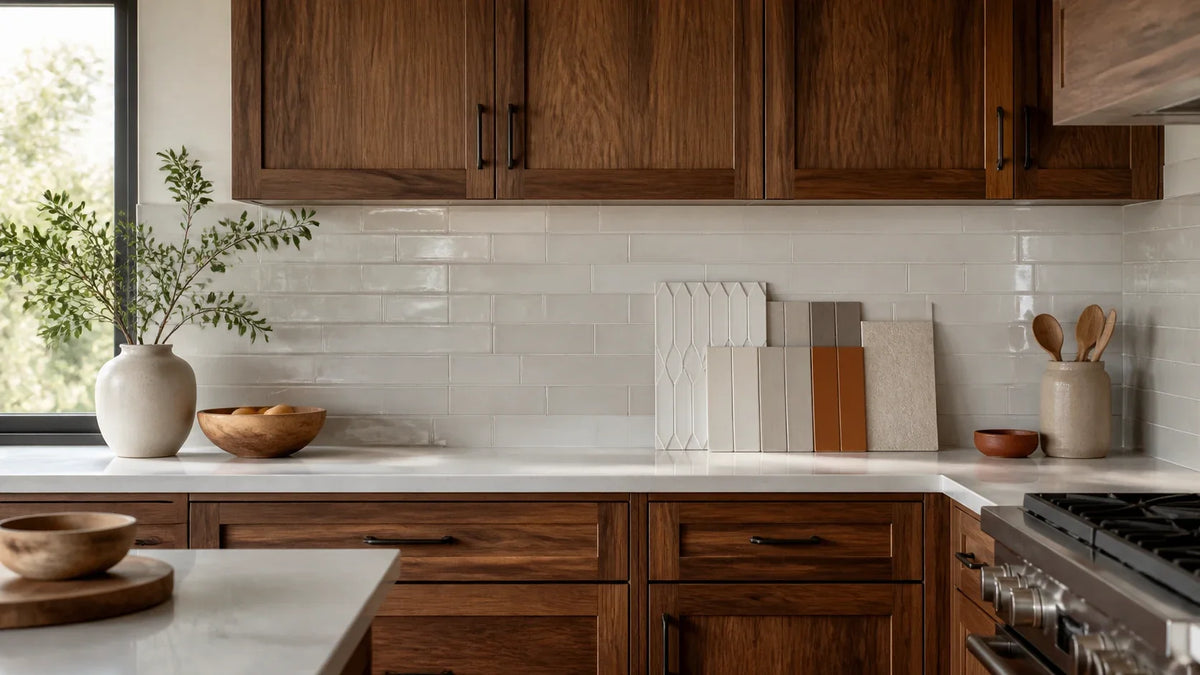
The most reliable backsplash for walnut cabinets is usually a quiet warm white, cream, pale greige, muted sage, or countertop-matched slab that supports the walnut rather than competing with it. The final choice should be based on cabinet undertone, grain movement, countertop pattern, room brightness, and samples viewed under actual household lighting.
Use three principles before ordering:
- Diagnose the walnut: Identify its value, undertone, grain intensity, stain, and response to daylight.
- Choose one dominant pattern: Let the walnut, countertop, or backsplash lead visually—never all three.
- Test the complete assembly: Review cabinet, countertop, backsplash, grout, and finish together under every routinely used light source.
The goal is not to find a universally “beautiful” material. It is to find the backsplash with the strongest relationship to the other fixed surfaces in your kitchen.
Our method uses a Three-Surface Compatibility Score, or TCS, followed by an In-Room Validation Confidence test. Together, they replace guesswork with a repeatable selection process.
How do you diagnose walnut before choosing a backsplash?
Does your walnut look golden in the morning, reddish at night, and much darker in photographs?
This five-minute diagnostic identifies its value, undertone, grain movement, countertop relationship, and required contrast before you compare backsplash materials.
The correct backsplash for walnut cabinets begins with the cabinet sample, not the tile display. Diagnose the walnut first, place the countertop beside it, and then decide whether the backsplash should create relief, continuity, or a focal point.
Why does walnut vary so much?
Walnut appearance changes with species, the part of the tree used, board selection, veneer matching, stain, clear finish, age, and lighting. “Walnut cabinets” is therefore a material category, not a precise color specification.
The USDA Forest Products Laboratory explains in its Wood Handbook that wood color and figure vary between species, between trees, and within the same tree. Finishes and exposure to light can alter appearance further.
Key sources of variation include:
- American black walnut: Often has medium-to-dark heartwood with brown, chocolate, purplish, grayish, or reddish character.
- European walnut: Often appears lighter or more varied, although origin and commercial naming do not guarantee a specific color.
- Heartwood: The darker inner wood that usually supplies the brown color associated with walnut.
- Sapwood: The lighter outer wood, which may introduce cream, tan, or pale yellow bands.
- Natural finish: A clear or lightly toned coating that preserves more of the wood’s existing variation.
- Stained walnut: Walnut altered by pigments or dyes, sometimes pushing it closer to espresso, orange-brown, red-brown, or gray-brown.
- Veneer matching: The arrangement of thin wood sheets, which can make the grain appear quiet, mirrored, striped, or highly expressive.
- Bookmatched veneer: Adjacent veneer leaves opened like pages, creating mirrored grain that acts as a deliberate pattern.
A common misconception is that walnut always becomes darker with age. Black walnut can lighten or become more amber with prolonged light exposure, while the finish may yellow or shift differently. Base your backsplash on the installed or approved finish sample, not unfinished raw wood.

What is the five-minute walnut diagnostic?
Set the cabinet sample vertically, because light reaches a vertical door differently from a horizontal countertop. Place the countertop sample directly against it, then evaluate the pair from your normal standing distance.
Complete these five checks:
- Rate the cabinet value: Classify it as light, medium, or dark relative to the room—not relative to walnut photographs online.
- Identify the undertone: Look for gold, orange, red, purple, gray, or a balanced neutral-brown bias.
- Rate grain movement: Mark it quiet, moderate, or expressive based on how strongly the grain reads from six to eight feet away.
- Add the countertop: Record whether it reinforces, cools, or conflicts with the cabinet undertone.
- Set the contrast goal: Choose light relief, tonal continuity, or dark emphasis before examining backsplash samples.
Here is a practical diagnostic table:
| Walnut condition | Visible cues | Likely backsplash direction | Use caution with |
|---|---|---|---|
| Light natural walnut | Honey, wheat, tan, pale brown | Cream, warm white, pale greige, muted sage | Yellow-beige that makes the wood look orange |
| Medium neutral walnut | Balanced brown, subtle gray or gold | Warm white, greige, soft green, restrained stone | Flat mid-brown tile with little value separation |
| Dark walnut | Chocolate, espresso, deep purple-brown | Reflective cream, warm white, pale greige, light slab | Charcoal in small or low-daylight rooms |
| Red-biased walnut | Mahogany-like red or auburn notes | Soft cream, restrained greige, muted olive-sage | Pink beige, bright terracotta, icy blue-gray |
| Gray-purple walnut | Smoky brown, plum-gray cast | Balanced greige, warm white, desaturated blue-green | Yellow cream or orange tile |
| High-sapwood walnut | Cream and dark brown variation | Simple warm white or countertop-matched slab | Small multicolor mosaics |
| Bookmatched veneer | Mirrored, architectural grain | Quiet slab or low-contrast large-format tile | Herringbone, bold marble, active zellige mixes |
| Espresso-stained walnut | Nearly black-brown, reduced natural variation | Light warm neutral with moderate reflectance | Black backsplash without strong daylight |
This is aesthetic guidance, not a species-identification chart. Commercial labels can be inconsistent, and photography can conceal color variation.
How can you tell whether walnut is warm or cool?
Compare the walnut with controlled warm and cool references. Place an uncoated white sheet, a cream sample, a neutral gray sample, and a blue-gray sample beside the cabinet. Do not hold samples separately or rely on memory.
A warm walnut usually becomes richer beside cream and more orange beside blue-gray. A gray-purple walnut may look balanced beside greige but dull beside yellow cream. Red-biased walnut may make pink-beige tile appear much pinker than expected.
Use these testing practices:
- Neutral surroundings: Cover brightly colored walls or packaging that may cast reflected color onto the sample.
- Consistent orientation: Keep cabinet and backsplash samples vertical and the countertop horizontal.
- Multiple light settings: Review daylight, overhead lighting, under-cabinet lighting, and evening ambient lighting.
- Clean reference surfaces: Dust, protective film, and fingerprints can change sheen and apparent depth.
- No camera-only approval: Smartphone processing can alter white balance, contrast, and saturation.
Light reflectance value, or LRV, describes the proportion of visible light a surface reflects under defined test conditions. It is not a complete brightness prediction because sheen, texture, illumination, surrounding colors, and viewing angle also matter.
ASTM standards such as ASTM E1477 provide standardized terminology and test procedures for luminous reflectance factor in specified material contexts. Do not assign an LRV to handmade tile by visual estimation. Request tested manufacturer data if reflectance is critical.
Should the backsplash be lighter or darker than walnut cabinets?
A lighter backsplash is usually safer with dark walnut, compact rooms, or limited daylight. A darker backsplash can work with light walnut when the kitchen has sufficient illumination and the countertop provides clear separation.
The decision should account for five conditions:
- Cabinet value: Dark cabinets usually benefit from a lighter vertical plane.
- Room size: Light surfaces can reduce perceived visual weight in compact kitchens.
- Daylight: Low-daylight rooms need careful control of dark, matte, and heavily textured finishes.
- Countertop value: A white countertop can bridge dark walnut and a pale backsplash; a black countertop may need a lighter backsplash to prevent a continuous dark block.
- Desired focal point: A dark backsplash intentionally becomes a visual anchor, so the grain and countertop should remain restrained.
A darker backsplash does not physically make a room smaller. It can, though, reduce reflected light and increase visual enclosure. That effect becomes stronger when dark cabinets, dark counters, dark flooring, and low-output lighting appear together.
The NKBA Kitchen Trends Report documents continuing professional interest in layered lighting, natural materials, and visually connected kitchen surfaces. Treat lighting as part of the material specification rather than a correction made after installation.
What is the one-dominant-pattern rule?
Across the cabinets, countertop, and backsplash, allow only one surface to carry strong movement. The other two should serve as visual support.
“Movement” means visible directional activity created by grain, veining, color variation, layout, or grout lines. It is separate from color. A white marble slab with strong diagonal veining can have more movement than a solid dark tile.
Use this hierarchy:
- Expressive walnut leads: Choose a quiet countertop and a low-contrast backsplash.
- Bold stone leads: Keep the backsplash simple, preferably slab-matched or softly tonal.
- Patterned tile leads: Use restrained walnut grain and a relatively quiet countertop.
- No surface leads: Introduce subtle texture through zellige, handmade ceramic, or a restrained layout.
- Two surfaces compete: Simplify the backsplash first because it occupies the vertical field between cabinets and counters.
Think of the kitchen as a conversation. Grain, veining, grout, and tile layout all speak. If every surface raises its voice, the room becomes harder to read.
For bold-veined counters, the foundational methodology requires strict control of competing movement. If you are worried that a backsplash will fight dramatic stone, use this persuasive next step to benchmark visual hierarchy before adding another active surface: learn how visual balance pairs backsplashes with bold marble.
How does the Three-Surface Compatibility Score work?
The Three-Surface Compatibility Score rates the cabinet, countertop, and backsplash as one assembly. Score five criteria from 1 to 5, for a maximum of 25 points.
The TCS is a decision aid, not a peer-reviewed material standard. Its value is consistency: every finalist is benchmarked against the same quantitative baseline.
| Criterion | 1 point | 3 points | 5 points |
|---|---|---|---|
| Undertone alignment | Clear clash | Conditional or light-dependent fit | Stable relationship across tested light |
| Movement hierarchy | Three competing patterns | Two surfaces partly compete | One clear leader with quiet support |
| Value contrast | Surfaces merge or feel disconnected | Acceptable separation | Deliberate, legible contrast |
| Light response | Fails in one or more routine settings | Changes but remains usable | Holds together in all tested settings |
| Maintenance fit | Conflicts with household needs | Manageable with concessions | Fits cleaning, sealing, and repair expectations |
Use these working thresholds:
- 21–25 points: Strong finalist ready for in-room validation.
- 17–20 points: Viable, but identify the weak criterion before ordering.
- 13–16 points: High risk; change color, finish, grout, or pattern.
- 5–12 points: Reject the combination.
These thresholds have not been empirically demonstrated as performance guarantees. They are a standardized evaluation tool for comparing your own finalists.
What does a worked TCS comparison look like?
Consider dark, red-biased walnut with a white quartz countertop containing fine warm-gray veining.
Two backsplash finalists are tested:
| TCS criterion | Stark blue-white glossy tile | Warm white satin tile |
|---|---|---|
| Undertone alignment | 1 | 5 |
| Movement hierarchy | 4 | 5 |
| Value contrast | 4 | 4 |
| Light response | 2 | 5 |
| Maintenance fit | 5 | 5 |
| Total | 16/25 | 24/25 |
The deterministic outcome is straightforward: the warm white satin tile advances because it scores eight points higher under the same criteria. The blue-white tile is not universally wrong; it fails this specific assembly by turning colder beside the red-biased wood under evening light.
This process also exposes fixable problems. If the warm white tile scored poorly for maintenance because of a crackled glaze, a similar color in porcelain could preserve the aesthetic score while improving practical fit.

Which backsplash options work best in each walnut kitchen?
Are you comparing cream, sage, zellige, marble, quartz, and porcelain without knowing which variable matters most?
This section ranks the main options by walnut value, countertop color, room light, grout behavior, maintenance, and installation demands.
The best backsplash ideas for walnut cabinets generally fall into three groups: quiet light neutrals, muted natural colors, and countertop-connected slabs. The right group depends on which surface carries the visual movement and how much light the kitchen receives.
Which backsplash colors coordinate with walnut?
Warm white, cream, pale greige, and muted sage have the broadest compatibility. Blue-green, terracotta, and charcoal are more conditional because they create stronger color relationships and require tighter control of lighting and countertop undertones.
| Backsplash color or surface | Best for | Avoid if | Grout direction | Practical note |
|---|---|---|---|---|
| Warm white | Dark walnut, small rooms, white counters | Countertop is distinctly cool blue-white | Matching warm white | Creates relief without a stark edge |
| Cream | Golden or medium walnut | Walnut is strongly gray-purple | Tonal cream | Test carefully under warm LEDs |
| Pale greige | Neutral, gray, or purple-brown walnut | Greige turns lavender beside the counter | Close tonal match | Useful bridge between warm wood and gray stone |
| Muted sage | Natural walnut, organic modern kitchens | Countertop has strong pink or blue veining | Sage-gray or warm gray | Echoes warmth without matching the wood |
| Blue-green | Orange-gold walnut, contemporary schemes | Room is dim or counter is red-biased | Muted gray-green | Desaturation matters more than trend labels |
| Terracotta | Pale walnut, cream counters, warm Mediterranean influence | Walnut is red or orange-biased | Sand or warm taupe | Can amplify warmth quickly |
| Charcoal | Light walnut, bright rooms, restrained counters | Dark cabinets, black counters, low daylight | Matching charcoal | Makes the backsplash a focal plane |
| Marble | Quiet walnut and restrained counter coordination | Cabinets or countertop already carry strong movement | Vein-related neutral | Acid-sensitive and often sealing-dependent |
| Quartz slab | Minimal grout, easy visual continuity | Fabricator limits or pattern mismatch | Usually none except seams | Match slab production information |
| Porcelain slab | Full-height coverage and controlled pattern | Substrate or installation team is unsuitable | Minimal seams | Large panels need specialist handling |
| Zellige | Quiet counters and softly varied interiors | Bookmatched walnut or bold stone already leads | Tonal, low-contrast grout | Shade, edge, and surface variation are intentional |
These are conditional aesthetic recommendations. Technical acceptance depends on the selected product, substrate, installation system, exposure, and manufacturer documentation.
Is warm white better than stark white?
Warm white is usually more forgiving because it shares a soft yellow, red, or neutral component with walnut. Stark blue-white can make warm walnut appear orange and can expose a mismatch with cream countertops or warm wall paint.
A white backsplash with walnut cabinets works best when the whites are related rather than merely similar in photographs. Compare tile, countertop, sink, appliance enamel, grout, and wall paint in one group.
Use this hierarchy:
- Countertop first: If the countertop is fixed, let its background white control the backsplash family.
- Cabinet second: Reject whites that exaggerate orange, red, or purple in the walnut.
- Grout third: A cool grout can redraw every joint and make a warm tile appear cooler.
- Finish fourth: Gloss reflects nearby colors; matte appears quieter but may absorb more visual light.
- Paint last: Paint offers more formulation flexibility than stone or tile.
A common mistake is choosing the brightest sample to make the kitchen feel larger. Brightness without undertone alignment can create a hard visual break. A slightly softer white often yields an optimal configuration because the cabinet, counter, and wall read as connected layers.
When does greige work better than gray?
Greige works better when the countertop or walnut contains both warm and cool notes. It can bridge chocolate wood, stainless steel, warm-white paint, and restrained gray veining without forcing the kitchen fully warm or cool.
Blue-gray is more conditional. Beside orange-gold walnut, it creates complementary contrast, which can be sophisticated or overly sharp depending on saturation. Beside purple-gray walnut, a blue-gray tile may become flat and cold.
Use a pale greige when:
- Walnut is neutral-brown: The tile can create calm separation without introducing a new color.
- Counters contain warm-gray veining: Greige can connect the vein color to the cabinets.
- Stainless steel is prominent: A balanced greige mediates between cool metal and warm wood.
- The style is transitional: It supports both traditional profiles and contemporary hardware.
- Lighting changes markedly: A balanced sample often tolerates daylight-to-evening shifts better than a strongly blue gray.
Do not approve a color based on its name. “Greige,” “mushroom,” and “taupe” are marketing labels, not standardized coordinates.
Is a green backsplash a good choice with walnut cabinets?
A green backsplash can work especially well with natural walnut because muted green and warm brown share an organic, low-saturation character. A muted olive-sage can echo walnut’s warmth without matching it.
Sage is the safer green because it usually carries gray or yellow moderation. Emerald, mint, and blue-green tiles create stronger contrast and need more precise sampling.
A green backsplash with walnut cabinets is best suited to:
- Organic modern kitchens: Use low-contrast grout and simple tile geometry.
- Scandinavian-influenced rooms: Pair light walnut with pale sage and restrained counters.
- Mid-century schemes: Use muted olive or blue-green with simple hardware and uncluttered lines.
- Warm white countertops: Let the countertop provide a clean buffer between green and walnut.
- Rooms with natural light: Daylight makes subtle green shifts easier to evaluate.
Avoid green selected solely from an online photograph. Camera white balance can suppress yellow, making olive tile appear cooler than it is.
For readers considering a distinctly blue-green direction, compare saturation against cabinet warmth, countertop white, and artificial lighting rather than judging an isolated swatch. Use this focused guide to control those variables before committing: discover how to choose the right blue backsplash material and tone.
When do terracotta and charcoal work?
Terracotta works with pale or neutral walnut when the room can support a deliberately warm palette. Charcoal works with light walnut when the kitchen has adequate illumination and a quiet countertop.
Both are statement choices rather than default answers.
Terracotta can succeed when:
- The walnut is not orange-red: Similar red-orange undertones can become visually excessive.
- The counter is cream or warm white: It creates breathing room between two warm surfaces.
- Grout is restrained: Sand, clay, or warm taupe usually preserves continuity.
- The room has simple finishes: Too many warm woods, metals, and earthen colors can become muddy.
Charcoal can succeed when:
- The cabinets are light: Dark tile creates an intentional value contrast.
- Daylight is strong: Natural light offsets the dark vertical plane.
- The countertop separates surfaces: A pale counter prevents the cabinets and backsplash from merging.
- The finish is considered: Glossy charcoal reflects more of the room; matte charcoal reads denser.
Avoid charcoal with dark walnut and black countertops in a small, low-daylight kitchen unless enclosure is the explicit design goal.
If a rich brown accent is part of your palette, first compare it against the walnut so the two browns remain deliberately separated. Then review Chic Cocoa peel-and-stick 3D wall tiles as a warm statement option, checking product documentation and a physical sample before use.
For a brighter, high-energy contrast rather than tonal brown, explore Lemon Zest wall tiles for a vibrant personalized direction. Treat the color as the dominant accent and confirm all heat, water, substrate, and cleaning requirements for the intended location.
Is zellige a good backsplash for walnut cabinets?
Zellige can complement walnut when its irregular surface is the secondary texture rather than a competing pattern. Choose a narrow color range, low-contrast grout, and a simple layout.
Zellige refers to traditionally handmade Moroccan clay tile with variations in color, edge, thickness, and glaze. Products marketed as “zellige-style” may be machine-made ceramic or porcelain and may perform differently.
A zellige backsplash with walnut cabinets is best for:
- Quiet countertops: Subtle quartz or low-movement stone allows the tile texture to register.
- Moderate walnut grain: The cabinet and tile can share visual richness without equal pattern intensity.
- Warm minimalism: Tonal cream or pale greige creates depth without introducing strong graphics.
- Reflective relief: Irregular glaze catches under-cabinet light and changes through the day.
Avoid highly varied zellige beside bookmatched walnut and bold-veined stone. That combination breaks the one-dominant-pattern rule three times.
Check the current technical sheet for installation, wet-area suitability, edge variation, sealing, grout release, cleaning, and acceptable shade range. Handmade appearance does not override technical requirements.
Should you use marble, quartz, or porcelain for a slab backsplash?
A slab backsplash is strongest when visual continuity and minimal grout are more valuable than low installation complexity or easy spot repair. Matching the countertop material can create the clearest movement hierarchy.
A full-height backsplash extends from the countertop to the upper cabinets, shelves, hood, or ceiling. It creates a larger visual field, so subtle pattern differences become more noticeable.
| Material | Movement | Moisture and cleaning considerations | Repairability | Installation complexity |
|---|---|---|---|---|
| Marble slab | Natural and variable | Calcareous stone can etch from acids; sealing needs vary | Local repairs may remain visible | High |
| Engineered quartz slab | Product-specific, generally controlled | Follow manufacturer heat, cleaner, and exposure limits | Chips and seams require specialist work | High |
| Porcelain slab | Printed or through-body, product-specific | Low water absorption when classified as porcelain | Edge damage can be difficult to disguise | High |
| Ceramic tile | Broad color and finish range | Glaze and body classification vary | Individual tiles may be replaceable | Moderate |
| Porcelain tile | Low water absorption under ANSI classification | Suitable products offer predictable cleanability | Individual tiles may be replaceable | Moderate |
| Zellige or handmade tile | High surface and shade variation | Product-specific sealing and cleaning rules | Replacement may show batch differences | Moderate to high |
The Natural Stone Institute advises using appropriate cleaners and explains that acidic substances can etch calcareous stones such as marble. Sealing can reduce staining risk, but it does not make marble acid-proof.
ANSI A137.1 classifies ceramic tile by properties including water absorption. Porcelain tile has a water absorption of 0.5% or less under the standard’s test framework. That classification does not automatically guarantee stain resistance, slip performance, or suitability for every adhesive and substrate.
For installation, use the current TCNA Handbook and applicable ANSI A108, A118, and A136.1 standards. Industry consensus dictates that the complete installation system—tile, mortar, grout, movement accommodation, backing, and substrate—must be compatible.
What works with white or black countertops?
For walnut cabinets with white countertops, select a backsplash related to the countertop’s background white or veining. For walnut cabinets with black countertops, use a lighter backsplash unless the room can support a deliberately dark composition.
| Scenario | Strong starting point | Why it works | Main risk |
|---|---|---|---|
| Walnut with warm-white quartz | Warm white, cream, pale sage | Countertop buffers wood and tile | Choosing a blue-white backsplash |
| Walnut with cool-white quartz | Balanced white or pale greige | Connects cool counter to warm wood | Making walnut appear orange |
| Walnut with bold marble | Countertop-matched slab or quiet tonal tile | Preserves one dominant pattern | Competing zellige or herringbone |
| Walnut with soapstone | Cream, warm white, pale greige | Relieves the dark counter | Dark backsplash creating a heavy band |
| Walnut with black granite | Light matte tile or restrained slab | Restores value separation | Strong speckle plus active tile |
| Light walnut with black quartz | Warm white or controlled charcoal | Supports contemporary contrast | Insufficient room light |
Soapstone changes visibly with mineral oil or wax and may show natural veining. To avoid approving a backsplash against only one temporary counter state, compare nine tested soapstone backsplash pairings across undertones, oiling states, grout, and changing light.
What backsplash works in a small or low-daylight walnut kitchen?
Use a light, moderately reflective backsplash with restrained movement. Warm white, cream, pale greige, and lightly varied satin tile usually preserve more visual openness than charcoal, dense mosaics, or highly textured matte surfaces.
For dark walnut cabinets, a pale backsplash is usually the operational baseline. It separates the upper and lower planes, reflects under-cabinet light, and prevents the cabinet run from reading as one uninterrupted dark mass.
Improve the assembly through:
- Under-cabinet lighting: Place continuous lighting near the cabinet front to reduce glare and scalloping on glossy tile.
- Moderate sheen: Satin or softly glossy finishes can reflect light without acting like a mirror.
- Larger tile scale: Fewer grout lines reduce visual fragmentation.
- Low-contrast grout: Tonal grout allows the backsplash to read as a field rather than a grid.
- Simplified movement: Avoid combining dark walnut, dramatic stone, and strongly varied tile.
- Light wall paint: Keep adjacent paint related to the backsplash rather than selecting it independently.
Reflectance alone cannot correct poor lighting design. A glossy tile may reflect a bright point source while leaving the work surface unevenly lit. Review fixture placement, color quality, output, controls, and under-cabinet coverage with a qualified lighting professional.
How do grout, sheen, and tile scale change the result?
Grout can alter the apparent color, pattern, and scale of the entire backsplash. High-contrast grout emphasizes geometry; tonal grout emphasizes material and color.
A cream subway tile with dark gray grout behaves like a graphic pattern. The same tile with matching cream grout reads as a quiet plane. That distinction can determine whether the backsplash supports or competes with walnut grain.
Use these controls:
- Matching grout: Best when expressive walnut or veined stone already leads.
- Contrasting grout: Best when the backsplash is intended to become a focal point.
- Warm grout: Can connect cream, beige, terracotta, and gold-biased walnut.
- Cool grout: Can sharpen greige or blue-green but may make warm tile look yellow.
- Gloss finish: Reflects nearby wood, metal, paint, windows, and people.
- Matte finish: Reduces sharp reflections but can appear darker.
- Small tile: Adds more joints and greater visual rhythm.
- Large tile: Reduces grid activity but demands careful substrate preparation.
- Herringbone layout: Increases directional movement even when tile color is quiet.
Grout performance is product-specific. Current technical sheets from manufacturers such as MAPEI and Custom Building Products specify joint ranges, mixing, curing, cleaning, substrate, and exposure requirements. Verify the exact product rather than transferring claims from one grout category to another.
If tile format is still unresolved, compare traditional and peel-and-stick kitchen backsplash categories by installation method, style, and budget. Product claims must still be checked against heat clearances, substrate conditions, cleaning limits, and local requirements.
If herringbone is a finalist, remember that layout itself adds movement. Before combining it with walnut grain, review modern herringbone backsplash ideas, materials, colors, and practical installation considerations, then rescore the movement hierarchy.
How should you test backsplash samples in the actual kitchen?
A backsplash finalist passes only after the cabinet, countertop, tile, grout, and finish are reviewed together in daylight and every routinely used artificial-light setting. This is the In-Room Validation Confidence test, or IVC.
IVC is a pass-or-fail gate rather than a point total. A sample that fails under one frequently used lighting condition returns to the shortlist, even if it photographed well elsewhere.
Build each sample board with:
- Cabinet reference: Use an approved finished door, not a raw walnut offcut.
- Countertop sample: Include the actual color, finish, and representative veining.
- Backsplash field: Use several tiles from the intended lot where variation is expected.
- Grout sample: Create a cured joint or use a manufacturer-prepared sample.
- Metal reference: Add the actual hardware, faucet finish, or stainless steel sample.
- Paint sample: Apply the proposed wall color to a movable board.
- Finish notation: Label matte, satin, polished, honed, crackled, or textured surfaces.
Review the boards:
- Morning daylight: Check whether whites turn blue or walnut becomes orange.
- Afternoon daylight: Watch for stronger red, gold, or glare.
- Overhead lighting: Evaluate overall value and color balance.
- Under-cabinet lighting: Inspect grout shadows, surface texture, and reflection.
- Evening ambient light: Confirm that cream does not turn yellow or greige turn purple.
- From a distance: Stand six to eight feet away and identify the dominant pattern.
- Beside fixed finishes: Include flooring, appliances, nearby paint, and open-room sightlines.
Review samples over several days. A five-minute diagnosis creates the shortlist; it should not replace extended validation.

What should be on the final approval checklist?
Approve no more than three finalists. More options create comparison fatigue and make subtle undertone differences harder to track.
Before ordering, confirm:
- TCS result: The preferred assembly scores at least 21 points or has a documented reason for any weaker criterion.
- One dominant pattern: Cabinet grain, counter veining, and backsplash movement have a clear hierarchy.
- IVC pass: The full assembly works in all routinely used lighting.
- Lot review: Shade and caliber expectations are confirmed for tile.
- Grout approval: The cured color and joint width have been tested.
- Technical suitability: Product documentation supports the intended wall, heat, moisture, cleaning, and substrate conditions.
- Installation method: The installer has approved the setting materials, backing, edge treatment, seams, and movement accommodation.
- Maintenance fit: Cleaning, sealing, etching, staining, and repair expectations suit the household.
- Overage plan: Extra material is ordered according to layout, breakage risk, variation, and future repair needs.
- Final mockup: A representative section is approved before full installation where project scale and cost justify it.
This standardized evaluation fundamentally mitigates the most expensive failure: approving each material separately and discovering after installation that the three surfaces do not work together.
The best backsplash for walnut cabinets is not a universal tile, color, or slab. It is the option with the strongest Three-Surface Compatibility Score and a successful In-Room Validation Confidence test.
Use the sequence in order:
- Diagnose the walnut: Identify value, undertone, grain, stain, veneer, and light response.
- Establish one dominant pattern: Let walnut, countertop, or backsplash lead.
- Coordinate the countertop: Treat all three surfaces as one visual assembly.
- Shortlist by scenario: Account for cabinet value, counter color, room size, daylight, style, and maintenance.
- Test complete assemblies: Review cabinet, counter, tile, grout, finish, paint, and metal together.
This method yields an optimal configuration because it replaces isolated product impressions with a repeatable quantitative baseline and a real-room approval gate.
Score no more than three finalists. Build cabinet-countertop-tile-grout sample boards and review them for several days before ordering. Use a printable version of the scorecard, or consult a qualified designer and installer for project-specific verification.
Frequently Asked Questions
Still unsure how the method applies to common walnut kitchen decisions?
These answers resolve the final questions about color, material, lighting, grout, and ordering.
What is the safest backsplash color for natural walnut cabinets?
Do you want a low-risk starting point without making the kitchen feel generic?
A quiet warm white, cream, or pale greige provides the broadest compatibility while preserving walnut as the focal material.
Warm white is the safest starting point for most natural walnut cabinets. Cream suits gold-biased wood, while pale greige can bridge neutral walnut, stainless steel, and counters with restrained gray veining.
“Safest” does not mean automatically correct. The backsplash white must be compared with the countertop background, grout, wall paint, and actual cabinet finish. A warm white that coordinates with one quartz may appear yellow beside another.
What backsplash is best for dark walnut cabinets?
Does dark walnut make your kitchen feel visually heavy or short on light?
Use a lighter backsplash with controlled movement, then support it with continuous under-cabinet lighting.
Warm white, cream, pale greige, and light countertop-matched slabs are the strongest starting points for dark walnut cabinets. Satin or softly glossy surfaces can reflect useful light without creating the sharp glare associated with highly polished tile.
Avoid combining dark walnut, black counters, charcoal backsplash, dark flooring, and weak lighting unless a deliberately enclosed atmosphere is the goal. A pale countertop can serve as a visual break if a darker backsplash remains important to the concept.
Can you use marble backsplash with walnut cabinets?
Do you like natural stone but worry that marble veining will compete with walnut grain?
Marble works when its movement is quieter than the wood, or when the marble becomes the single dominant pattern.
Use marble with restrained walnut grain and a simple countertop relationship. If the countertop is already bold marble, continuing the same slab up the wall is often calmer than adding a separate marble pattern.
Marble is a calcareous stone and can etch when exposed to acids. Sealing may reduce staining risk but does not prevent acid etching. Confirm finish, care, seam planning, outlet cuts, and slab placement before fabrication.
What grout color looks best with walnut cabinets?
Could the wrong grout turn a quiet backsplash into a busy grid?
Choose grout according to the desired movement hierarchy, not as an isolated color decision.
Tonal grout is usually best when walnut grain or countertop veining already leads. It allows the backsplash to read as a continuous field.
Contrasting grout is appropriate when tile geometry should become the focal pattern. Test a cured sample because wet grout, printed color cards, screens, and uncured material may not represent the final result.
Are peel-and-stick tiles suitable behind walnut kitchen counters?
Are you considering a simpler installation but unsure whether the material suits the location?
Suitability depends on the product’s technical limits, substrate, heat exposure, moisture, cleaning requirements, and installation instructions.
Peel-and-stick is a product category, not one standardized performance level. Review the current manufacturer documentation for heat resistance, water exposure, surface preparation, stove clearances, cleaning, removal, and permitted substrates.
Do not assume that “waterproof” means suitable for every seam, wall assembly, or high-heat location. Local codes, appliance instructions, and product-specific clearances control the installation.
How many backsplash samples should you order?
Are too many samples making the decision harder rather than clearer?
Reduce the field to three complete assemblies and compare them under the same conditions.
Start with several inexpensive color references, then order physical samples for no more than three finalists. For varied tile, request multiple pieces or a representative sample board rather than judging one unusually light or dark tile.
For natural stone, printed porcelain, or quartz, confirm how the sample relates to the full slab, panel, production batch, or print repeat. Small samples may omit the movement that controls the final design.


Leave a comment
This site is protected by hCaptcha and the hCaptcha Privacy Policy and Terms of Service apply.