

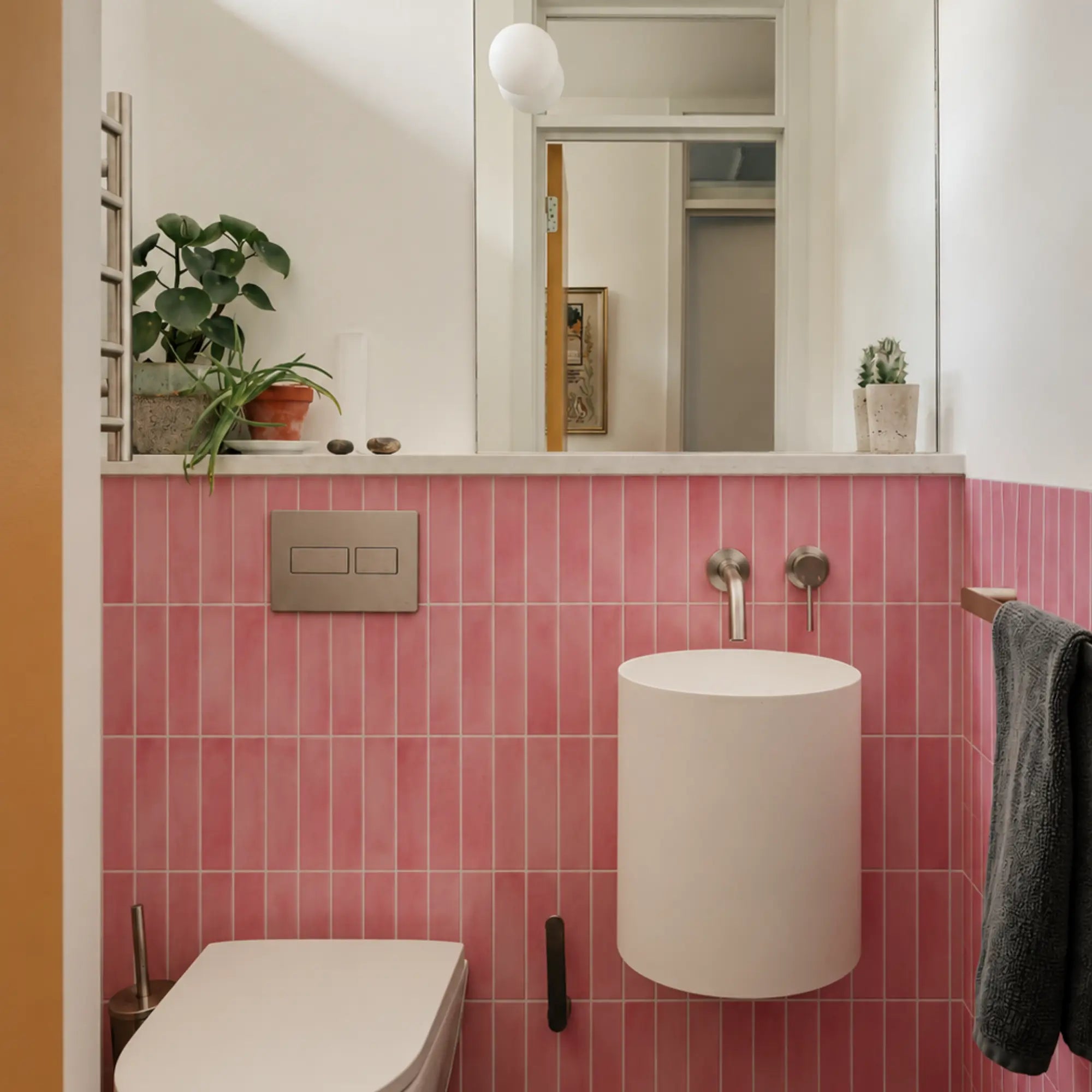
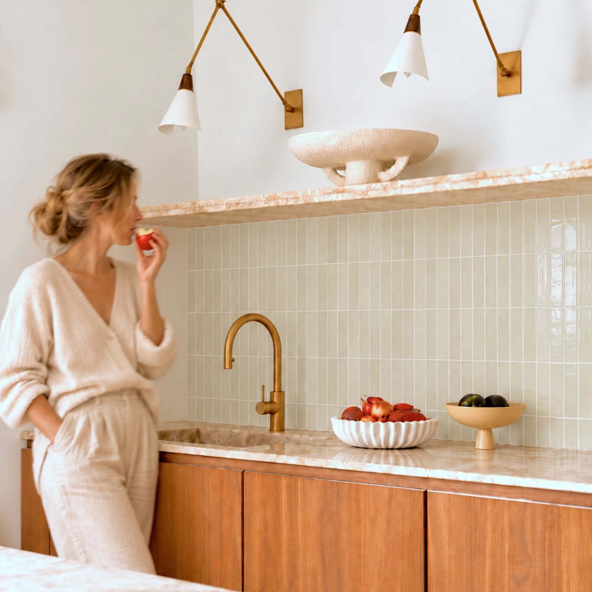



Choose tile direction by comparing a real layout against the wall's proportions, viewing positions, interruptions and product instructions. Horizontal, vertical, stacked and feature patterns can create different visual rhythms, but none guarantees a wider or taller-looking room. Pattern density, color contrast, lighting and the amount of wall actually visible also matter. Check that a manufactured sheet can be rotated before designing around a new direction.
Explore this guide
Direction is easy to discuss in a photograph and harder to resolve around an outlet, a sloping counter or a short return. A useful plan connects the visual idea to the installed module and the cuts it creates. The best pattern is not simply the one you like most in isolation, but the one that still works when fitted to your actual wall.
This guide develops a practical comparison method, explains what perception research can and cannot support, and works through layout arithmetic. It is not a catalog of measured room-size improvements or an experiment on Stickwoll products. The numerical examples are planning exercises with stated assumptions.
Decide what the wall should contribute to the room
Write one sentence about the wall's role. It might be a calm background for an active kitchen, a deliberate focal point behind a vanity or a quiet frame for a desk. This gives you a reason to compare patterns beyond whether they are currently popular.
Look at the fixed geometry around the area. Countertops, cabinet rails, windows, mirrors and shelves create lines before any tile is added. A new pattern can align with those lines or contrast with them deliberately. Problems often arise when the result does neither because the surrounding features were not included in the plan.
Identify the part that will actually be visible. A full-height wall behind furniture, a strip beneath cabinets and a narrow side return are not equivalent canvases. A pattern with a broad repeat may be attractive on the whole wall but become fragmented when most of it is concealed.
Separate preference from a performance promise. You may like a vertical stack because it feels orderly or a herringbone because it creates movement. Those are valid design reasons without claiming a guaranteed increase in perceived height or a percentage improvement in room quality.
Choose a small number of candidates with clear differences. Comparing horizontal stack, vertical stack and one feature pattern is usually more informative than scrolling through dozens of similar photographs without a room-based question.
What research says about orientation and perceived size
In four experiments with stereoscopically presented simulated interiors, von Castell, Hecht and Oberfeld varied stripe direction and density. Pattern density had a stronger role in judged width and height than simple orientation rules predicted. The results caution against presenting vertical-equals-taller and horizontal-equals-wider as universal facts.
A separate study of simulated achromatic rooms with 20 observers examined how surface brightness affected perceived spatial extent. That supports considering the surrounding surfaces rather than direction alone. It does not establish how much larger a particular kitchen will look after installing a named tile.
These studies are useful precisely because their conditions are defined. A simulated room, a striped wall and a laboratory judgment are not identical to a furnished home with an embossed backsplash, colorful objects and changing daylight. Do not turn the findings into a new rule that dense patterns always make the best interior.
Use the research to improve the question: what changes when this pattern, scale and contrast are placed in this room? A representative mock-up and observations from normal positions are practical ways to answer that personal design question without inventing a quantitative outcome.
Understand the pattern families you are comparing
A horizontal stack aligns rectangular pieces in rows and columns. A vertical stack rotates that visual arrangement when the product permits it. A running bond offsets successive rows. These choices change where joints intersect and how the pattern relates to the room's existing lines.
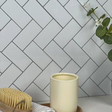
Herringbone and chevron are not interchangeable. A herringbone arrangement typically uses alternating rectangular pieces at angles to create a zigzag rhythm, while chevron commonly relies on pieces or a printed format designed to meet in a continuous V. A manufactured sheet may depict either pattern without allowing its individual elements to be rearranged.
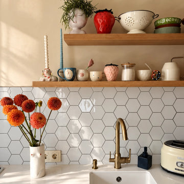
Hexagon and other geometric formats introduce their own repeat and boundary cuts. Their visual direction may come from the print, the joint network or the overall sheet shape. A tile with a nondirectional texture can still have a directional installation edge.
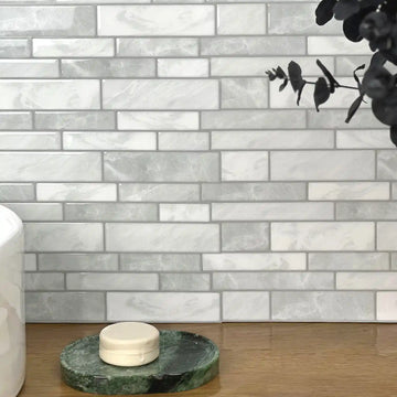
Marble veining creates another layer of direction. A rectangular grid and a dominant diagonal vein may reinforce or compete with each other. Not every print is intended to connect across seams, so matching should follow the supplied design rather than a promise that any pieces can become a continuous slab.
| Pattern | Useful comparison | Practical check |
|---|---|---|
| Horizontal stack or subway effect | Relationship with counters and cabinet lines | End cuts, row height and joining direction |
| Vertical stack | Relationship with mirrors, tall openings and narrow fields | Whether rotating the actual product is permitted |
| Offset arrangement | Rhythm and joint intersections | Allowed offset and effect on edge pieces |
| Herringbone or chevron | Movement and the focal area | Manufactured repeat, angle cuts and usable offcuts |
| Hexagon or graphic sheet | Scale of the complete repeat | Factory edges and terminations |
| Veined pattern | Dominant print flow and background tone | Actual connecting faces and permitted orientation |
Distinguish the visible tile from the installed sheet
A peel-and-stick sheet can contain several printed or raised tile shapes. Rotating the photograph of one rectangle does not mean the whole sheet can be rotated without changing its overlap or joint method. Find the actual supplied unit and its instructions before finalizing direction.
Check arrows, tabs, overlap strips and any numbered sequence. A directional backing may exist even where the print looks nondirectional. Do not trim away a functional edge merely to reproduce a layout found online unless the manufacturer permits that modification.
Use the installed module in your drawing. If sheets overlap, nominal width and effective coverage may differ. A row calculated from the box's outer dimensions can end in the wrong place when the actual joining detail is included.
Look at several adjoining units before deciding. A sheet that looks balanced alone may repeat conspicuously in a large field. A design with intentionally varied faces may need a different sorting strategy from a continuous mural-like pattern.
For a strongly veined product, use the faux-marble matching guide. It separates continuous flow, mirrored bookmatching and simple visual balance, rather than assuming rotation creates every kind of match.
Map interruptions before choosing the strongest pattern
Draw outlets, switches, cabinet breaks, shelves, windows and exposed ends on the wall plan. Include the actual dimensions and position of the openings. A beautiful central repeat may lose its effect if every visible section is interrupted by a cut.
Keep functional requirements fixed. Do not move or conceal an outlet, block a vent or compromise an appliance clearance just to preserve a vein or V-shaped pattern. If the renovation legitimately involves changing those features, that work needs its own appropriate design and professional scope.
Identify primary and secondary viewing areas. The wall seen from the entrance may deserve a different compositional focus from a narrow return beside a cabinet. A less prominent area can accept a planned pattern reset, but it should not be used to hide a poor bond or an unsafe detail.
Consider how doors and drawers move. A trim or projecting edge should not catch a handle or reduce useful clearance. Shelves and cabinets also need their own support; decorative tile is not a structural attachment.
The kitchen backsplash guide helps connect the layout to practical use. The direction decision should be made within those constraints, not before they are known.
Use a reliable datum while fitting irregular boundaries
A reference line gives the pattern a consistent orientation. The countertop, ceiling or cabinet may be slightly out of level or plumb, so do not automatically use it as the datum. Check the actual geometry and decide which line the field should follow.
Perimeter cuts can accommodate a boundary without tilting the entire pattern. If a cabinet side is wavy, keep the field aligned and transfer the boundary to the final piece with an appropriate template or scribing method. Do not stretch a sheet to make the last edge fit.
Compare the appearance from a normal distance as well as with a level. A small irregularity in an old room may need a deliberate transition rather than an attempt to make every existing feature parallel. A consistent planned reveal can look more intentional than forcing a pattern to follow several conflicting lines.
Use the cabinet-scribing guide when fitting a difficult edge. Its purpose is to transfer the actual contour while preserving the layout reference, not to certify one gap width as correct for every material.
Work through a simple balanced-cut calculation
First define the available field width after any required perimeter clearances are accounted for. Then identify the actual piece width and internal-joint detail. For a manufactured overlap system, it may be easier to use the installed module and a dry layout rather than a simple separate-tile equation.
For a hypothetical zero-joint illustration, suppose the available field is 124 centimetres wide and the pieces are 30 centimetres wide. Starting with four full pieces leaves a four-centimetre end strip. Another arrangement uses three full pieces in the middle and equal end pieces: (124 − 3 × 30) ÷ 2 = 17 centimetres each.
That arithmetic shows why checking a centered alternative can help, but it is not a rule that every wall needs half-tile ends. Outlets, pattern connections and the actual joining detail may favor a different start. The example also assumes a product whose pieces can be cut and arranged that way.
If the hypothetical assembly instead requires internal joints of 0.2 centimetres, three full middle pieces plus two cut ends create four internal joints. The equal cut would be (124 − 90 − 4 × 0.2) ÷ 2 = 16.6 centimetres. The joint width here is an invented calculation input, not an installation recommendation.
Write assumptions beside the drawing. Note whether dimensions describe tile faces, installed modules, clear fields or overall wall widths. Mixing those measurements is a common source of end-cut errors. A correct calculation using the wrong dimension is still the wrong layout.
Check direction against row height and visible cuts
Width is only half the plan. Calculate how rows meet the counter, cabinet underside, window sill and top termination. A visually attractive direction can create a thin strip in the most visible area if height is not checked.
Compare more than one starting row. You may be able to distribute cuts, align a meaningful feature or end at a planned trim. Do not assume the bottom row must always be full or that the first physical piece must be installed at the center of the wall.
For a pattern with angled elements, check the complete repeat rather than measuring only one visible rectangle. The width of a cut piece does not always describe how much of the motif remains. A half motif at a boundary can look deliberate, while a tiny fragment may be difficult to handle or visually awkward.
Preserve required joints and factory edges. Do not eliminate a specified gap or overlap to make a row arithmetic work. Adjust the layout or choose another format when the design cannot be installed correctly in the available dimensions.
Record the final row and column plan before removing liners. It should identify the starting datum, key pieces, cuts and any intended pattern reset. That record is especially helpful if installation is split over several sessions.
Compare contrast and density with the room's existing detail
A dark joint network, bold vein or contrasting shape makes direction more visible. The same layout in low-contrast tones can read as a quieter texture. Decide how much attention the wall should attract relative to the countertop, cabinet hardware and objects normally present.
Pattern density changes with both tile size and viewing distance. A small repeat seen close to the counter can feel different from the same wall viewed across a room. A large feature wall is not automatically more tolerant of every pattern; judge the actual visible field.
Keep the laboratory research in perspective. The finding that density affected perceived dimensions in simulated striped rooms does not mean that the busiest possible backsplash is always desirable. Perceived spaciousness, visual comfort and personal preference are not identical outcomes.
A practical comparison is to hold color and finish broadly similar while varying layout or scale. That makes the difference easier to understand. Comparing a dark glossy herringbone with a pale matte stack changes several properties at once; it may still identify your preferred product but does not isolate direction.
Use the finish guide to evaluate reflections separately. A pattern that works geometrically can still produce an unwanted highlight under the actual light.
Plan corners and transitions rather than forcing continuity
At an inside corner, decide whether the product is meant to stop, join or wrap. Do not bend a rigid panel or force a flexible one around a shape that its instructions exclude. Visual continuity does not justify installing the material under tension.
A deliberate reset can be attractive. Align a row, a tonal family or a dominant feature across the turn without pretending the wall is one unbroken sheet. For some manufactured patterns, matching is planned by the producer; for others, a balanced transition is more realistic than exact continuity.
At an exposed edge, check the visible core and trim options. A raw edge may be acceptable for one product and need a specified finish for another. Choose attachment and material compatibility before applying a trim, especially in a rental.
Keep movement and water-management details functional. A decorative pattern should not bridge a joint that needs to move or conceal an opening designed for drainage or service. Ask for the correct system detail where those issues are unclear.
The best transition is one that looks intentional and can be installed and maintained properly. It does not need to disappear completely to be a successful design.
Use a mock-up protocol that answers real questions
Choose a representative area rather than the easiest empty rectangle. Include an edge or interruption if it will be prominent in the final view. Use a temporary display method that is safe for the wall and product, keeping the release liner attached where appropriate.
View the arrangement from the entrance, the main working position and any seated position that matters. Check normal daytime and evening lighting. Note what you prefer and what bothers you without trying to turn taste into a numerical certification.
Photograph each option from a consistent position. Keep the camera settings comparable where practical, but recognize that exposure and screen size can change the impression. The photographs are a memory aid, not proof that the room's dimensions have changed.
Change one design factor at a time when you want to understand its effect. For example, compare the same allowed pattern vertically and horizontally before changing its color. If the sheet cannot be rotated, use actual eligible alternatives rather than a digital arrangement that cannot be installed.
Keep a short decision note: preferred option, important viewing positions, unresolved cuts and product constraints. A useful mock-up ends with a more practical plan, not simply another folder of inspiration images.
Four room-based layout examples
A long galley-kitchen backsplash
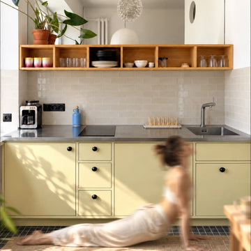
In this hypothetical room, cabinet and countertop lines already create a strong horizontal structure. The owner compares a quiet horizontal pattern with a vertical stack in the available strip. The final choice depends on the outlet cuts, reflections and personal preference, not a promise that one direction makes the galley wider.
A compact vanity wall
A mirror and side lights occupy much of the wall. The owner maps the visible strips before choosing a large repeat. A simpler pattern may keep the remaining pieces coherent, while a bold motif could work as a deliberate frame if the cuts are planned. The wall's apparent height is only one consideration.
A desk or video-call background
The user checks the design from the desk and the actual camera view. Fine repetitive patterns can look different on a screen, so the camera observation is useful alongside direct viewing. The user chooses a pattern that supports the room and image without claiming an acoustic or productivity benefit.
A feature wall behind furniture
The owner lays out the portion visible above and beside the furniture, then checks whether the strongest motif will be concealed. A shifted composition may work better than centering on the full wall alone. The selected direction is tied to what people actually see, not merely the room's mathematical center.
These examples are planning exercises rather than completed customer studies. They show why the same pattern can lead to different decisions in different rooms.
Estimate waste from cuts, not from a universal percentage
List pieces that need a particular factory edge, orientation or print connection. An offcut may be large enough in area but unusable because its joining side or pattern direction is wrong. Keep those constraints visible in the quantity estimate.
Distinguish installation allowance from repair spares. Extra material needed to complete a complex pattern is different from pieces retained for a future local repair. Check the supplier's recommendations and your actual layout rather than assuming ten percent covers both for every room.
For a simple pattern, a cut map can show which leftovers are reusable. For a continuous image or limited set of connecting faces, the supplier may need to help calculate quantity. Do not discard pieces merely because they do not fit the central focal zone; they may work elsewhere within the permitted layout.
Label and store useful offcuts without damaging their adhesive or orientation information. Keep a final photograph and batch details. A future replacement is easier to plan when the original design is traceable.
Move from the approved layout to installation
Confirm the wall and product requirements before the layout becomes a live installation. A preferred direction cannot repair a weak coating or approve an unsuitable wet or heated location. Complete necessary preparation and condition the materials as instructed.
Transfer the reference lines carefully, keep templates identified and dry-fit difficult pieces. Use the actual cutting and pressure methods for the product. Do not change the joining detail to make the final row fit.
Check alignment periodically and compare the developing wall with the plan. If a problem appears, stop while it is still localized. Repeatedly stretching, peeling or forcing pieces can turn a manageable layout issue into a material problem.
Finish edges and maintain required access using compatible details. Save the plan and care instructions with the spare material. The installation guide provides the broader sequence once direction and layout are resolved.
Keep a layout change log when comparing alternatives
Give each option a clear name, such as horizontal low-contrast stack or vertical permitted sheet layout. Record the module, starting datum, joining assumption and the location of the most difficult cuts. A photograph without those details can be hard to reconstruct once the samples are moved.
When changing an option, note what changed and why. Moving the start by part of a module, changing the pattern scale and selecting another color are different decisions. If several change at once, the comparison may still identify your preference, but it will not reveal which factor caused it.
Keep the rejected alternatives briefly rather than deleting them immediately. They can explain why the final plan uses a particular border or why a centered start was impractical around an outlet. This is especially useful when another household member or installer joins the project later.
Before ordering, check that the final drawing uses the chosen product rather than the dimensions of an earlier candidate. A small change in installed coverage can alter the edge cuts. The plan should identify both its visual intent and its physical assumptions.
At handover, retain the final layout, product label and spare-piece location. The record can make a future repair easier without pretending that the original pattern is the only correct design for the room.
Frequently asked questions
Does vertical tile always make a room taller?
No universal result is established. Pattern density, contrast, lighting and the visible room geometry also matter. Compare a representative mock-up rather than relying on a single orientation slogan.
Can I rotate any peel-and-stick sheet?
Only when the product's print and joining method permit it. Check arrows, overlap edges, tabs and sequence instructions. A rotated image may look attractive while being incompatible with the actual installation.
Should every wall start with a centered tile?
No. Compare centered tiles, centered joints and other practical starts against both ends and interruptions. The best layout balances appearance and usable cuts while respecting the product's joining detail.
Is herringbone the same as chevron?
No. Their typical piece geometry and meeting pattern differ, and a manufactured sheet may depict either without allowing individual elements to be rearranged. Check the actual supplied format.
Do all end pieces need to be at least half a tile?
There is no universal aesthetic or installation rule stated here. Avoid awkward fragile cuts where possible, but follow the product and layout requirements. A planned border or transition can be appropriate where a strict half-tile rule is impractical.
Can a busy pattern work in a small room?
It can, depending on the composition, scale, contrast and personal preference. Small does not automatically mean plain. Check the real visible area and normal viewing positions before ordering.
What is the most important final check?
Confirm that the preferred visual arrangement is actually installable: correct module, factory edges, cuts, joints, surface and exposure. A successful design should remain practical when it leaves the inspiration photograph.
Sources and their scope
- von Castell, Hecht & Oberfeld (2020): Wall patterns influence the perception of interior space; author accepted manuscript — Four stereoscopic room experiments; pattern density mattered more than orientation. Not a real Stickwoll kitchen trial. DOI 10.1177/1747021819876637.
- von Castell, Hecht & Oberfeld (2018): Bright paint makes interior-space surfaces appear farther away — 20 observers, simulated achromatic rooms. Supports a bounded perception mechanism, not percentage room-size or energy claims.


Leave a comment
This site is protected by hCaptcha and the hCaptcha Privacy Policy and Terms of Service apply.