







Choose marble-effect peel-and-stick wall tiles by checking the real construction, the supplied print variation, the wall's intended use and the complete installation cost. Compare several adjoining pieces under your room's lighting and plan visible edges before ordering. A marble appearance does not establish natural-stone composition, floor or countertop suitability, heat protection or damage-free removal.
Explore this guide
The attraction is understandable: marble-inspired veining can create movement and contrast without requiring the same construction as a slab installation. But the result depends on more than selecting a photograph. Background color, repeat, finish, joints and the room around the wall all influence how the pattern reads. This guide connects those visual decisions with the product information needed to use the material appropriately.
Separate marble effect from actual marble
A marble-effect product may use a printed face over a backing and adhesive, while another product may contain a genuine thin natural-stone component. Their care, handling and attachment requirements can differ. Read the material description for the exact product rather than inferring composition from a collection name.
Ask what forms the exposed face, what supports it and which adhesive or mounting method is supplied. Check the stated intended use and whether the product is a flexible sheet, dimensional tile or rigid panel. A printed tile outline does not necessarily identify a separate piece you can move or rotate. When comparing finishes, browse Stickwoll peel-and-stick tiles and review the product details for your surface and room.
Do not assume lightweight means suitable for every wall, ceiling or load. The complete product and supporting surface still need an accepted installation. Keep decorative wall use separate from flooring, worktops and equipment surrounds unless the exact product documentation covers those applications.
Choose the kind of marble pattern you actually want
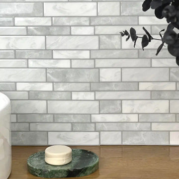
Compare a quiet field with fine veining, a stronger diagonal pattern and a high-contrast design before choosing a color. These can create different visual roles even when each is sold as white marble. A small sample with one attractive vein may not represent the rhythm across a full wall.
Decide whether the wall should resemble a field of individual tiles or suggest a more continuous surface. Neither is automatically better. A clear tiled grid can look intentional, while trying to hide every joint in a product that was not printed for continuity can create frustration and unnecessary waste.
Keep the room's existing pattern in view. A strongly veined countertop may work better with a quieter backsplash, or you may prefer a deliberate contrast. Compare actual samples rather than assuming two marble looks will match because both use grey and white.
Compare the background color with the fixed finishes
Look at the broad background as well as the dramatic vein. A warm cream field can appear different beside a cool cabinet white; a grey field can relate differently to wood and metal. The background repeats over a larger area than a small dark streak, so it deserves its own comparison.
Place samples beside cabinet doors, the counter and visible floor. Keep those relationships together under the light used in the room. A color name or studio image cannot establish the match. Save the preferred physical sample with its product and finish identification.
Avoid buying new accessories to rescue a background that never worked with the permanent surfaces. Try a different sample or a smaller covered area first. The aim is a coherent room, not a sequence of extra purchases made to justify the first one.
View the finish from normal working positions
Inspect samples in ordinary daylight and with the normal task and evening lights. Look from the entrance, preparation area and seating position. A reflection or joint that is unobtrusive from one angle can become prominent from another, especially when the surface is close to a light source.
The Department of Energy distinguishes light-source color appearance from color rendition. Similar nominal color-temperature descriptions can produce different material relationships. Use the actual lamp and sample together rather than assuming that a warm-white label guarantees the appearance in a photograph. DOE color and spectrum guidance.
Keep touch and appearance separate from performance claims. A thicker or glossier sample may be the look you prefer, but it does not thereby demonstrate longer life, better heat resistance or a more secure bond. Confirm those use conditions from the relevant documentation.
Inspect several pieces for variation and repeat
Ask how the supplied pattern varies and whether specific pieces are designed to connect. Lay out several examples without exposing their adhesive. Group identical prints so you can see what choices the actual material gives you. Do not assume every box contains a large library of unique designs.
Check the allowed orientation. Turning a sheet to align a vein may conflict with its joining profile or directional instructions. Flipping it over also changes which side is visible and cannot create a usable mirrored print. Work with the supplied construction rather than forcing a pattern the product was not designed to make.
For a large visible area, compare repetition from across the room as well as at arm's length. A fine repeat may be unobtrusive nearby but form a noticeable diagonal rhythm when several rows are installed. A dry layout helps identify that before the material is committed.
Distinguish continuous veining, bookmatching and visual balance
Continuous veining means selected lines appear to carry across adjoining pieces. Bookmatching describes a mirrored relationship. Visual balance can instead use varied pieces without pretending that every vein connects. Choose which result the supplied design can realistically support.
Do not require all small streaks to align at every seam. Select the relationships that matter most in the focal area, while following the actual joining instructions. A good-looking tiled field does not need to be presented as a seamless slab or assigned an invented continuity percentage.
The marble-pattern matching guide develops a more detailed dry-layout method. Use it after confirming the available prints and orientation. No sorting technique can manufacture a connecting or mirrored image that was not supplied.
Choose scale for the actual wall and its interruptions
Measure the wall height and width, then mark cabinets, windows, outlets and exposed ends. A large sweeping vein can be repeatedly interrupted on a shallow backsplash. A small pattern can create a busy grid on a larger uninterrupted wall. Compare the repeat at actual scale rather than enlarging a small product thumbnail.
Try a simple layout and a more pronounced one using the same wall drawing. Keep the cut positions visible. An attractive central piece is not enough if every end becomes an awkward sliver or a heavily veined corner clashes with the next wall.
Do not use a universal rule that a certain scale makes every small room look larger. The visual effect depends on the whole arrangement. Choose a pattern whose role remains clear from the positions where the wall will actually be seen.
Confirm the specific wall application
A normally dry accent wall, a sink backsplash and a stove-adjacent surface have different requirements. Describe the actual exposure rather than relying on the name of the room. A kitchen can contain both a suitable decorative area and a location where the product is excluded.
Keep the appliance's instructions and the wall-product limits together. A marble print is not an approved heat shield, and a reflective face does not change the construction behind it. Preserve clearances, ventilation and service access. Do not infer fireplace suitability from a styled photograph.
For bathrooms, separate decorative walls from direct shower and tub-shower exposure. A water-resistant face does not establish a waterproof wall assembly. Choose a product and complete installation specifically accepted for the location, or use another finish in that area.
Do not transfer wall guidance to counters and floors
A countertop can involve food contact, hot items, abrasion and standing liquid. A floor can involve foot traffic, rolling loads, slips and transitions. These uses require product-specific information that a decorative wall-tile description does not provide.
Do not place a spare wall tile under an appliance or use it as a cutting surface to invent a home suitability test. The absence of visible damage after one event does not establish an approved service condition. Ask for a separately suitable system when the intended use is not a wall.
The same distinction applies to furniture and shelving. A color match can be attractive, but the surface, loads, edges and care method still need to be appropriate. Avoid turning an all-purpose decorative inspiration list into an assumption that one adhesive construction can cover every object in the home.
Inspect the base before paying for the finish
Identify the wall and the coating the adhesive will touch. Check for weak paint, loose old tile, raised repairs, cracking and dampness. The decorative face cannot stabilize a substrate that is moving or releasing below it. More adhesive is not an automatic remedy.
Follow the exact preparation and cure requirements. Do not assume every glossy surface should be sanded, every grout line can be filled with ordinary spackle or every fresh coating is ready after the same number of days. Ask about the actual combination of materials.
Resolve moisture before decoration. EPA emphasizes correcting the water source and cautions against painting or caulking over mold. A new marble-effect covering should not hide the evidence needed to investigate a recurring problem. EPA moisture guidance.
Calculate packs with matching and finishing in mind
Use the installed coverage of the selected pack rather than only nominal sheet dimensions. Sketch the pattern and opening cuts before choosing an allowance. A cutout can reduce visible area without producing material that can be reused in the required direction elsewhere.
For an illustrative eighteen-square-foot area, suppose the layout calls for a chosen fifteen-percent allowance. The material target is 20.7 square feet. If an example pack provides 4.2 usable square feet, five packs are required after rounding up. These are hypothetical figures, not a Stickwoll pack specification or a universal waste rule.
Separate cutting waste from a deliberate repair reserve. Keep spare pieces identified by product and batch, with release liners intact and storage conditions followed. A later replacement may have a different appearance, so retain the original sample and layout record as well.
Compare complete costs with natural stone
Compare the same area and finished result. A decorative-sheet price should not be set against a stone quotation that includes wall repair, fabrication, installation, joints and cleanup unless those scopes are shown separately. Ask what each option assumes about the existing surface.
Include samples, preparation, tools, trim, delivery, tax and any professional work. Keep possible removal and restoration as separate items. Do not use an unverified service life or a guaranteed damage-free exit to calculate an artificially low long-term cost.
You can prefer one material for its appearance or handling without declaring it the universal winner. Natural variation, print control, maintenance and permanence are legitimate trade-offs. A fair comparison records what is known and leaves unresolved costs visible instead of inventing a return-on-investment score.
Use the correct care category
Do not clean a printed marble effect as though it were natural marble, or assume natural stone always needs the same treatment. Identify the exposed material and obtain its care directions. A cleaner accepted for the center of one surface may be unsuitable for its joints or neighboring finish.
The Natural Stone Institute distinguishes staining from etching and explains that an impregnating sealer can improve stain resistance without making stone stain-proof. It also notes that some stones do not need sealing. These are reasons to ask about the actual stone and treatment, not to impose an annual sealing ritual on every marble-inspired product. Natural Stone Institute care guidance.
For a decorative tile, follow its permitted cleaner, tool and contact method. Inspect a persistent mark after drying before escalating the treatment. Do not apply stone polish, an acidic cleaner or a solvent simply because the print resembles a familiar countertop.
Keep the approved pattern map intact during installation
Label the accepted pieces or record their positions in a clear photograph while the liners remain intact. Identify the starting line, corner transitions and the pieces selected for openings. A good dry layout loses value if the sequence becomes confused during cutting.
Make complex cuts on a stable protected surface using the product's permitted tool. Check orientation and dry-fit the cut before exposing adhesive. Do not press a template into an electrical box or make exploratory cuts toward concealed services; obtain appropriate qualified help when fittings need alteration.
Apply the required joining and pressure method without stretching sheets to create a vein match. The printed line should not dictate a physically incorrect joint. If the pattern cannot connect within the permitted installation, revise the visual plan rather than forcing the material.
Resolve corners and open ends before the last piece
Inspect a cut sample edge so you know what will be visible. A white, dark or layered edge may differ from the printed face. Decide whether the product's own finishing method, a suitable trim or another planned termination is appropriate before installing the final row.
At a corner, follow the product's permitted wrap or separate-piece method. Do not assume a flexible appearance means it can bend through every turn without tension. Consider how the vein enters the next wall, but keep required movement and moisture details intact.
Use sealant only as part of a compatible complete detail. A small bead cannot turn an unsuitable product into a waterproof assembly or guarantee future removal. A neat planned boundary is more useful than an improvised attempt to hide every physical edge.
Plan a rental installation and its eventual removal separately
Confirm permission for the area, preparation and attachment method. Save photographs of the existing wall and agree on restoration expectations. A decorative product's removable description does not settle a lease condition or guarantee a deposit outcome.
A permitted sample can identify an obvious concern with the coating, but a short observation cannot predict every later removal condition. Keep the sample method and its limits recorded. Do not use a fixed heating duration or solvent from an unrelated construction.
If a removable panel is considered, its support, edges, heat use and service access still need an appropriate design. It should not be treated as automatically damage-free. Compare the full assembly and possible restoration cost rather than only the adhesive contact area.
Check delivered material before committing it to the wall
Compare the product, finish and visible labels with the accepted sample and order. Inspect enough material to understand the supplied print variation, within the seller's opening and return conditions. Save photographs of concerns before cutting or removing release liners.
If the supplied product appears different, ask about the difference instead of assuming that the original instructions and supporting documents still apply. A substitution may be suitable, but it needs its own confirmed identity and conditions.
Keep the accepted answer, product labels and final layout together. This supports later maintenance and matching without pretending every future pack will be identical. A careful delivery check is more useful than discovering a variation after the focal part of the wall is installed.
Investigate a changed piece before replacing it
Record whether the problem concerns the face, edge, joint, adhesive or underlying coating. New dampness and repeated lifting require more investigation than a cosmetic replacement. A piece that looks intact may still have an attachment problem, while a scratch may not indicate a bond failure.
Use the approved repair method and compare available spare material under the actual light. A small new insert can be more noticeable than expected because of print, sheen or age. Decide the repair scope with those constraints visible rather than promising an invisible patch.
Do not keep reapplying adhesive to a recurring failure without resolving the cause. Save the record and ask the supplier about the next step. A maintenance history that includes repairs is more useful than a claim that the installation has remained unchanged when pieces were replaced.
Build a shortlist from evidence and samples
Give each candidate the same comparison fields: product identity, construction, intended area, accepted substrate, installed coverage, appearance sample, care, finishing and removal. Add supporting documentation for any specific claim that affects the decision.
Read reviews for the context they actually provide. An account from another wall, cleaner or exposure may identify a useful question without predicting your result. Do not invent a brand ranking, verified-customer trial or independent test from a collection of unattributed statements.
Use the faux and natural stone comparison for the wider material decision and the backsplash planning guide for the room layout. Keep the final selection narrow enough that you can explain why the specific product fits the specific wall.
Frequently asked questions
Do marble-effect tiles contain natural marble?
Some products may contain a natural material, while others reproduce the appearance through printing or another finish. Read the exact construction. The name marble does not by itself establish composition, weight, care or performance.
Can every marble pattern be matched continuously?
No. The supplied print variation and permitted orientation determine the possibilities. A dry layout can find useful relationships, but it cannot create a connecting or mirrored image that was not provided. A balanced tiled field can be an intentional result.
Should I seal printed marble tiles?
Only use a treatment specifically accepted for that product. Natural-stone sealing guidance does not automatically apply to a printed face, backing or adhesive. An added coating can change appearance, compatibility and removal.
Can I use the tiles around a fireplace?
Do not infer approval from a marble look or a styled image. The exact product, fireplace instructions, wall construction and relevant requirements must permit the location. A decorative face is not automatically a heat shield.
How do I keep a small repair from looking different?
Keep identified spare material and the layout record, then compare a replacement in the actual room light. Pattern, sheen and batch variation can remain noticeable. There is no universal guarantee that a future local repair will be invisible.
What is the most important buying step?
Confirm the real construction and eligible use, then compare several adjoining samples with the fixed finishes and planned edges. Calculate complete pack and project costs afterward. This keeps the visual preference connected to a workable installation.
Build a simple print inventory before choosing the focal pieces
Put a small group of permitted samples or inspectable pieces on a clean protected surface. Identify background tone, the strongest vein direction and any distinctive repeated mark. Give each different print a simple label on the layout record, without marking a surface that must remain clean for adhesion. This inventory shows what choices are actually available rather than what a photograph of a continuous slab suggests should be possible.
Choose two alternative compositions using the same material. One can prioritize a continuous-looking main vein and the other a balanced tiled field. Compare them with the actual countertop and from ordinary viewing positions. A continuous line is not necessarily preferable if it creates an obvious repeated diagonal elsewhere. The decision is aesthetic and specific to the supplied prints, not a measurable percentage of luxury.
Reserve the best relationships for the areas that remain visible in normal use, but do not hide a technical defect behind an appliance. A less prominent print can be acceptable in a lower-visibility location only when the material itself is sound and the installation is permitted. Visibility is not a reason to use damaged backing, ignore a required joint or cover an unresolved wet spot.
Plan a corner without promising an impossible mirror
As a hypothetical exercise, draw two adjoining walls and mark the height at which a main vein reaches the corner. Compare the available print on the second wall at that height. You may find a coordinated transition, a deliberate break or no useful connection. Do not rotate a directional joining edge or bend a product against its instructions solely to continue the line.
Natural-stone bookmatching and a repeated printed sheet are not the same inventory. A mirror image requires a corresponding supplied appearance; turning a face away from the viewer does not produce another usable decorative surface. When an exact match is unavailable, a controlled corner transition or a different pattern can look more intentional than a strained attempt to imitate a slab. Keep the physical detail correct even when the visual line changes.
Check the accepted sample against the delivered batch
Inspect the labels and visible product before committing it to the wall, following the seller's opening and return conditions. Compare several pieces under consistent light. A slight appearance difference can arise from the setup, orientation or supplied material; a single phone image may not distinguish them. Record the concern and ask the supplier before cutting the whole order.
Keep the accepted answer with the order, especially if the seller proposes a substitute. Confirm the new product's construction, installed coverage and joining method rather than reusing every figure from the original plan. A visually similar replacement may require a revised layout and different finishing detail. This small pause can prevent an attractive sample from becoming a mismatch discovered only after installation.
Turn the preferred sample into an order card
Record the exact product, finish, supplied print variations, allowed orientation and installed coverage. Attach the preferred dry-layout photograph and mark the final exposed edge. Keep unresolved questions about the actual wall separate from aesthetic preferences so neither is forgotten when the order is placed.
The card also helps when another person receives the delivery or completes the installation. They can compare the supplied identity with the accepted sample rather than choosing whichever marble-looking pack arrived first. Update the layout if a substitution changes the repeat or joining profile. The strongest final result is a coordinated, eligible wall installation, not an unsupported promise of a seamless slab, guaranteed removal or identical future replacements.
Sources and scope
- Natural Stone Institute: Care and Cleaning — Natural stone, stains, etching and sealer needs; not printed-tile care.
- US Department of Energy: Color and Spectrum — Light appearance and color rendition differ; assess actual samples.
- US EPA: Mold, Moisture and Your Home — Correct moisture before decoration.


Leave a comment
This site is protected by hCaptcha and the hCaptcha Privacy Policy and Terms of Service apply.