





















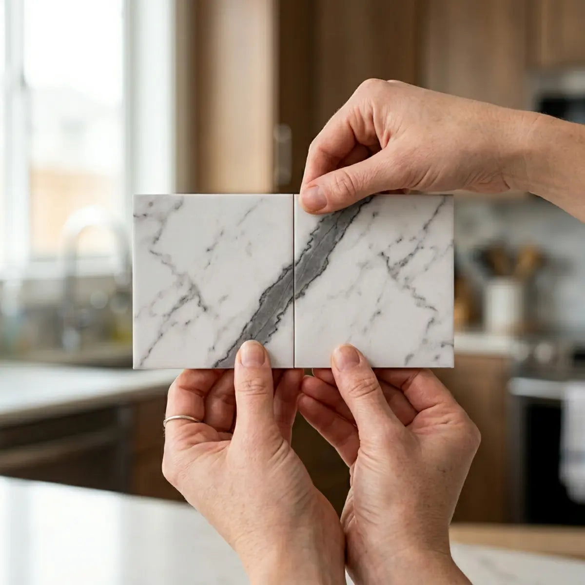
Match faux-marble peel-and-stick tiles by examining the actual supplied prints, dry-laying adjoining pieces and protecting the most important vein relationships before cutting. Follow the product's allowed orientation and joining method. Some prints are designed to connect, while others are intentionally varied; no sorting technique can create a missing connecting or mirrored image. Aim for a balanced installed wall rather than a guaranteed seamless slab illusion.
Explore this guide
A marble-inspired backsplash can look considered without every fine line meeting perfectly. The strongest results usually come from deciding what matters most: background tone, a few dominant veins, the rhythm of the joints and the way the pattern meets the room's boundaries. Trying to optimize every small streak independently can make the larger composition less coherent.
This guide develops an inventory and layout workflow, explains bookmatching and vein continuity, and works through corners, cuts and quantity planning. It does not present a Stickwoll alignment experiment, an invented vein-continuity percentage or a statistical claim about perceived luxury. The examples are clearly labeled planning exercises.
Ask whether the product is manufactured for matching
Before ordering a full wall, ask whether the design has connecting edges, a numbered sequence, mirrored pairs or a random set of faces. Request the actual layout instructions and representative images of adjoining units. A photograph of one attractive tile cannot establish what the supplied set can do.
Check the physical format as well as the print. A sheet may contain several visible tile shapes and a directional overlap edge. Rotating it can change the installation detail even when the veining looks better. Follow arrows, tabs and factory-edge instructions rather than assuming all pieces can turn freely.
Do not assume that every brand provides the same number of unique prints. Inspect the actual carton and any batch information. A different production lot or later order may not provide identical background tone or pattern variation, so discuss matching needs with the supplier before relying on future replacements.
Clarify what continuous means in the product description. It might refer to a planned mural-like sequence, a repeated motif or simply a relatively coherent marble appearance. Ask for a practical example of the intended joint arrangement rather than interpreting the word as a promise that every edge matches every other edge.
If the product is not designed for exact connections, a balanced random layout may be more successful than forcing unrelated veins together. The decision can still be attractive and honest. The goal is an intentional wall made from the product you actually have.
Separate bookmatching, continuous veining and visual balance
The Natural Stone Institute's Use Natural Stone explanation describes bookmatching as a mirror-image relationship between neighboring slab faces. It distinguishes that effect from vein or slip matching, where visual features flow across a seam. The distinction is useful for printed products too, although their production method is different.
Rotating a printed tile does not generally create its mirror image. A tile may need a separately manufactured matching face to produce a true mirrored composition. Do not digitally flip an image in a planning app and assume the physical product can be installed that way.
Continuous veining is also more than matching one dark line at one point. The direction, thickness, tone and surrounding pattern affect whether the transition looks coherent. Two veins can meet at the same height yet change character abruptly across the seam.
Visual balance is a broader and often more achievable objective. It can distribute strong and quiet areas, avoid obvious clusters of identical prints and relate the wall to the countertop. A balanced layout does not need to be described as bookmatched if no mirror relationship exists.
| Desired effect | What the supplied product must support | Common misunderstanding |
|---|---|---|
| Mirrored bookmatch | Appropriate mirror-image faces and an accepted arrangement | Turning one ordinary print creates every required mirror. |
| Continuous vein flow | Compatible edge features in the intended sequence | Any two dark lines touching are a complete match. |
| Balanced varied field | A workable mix of tone, contrast and permitted orientations | Failure to join every vein means the whole design is wrong. |
| Graphic tile pattern with marble texture | A coherent geometric repeat and accepted joints | The wall must imitate one giant slab to look intentional. |

Inventory the actual pieces before cutting
Open and inspect material only as the supplier's packaging and conditioning instructions allow. Keep release liners attached and support the pieces so they are not bent or contaminated. Use a clean surface large enough to compare the relevant pattern without stacking faces in a way that can mark them.
Group obvious identical prints and note background tone, dominant direction and the location of strong features. Do not separate pieces solely by the darkest vein. A pair with a good line connection can still look mismatched if one background is much warmer or the finish differs.
Use identifiers that distinguish print identity from planned wall position. For example, Face A describes a recurring print, while R2-C3 describes a position in row two, column three. Keeping those ideas separate makes it easier to rearrange the layout without losing track of what each label means.
Mark only where permitted, such as on the liner or a separate plan. Test any temporary tape's compatibility before putting it on a decorative face or a painted wall. Do not write permanent marks on an exposed surface and assume they can be cleaned off later.
Photograph the available pieces with their labels and orientation clear. A record of the actual inventory is more useful than a generic claim that the product has four or six faces. It also helps the supplier understand a matching question.
| Inventory field | What to record | Why it helps |
|---|---|---|
| Product and batch | Exact supplied identity and any lot information | Tracks the material being compared. |
| Face identifier | Repeated print or unique piece label | Prevents accidental clustering of identical features. |
| Allowed orientation | Arrows, tabs, overlap or sequence restrictions | Keeps the visual plan installable. |
| Background tone | Observed relationship to neighboring pieces | Avoids focusing only on a vein connection. |
| Prominent feature | Where the main vein enters and leaves the face | Helps test plausible adjacent pairings. |
Map the real wall and choose the visual priority
Measure the eligible wall, including cabinets, windows, outlets, corners and visible ends. Mark the areas normally concealed by furniture or equipment, but do not use concealment as a reason to ignore installation quality or access requirements.
Identify the main viewing positions. A wall seen from the room entrance may have a different focal area from the strip immediately above a sink. A large decorative hood or mirror can create a visual center that differs from the mathematical center of the whole wall.
Choose a limited number of important vein relationships to protect. Trying to make every small streak connect can consume time and material without improving the whole composition. Background balance and a calm transition may matter more than a perfect match in a mostly hidden corner.
Keep functional features fixed in the plan. Do not conceal, relocate or reduce access to an outlet or service point simply to preserve a print. If the renovation includes legitimate electrical or fixture changes, those require their own appropriate design and work.
Check the intended exposure before reserving the most dramatic tile for a location beside a stove or steam source. Visual priority does not override product or appliance restrictions. An approved dry feature area may be a better place for the strongest pattern than a demanding location chosen only for its visibility.
Build a dry layout in the intended installation plane
Arrange a representative set using the actual module and joining detail. If the product overlaps, account for the part of the print that will be covered. A perfect edge-to-edge pairing on a table may not look the same after the required overlap is applied.
Start with the important focal relationship, then expand outward while checking tone and repeats. Keep several alternatives visible rather than committing every piece to the first plausible connection. A local match may force an awkward neighboring arrangement, so judge the whole run before cutting.
Use a scaled wall drawing when space prevents a full-size floor layout, but verify the critical joins with physical pieces. Digital photos can help compare options, yet they can change color, scale or orientation. Do not rely on a mirrored or stretched image that the actual sheet cannot reproduce.
Once a preferred arrangement emerges, label positions and photograph the complete set. Include the top direction and the reference edge. Keep a separate list of pieces reserved for cuts or less prominent areas so they are not accidentally used in the center.
Before calling the layout final, check that every orientation remains permitted. A beautiful arrangement is not ready if it requires removing functional edges, stretching material or using an unapproved joining method.
A hypothetical inventory exercise
Imagine eight permitted rectangular pieces for a small feature run. Three share a bold diagonal face, three have a quieter branching face and two are mostly pale. These quantities are invented for the exercise and do not describe a Stickwoll pack.
Begin by placing two compatible bold features in the most visible area, if their actual edges and orientation allow it. Then use the quieter pieces to distribute contrast rather than putting all bold copies next to one another. The pale pieces can provide a visual pause, but they should not be forced beside a dark vein that stops abruptly if another accepted arrangement looks better.
Now add the real interruptions to the plan. An outlet may remove the part of a piece that made a connection attractive. A short return may show only the pale side of a print. Reassess the arrangement with those cuts included instead of treating the uncut tabletop pattern as the finished wall.
Compare two complete alternatives from the normal viewing distance. Write down why you prefer one: fewer obvious repeated marks, better background balance or a stronger focal connection. Do not assign a percentage of realism to the result without an actual defined study.
The exercise demonstrates a useful sequence: inventory, priority, neighboring relationships, interruptions and final review. It does not guarantee that every random set can produce a continuous vein or that unused pieces should automatically be discarded.
Choose stacked, offset or geometric layouts from the actual print
A stacked grid may make some factory-designed edge connections easier to align. An offset arrangement may distribute repeated marks or suit a traditional tile rhythm. Neither is universally better for every marble-inspired print.
Do not assume a one-third offset always improves veining compared with a half offset. The outcome depends on where the actual features fall within the supplied face. Compare the candidate arrangements using the product's permitted layout before describing one as more natural.
Hexagons and other graphic formats can make the geometry itself a prominent part of the design. That may reduce the expectation of a single slab-like vein, but it does not automatically hide every seam or create continuous flow. Check the actual repeated sheet and its boundary cuts.
For a product with a fixed manufactured pattern, you may have less freedom to rearrange individual visible shapes than the photograph suggests. Treat the supplied sheet as the module unless the instructions allow subdivision and reassembly.
Use the pattern-direction guide to compare layout geometry separately from veining. The strongest design can be a clear geometric field with marble texture rather than an unsuccessful attempt to imitate one uninterrupted stone slab.

Account for color, finish and lighting at the joins
Inspect the background tone of adjoining pieces under the room's normal lighting. A small tonal difference can be more noticeable across a broad pale field than a slight change in a fine vein. Keep the actual countertop and cabinets in view while judging the combination.
Check sheen from several positions. A pattern can align geometrically while a changed reflection makes the seam obvious. Raised edges, bevels and physical relief also affect the transition. Do not assume matching the printed line automatically matches the whole appearance.
Look from the entrance and from close range at the worktop. A join that seems imperfect during close inspection may read as a coherent field from the usual distance. Conversely, a repeated dark mark can remain conspicuous from across the room even when every local seam is carefully fitted.
Photographs help preserve a decision but can alter exposure and color. Do not treat a phone image as a calibrated proof of a perfect match. Use direct observation alongside the plan, and retain any supplier information about expected variation.
The finish comparison explains why gloss, color reflectance and relief are different properties. The choice should suit the room rather than follow a universal rule that all marble effects must be matte or glossy.
Make cut templates without losing the print reference
When a piece needs an opening or irregular edge, label its planned position and orientation before moving it from the layout. Mark the feature you are protecting on the plan so the cut can be checked against neighboring pieces, not just against the opening.
Use a stable template and a fixed reference. Note top, front and the edge that aligns with the field datum. A template traced on the back can become mirrored if those labels are missing. Verify the template in place before transferring it to the finished tile.
Keep the release liner attached while fitting. Account for the actual installed plane and joining detail. A template pushed into a recess or folded around a shape that the final tile cannot follow gives misleading dimensions.
For outlet areas, work from safe external measurements and appropriate templates. Do not press paper or tools into electrical boxes, cut against hidden wiring or rely on one assumed faceplate overlap dimension. If the finish changes the device's mounting or reveals a damaged fitting, obtain qualified electrical help.
Use the product's actual cutting method. Flexible, raised, rigid and metal-faced formats may need different tools. There is no universal blade angle, number of passes or rule that every tile must be cut with a heavy utility knife rather than scissors.
After cutting, return the piece to the dry layout with its neighbors. Check the opening, field alignment and print relationship before exposing adhesive. A correct hole in the wrong planned piece can disrupt the entire sequence.
Handle inside corners with a planned relationship
First determine whether the product is intended to stop, join or wrap at a corner. Do not force a rigid tile around a bend or assume a flexible face can remain attached under any amount of tension. The installation requirement comes before visual continuity.
Where two separate pieces meet, choose the relationship deliberately. You may align a dominant vein's height, maintain similar background tone or make a clear pattern reset. Exact continuation is possible only when the supplied pieces and detail support it.
A corner that changes plane will also change how light reaches the surface. Even a good print connection can look different on the two walls. Evaluate the joint in the actual lighting rather than expecting a tabletop match to appear identical around a turn.
Leave the specified joint or clearance, not a universal one-sixteenth inch copied from another system. Use compatible finishing materials only where the instructions call for them. Sealant does not turn a prohibited wet-area application into an approved one.
Keep any service, movement or water-management requirement intact. Do not wrap a decorative sheet across a joint that needs to move or conceal an opening for the sake of a continuous vein. A deliberate visual break is preferable to an unsuitable assembly.
Calculate end pieces with the joints included
Measure the usable field after required perimeter details are considered. Identify the actual tile width or installed module. For a separate-piece layout, internal joints also consume width; for an overlap sheet, the effective coverage may be the more useful measurement.
As a hypothetical zero-joint illustration, an available width of 124 centimetres with 30-centimetre pieces can be filled by three full pieces and two 17-centimetre ends. Starting with four full pieces would instead leave a four-centimetre strip at one side. The example shows why alternative starts are worth checking, not that every end must always exceed half a tile.
Now consider the print. The geometrically balanced version may cut through a prominent vein at both ends, while a shifted arrangement creates a better focal relationship. Compare both against the room and product requirements. There is no single mathematical adjustment that guarantees the best appearance around every interruption.
Keep practical cut size separate from a visual preference. A piece must be large and supported enough to cut and install using the permitted method. If the desired pattern produces fragile fragments, reconsider the layout, format or edge detail rather than relying on extra adhesive.
Draw the final cuts on the labeled plan. Note which factory edges must remain and which offcuts are usable. This turns the quantity estimate into a real installation map rather than an area calculation with an arbitrary percentage added.
Manage usable offcuts and replacement material
An offcut can be useful even when it does not fit the main focal area. Check whether its print, orientation and remaining factory edges suit a short return or a less prominent location. Do not discard a large piece merely because it cannot complete one particular vein connection.
Keep offcuts labeled with their original face and direction. Protect the backing as instructed. A pile of anonymous pieces can lead to accidental rotation or a mistaken match later in the project.
Distinguish material needed for installation cuts from repair spares. A matched layout may require a specific face for a future replacement, not just any leftover area. Ask the supplier about batch variation and availability before assuming a later order will reproduce the same pattern.
Budget matching effort honestly. Some designs need more sorting or a particular supplied sequence. Do not promise that careful planning always reduces waste by a fixed percentage or delivers most of the look for a fraction of natural stone cost. Use actual product quantity and project scope.
If the inventory cannot produce the desired effect within a sensible quantity, revise the visual goal. A balanced modular pattern can be better than purchasing many extra pieces to chase a connection the design does not support.
Keep surface preparation independent of visual matching
A beautifully arranged print still needs a suitable wall. Inspect coating strength, flatness, contamination and moisture before installation. Do not use texture or a busy vein to hide a damaged supporting surface.
Follow the accepted preparation for the coating and tile. A strong degreaser, primer or sanding step is not automatically required for every product. Recent repairs and paint need their own curing and covering conditions.
When the old material is unknown, assess hazards before disturbance. EPA's lead-safe DIY guidance is relevant to potential lead-paint work in US housing. Do not turn a decorative pattern project into uncontrolled scraping or sanding merely to make the wall look flat.
Keep the product's moisture and heat restrictions visible in the layout. A marble-like face is not natural stone and does not inherit stone's properties. A product name or a convincing print cannot establish temperature, chemical or waterproofing performance.
Use the general installation guide for the work sequence and the actual product instructions for the accepted method. The pattern plan and substrate plan should both be ready before final contact.
Install from the labeled plan without introducing new variations
Keep the approved layout photograph and labels available during placement. Start at the chosen datum and use the intended sequence. Do not switch an apparently similar piece into a position without checking the adjoining print and factory edges.
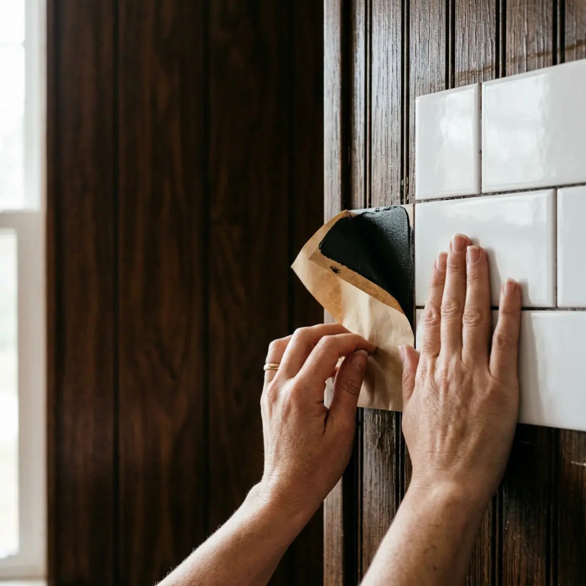
Expose the adhesive and apply pressure as specified for the product. Keep the face and backing free from contamination, and do not stretch a sheet to pull a vein into alignment. A visual connection achieved by distorting the material may not remain stable.
Check the field at intervals from the normal viewing position. Confirm row alignment, background balance and the planned focal relationship before continuing. A localized error is easier to address than a pattern drift noticed after the whole wall is covered.
Use the permitted repositioning or replacement procedure if a piece is wrong. Repeated peeling should not be the main fitting strategy. The dry layout is intended to resolve those decisions before adhesive is exposed.
Finish edges and corners with the appropriate detail, then photograph the complete wall and its important transitions. Retain the layout and spare-piece labels for future repair rather than discarding them with the packaging.

Review the result without inventing a realism score
Walk through the viewing positions you identified at the beginning. Does the background tone feel balanced? Are repeated features distracting? Does the main vein relationship support the composition? Are seams and edges appropriate for the product? These questions give a useful review without claiming statistical significance.
Separate appearance from physical acceptance. A visually pleasing seam may still need correction if the required joining method was not followed. A visible but properly designed joint is not automatically a defect. Check each kind of requirement on its own terms.
If the result is slightly different from the tabletop arrangement because of room lighting or a necessary corner detail, assess the whole composition before making destructive changes. A small local imperfection can be less important than preserving a sound installation.
Document any repair or changed piece. A later article or customer photo should not present an altered installation as an untouched performance trial. Accurate records are useful even when the project is entirely successful as decoration.
Keep maintenance simple and product-specific. Do not use polish, sealant or abrasive treatment to make mismatched sheen disappear unless the supplier approves it. A printed surface is not necessarily cared for like natural marble.
Three example layouts with different priorities
A broad uninterrupted feature
In this hypothetical project, the supplier offers a numbered connecting sequence. The owner lays it out as directed, checks the background tones and plans the border around the complete image. The sequence, not random rotation, provides the intended continuity.
A narrow kitchen run with several outlets
A second owner has a varied print rather than a continuous set. The main aim becomes balanced tone and a few strong connections in the visible field. Templates preserve the planned piece positions around openings. The owner does not sacrifice electrical details to keep every small vein intact.
A corner with different light on each wall
A third owner chooses a deliberate reset at the turn because exact flow is not supported by the pieces. Similar background tone and aligned rows make the transition coherent. The result is not called bookmatched, and the required joint remains functional.
These examples are planning exercises, not measured consumer studies. Their value is showing how the actual product and wall can lead to different reasonable definitions of a successful match.
A worked pairing exercise: matching entry points is only the first check
Imagine two hypothetical rectangular printed tiles intended to be viewed in the same upright orientation. On the first, a prominent vein reaches the right edge 12 centimetres below the top. On the second, a similarly dark vein enters the left edge at the same height. That is a plausible pair to inspect, but the shared height alone does not establish a convincing connection.
Compare the vein direction at the seam, its width and its surrounding shading. One line may approach diagonally while the other turns sharply, or one may become much darker immediately across the joint. The background tones may also differ. Treat the measured entry point as a way to shortlist pairings, not a complete realism test.
Now apply the actual joining detail. If an overlap covers part of the second face, the visible entry position may change. If a specified gap separates the pieces, the transition is judged across that gap. Do not trim or eliminate a functional edge merely to recreate the idealized tabletop connection.
Check whether the chosen pairing forces the next neighbor into an awkward repeat. A strong local connection can still produce a poor overall field when the same bold feature appears several times close together. Compare at least the representative surrounding area before reserving the pair for the central position.
Record the face IDs, position and permitted orientation in the layout. The example uses invented measurements to explain a comparison method; it does not state that a Stickwoll product has those prints or can be matched to a fixed tolerance. The actual supplied design determines the available relationships.
What to do when no exact neighboring face exists
Change the visual objective rather than forcing the material. You might favor similar background tones, reduce the concentration of bold repeats or use the product's intended geometric rhythm. A planned modular field can be attractive without pretending that every vein crosses every seam.
Ask the supplier whether a connecting or mirrored set is available before ordering more random pieces. If the design is intentionally varied, additional cartons may not solve the specific connection you are seeking. Understand the product before turning matching into an open-ended search.
Keep rejected pairings in a simple photo record while deciding. They can show why the final arrangement uses a particular reset or why a different starting point was chosen. Once the plan is accepted, preserve only the clear final map and useful alternatives for repair reference.
Plan the countertop-to-wall relationship separately
A marble-patterned backsplash often sits beside an existing stone or stone-look counter. Trying to match both exactly can be more demanding than creating a deliberate contrast. Compare the actual counter with the tile sample rather than assuming two materials called Carrara or Calacatta share the same base color or vein direction.
Decide whether the wall should continue the counter's movement, provide a quieter background or introduce a separate graphic pattern. A strongly veined counter may benefit from a calmer wall in one room, while another owner may prefer a coordinated bold composition. Neither preference is a universal rule.
Look at the counter junction from the normal working position. The horizontal and vertical planes receive light differently, so even similar tones can appear different. A sample photographed flat on a table may not represent how it looks upright beside the installed countertop.
Keep the joint and material compatibility correct. A visual continuation does not justify omitting a required sealant detail, changing an appliance clearance or applying a wall product to a horizontal work surface. The tile's intended use remains separate from the pattern relationship.
For a hypothetical kitchen with a bold existing counter, the owner compares a lightly veined wall sample and a second strongly patterned sample. The first creates a quieter composition with fewer competing lines. The owner chooses it because of the actual room comparison, not because a scientific score proves it more luxurious.
In another hypothetical room, the supplier offers a coordinated set designed for the intended wall arrangement. The owner verifies the supplied sequence, edge details and compatibility before planning a connected effect. This is different from assuming any two unrelated marble prints can be made continuous through rotation.
Document the final combination with the product identities and sample positions. If cabinets, paint or lighting later change, the record explains the original decision and helps evaluate whether a new accessory or finish still relates to it.
The countertop relationship is often more visible than a minor line mismatch high under a cabinet. Prioritize the composition people actually see while keeping the installation requirements intact. That is a practical way to spend matching effort without inventing a percentage of achieved realism.
Hand over the layout without relying on memory
If another person will help install, give them a map that distinguishes piece identity from position. A label such as Face B, position R2-C3, top arrow upward identifies three different things: the print, the place on the wall and its permitted orientation. Show which factory edge joins the neighboring piece and which side is waste on a cut. Do not assume a photograph taken before the pieces were moved communicates all of that.
Review the focal joins together before installation begins. Agree that an unavailable face, damaged piece or unexpected wall condition should prompt a pause rather than an unrecorded substitution. Keep spare and rejected pieces labeled until the layout is accepted. After any approved change, update the map and photograph so a future repair follows the installed arrangement rather than an earlier draft. This is a practical communication method, not a guarantee of perfect veining or a measured reduction in waste.
Frequently asked questions
Can every faux-marble tile be matched continuously?
No. Some designs have connecting faces or sequences; others are intentionally varied. Inspect the actual supplied prints and ask the manufacturer. Dry fitting can improve balance but cannot create a missing connection.
Is rotating a tile the same as bookmatching?
No. Bookmatching requires a mirror-image relationship, which ordinary rotation does not generally create. A printed system needs suitable matching faces if that is the intended effect.
Is one-third offset always better than half offset?
No universal rule applies. The result depends on the actual print, module and allowed layout. Compare physical arrangements instead of assuming a fraction guarantees natural-looking veins.
Should every vein meet at a seam?
Not necessarily. Background balance, dominant features and the overall composition may be more important than every fine line. Follow a supplied continuous pattern where one exists; otherwise choose an intentional modular arrangement.
Can I wrap a tile around an inside corner to preserve the pattern?
Only when the product permits that detail. Do not force a material around a bend or eliminate a required joint. A planned pattern reset can be preferable to an installation held under tension.
Do narrow end pieces always mean a bad layout?
Not automatically, but the pieces must be practical to cut and install and should look intentional. Compare alternate starts, borders and product formats. Do not use an inflexible half-tile rule without considering the real wall.
What should I save after installation?
Keep the product and batch, labeled layout, useful templates, photographs and suitable spare faces. These records help a future repair preserve the intended print relationship rather than starting the matching problem again from scratch.
Sources and their scope
- Natural Stone Institute's Use Natural Stone: Bookmatching—Geology Meets Geometry — Distinguishes mirrored bookmatching from continuous vein/slip matching. Printed tile rotation cannot create an absent mirror image.
- US EPA: lead-safe renovations for DIYers — US guidance for potential lead paint disturbance; not a diagnosis or a universal international date rule.



Leave a comment
This site is protected by hCaptcha and the hCaptcha Privacy Policy and Terms of Service apply.