




Peel-and-stick wall tile ideas are more useful when they solve a room problem than when they are attached to a trend year. A color can look current today and dated later; the more durable decision is whether the pattern works with your cabinets, lighting, wall size, room exposure and the amount of visual activity already present.
This guide treats subway, geometric, stone-look, square, honeycomb and textured designs as directions to test—not as a ranking. The goal is to help you choose a finish that fits the actual wall and room, compare samples at full scale, and avoid letting a style choice override heat, water, substrate or removal limits.
Start with the room’s fixed surfaces
Most wall-tile projects do not begin with an empty room. Cabinets, countertops, appliances, flooring, plumbing fixtures, furniture and lighting are already there. Treat those elements as the first palette. A backsplash or accent wall should work with them rather than forcing every other surface to compete.
Photograph the room in daylight and under the lighting you normally use at night. A cool white cabinet can shift warmer beside wood flooring; a gray countertop can reveal blue, green or brown undertones when a new tile is placed next to it. Use the room itself to judge the design, not the isolated product image.
Compare color under the light that will actually hit the wall
Color appearance changes with the light source and surrounding materials. The U.S. Department of Energy’s color and spectrum resources explain why spectral characteristics influence how colors render. For a shopper, the practical lesson is simple: a screen swatch or one showroom lamp cannot predict every room.
Place a sample where the tile will be installed and look at it in morning, afternoon and evening light. Under-cabinet LEDs can make relief and gloss more visible. Warm lamps can soften blue or gray; cooler light can make cream or beige appear flatter. If the wall receives strong side light, check the sample from an angle as well as straight on.
Use color families instead of chasing a single named trend
Greens can range from pale mint to olive and deep forest. Blues can move from dusty gray-blue to saturated navy. Warm neutrals can include cream, sand, taupe and soft mocha. Whites can lean warm or cool. Grouping colors by family helps you compare how the room changes without pretending one exact shade is the “color of the year” for every kitchen.
For a quiet room, start with a color close to an existing cabinet or countertop undertone. For a focal wall, choose a stronger contrast deliberately. The decision becomes easier when you can explain the role of the color: background, bridge between surfaces, or focal point.
Pattern scale matters as much as pattern name
A small geometric repeat can look calm across one sheet and busy across an entire wall. A large stone-look vein can look dramatic on a sample but become fragmented when outlets and corners cut through it. Before ordering, estimate how many pattern repeats will be visible across the actual wall width.
Dry-layout several pieces together. Photograph them from the distance where you normally view the wall. A backsplash seen from three feet away and a TV accent wall seen from across a room need different judgments. Pattern scale should be evaluated at viewing distance, not only at close-up product-photo scale.
Subway layouts are a framework, not one look
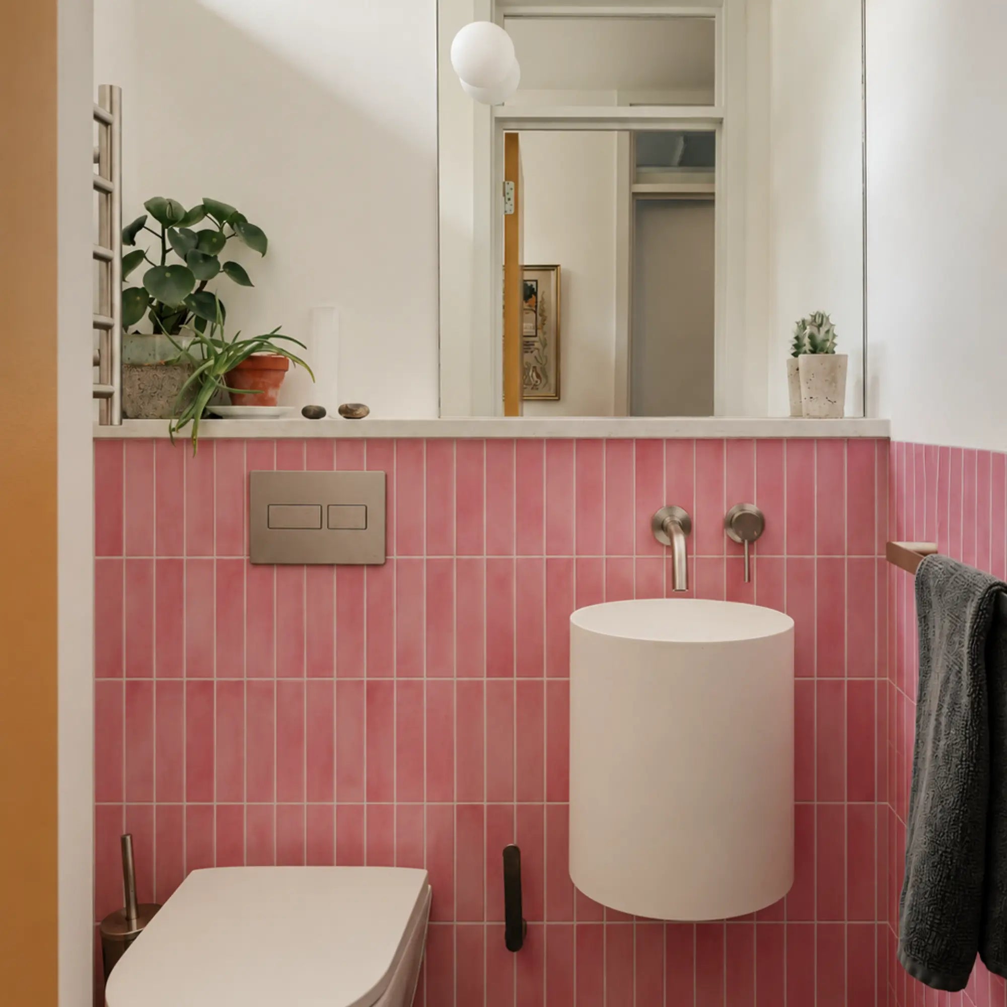
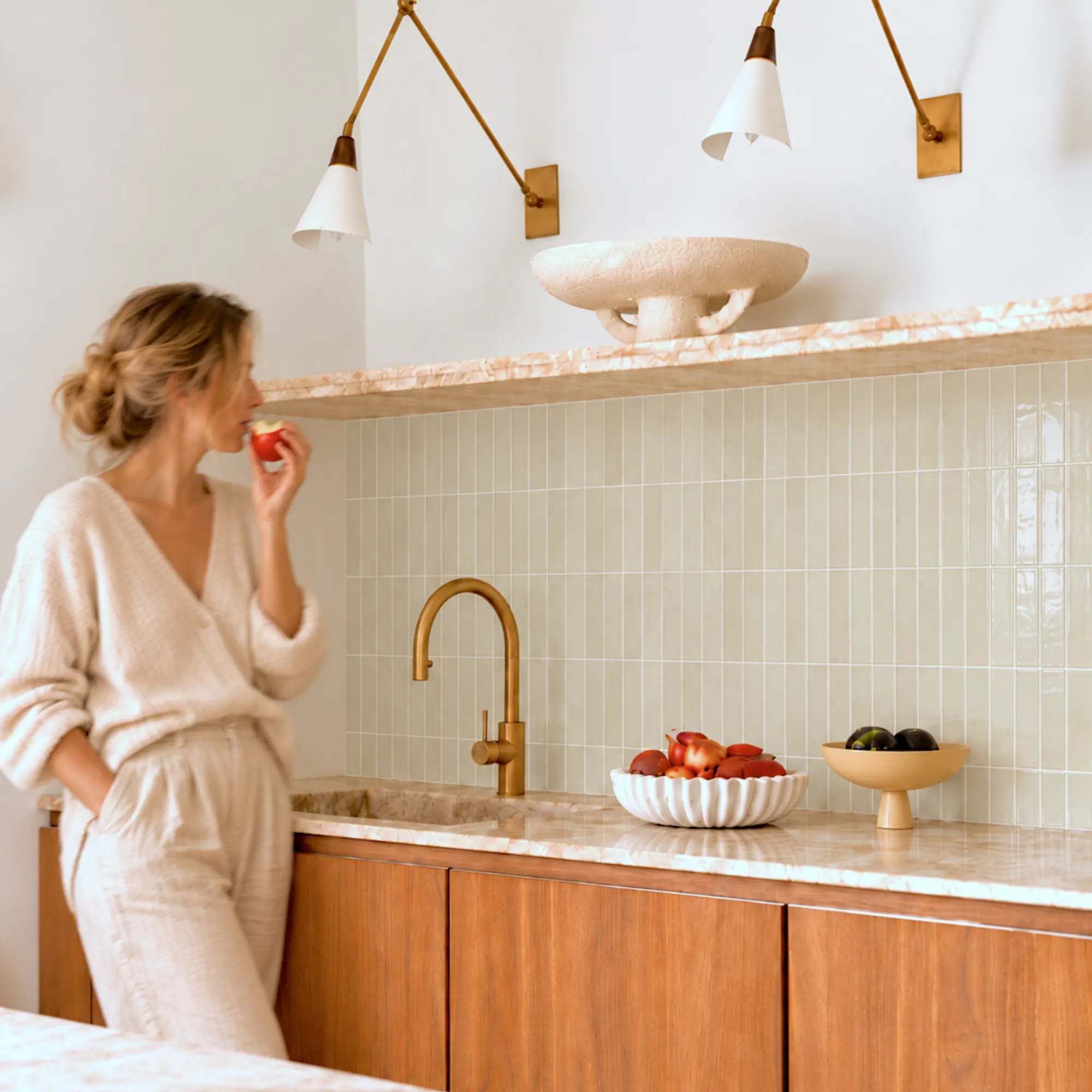
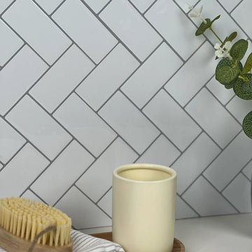
Rectangular subway-style tiles can be arranged or printed to create horizontal, vertical, stacked or offset visual rhythms, depending on the product. Color, aspect ratio, relief and grout-like lines can make two subway products look very different even when both use the same general geometry.
Horizontal rhythm can reinforce width; a vertical arrangement can emphasize height. That is a visual effect, not a guarantee that the room will look larger. Use a sample or simple mock-up to see whether the direction supports the room rather than relying on a universal design rule.
Square and grid patterns make alignment more visible
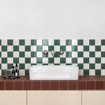
Square formats create a regular grid that can feel quiet in a low-contrast color or graphic in a high-contrast palette. Because the lines repeat in both directions, level reference lines and clean cuts around outlets become visually important.
In a small backsplash, a compact grid can create detail without one large motif dominating the wall. On a large accent wall, the same grid can become a strong background structure. Compare the exact tile size and seam system because those determine how dense the final grid appears.
Zigzag and herringbone-inspired layouts create directional movement
Angled patterns pull the eye across the wall and can make a small area feel more active than a straight grid. They also make direction changes and edge cuts easier to notice. If a corner or outlet interrupts the pattern, plan the transition before exposing adhesive.
Use several pieces to check whether the printed or molded geometry continues naturally across seams. A beautiful single sheet can still look awkward if the repeat creates obvious breaks on a larger wall.
Hexagon and honeycomb patterns need edge planning
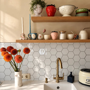
Hexagonal geometry can create a distinctive mosaic-like field, but the outer boundary may be less forgiving than a straight-edged square or rectangle. Decide whether the product terminates with a clean straight cut, trim, or another manufacturer-specified edge method.
On a backsplash, look at how the hexagon repeat meets upper cabinets and the countertop. On an accent wall, check whether a partial row at the edge looks intentional. The design should still make sense at the boundary, not only in the center.
Stone- and marble-look designs should be judged across multiple pieces
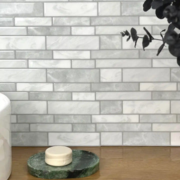
A stone-look surface is usually a printed or molded interpretation of natural material. The important design question is how veining, color variation and repeat behave from piece to piece. Order or inspect more than one piece when possible, because one sample may not show the full repeat.
Look for abrupt duplicated veins, mirrored repeats or high-contrast joints that become obvious across a larger field. A lower-contrast pattern can be easier to integrate with busy countertops, while a bold vein can become the focal point when surrounding surfaces are simple.
Texture can create depth but should not be used to hide a bad wall
Raised relief changes how light moves across the finish. It can make a wall feel more dimensional and may visually distract from very minor appearance differences, but texture does not repair loose paint, large ridges, damaged drywall or moisture problems.
A thin flexible tile may actually telegraph a ridge or depression beneath it. Inspect and prepare the substrate according to the exact product requirements. Design texture should be chosen for appearance, not as a substitute for wall repair.
Gloss, matte and relief change how seams read
Glossy surfaces reflect light more strongly, so a small height difference at a seam can become visible under grazing light. Matte finishes scatter light and can make some joints less obvious, but they may show soil differently. Deep relief can create realistic shadows while also creating more high points for cleaning cloths to catch.
View the sample under the lighting that will actually be used. A seam that disappears under diffuse ceiling light may become obvious under a bright strip light mounted directly above the backsplash.
Use a kitchen backsplash as a room-specific design test
Kitchens combine design with practical exposure. The backsplash sits near grease, cleaning, sink splashes and appliances, so style cannot be separated from placement. Choose the color and pattern only after confirming the exact product belongs in the planned zone.
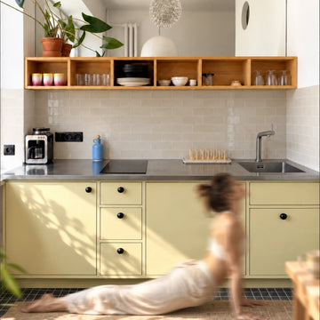
Behind a sink, distinguish routine splashes from direct or prolonged water exposure. Near appliances, follow the exact product and appliance clearances. Do not use a fixed distance borrowed from another brand. The Stickwoll Kitchen Backsplash Guide can help with layout and room-specific planning.
Bathroom wall ideas should begin with the moisture zone
A vanity wall, a dry decorative wall and the inside of a shower are different environments. A water-resistant face does not automatically create a waterproof wall assembly. Seams, exposed edges, penetrations and the substrate behind the decorative layer still matter.
The EPA’s mold and moisture guidance emphasizes controlling the moisture source. If the bathroom wall is repeatedly damp, soft, stained or moldy, resolve that condition before covering it. Use the bathroom wet-area guide to separate splash-prone decorative zones from locations that need a purpose-designed waterproof assembly.
Rental walls require a separate removal decision
A design can be ideal visually and still be wrong for a rental wall. Read the lease, identify the paint and substrate condition, and check the exact manufacturer removal guidance. “Renter-friendly” does not guarantee that every paint layer will remain unchanged.
When appropriate, test a small hidden area before committing the entire wall. Avoid adding permanent adhesive merely to force a weak or textured surface to work. For a more detailed rental workflow, see the Renter Tile Guide.
Accent walls benefit from distance and composition checks
An accent wall may be viewed from much farther away than a backsplash. A small detailed pattern can merge visually at distance, while a large geometric shape or stronger color may remain legible across the room. Take a room photo and place a rough mock-up into it before ordering a full-wall quantity.
Consider furniture and artwork too. A wall behind a television, sofa or headboard already has a focal object. The tile can support that object with quieter texture or compete with it through contrast. Neither choice is automatically better; the design should reflect the role of the wall.
Compare construction before comparing photographs
Peel-and-stick wall products can use vinyl, gel-faced layers, composites, metal-faced surfaces or other constructions. Those materials can differ in thickness, flexibility, cut method, seam design, surface feel and care requirements. Two products with similar marble or subway graphics may therefore behave differently during installation.
Use the exact product page to check dimensions, construction, approved surfaces and placement limits. If the listing does not provide the information you need for the room, ask the seller rather than inferring it from the product photo.
Tile thickness is not a universal quality ranking
A thicker tile can create more relief or a different edge profile, but thickness alone does not prove better adhesion, easier removal, stronger scratch resistance or longer life. A thinner product may be easier to cut around outlets; a thicker product may create more noticeable transitions at exposed edges.
Judge thickness together with construction and the room. Do not create “luxury / mid-range / budget” technical rankings solely from millimeters unless the products are otherwise comparable.
Seams can matter more than the pattern
Overlap, interlocking and straight-edge systems create different joint conditions. Some products simulate grout within the face; others rely on aligned sheet edges. Before deciding that one style looks more realistic, connect several pieces and inspect the joint under side lighting.
Dry-layout also reveals whether the print repeat lines up naturally. If a seam is difficult to align on a table, it may become even more noticeable around outlets, inside corners and the final wall edge.
Use exact coverage rather than assuming every pack is comparable
Pack price tells you little without usable coverage. Tile dimensions, pack count, overlaps, cuts and pattern alignment all affect how much wall one package actually covers. Measure the project and calculate the quantity for the exact product.
Add a reasonable allowance for cuts and future repairs. A straight backsplash with few outlets may need less extra material than a directional feature wall with many corners. The allowance should come from the actual layout rather than a fixed internet percentage.
Save one sample and product record
If a design is installed, keep the handle or SKU, dimensions, order date and at least one spare piece or approved sample when practical. That information makes future repairs and color matching easier if the pattern is later changed or discontinued.
A saved piece also gives you a safe surface for future cleaning checks. Instead of experimenting with a new cleaner on the installed wall, test it on the spare material first when the manufacturer’s instructions permit.
Do not use brand rankings as a substitute for product documentation
A brand can sell several constructions with different use limits. A “best brand” list can therefore mix unlike products and become outdated quickly. Compare exact products using the same questions: material, dimensions, surface requirements, seams, cutting method, room limits, care and removal.
The Peel-and-Stick Tile Brands Buyer Comparison Guide provides a documentation-based framework without declaring a universal winner.
Plan installation before the design decision becomes expensive
A pattern becomes expensive when you discover after ordering that the wall is unsuitable or the layout creates excessive waste. Inspect the substrate, measure all interruptions, choose a reference line and make a rough dry layout before ordering the final quantity.
For installation details, use the Stickwoll Installation and Care Guide and the instructions for the exact product. The design article should help you choose a direction; the product instructions should control how it is installed.
Keep older painted walls out of unnecessary sanding
If a product or repair would require sanding an older painted wall, consider lead-safety implications before disturbing the coating. EPA’s lead-safe renovation guidance for DIYers explains why work on pre-1978 painted surfaces can create hazardous lead dust.
A decorative update should not create a safety problem for the sake of adhesion. When the wall requires more preparation than the project reasonably supports, choose a different surface or postpone the installation.
Use a room mock-up as a design filter, not a material test
A digital mock-up can help compare colors and pattern scale, especially for a large accent wall. It cannot show actual relief, gloss, seam visibility or how the adhesive will behave on the wall. Treat the mock-up as a composition tool and the physical sample as the material check.
When making a mock-up, include the major fixed surfaces and furniture. Compare only two or three options at a time. Too many designs can make every choice feel arbitrary instead of clarifying what the room needs.
Build a short design brief before ordering
- Room: kitchen backsplash, bathroom vanity wall, dry accent wall or another specific location.
- Role: quiet background, bridge between surfaces or focal point.
- Color family: warm neutral, cool neutral, green, blue, dark contrast or another defined direction.
- Pattern scale: small repeat, medium geometry or large statement motif.
- Surface character: smooth, gloss, matte or raised relief.
- Practical limits: sink splashes, appliance heat, rental removal, cleaning or edge exposure.
- Wall condition: smooth/stable, repaired, textured, freshly painted or unsuitable.
This brief gives you a reason for the design beyond “it was trending.” If two products fit the brief, compare their samples, construction and installation details rather than adding more unrelated options.
Five design directions to compare
1. Quiet subway or rectangular rhythm
Choose this direction when the room already has a strong countertop, cabinet grain or open shelving. The repeated rectangular geometry provides structure without requiring a high-contrast motif. Compare horizontal, vertical and stacked visual directions if the product supports them.
2. Compact square or mosaic-led grid
Use a compact grid when you want more visual detail at backsplash distance. Color determines whether the result feels calm or graphic. Smaller modules can also make local cuts less dominant, though the increased number of lines makes alignment important.
3. Herringbone or zigzag movement
Use angled geometry when the wall should feel active. It can work well on a bounded backsplash or focal area, but plan corners and outlets early because directional interruption is more visible than in a simple grid.
4. Honeycomb or hexagonal geometry
Use hexagonal repetition when you want a mosaic character without relying on a stone print. Evaluate the outer boundary and any partial cells at edges. The termination should feel deliberate rather than like the pattern was randomly cut off.
5. Stone-, marble- or surface-inspired pattern
Use this direction when the countertop and cabinets are relatively quiet or when you want the wall to connect several neutral tones. Compare multiple pieces to see the repeat and veining. Treat the design as an interpretation of stone rather than assuming it carries the material properties of natural stone or ceramic.
How to narrow three samples to one
Place the samples in the actual room for at least several normal lighting cycles. Score nothing. Instead, write three observations for each: how the color relates to the fixed surfaces, how strong the pattern feels from normal viewing distance, and whether the seam/relief looks acceptable under the room’s strongest side light.
Then remove the sample that creates a problem you would need to “explain away.” If one clashes with the countertop, one looks too busy across several pieces and one simply fits the room, the third option has earned the decision without a trend ranking.
Bottom line
Peel-and-stick wall tile ideas stay useful when they are tied to color, pattern scale, room role, light and actual product construction instead of a year-specific trend list. Subway, grids, herringbone, honeycomb, stone looks and stronger colors can all work when the design solves a real composition problem and the product fits the wall.
Choose the room and exposure first, compare physical samples, inspect seams and dimensions, verify heat/water/removal limits, and keep the wall condition separate from the style decision. That gives you a design you can explain and maintain long after a “top trends” article would have expired.
Replace trend chasing with a room-specific sample test
A design idea stays useful longer when it solves a room problem rather than when it carries a year label. Instead of asking which pattern is trending, ask whether the room needs a calmer background, stronger focal wall, more texture, warmer color or easier visual connection to existing finishes. Then compare physical samples that answer that job.
For a rental, permission and removal expectations come before style. For a kitchen, appliance and sink zones come before pattern. For a bathroom, direct water and ventilation come before the color story. A trend is never a substitute for product suitability.
Use a three-view sample check: from the room entrance, from the normal working or seated position, and close enough to inspect seams and relief. Repeat the check in daytime and evening light. This reveals pattern repetition and glare that an online product photo cannot show.
Texture can add realism without fixing the wall
Relief can cast convincing shadows and reduce the flat-sticker look, but it does not make a rough or failing substrate acceptable. Deep wall texture reduces adhesive contact, and loose paint can release even when the decorative face is thick. Inspect the wall independently from the visual effect of the product.
Also inspect the repeating pattern. A dramatic stone or wood print can look artificial when identical marks repeat next to each other. Dry-lay multiple pieces and rotate or reorder only when the product allows it. A quieter subway or solid-color layout may be the better choice when the room already contains strong counters, flooring or hardware.
Choose current style without inventing a lifespan
If you like a particular color or pattern now, choose it because it works with the room and you are comfortable maintaining or replacing it—not because a trend forecast promises it will remain fashionable. Keep spare material for repairs and save the product details. A future replacement may differ in shade or print even when the name is similar.
Likewise, do not attach a generic three-, five- or ten-year service life to wall tiles as a category. Surface preparation, moisture, heat, cleaning and construction vary too much. Use the exact product documentation and your own inspection record instead.
Keep a style decision reversible on paper first
Before ordering, save a room photograph and place two or three sample options into a simple comparison sheet. Note what each option does well, what product restrictions apply and which fixed materials it must coordinate with. Making the decision on paper first reduces the temptation to justify an unsuitable product after you have already bought it.
Keep a sample and batch record for future repairs
Save one approved sample, the product label and a photograph of the dry layout. If you need a repair later, compare the replacement under the same room lighting before mixing it into the wall. Color, sheen, relief or print variation can make a new piece visible even when the product name appears unchanged.
Record the pattern direction and where spare pieces are stored. This small step makes a later local repair more predictable without turning the original installation into a promise that the same style or batch will remain available indefinitely.
Frequently Asked Questions (FAQ)
There is no useful category-wide three-, five- or ten-year lifespan for peel-and-stick wall tile. Service depends on the exact construction, substrate, preparation, exposure, cleaning and maintenance. Use product-specific documentation and actual inspection rather than a generic life estimate.
Yes, you can! This is one of their best features. As long as the existing tile surface is clean, dry, and the grout lines are not excessively deep, you can apply them directly over the top. If grout lines are deep, some people apply a thin layer of primer to even out the surface first.
You must choose tiles specifically labeled "waterproof." These are designed with special adhesives and materials that can handle direct water exposure. When installed correctly with tight, overlapping seams, they create a reliable waterproof barrier perfect for a shower wall.
Removal outcome depends on the adhesive, paint, substrate condition, time in service and method. Use the exact removal instructions, proceed slowly and budget for possible patching or repainting. Do not promise an intact wall or a security-deposit outcome.
Sources and scope
- US Department of Energy: Color and Spectrum — Color rendition and spectrum research; nominal lamp labels do not guarantee identical material appearance.
- US EPA: A Brief Guide to Mold, Moisture and Your Home — Moisture control and prompt drying guidance; not a tile approval or hidden-wall diagnosis.
- Smart Tiles official FAQ — Manufacturer-specific examples for its products only; not Stickwoll specifications.


Leave a comment
This site is protected by hCaptcha and the hCaptcha Privacy Policy and Terms of Service apply.