




















Oak cabinets do not need to be hidden or “corrected.” They need a backsplash that respects the wood’s undertone, visible grain, and relationship with the countertop. A kitchen can feel current while keeping the warmth, durability, and character that made oak cabinetry worth retaining in the first place.
The best backsplash for oak cabinets is rarely determined by the species name alone. Finish, age, grain, daylight, electric light, countertops, flooring, and grout all affect the final result. The goal is to make those materials feel related without requiring them to match exactly.
What backsplash goes with oak cabinets?
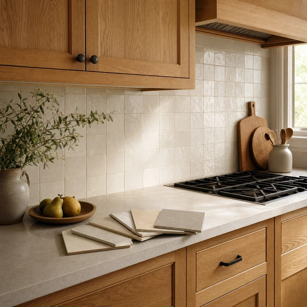
A light, warm-neutral backsplash usually gives oak enough breathing room without creating a cold break between the cabinets and wall. Start with warm white, cream, restrained greige, or soft taupe. Muted green, quiet blue-green, and selective dark accents can also work when the countertop and light support them.
Treat those colors as samples to test, not universal prescriptions. Institutional wood references distinguish between red- and white-oak species groups, but they also document substantial variation in wood structure, color, grain, and finish. The USDA Forest Service Wood Handbook provides the broader technical context: a wood surface’s appearance depends on more than its species label.
A simple warm-white tile may be enough in a room with active oak grain and a patterned countertop. A pale-oak kitchen with a quiet white counter may have room for muted green or subtle surface variation. The backsplash should fill the role the kitchen still needs, rather than adding another attention-seeking surface by default. For broader planning, see our kitchen backsplash guide.

Which type of oak do you have?
Judge the installed cabinet rather than relying solely on a product name, listing, or memory of what the kitchen was called. Natural oak, honey oak, and red oak are useful visual categories, but each can contain meaningful variation.
“Honey oak,” in particular, is a finish-and-color description rather than a botanical species. It may refer to red oak, white oak, veneer, or another oak-based cabinet surface with a golden or amber finish. That is why two kitchens both described as honey oak can respond very differently to the same gray or white tile.
Natural or pale oak
Natural or pale oak commonly reads beige, tan, straw-colored, or softly golden. Its lower color contrast can support a light backsplash without making the room feel flat, provided the tile and cabinet do not become two almost-matching beige surfaces with no definition between them.
White oak is often lighter than red oak and may have somewhat more subdued grain, but it is not necessarily uniform or visually quiet. Purdue’s white-oak color and grain guide describes a showy, coarse-grained wood that can include pink, dark, or mixed-color boards. A natural-finished door can therefore look neutral in one area and warmer or pinker in another.
Good first samples for natural or pale oak include:
- Warm white with a slight cream or stone undertone
- Pale greige that does not turn visibly blue or violet beside the wood
- Soft putty or mushroom
- Low-saturation sage
- Quiet blue-green in a well-lit room
- A simple off-white tile with slight tonal variation
If the natural oak has restrained grain and the counter is nearly solid, the backsplash may carry a little more texture or color. If the oak has pronounced cathedral grain or strong ray figure, keep the wall pattern simpler.
Honey oak
Honey oak usually reads gold, amber, yellow-orange, or caramel. The most useful strategy is to test whether the backsplash gently relates to that warmth or creates a clean, intentional counterpoint.
Start with warm white, softened greige, light taupe, or low-saturation green. Compare those samples with a blue-white, cool gray, and strong yellow-beige sample as controls. The controls help reveal what the room does not need.
Cool gray does not universally make honey oak look orange. Gray tiles vary widely, and the result depends on their blue, green, violet, or brown undertones, as well as the counter and lighting. Still, a cool gray can create enough temperature contrast to make the oak’s warmth feel more prominent in some kitchens. That makes gray a color to test carefully rather than approve from an online image.
Strong yellow-beige deserves the same caution. A beige that closely repeats the cabinet’s gold may make the whole wall read as one warm field. That can be pleasant in the right room, but it can also reduce definition between the cabinet and backsplash. Look for a small shift in value, undertone, or texture so the surfaces remain distinct.
Red or orange-cast oak
Red oak does not always look red, but many red-oak cabinets show pink, red, amber, or orange notes after stain and clear coating. The installed finish matters more than the species name.
Purdue’s red-oak lumber and grain reference documents light and darker boards, mineral coloration, sapwood, ray figure, visible pores, and cathedral patterns. Those published examples are not a survey of finished cabinets, but they show why red oak should be assessed door by door.
For red or orange-cast oak, begin with a soft neutral that does not repeat the strongest red-orange note. Warm white, balanced greige, muted mushroom, subdued green, or a smoky blue-green may provide enough separation without turning the room cold.
Avoid making the backsplash and cabinets compete through opposite extremes. A stark blue-white wall beside strongly ambered oak can create a sharp temperature break. A red-brown tile may repeat the wood too closely. The better option is often a quieter bridge between the oak and counter.
| Oak appearance | Countertop direction | First tile samples to test | Directions to treat carefully |
|---|---|---|---|
| Natural or pale oak | Light, quiet white or cream | Warm white, pale greige, soft sage, quiet blue-green | Blue-white beside pink-cast oak; near-matching beige with little separation |
| Natural or pale oak | Dark or gray | Warm white, putty, restrained taupe | Busy gray mosaics or strong contrast grout if the counter is already active |
| Honey oak | Light and quiet | Creamy white, softened greige, low-saturation green | Icy white, cool gray, or strong yellow-beige without an in-room test |
| Honey oak | Warm, speckled, or patterned | Simple warm white, light taupe, quiet greige | Small multicolor mosaics that repeat every counter color |
| Red or orange-cast oak | Light or softly patterned | Warm white, mushroom, muted green, smoky blue-green | Pink beige, red-brown tile, or stark blue-white |
| Any oak with strong grain | Heavily veined or high contrast | Low-pattern neutral tile with related grout | Pronounced tile pattern plus dark grout plus active counter |
| Any oak | Quiet counter in a bright room | Charcoal or black accent tile as a deliberate contrast | Large dark areas in a dim room without a full-wall mockup |
Build your first three-sample shortlist
Choose the description closest to your room and use the result as a starting set:
This is a screening method, not a verdict. If a suggested color separates from the counter, emphasizes an unwanted cabinet undertone, or changes badly under evening light, remove it from the shortlist.

What backsplash colors work best with oak?
The most useful color families are warm whites, soft earth-based neutrals, muted greens or blues, and selective dark accents. The right family depends on whether the backsplash should calm the room, connect existing finishes, add color, or create contrast.
Warm white and off-white
A white backsplash with oak cabinets can make the wall feel cleaner and brighter, but “white” is too broad a label to be a decision. Compare at least one warm white, one neutral white, and one cooler white directly against the cabinet.
Warm white usually creates the gentlest transition with golden or natural oak. Neutral white can work when the countertop already provides a bridge. Blue-white may be useful in a cooler room, but beside honey or red-orange oak it can make the color-temperature difference more visible.
A simple subway format is an effective first sample because it lets you judge color before adding a strong pattern. For more layout references, the guide to backsplash colors, layouts, and grout contrast covers restrained subway arrangements and nature-based color directions.
Soft beige, greige, and taupe
Beige, greige, and taupe work best when they connect materials that already share warmth. They can bridge oak cabinets with cream quartz, warm granite, beige flooring, or stone-look surfaces.
Greige means a gray-beige mixture. The balance matters. Some greiges lean cool and violet; others lean green, brown, or warm stone. Place the sample against the cabinet and counter at the same time. A greige that looks balanced against the oak may turn muddy beside the counter, while another may look too cold against the wood.
Taupe and mushroom are especially useful where the counter contains brown, gray, and cream without a dominant pure white. They can add quiet depth while maintaining enough contrast to distinguish the wall from the cabinets.
Muted green or blue
Green backsplash with oak cabinets works most naturally when the color is softened rather than highly saturated. Sage, gray-green, dusty olive, and blue-green can relate to the organic character of wood without copying its warmth.
The main question is whether the room has enough visual and physical light for color. A deep olive sample may look grounded in direct daylight but heavy under upper cabinets. A pale sage may look calm by day and unexpectedly gray at night.
Start with the color family rather than a single shade. The guide to sage, olive, and deeper green backsplashes can help define the range, while the comparison of green tile with wood and neutral finishes gives you additional combinations to sample.
Muted blue can also work, particularly with pale oak and a quiet counter. Blue-green is often easier to connect than a crisp primary blue because it shares some visual territory with sage and gray. Test it in the room before deciding; the tile should add a controlled color note, not isolate the cabinets on one side of the palette.
Dark or black accents
Dark tile can create deliberate contrast with oak, especially in a bright kitchen with a quiet countertop. Charcoal, soft black, deep green-black, or dark brown-black tend to sit more comfortably with wood than a sharp blue-black.
Use dark tile selectively when the room already has limited daylight, dark counters, or a large uninterrupted backsplash area. A small sample can look sophisticated while a full wall feels much heavier. Tape together enough material to represent the real scale, then view it from the kitchen entrance.
If the countertop is soapstone or another dark, visually grounded surface, the soapstone and backsplash pairing guide offers a closer look at undertones, grout, and limiting competing movement.

How much backsplash pattern can visible oak grain handle?
Visible oak grain can support pattern, but the tile pattern should be judged against the most active cabinet door, not the flattest or least representative section. In many oak kitchens, the cabinet surface is already one of the room’s main patterns.
A simple layout uses repetition without much internal movement. Examples include a stacked rectangle, horizontal subway arrangement, or large square grid in a quiet color. A small-texture tile adds surface variation but keeps the overall silhouette orderly. A busy mosaic introduces frequent color changes, small shapes, directional movement, or pronounced grout lines.
Those categories matter because pattern is cumulative. Oak grain, countertop veining, tile movement, and grout contrast are all read together from across the room.
Do not double up without testing the whole composition. Pronounced wood grain, heavy countertop veining, a high-movement tile, and strong grout contrast may create more competing signals than you intended. This is not a ban on pattern. It is a prompt to decide which surface should lead.
Check your room’s pattern load
Add one point for each statement that is true:
Use the total to guide the next sample:
- 0–1 points: Quiet composition. The room may have space for texture, color, a visible layout, or moderate grout contrast.
- 2 points: Layered composition. Keep at least one of the backsplash variables quiet: color, pattern, texture, or grout.
- 3–4 points: High-signal composition. Make a large mockup. If the wall feels fragmented from across the room, simplify the tile or reduce grout contrast before ordering.
This score measures visual activity, not design quality. A maximal room may intentionally score four. The purpose is to make that choice consciously.
For another wood species with strong natural character, the walnut cabinet backsplash guide uses a similar undertone-and-grain approach.

How should the countertop affect your tile choice?
The countertop and backsplash share a visual edge, so they need a clearer relationship with each other than either one needs with the floor. Let the counter determine how warm, light, and patterned the wall can become.
A light or white counter may leave room for a warmer tile because the counter supplies brightness and separation from the oak. That is a direction to test, not a formula. If the counter is a cool blue-white and the cabinet is strongly golden, a creamy backsplash may expose a three-way undertone conflict rather than solve it.
A dark counter often benefits from a lighter wall when the room needs visual relief. Yet a dark backsplash can still work in a bright kitchen with pale oak and generous lighting. The right choice depends on the full wall area, not a small sample held under showroom lights.
Gray-veined counters need particular restraint. First identify whether the veins lean blue-gray, green-gray, violet-gray, brown-gray, or nearly black. Then choose whether the backsplash will repeat one of those quieter notes or step back into a low-pattern neutral.
The backsplash should rarely become an accidental third pattern. If the oak grain is active and the counter has strong movement, a simple warm white or putty tile often gives both materials room to register. If the oak and counter are quiet, the wall can carry more color or geometry.
Appliances can shift the same decision. Stainless steel, black, white, and mixed-metal finishes introduce their own contrast. The backsplash guide for four appliance finishes shows how natural wood, counters, and appliance surfaces can be reviewed together.
Which tile finish works beside oak cabinets?
Matte, glossy, and lightly textured tile can all work with oak. The difference is how each finish reflects light and changes the visual density of the wall.
There is no universal rule that glossy cabinets need matte tile or that satin cabinets need gloss. The pairing is about balance. Two reflective surfaces can feel bright and lively in one kitchen but visually dense in another. Two muted surfaces can feel calm or unexpectedly flat.
The National Institute of Standards and Technology treats color, gloss, reflectance, and viewing conditions as separate parts of material appearance. Its color and surface appearance reference supports a practical point: evaluate tile finish under the light and viewing angles found in the actual kitchen.
Hold finish samples vertically. A tile laid flat on a counter receives light differently from a tile installed on a wall. Stand at the kitchen entrance, beside the sink, and near the main work area. Watch for reflected cabinet grain, bright fixture spots, and texture shadows.
What grout color works with a tile backsplash and oak cabinets?
Tone-on-tone grout keeps the backsplash visually quiet. Medium contrast makes a simple tile layout more visible. Strong contrast turns every joint into part of the pattern, so it should be reviewed with the oak grain and countertop before approval.
| Grout relationship | Visual effect | Best reason to test it | Main caution |
|---|---|---|---|
| Close to tile color | Creates a more continuous wall | Active oak grain or heavily patterned counter | The tile layout may become less visible than expected |
| Slightly lighter or darker | Defines shape without dominating | Simple subway, stacked, or square layouts | Undertone can look different once spread across the wall |
| Strong contrast | Makes the grid or geometry a feature | Quiet counter, restrained grain, deliberate graphic style | Can compete with wood grain and countertop movement |
| Warm grout with warm-neutral tile | Connects cream, beige, or taupe surfaces | Golden oak and warm counters | Too much yellow or brown may reduce separation |
| Cool or gray grout | Adds a cooler line to white or gray tile | Counters with related gray notes | May emphasize temperature contrast beside honey oak |
Test grout as an area, not as a thin color chip. Several visible joints will show whether the wall reads as one surface or a grid. If the tile has faux grout lines or a built-in pattern, include those lines in the overall pattern-load check rather than treating them as neutral background.
How do you test a backsplash with oak cabinets before ordering?
Build a small sample board with the cabinet, counter, tile, grout, and any visually strong flooring represented together. Check it in daylight, evening kitchen light, and from normal room distance.
Material appearance can change with illumination and viewing conditions. A tile that looks softly creamy in daylight may look more yellow at night. A gray-green may lose its green cast under one lamp. Gloss can reflect the cabinet tone and make the tile appear warmer than it did in isolation.
Use this process:
- Choose a representative cabinet area. Use the most active grain and the strongest undertone you can find, not the easiest door to coordinate.
- Place the tile vertically beside the cabinet. Include the countertop sample or hold the tile at the real counter-to-cabinet junction.
- Add the floor when it is visually strong. This matters most with wood-look, stone-look, patterned, or dark flooring.
- Compare available daylight and normal evening light. Review the materials with the lights you use during daily cooking and cleanup.
- Create a larger wall mockup. Tape several samples or a printed-to-scale layout to the backsplash area.
- Stand across the room. Look from the kitchen entrance and adjoining space, not solely from a few inches away.
- Eliminate conflict before choosing a favorite. Remove any tile that turns too blue, yellow, pink, gray, busy, or reflective in one of the room’s normal conditions.
- Measure each wall section separately. Record width and height, then account for corners, windows, appliances, outlets, edge treatment, pattern alignment, and cutting waste.
- Review the current product instructions. Confirm approved wall surfaces, cutting guidance, layout steps, appliance restrictions, and removal directions for the exact product.
- Plan outlet work before installation. Faceplates and cuts affect both safety and the quantity of usable material.
A phone photo can help you compare layouts, but do not use it as the sole color test. Camera processing and screen settings can shift undertones. The physical sample in the physical room remains the better decision tool.

Can peel-and-stick tile work in an oak kitchen?
Peel-and-stick tile can be considered when the selected product is approved for the wall surface and kitchen location you have. Cabinet color compatibility is only one part of the decision; wall condition, measurements, cuts, product instructions, appliance guidance, and removal planning also matter.
At the August 20, 2026 check, Stickwoll Subway Magic in White was listed with a selectable variant and active add-to-cart control. The page reported nominal 12-by-12-inch pieces and described the product for indoor wall and kitchen-backsplash use. Availability, price, and delivery eligibility can change, so verify the current listing and checkout details for your address.
The checked instructions direct application to clean, smooth, dry, stable indoor walls. They list smooth painted walls, smooth ceramic or glazed wall tile, and clean non-textured glass, while excluding textured walls, dusty or peeling paint, floors, and countertops. That guidance applies to the named product; do not assume another peel-and-stick tile has the same approved surfaces.
The Subway Magic calculator offered an optional 10% extra-tile setting at the checked time. That is a calculator option, not a guarantee that 10% will cover every layout. Multiple outlets, narrow wall sections, complex alignment, damaged pieces, and pattern matching can change the needed quantity.
If removal is part of the plan, review the live directions before installation. The checked Subway Magic instructions described warming the tile and gently peeling from a corner, but they did not guarantee residue-free or damage-free removal on every wall.
For store and installation questions, consult the current Stickwoll tile FAQ and the exact product page before purchasing.
Electrical safety: If a receptacle cover is removed during measuring or installation, de-energize the receptacle before working in that area. The OSHA receptacle-cover safety interpretation identifies uncovered energized receptacles as a shock hazard. Its letter addresses workplace construction, so follow applicable residential requirements and use a qualified electrician for wiring, box, grounding, or device-position changes.
Frequently Asked Questions
Is white tile always a safe choice with honey oak?
No. White is a useful starting family, but its undertone determines whether it relates to honey oak or creates a sharp contrast. Warm white and soft cream often deserve the first test. Compare them with neutral and cool white in the room rather than assuming the brightest white is the cleanest choice.
Also compare the white tile with the countertop. A creamy tile may work with honey oak but conflict with a crisp blue-white counter. A more neutral white may connect both surfaces better.
Does a gray backsplash make oak look orange?
It can make the warmth of honey or amber oak feel more noticeable in some rooms, but that is not a universal result. Gray can lean blue, green, violet, brown, or nearly neutral. The countertop, lighting, grout, cabinet finish, and nearby colors all affect the perception.
Test cool gray beside a warmer greige and a warm white. If the cool gray makes the cabinet feel isolated or more intensely orange than you want, remove it from the shortlist. If it connects naturally with the counter and the oak still looks balanced, it may remain a valid option.
Can I use green or blue tile with oak cabinets?
Yes, provided the selected shade and room light leave enough space for color. Muted sage, gray-green, olive, smoky blue, and blue-green are sensible families to sample because they can create a controlled counterpoint to warm wood.
Pale oak and quiet counters may support a clearer color. Honey or red-orange oak with an active counter often benefits from a more subdued version. Always check the sample under upper cabinets and during evening use, where a color may appear darker or grayer.
What tile pattern works with visible wood grain?
Start with a simple repeated layout, low color variation, and grout close to the tile color. Stacked rectangles, horizontal subway arrangements, and quiet square grids allow the oak grain to remain visible without forcing the backsplash to disappear.
Patterned tile is still possible. Compare it with the most active cabinet door and the full countertop movement. If all three surfaces compete from across the room, simplify one variable: tile pattern, grout contrast, or color variation.
Can peel-and-stick tile work in my kitchen?
It may, if the exact product is approved for your wall surface and intended location. Confirm that the wall is clean, smooth, dry, and stable where required. Review current guidance for appliances, cutting, outlets, layout, and removal.
Do not rely on category-wide claims. Peel-and-stick products can have different surface lists and installation instructions. Base the decision on the live documentation for the product you plan to use.
Make the oak, counter, and tile agree before you order
A successful backsplash for oak cabinets begins with the installed wood, not a generic label. Identify whether the cabinets read pale and natural, honey-gold, or red-orange. Then judge the most active grain, the countertop’s undertone and movement, the tile finish, and the grout as one composition.
Build a three-sample shortlist before browsing dozens of near-identical colors. Place each sample vertically beside the cabinet and counter, check it in daylight and evening light, and make a larger mockup for any dark, patterned, glossy, or high-contrast choice. The sample that holds the room together is more useful than the tile that looks best by itself.
Once the sample board shows a clear direction, compare it with current Stickwoll tile colors and product guidance. The result should respect the oak’s natural character while giving the kitchen a clearer, more intentional wall.


Kommentar hinterlassen
Diese Website ist durch hCaptcha geschützt und es gelten die allgemeinen Geschäftsbedingungen und Datenschutzbestimmungen von hCaptcha.