




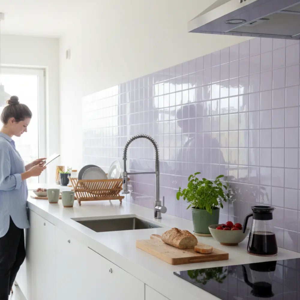
















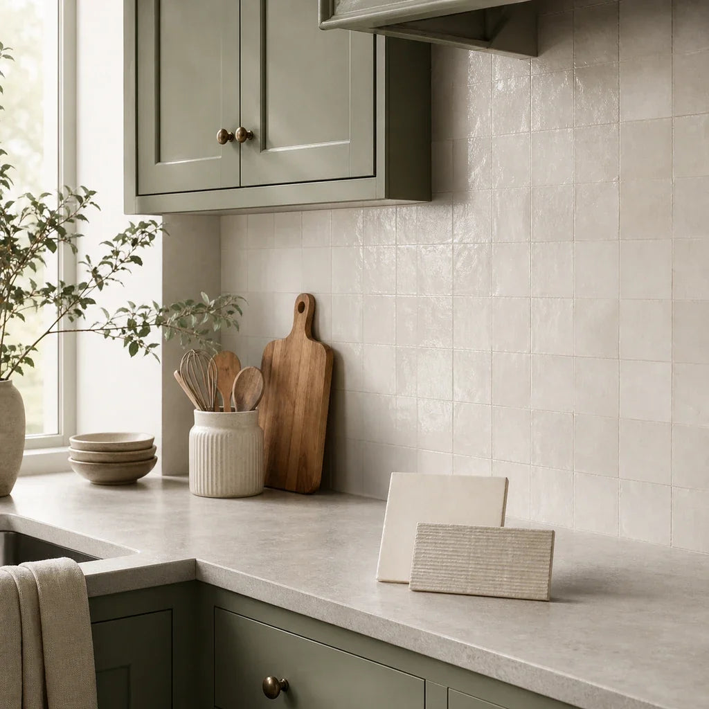
Two sage cabinet samples can look almost identical under store lighting, then separate completely at home: one turns cool and gray beside a quartz counter, while the other shifts yellow-green under warm kitchen lights. For most sage green cabinets, a warm white or soft neutral backsplash is the least risky place to start. From there, adjust for whether the cabinet reads cool gray-green, warm yellow-green, olive, or deep green beside the actual countertop and hardware.
The paint name alone cannot tell you what backsplash goes with sage green cabinets. “Sage” covers a broad range of greens, and the surrounding materials can pull the same cabinet finish in different directions. A sharp white may make one sage feel fresh but leave another looking dull. Pale beige may connect beautifully to brass and a warm counter, yet turn muddy beside blue-gray cabinetry.
That is why the most useful backsplash decision is made with a real cabinet door, countertop sample, tile sample, and the kitchen’s actual lighting. A Chalmers University study involving 18 observers found that reference samples showed a clear tendency to shift in perceived color between incandescent light and simulated daylight. The study did not test kitchen materials, but it supports the practical reason for checking finishes in the room rather than trusting a screen or showroom display. See the Chalmers study of color appearance under room lighting.
The short answer: Begin with warm white, off-white, pale greige, or another light neutral. Choose warm white or cream when the sage and counter lean warm; consider soft gray or pale greige when the sage reads cool; reserve black, deep green, and stronger patterns for kitchens with enough light and a clear contrast plan.
What Kind of Sage Green Do You Actually Have?
Before choosing a sage green cabinet backsplash, decide how the cabinet reads in your room. Cool sage, warm sage, olive-leaning sage, and deep sage are useful visual descriptions, not official color categories. They help you compare options without assuming every paint or cabinet finish labeled “sage” behaves the same way.
Use a cabinet door or a large painted sample for this test. A small online swatch cannot show the cabinet’s sheen, the amount of visible green, or the effect of nearby counters, flooring, walls, and lighting.

Cool sage
Cool sage usually looks gray-green and may show a faint blue cast in daylight. It often feels quieter and less earthy than olive sage. Black, chrome, or brushed nickel hardware can strengthen this cooler reading, especially when the countertop contains gray or blue-gray veining.
Soft white, pale greige, restrained gray, and lightly blue-toned accents can work here. The main risk is going so cold that the kitchen loses warmth. If both the counter and backsplash are icy gray, the cabinets may appear flatter than they did when viewed alone.
Warm sage
Warm sage shows more yellow than blue. It may look soft and herbal in daylight, then become noticeably warmer under evening lights. Brass, champagne, copper-colored, or bronze hardware often reinforces this side of the color.
Warm white, ivory, cream, and carefully chosen pale beige are natural starting directions. A sharp blue-white can create more contrast than expected, making the cabinets look yellow by comparison.
Olive-leaning sage
Olive-leaning sage has a stronger yellow, brown, or earthy influence. It can be light and muted or relatively rich. This cabinet reading often works well with warm stone colors, off-white tile, wood, and warm metals.
The common mistake is adding too many yellow-based surfaces. Olive cabinetry, cream tile, a honey-colored floor, warm bulbs, and a beige counter can merge into one dull field. A warmer palette still needs variation in lightness and texture.
Deep sage
Deep sage has less reflected light and may approach moss, forest, or muted bottle green. It carries more visual weight than pale sage, so the backsplash needs to either lift the wall or contribute to a deliberate dark composition.
Light warm neutrals create clear separation. Dark tile can work, but the counter, lighting, hardware, and floor need to support that choice. A dark backsplash should feel intentional from across the room, not like a gap between upper and lower cabinets.
Ask these three questions
- Does the cabinet look more gray, yellow, or blue in daylight? Gray or blue usually points to a cooler neutral direction. Yellow or olive suggests testing warmer whites and mineral neutrals first.
- What color is the countertop? Look past the counter’s product name. Identify the background color, strongest vein, and any repeated warm or cool notes.
- Are the handles warm metal, black, or chrome? Hardware is a smaller surface, but it can clarify the intended direction. Brass may connect warm sage to cream tile; black may support stronger contrast; chrome may sit more naturally with cooler whites and grays.
The U.S. Department of Energy explains that correlated color temperature, or CCT, describes the color appearance of a light source and lists common examples ranging from 2700 K through 4100 K. It also notes that object color perception varies with the light source. That does not make one bulb temperature universally correct for sage kitchens. It means your material test should include both daylight and the lights you use after sunset. See the Department of Energy guidance on light color and object appearance.
| Cabinet reading | Safest backsplash family to test first | When it tends to work | What can make it look wrong |
|---|---|---|---|
| Cool gray-green sage | Soft white, pale greige, restrained light gray | Gray-veined counters, black or chrome hardware, balanced daylight | Icy gray tile, blue-white lighting, or too many cool surfaces |
| Warm yellow-green sage | Warm white, off-white, light cream | Warm counter backgrounds, brass or bronze hardware, natural wood | Sharp blue-white tile or an overly yellow cream |
| Olive-leaning sage | Ivory, mineral white, pale stone, quiet beige | Earthy counters, wood details, warm metals | Yellow lighting plus yellow-beige tile and warm flooring |
| Deep sage | Light warm neutral, softly patterned white, controlled dark accent | Strong task light, a counter with clear contrast, simple tile layout | Dark counter, dark floor, dark hardware, and dark tile all competing |
| Unclear or changeable sage | One warm neutral and one pale greige sample | Cabinets that shift noticeably between day and night | Ordering from product photography without an in-room comparison |
This table is a shortlisting tool, not a universal color formula. Your best result may sit between two rows, particularly if the cabinet changes character through the day.
Which Light Neutral Backsplash Works Best With Sage Cabinets?
Warm white, off-white, pale greige, and restrained beige are the most practical families to compare first. They give sage cabinets room to remain the main color while letting you connect the backsplash to the countertop and hardware.
The word “neutral” can be misleading. Two tiles sold as white may have very different undertones. One may lean blue and look crisp; another may lean cream and feel softer. The goal is not to find a neutral with no undertone. It is to find one whose undertone does not fight the cabinet or counter.
Warm white and off-white tile
A warm white backsplash is often easier beside warm or olive sage than a sharp blue-white. It creates light contrast without forcing the cabinet to look more yellow or brown than it already does.
Warm white is particularly useful when:
- The sage cabinet has a yellow-green or olive influence.
- The counter has a creamy, warm white, taupe, or beige background.
- The hardware is brass, bronze, champagne, or another warm metal.
- The floor contains natural wood or warm stone colors.
- You want the cabinet color to remain the strongest color in the room.
Look for restrained warmth rather than obvious cream. From a distance, the backsplash can still read as light and clean. Up close, its warmer base keeps the cabinet and wall from separating into green versus icy white.
If the room already contains several warm finishes, compare the warm white with a pale greige. The greige may provide enough restraint to prevent the kitchen from becoming yellow-heavy.
For a warm, softly patterned peel-and-stick comparison, the current Subway Marble almond-white direction can be placed beside the cabinet and countertop sample. Treat it as a sample candidate, not a predetermined match. The marble-look movement also needs to be checked against any veining already present in the counter.
Cream and pale beige tile
Cream and pale beige can bridge sage cabinets to a warm counter, wood floor, or brass hardware. They are most successful when they create an intentional material relationship rather than simply adding more warmth.
A pale beige backsplash may help if the counter contains taupe, tan, cream, or warm mineral notes. Instead of matching the counter exactly, choose a backsplash that repeats one secondary color from it. This makes the materials feel connected without trying to turn them into one continuous surface.
Be cautious when:
- The sage already looks distinctly yellow or olive.
- The kitchen uses very warm artificial light.
- The counter has a strong gold, peach, or yellow cast.
- The floor is honey-toned or orange-toned wood.
- The beige tile is noticeably darker than both the counter and wall.
In that setting, beige may not provide enough separation. The cabinet, wall, counter, and floor can begin to look muddy because each surface sits in a similar warm, muted range.
The fix is often subtle. Test a lighter beige, a less yellow cream, or a warm off-white. You do not necessarily need to abandon the warm family; you may only need more difference in lightness.
The Mint Garden almond-white tile direction offers another warm-light comparison point. Review its color and texture upright beside the cabinet rather than judging the product image against a digital cabinet swatch.
Soft gray and pale greige tile
Soft gray and pale greige can suit cool sage cabinets, black hardware, and countertops with gray veining. Greige means a gray-beige neutral: it combines some of gray’s restraint with a small amount of warmth.
A pale greige is often more forgiving than a cool silver-gray because it can connect a gray-green cabinet to a warm floor or mixed counter. It is useful in kitchens where pure white feels too stark but beige looks too yellow.
Cool gray deserves more care. Beside warm sage, it may suppress the green’s yellow side and make the cabinet look dull. Beside a cool gray-green sage, the same tile may feel calm and coherent. This is exactly why the cabinet door test matters.
Try soft gray or greige when:
- The sage reads gray-green in daylight.
- The counter has gray, charcoal, or blue-gray markings.
- Black or nickel hardware is already part of the plan.
- The floor is neutral rather than strongly golden.
- You want lower contrast than white but more definition than beige.
Do not match a gray vein based on a photograph. Stone and stone-look countertops often contain several warm and cool notes, and the most visible vein may not be the color that dominates once the full slab is installed.
Can You Use a Colored Backsplash With Sage Green Cabinets?
Yes, but the backsplash should usually play a quieter role than the cabinets. Muted blue, pale green, and restrained small-format patterns can add depth without turning the cabinet and wall into competing focal points.
“Quieter” is a visual judgment rather than a fixed saturation score. The practical test is to stand at the kitchen doorway. If your eye jumps to the wall before it registers the cabinetry, the tile may be carrying more color, contrast, pattern, or shine than you intended.
Muted blue
Muted blue can work with cool sage because both colors may share a gray or blue influence. Dusty blue, faded denim, gray-blue, and soft blue-green are easier to coordinate than bright cobalt or clear aqua.
This direction is strongest when the counter is relatively quiet. If the counter already contains dramatic veining, a blue backsplash can introduce a second color story. In that case, use a simpler shape and low-contrast grout or faux-grout line.
Muted blue is less predictable beside yellow-green sage. The blue can make the cabinet appear more yellow through contrast. That may be attractive, but it should be an intentional result seen in the room.
Pale green and tone-on-tone color
A pale green backsplash can create a layered, tone-on-tone kitchen. The tile should not be an almost-match that misses by a small margin. That often reads as an error. Choose a clearly lighter, darker, grayer, bluer, or more mineral version of green so the relationship looks deliberate.
A pale gray-green tile can soften deep sage cabinets. A light celadon-like direction may work with cool sage. Muted olive or moss accents may suit warm, earthy rooms, provided the counter gives the two greens enough visual separation.
For broader color examples, review the sample-led ideas in the green peel-and-stick backsplash guide and the material and lighting pairings in the green kitchen tile inspiration guide. Use those pages to identify directions worth sampling, not as proof that a photographed green will reproduce under your lights.
The Nature’s Green decorative tile direction is one store-local option to compare if you want a green-on-green wall. Set the sample beside the cabinet and counter to make sure the two greens are distinct enough to look intentional.
Small-format patterns
A small hexagon, slim subway shape, restrained geometric, or lightly varied pattern can add interest while keeping the palette neutral. Pattern becomes easier to manage when at least one of these elements stays quiet:
- The color contrast is low.
- The grout or faux-grout line is close to the tile color.
- The countertop movement is restrained.
- The hardware is simple.
- The pattern repeats consistently across the wall.
If the counter has bold movement, a patterned backsplash may make the middle of the kitchen feel busy. Let one surface own the visual movement. The other can provide a calmer field.
For layout ideas such as subway, hexagon, marble-look, and directional patterns, use the kitchen tile design ideas hub after you have narrowed the color family.
Find Your Backsplash Direction in Three Answers
Use the three-answer path below to produce a shortlist. It is a practical design guide, not a scientific color test.
Input 1: How does the cabinet read in daylight?
- Gray or slightly blue: Give the cool-neutral path one point.
- Yellow, herbal, or softly olive: Give the warm-neutral path one point.
- Dark, mossy, or strongly olive: Give the contrast-managed path one point.
- It changes too much to call: Keep both warm white and pale greige in the test.
Input 2: What dominates the countertop?
- Cool white, gray, charcoal, or blue-gray: Add one point to the cool-neutral path.
- Cream, beige, taupe, brown, or gold: Add one point to the warm-neutral path.
- Black or very dark stone: Add one point to the contrast-managed path, then test a light backsplash before adding another dark surface.
- Strong multicolor movement: Favor the simpler backsplash pattern, regardless of color family.
Input 3: What does the hardware reinforce?
- Chrome, nickel, or black: Add one point to the cool-neutral path.
- Brass, bronze, copper-colored, or champagne: Add one point to the warm-neutral path.
- Mixed metals: Let the counter and cabinet carry more weight than the handles.
Your result
Mostly cool-neutral points: Test soft white, pale greige, and one restrained light gray. If you want color, add a muted blue or pale gray-green sample.
Mostly warm-neutral points: Test warm white, ivory, and one controlled cream or pale beige. Avoid choosing the most yellow sample until you see it under the evening lights.
Mostly contrast-managed points: Start with a light warm neutral, then compare one dark or colored accent. The light sample acts as a baseline so you can tell whether the darker choice genuinely improves the room.
Mixed result: This is common. Test one warm white, one pale greige, and one optional accent. Do not add more candidates until those three have been viewed beside the installed materials.
The result narrows the search; it does not select a product automatically. A tile can fall into the correct family and still look wrong because of its finish, pattern scale, or relationship to the counter.
Which Tile Shape and Pattern Should You Choose?
Choose the pattern based on how much movement is already present in the countertop and cabinetry. Simple shapes are usually easier to coordinate when sage is the main color or the counter has strong veining.
Classic subway shapes create clear horizontal rhythm. Vertical or stacked layouts feel more linear. Hexagons add more edge detail and become more visible when the grout contrasts. Marble-look patterns add their own movement, so they need careful comparison with stone or stone-look counters.
A useful hierarchy is:
- Bold countertop: quieter backsplash color, simple repeat, low grout contrast.
- Quiet countertop: more freedom for hexagons, directional layouts, or gentle variation.
- Detailed cabinet doors: simpler backsplash shape.
- Flat-panel cabinets: either simple or patterned tile can work, depending on the counter.
- Open shelving: review how shelf brackets, dishes, and tile lines overlap visually.
Pattern scale also changes at installation size. A small sample may show only one or two repeats. Lay several pieces together, or mock up the full section behind the sink or range on paper, so you can see the actual frequency of lines and motifs.
Can Black Backsplash Tile Work With Sage Green Cabinets?
Black tile can work with sage cabinets when the room has sufficient daylight or task lighting, the counter supports the contrast, and the backsplash pattern stays simple. It is a conditional accent direction, not an automatic mistake and not a universal upgrade.
Black can sharpen pale sage and connect it to black hardware, dark-framed windows, appliances, or a dark counter. The strongest applications usually repeat black in a few controlled places rather than filling every major surface with it.
A black backsplash is worth testing when:
- The kitchen receives useful daylight.
- Under-cabinet or task lighting reaches the backsplash.
- The cabinet is light enough to remain distinct.
- The counter creates a clear boundary between the cabinet and wall.
- The pattern is simple enough that reflections and grout lines do not become noisy.
- The floor or surrounding walls provide some relief from the dark palette.
Use more caution if the plan already includes glossy black tile, black handles, a black counter, dark flooring, and dark appliances. The cumulative effect may feel visually compressed because the center of the kitchen reflects less light and several boundaries become less distinct.
That outcome is not guaranteed. Research on perceived interior dimensions shows that surface lightness can affect spatial perception, but color is only one factor. The Oberfeld and Hecht experiments on surface lightness used virtual rooms rather than kitchens and did not test black backsplashes. A separate Stamps study of color and perceived spaciousness reported that color had a much smaller relationship with spaciousness than horizontal area and height when light amount was controlled. In practical terms, do not expect backsplash color alone to make a kitchen feel large or small.
If your sage kitchen already has a dark countertop, the contrast principles in the guide to balancing dark surfaces and backsplashes can help you assess countertop movement, sheen, and surrounding light. Although that guide focuses on dark cabinetry, the same whole-room review is useful when a dark counter becomes the visual anchor.
A quick contrast-load check
Give the kitchen one point for each dominant dark surface:
- Dark backsplash
- Dark countertop
- Dark floor
- Dark upper cabinets or tall pantry units
- Large black appliances
- Limited daylight at the main work wall
Zero to two points: A black accent may remain contained, though the sample test still decides.
Three or four points: Compare black with charcoal, deep green, and a light baseline. Look from the doorway and with task lights off and on.
Five or six points: A dark backsplash may still suit the intended mood, but it will be a major room decision rather than a small accent. Test a larger temporary section before ordering the full amount.
This score is simply a way to count the room’s dark visual mass. It does not measure brightness, safety, or the exact perception of space.
How Do Glossy, Matte, and Textured Finishes Change Sage Green?
Finish changes how the backsplash responds to light, so two tiles in the same color can create different relationships with sage cabinets. Compare finish as carefully as hue.

Glossy light tile
Glossy tile produces stronger reflections and brighter highlights. Under-cabinet lights may create visible bands or points of light across the wall. Those reflections can make a warm white look brighter and may sharpen the difference between the backsplash and a matte cabinet finish.
Gloss can help a light neutral feel lively, particularly in a kitchen with restrained colors. It can also make tile edges, raised details, and printed grout lines more noticeable.
Do not treat a glossy finish as automatically cleaner, more durable, or more suitable near heat. Those are product-specific questions that require current documentation.
Matte light tile
Matte surfaces produce softer, more diffuse reflections. They can make the wall feel calmer beside matte or satin cabinets and may allow subtle green undertones to remain more visible.
A matte cream may look richer than a glossy cream because it has fewer bright reflections. A matte gray may appear denser or flatter under weak lighting. Neither result is inherently better. It depends on whether the wall should fade back or contribute visible texture.
Lightly textured surfaces
Texture creates small highlights and shadows that change as you move through the room. A raised white or marble-look surface may appear warmer in shadow and brighter on its high points. This can add depth to a simple palette, but it also means a sample viewed flat on a table will not represent the installed appearance.
Place textured samples upright and switch on the under-cabinet lighting. View them straight on and from the doorway. If the texture is printed or molded to resemble individual tiles, stand far enough away to judge the overall repeat.
For any peel-and-stick option, check the current product page for its stated finish, dimensions, placement guidance, and wall requirements at the time of purchase. Product specifications and availability can change.
What Grout Color Looks Best With Sage Cabinets?
Tone-on-tone grout creates a quieter wall, while medium-contrast grout makes the tile shape more visible. Dark grout is one optional design choice, not a default improvement.
With traditional tile, warm white grout beside warm white tile creates a broad, calm field. Pale gray grout can define a white subway or hexagon without turning every joint into a dark line. Charcoal or black grout makes the geometry much more prominent.
Ask what should be visible first:
- If the sage cabinets should lead, keep grout contrast low.
- If the tile shape should contribute more character, use medium contrast.
- If the backsplash pattern is meant to become a focal point, stronger contrast may fit, provided the counter is not already busy.
Tile size matters. Dark grout around small hexagons creates many repeated lines, while the same grout around larger rectangular tile produces less visual density. Review a multi-piece sample rather than one isolated tile.
Some peel-and-stick products are grout-free or include a printed or molded faux-grout effect. In that case, treat the line color as part of the product pattern. You may not be able to change it after installation, which makes pre-order comparison especially important.
How Should You Test Backsplash Samples at Home?
Test every backsplash candidate upright beside the cabinet and countertop in both daylight and the kitchen’s actual artificial light. Then step back to the doorway, where you first read the cabinet, wall, and counter as one composition.
The three-view sample test
- Build the material group. Put the tile sample upright beside the cabinet door. Place the countertop sample at the bottom in its horizontal position. Add a hardware sample if the finish has not been installed.
- Check two lighting conditions. View the group in daylight, then repeat the test after sunset with the actual ceiling and task lights on. Do not substitute a phone flashlight or lighting from another room.
- Check it from the doorway. Move to the point where the kitchen is first seen. Ask whether the cabinet still reads as sage, whether the counter and wall separate clearly, and whether the tile attracts the intended amount of attention.
Do this with no more than three finalists at a time. Too many similar samples make small differences harder to judge. A useful first set is:
- One warm white or off-white
- One pale greige or soft neutral
- One optional accent, such as beige, muted blue, pale green, or black
Use a simple sample scorecard
Rate each candidate from 0 to 2 for the following questions:
| Check | 0 points | 1 point | 2 points |
|---|---|---|---|
| Cabinet color | Makes the sage look dull or unexpectedly yellow/blue | Acceptable, but changes under some light | Keeps the intended sage reading in both light conditions |
| Counter relationship | Conflicts with the counter background or movement | Connects to part of the counter | Creates a clear, intentional relationship |
| Evening light | Becomes muddy, icy, or overly reflective | Works with some lights on | Remains balanced under normal evening lighting |
| Doorway view | Wall dominates or disappears awkwardly | Composition is acceptable | Cabinet, counter, and wall have a clear hierarchy |
| Pattern and finish | Competes with other surfaces | Adds moderate detail | Contributes the intended amount of detail |
A higher total does not prove that a tile is objectively better. The score helps you record what you saw instead of relying on memory after the samples are moved.
If two tiles finish close together, leave them in place for another day. Check them in morning light, midday light, and the evening setting you use most often. The better option is often the one that remains coherent across conditions, not the one that looks most impressive for ten minutes.
What Should You Check Before Ordering Peel-and-Stick Tile?
Confirm wall suitability, product-specific placement instructions, measurements, edge conditions, and outlet cuts before ordering. A good color match cannot compensate for an unsuitable wall or an incomplete installation plan.
Use the peel-and-stick tile project guide to connect the color decision to surface preparation, exposure zones, edge finishing, and measurement. For the full kitchen layout, the kitchen backsplash planning guide covers cabinet and countertop coordination, counter lines, outlets, sinks, stove areas, and practical project details.
Purchase checklist

Product pages may contain manufacturer statements about kitchen use, moisture, heat, adhesion, removability, or expected lifespan. Read those statements within the exact product instructions. They should not be treated as universal guarantees for every kitchen wall or every peel-and-stick material.
Once the sample test identifies the right family, compare one or two current store options rather than reopening the search across every available color. A warm-neutral result may point you to almond-white or softly patterned directions. A cool-neutral result may point you to white, pale gray, or greige. A contrast-managed result may justify a darker or greener sample.
Frequently Asked Questions
Is white backsplash tile too stark with sage cabinets?
White can be too stark if it has a cold blue cast and the sage cabinet leans warm, yellow-green, or olive. Start by comparing a sharp white with a warm white or off-white. The difference may look small on a product page but become obvious beside the cabinet.
A crisp white is more likely to work when the sage reads cool, the counter background is a clean white or cool gray, and the room has balanced lighting. Even then, check the sample after sunset. Artificial light can change how much contrast you see between the white wall and green cabinet.
Does beige work with cool sage green?
Beige can work with cool sage if another material gives it a reason to be there, such as a warm counter, natural wood floor, or brass hardware. Pale greige is often a useful middle option because it introduces warmth without looking distinctly yellow.
Avoid selecting beige only because it is described as neutral. Put it beside the cabinet and counter. If the cabinet becomes noticeably bluer while the backsplash looks yellow, the two undertones may be separating too strongly. A less yellow beige, warmer white, or pale greige may create a smoother connection.
Can I use black tile with sage cabinets?
Yes. Black tile can create strong, clean contrast with pale or mid-tone sage. It works best when the backsplash receives useful daylight or task light and the rest of the kitchen has enough lighter surface area to balance it.
Compare black with charcoal or deep green if pure black feels severe. Keep the pattern simple when the counter has movement. If the kitchen also has a black counter, dark floor, black appliances, and black hardware, install or temporarily mount a larger sample area before committing.
Should the backsplash match the countertop or the cabinets?
The backsplash does not need to match either one exactly. It should create a clear relationship among the cabinet undertone, countertop, hardware, and room light.
A practical approach is to let the backsplash repeat a secondary color from the countertop while maintaining enough contrast with the cabinets. For example, a warm white tile may repeat the creamy background of a veined counter while staying clearly lighter than sage cabinetry. Matching one surface in isolation can cause conflict with another, so evaluate the full material group.
Is peel-and-stick tile suitable for my kitchen wall?
It may be suitable if the specific product is intended for the planned location and the wall meets its current installation requirements. Surface condition is critical. Smooth, clean, dry, stable walls are commonly called for in the checked Stickwoll instructions, while textured, dusty, peeling, cracked, bumpy, or uneven surfaces are identified as unsuitable examples.
You also need to review product-specific guidance for sink exposure, cooking areas, heat sources, ventilation, edges, existing tile, paint condition, and removal. Do not generalize claims from one product to another. Confirm the exact instructions before ordering or installing.
Your Final Sage Backsplash Shortlist
The best backsplash for sage green cabinets is selected in the room, not from the paint name. Check the cabinet undertone first, connect it to the countertop second, and confirm the result under both daylight and kitchen lighting.
Use this final shortlist:
- Warm or olive sage: Test warm white, off-white, and one restrained cream or mineral beige.
- Cool gray-green sage: Test soft white, pale greige, and one restrained light gray.
- Deep sage: Start with a light warm neutral, then compare one controlled dark or colored accent.
- Busy countertop: Keep the backsplash pattern and grout contrast quiet.
- Quiet countertop: Consider a muted color, small-format pattern, or more visible tile shape.
- Uncertain undertone: Compare one warm white and one pale greige before considering stronger colors.
Save two or three sample directions, build the cabinet-counter-tile group, and check it from the doorway. After the color family has earned its place in the kitchen, compare current Stickwoll options and verify the exact product instructions, dimensions, wall requirements, and intended placement before ordering.


Kommentar hinterlassen
Diese Website ist durch hCaptcha geschützt und es gelten die allgemeinen Geschäftsbedingungen und Datenschutzbestimmungen von hCaptcha.