
















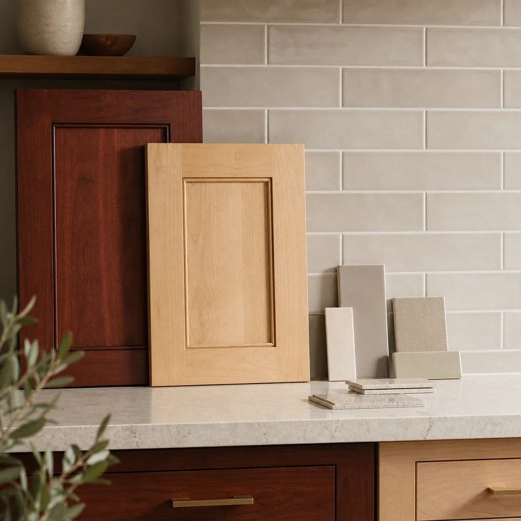
Two kitchens can both have wood cabinets and still need opposite backsplash decisions. A cherry door may read as deep reddish brown, while a finished maple door may look pale, softly golden, or almost neutral. Put the same bright white or cool gray tile in both rooms, and one kitchen may feel crisp while the other may feel disconnected.
Start by testing warm white, off-white, and soft neutral backsplash samples beside the actual cabinet, countertop, and floor. These are useful starting points for both cherry and maple, but they are not universal answers. Cherry usually carries more visual weight and reddish warmth; maple is often lighter, yet its finish can shift the room from creamy and golden to comparatively neutral.
The key is to stop shopping from a generic list of “backsplash colors for wood cabinets.” Choose from the cabinet’s present appearance, then let the countertop and household lighting narrow the options. A tile color does not correct or cancel a wood tone. It becomes one more surface in a room where color, gloss, texture, and light affect one another.

What backsplash works best with cherry or maple cabinets?
For most kitchens, the most useful first samples are warm white, soft ivory, light greige, and a quiet natural neutral. Add a soft gray only if the maple or countertop reads relatively neutral. Add a muted blue or green only when you want visible color and the cabinet, counter, floor, and lighting support it together.
The decision then splits into two paths:
- For cherry cabinets: Begin with softened light colors or stone-related neutrals that give the darker wood breathing room. Test cool grays and strong colors cautiously.
- For maple cabinets: Decide whether the installed finish reads creamy, golden, or comparatively neutral. Warm light tile often suits the first two readings; neutral maple may support a cooler greige or soft gray.
- For either wood: Reduce backsplash movement when the cabinet grain, countertop veining, or floor already attracts attention.
- For either wood: Evaluate a physical sample at full-room viewing distance, not solely in a close-up photo or online product image.
Color names are less precise than they sound. One manufacturer’s “ivory” may be yellow, another may be nearly white, and a tile called greige may lean violet, green, or brown in your kitchen. Treat the name as a shelf label, not a final color diagnosis.
How can you tell what undertone your cabinets have?
An undertone is the quieter color cast beneath the main surface color. You do not need to assign the cabinet a perfect label. You only need to observe whether it looks warmer, cooler, redder, more golden, or more neutral beside fixed reference surfaces.
The USDA Wood Handbook species descriptions explain why cherry and maple should not be grouped as generic brown wood. Natural black cherry heartwood ranges from light to dark reddish brown and can have a distinctive luster. Hard maple varies between lighter sapwood and darker heartwood and generally has a fine, uniform texture. Those are species baselines, not descriptions of every installed cabinet.
Stain, glaze, toner, clear coating, age, veneer, and factory finishing can alter that baseline. The USDA guidance on finishing wood notes that finishes are used to produce a desired appearance. In practical terms, the door in your kitchen matters more than the species name on an old invoice.
Use this three-part observation:
- Hold a plain white sheet of paper vertically beside the cabinet door. The paper is only a rough visual reference, not a calibrated color test. Does the wood now look reddish, amber, yellow-gold, brown, or relatively quiet?
- Compare the cabinet with the countertop edge. Look for a repeated color family, such as cream, beige, warm gray, charcoal, or a distinct veining color.
- Stand at the kitchen entrance and take a daylight photo. Use the photo to compare the amount of darkness, pattern, and contrast in the whole room. Do not use it as proof of the exact undertone because phone cameras adjust white balance, exposure, contrast, and saturation.
The ASTM practice for visual color appraisal supports the broader principle of comparing physical opaque materials under defined viewing conditions. A homeowner’s sample board is an informal version of that principle, not an ASTM-compliant test, but direct comparison is still more useful than evaluating isolated product photos.
| Wood type and current reading | Countertop direction | First tile samples to test | What can create an unwanted clash |
|---|---|---|---|
| Dark or reddish cherry | White, cream, or lightly veined counter | Warm white, soft ivory, quiet off-white | Blue-white tile, heavy dark grout, or a second strong pattern |
| Warm brown or amber-finished cherry | Beige, taupe, or warm stone counter | Light greige, mushroom, warm taupe, softened white | Icy gray, yellow ivory, or a busy multicolor mosaic |
| Pale or creamy maple | Warm white, cream, or beige counter | Warm white, gentle ivory, light neutral | Stark blue-white tile or a strongly yellow tile |
| Golden maple | Beige, gold, brown, or warm-veined counter | Soft off-white, light greige, restrained stone tone | Cool gray selected without an in-room test |
| Comparatively neutral maple | White, gray, or cool-veined counter | Soft white, pale gray, neutral greige | An overly warm beige that looks separate from the counter |
| Either wood with a dark counter | Black, charcoal, or deep brown counter | Clean light neutral, soft white, controlled contrast color | Dark cabinet, dark counter, dark floor, and dark backsplash combined without a deliberate plan |
Use the table to create a sample shortlist, not to order tile immediately. The winning sample still has to hold together under your kitchen’s daylight, overhead fixtures, and under-cabinet lighting.

Which backsplash colors work with cherry cabinets?
A backsplash for cherry cabinets usually works best when it gives the wood room to remain the dominant warm surface. Start with warm white, soft ivory, light greige, or a quiet taupe. Consider muted blue or green only after the cabinet and countertop have been evaluated together.
Warm white and soft ivory
A softened light tile can add separation between cherry cabinets and the countertop without creating the sharp edge that some pure whites produce. This direction is especially useful when the countertop contains cream, beige, warm white, or subtle gold-brown details.
“Warm white” does not mean visibly yellow. The better sample may be only slightly softer than printer paper. If the tile looks buttery on its own, it may become too creamy beside an already amber cabinet finish. If it looks blue-white, it may feel unrelated to a warm stone counter.
White tile can also expose a mismatch between the countertop and cabinet that was less obvious before. That is useful information. The backsplash should connect the fixed surfaces, not force the cabinet and counter into a relationship they do not have.
Light greige, taupe, and natural neutrals
Greige is a blend of gray and beige. It is useful with cherry when the countertop contains warm gray, putty, mushroom, or taupe movement. The beige component can relate to the wood while the gray component keeps the wall from becoming another strongly warm plane.
Be selective. A greige that looks warm in a showroom may reveal a violet or blue cast beside cherry. A taupe may become muddy beside a brown granite counter. Compare at least two nearby neutrals rather than buying the first tile with the right color name.
For very dark or espresso-like cherry finishes, the broader principles in the backsplash guide for dark cabinets can help you judge how much light contrast the room needs.
Muted blue or green
Muted blue and green can work as deliberate counterpoints, but color-wheel theory cannot choose the tile by itself. Lightness, saturation, tile area, cabinet finish, countertop, floor, and lighting all affect the result.
A documented Vermont kitchen offers a useful real-world example. In the Houzz cherry-and-green kitchen case, designers paired natural cherry slab cabinets with varied sage-green porcelain tile, a solid white quartz counter, and a vertical stacked layout. The project shows that colored tile can coexist with cherry when the cabinet style, counter, tile scale, and room concept support the choice. It does not prove that green is a universal match for cherry. (houzz.com)
If you test color, keep the first sample quiet: dusty sage, gray-green, softened denim, or a low-saturation blue. Reject it if the color appears detached from the countertop or if the kitchen starts to feel divided into separate red, blue, and brown zones.

Which backsplash colors work with maple cabinets?
A backsplash for maple cabinets should respond to the installed finish’s position between pale, creamy, golden, and relatively neutral. Warm white and light neutral tile are strong starting points for pale or golden maple. Soft gray or greige becomes more plausible when the maple and countertop both provide a cooler base.
Pale or creamy maple
Pale maple can look light enough that homeowners assume any white tile will work. The common problem is not a lack of brightness. It is a small temperature difference that becomes obvious across a large wall.
Compare a warm white, neutral off-white, and very light greige. A slightly softened tile may connect creamy maple to a warm white counter. A neutral white may be better if the counter and appliances are crisp. If your maple reads more like a cream-painted surface than visible wood, the cream-cabinet backsplash color guide offers a useful second comparison.
Golden maple
Golden maple usually needs a tile that acknowledges warmth without adding a second heavy yellow surface. Soft off-white, restrained ivory, light greige, and quiet stone colors are sensible first samples.
Watch the floor here. Golden maple cabinets, honey-toned flooring, beige counters, and yellow ivory tile can create a room in which every surface occupies the same warm middle range. The solution is not automatically cool gray. Often, a lighter and less saturated neutral gives the eye a rest while keeping the room coherent.
Comparatively neutral maple
Some maple cabinets look close to pale neutral brown, especially with a low-amber finish. If the countertop contains clean white, soft gray, or cool gray veining, test a neutral greige or pale gray beside a soft white.
Gray needs to earn its place through the countertop. If the counter has no gray and the floor is distinctly warm, gray tile may look like a separate design decision. Select it because it repeats something already present, not because gray appears on a list of current backsplash colors.
How much tile pattern can visible wood grain support?
When cabinet grain and countertop veining already create movement, a simpler backsplash is the most useful starting sample. This is a design heuristic, not a rule. A quiet cabinet face and plain counter may support more tile movement, while strongly figured wood beside heavily veined stone often benefits from restraint.
A simple way to judge visual load is to assign one point for each dominant surface:
- Add one point if the cabinet grain is clearly visible from the kitchen entrance.
- Add one point if the countertop has strong veins, speckles, or multicolor movement.
- Add one point if the floor has a pronounced grain, pattern, or high contrast.
- Add one point if the proposed tile has multiple colors, strong texture, or a prominent geometric layout.
Zero or one point: You have room to test a stronger pattern or visible grout grid.
Two points: Start with a simple field tile or modest texture, then compare one patterned alternative.
Three or four points: Begin with a quiet tile, tone-on-tone grout, and a straightforward layout. Add pattern only if the full-room sample still feels controlled.
This is an editorial comparison tool, not a validated design score. Its purpose is to stop each surface from being judged alone.
Running bond gives rectangular tile a familiar offset. A straight stack looks cleaner and makes the grid more obvious. A vertical stack adds height and direction without adding another tile shape. Light handmade-style variation or shallow texture can introduce movement while keeping the palette restrained.
Herringbone, hexagon, and stronger geometric patterns can still work, but they require a larger test area. The tile pattern and design ideas hub can help you compare layouts after you have settled the color direction.

Let the countertop set the value range
The countertop should usually narrow the backsplash shortlist before tile shape or pattern does. It occupies the transition between the cabinet and wall, so its color, darkness, and movement affect both surfaces.
With a white or light counter, test whether a softer tile gives the wood a more comfortable transition. The backsplash does not have to match the countertop exactly. A slight difference can prevent the wall from looking like an accidental near-match, but the two surfaces should share a believable relationship.
With beige, cream, or warm stone counters, pull backsplash candidates from the quietest light tones in the slab. Do not automatically extract the darkest brown or gold accent. Repeating a small accent over the entire backsplash can make that minor countertop color far more dominant than intended.
Black, charcoal, and deep brown counters need a clearer contrast plan. A clean light backsplash may separate the countertop from cherry cabinetry. A deliberate medium-value tile may work if the floor and room are light. A dark backsplash is not a generic answer for wood cabinets. Dark wood, dark counter, dark floor, and dark tile can compress the room visually unless lighting and contrast have been planned carefully.
If your cherry is deep and the countertop is nearly black, compare the entire room using the undertone and contrast method for walnut cabinets. Walnut is a different wood, but the guide’s treatment of dark visual weight and countertop movement is relevant.
What tile finish and grout should you choose?
Choose finish and grout only after the color family is stable. Matte, glossy, and lightly textured versions of the same nominal color can look different because they reflect and scatter light differently.
The NIST chapter on color and appearance explains that illumination and viewing conditions influence material appearance and that color, gloss, haze, and reflectance are separate dimensions. This is why a glossy white sample may appear very different under an under-cabinet strip than a matte white carrying the same color name.
A peer-reviewed study of material-property perception likewise found that illumination and geometry affect how people discriminate optical material properties. Its experiments used rendered objects rather than kitchens, so it cannot tell you that gloss will always make cherry look redder or maple look more golden. It supports testing the actual finish under the intended light.
Use these practical distinctions:
- Matte tile: Produces less distinct reflection and can create a calmer field beside glossy or strongly figured cabinets.
- Glossy tile: Reflects fixtures, windows, cabinets, and moving objects more clearly. It may add useful liveliness, but the reflected colors need an in-room check.
- Light texture: Adds shadow and variation without requiring a multicolor print. Judge it with the under-cabinet light switched on.
- Strong texture: Creates a more active surface and can collect shadow around every raised edge. Test a larger section before committing.
For grout, a tone-on-tone choice keeps individual joints quieter. Medium contrast grout makes the layout and tile grid more visible. That can be effective with a simple cabinet and plain counter, but it may become one pattern too many beside visible grain and veined stone.
Do not use grout color to rescue a tile that already looks wrong. Evaluate tile and grout together, but approve the tile field first.

How should you test backsplash samples at home?
Test samples beside the cabinet, countertop, and floor under every light you use regularly. The most useful sample is large enough to show repeated joints, color variation, finish, and at least part of the intended pattern.
The process is simple:
- Place the tile beside the cabinet door, countertop edge, and a floor sample or visible section of flooring. Keep the materials in their installed orientation where possible.
- Review the group in indirect daylight, with overhead lights on, and with under-cabinet lighting on if present. Check it in the evening as well.
- Step back to the kitchen entrance. The tile should make sense at normal viewing distance, not solely when held a few inches from the cabinet.
- Take a full-room photo of each option from the same position. Use the photos to compare value, pattern, and visual weight. Make the final color judgment in person.
- Remove the weakest option. Live with the remaining samples for several normal cooking days before ordering.
The scientific sources do not establish one fixed color shift for daylight, warm LEDs, cool LEDs, matte tile, or glossy tile. They do support the reason for testing: appearance changes with illumination, geometry, surface properties, and viewing position.
A practical shortlist should contain different directions, not four nearly identical whites. For cherry, that might mean warm white, light greige, and muted green. For golden maple, try soft off-white, neutral greige, and a restrained stone look. For neutral maple, compare soft white, pale gray, and greige.
Use the kitchen backsplash planning guide to review measurements, outlet locations, edges, sink and stove-adjacent areas, and other installation details once the sample board has reduced the palette.
What should you check before purchasing tile?
A successful color decision does not make a product suitable for every wall or kitchen location. Confirm the material, substrate, installation system, cleaning guidance, appliance clearances, and current product instructions separately from the visual choice.
Before ordering, check:
- The wall is stable and suitable for the selected installation method.
- Measurements account for waste, cuts, pattern alignment, and future repairs.
- Outlet, switch, window, cabinet, and exposed-edge cuts have been planned.
- The selected tile variant matches the sample you tested.
- Current documentation approves the intended wall surface and location.
- Range clearances and heat exposure have been checked against the appliance and tile-system instructions.
- Sink-area seams, edges, and perimeter transitions have a documented treatment.
- Grout, mortar, adhesive, primer, membrane, and sealant requirements are understood.
- A removal plan has been considered if you are installing a self-adhesive product over a painted wall.
For ceramic, glass, and stone systems, the TCNA tile installation handbook overview confirms that substrate preparation, flatness, grout joints, pattern, wet-area details, and workmanship are part of the installation decision. The handbook does not automatically govern self-adhesive vinyl, gel, PVC, or composite wall products; those require their own manufacturer instructions.
For the Stickwoll peel-and-stick products reviewed for this guide, the published instructions called for a clean, smooth, dry wall, advance layout planning, firm application, and smoothing from the center toward the edges. One checked page specifically excluded textured walls, dusty or peeling paint, floors, and countertops. Those instructions do not guarantee adhesion on every wall.
Removal deserves the same caution. Checked Stickwoll instructions described warming the product with a hair dryer and peeling gently from a corner, but the effect on paint or drywall depends on the wall’s original condition. Do not assume any peel-and-stick product will be damage-free to remove.
After your visual sample board has narrowed the design direction, you can review the current listing for this subway-style peel-and-stick wall option. Treat the page as a product to verify, not proof that its undertone or construction is right for your room.
Frequently Asked Questions
Does white tile work with cherry cabinets?
Yes, white tile can work with cherry cabinets, but compare a pure white with at least one softened white or ivory. A warmer or quieter white often creates a less abrupt transition beside reddish-brown wood and cream or beige counters. A pure white may be appropriate when the countertop, appliances, trim, and lighting already establish a crisp white reference.
The important comparison is not “white versus cherry.” It is this exact white tile, this cherry finish, this countertop, and this light. Check the grout too. Dark grout can turn a calm white field into a strong grid.
Can gray tile make cherry wood look redder?
A cool gray can create an unwanted contrast with cherry in some rooms, but it is not accurate to promise that gray always makes cherry appear redder. The result depends on the exact gray, the cherry finish, surface areas, light levels, adjacent colors, and viewing conditions.
Test the gray beside a warm greige and soft white. If the gray looks blue, detached, or overly sharp, remove it from the shortlist. If the countertop contains the same gray and the full room remains coherent, it may be a viable option.
What backsplash works with golden maple cabinets?
Start with soft off-white, light greige, restrained ivory, or a quiet stone-related neutral. These directions can acknowledge the cabinet’s warmth without making every surface in the room strongly yellow or beige.
If the counter contains clean gray or white, include a neutral sample as well. Avoid choosing from the cabinet alone. A backsplash for golden maple has to connect the wood to the countertop and floor.
Can patterned tile work with visible wood grain?
Yes. Patterned tile can work with visible wood grain when the countertop and floor are comparatively quiet, the tile palette is controlled, or the installation area is small enough to remain an accent.
Build or photograph a larger repeated sample. One tile rarely reveals the effect of many joints, color variations, and repeated motifs. If the cabinet, counter, floor, and backsplash all compete at the entry view, simplify one of them. Since the cabinets are staying, the backsplash is usually the easiest surface to quiet.
Is peel-and-stick tile appropriate for my kitchen wall?
It can be appropriate when the exact product documentation approves the wall surface and intended location. Suitability depends on wall texture and stability, paint condition, moisture exposure, seams, exposed edges, appliance clearances, and the manufacturer’s current instructions.
Do not extend a general kitchen-wall statement to every sink or range location. Check the current documentation for the specific item and variant before purchase. After your sample board has narrowed the design to a light subway direction, you can review the current listing, availability, surface guidance, and instructions for this subway-style peel-and-stick wall option. Treat the page as a product to verify, not proof that its undertone or construction is right for your room.
Keep cherry and maple on separate decision paths
Cherry and maple share a useful starting point: warm white, off-white, and soft neutral samples. They should not share one final answer.
With cherry, manage reddish warmth and darker visual weight. Begin with softened light tile, stone-related greige, or a carefully tested muted color. With maple, first decide whether the finish looks pale, creamy, golden, or comparatively neutral. Then choose the light-neutral or soft-gray direction that relates to the countertop.
Keep only the samples that work beside the real cabinet door, counter, floor, and household lighting. Once that board has reduced the palette, compare current Stickwoll options by exact color, finish, dimensions, approved surface, installation instructions, removal guidance, and availability. The goal is not to find a backsplash color that supposedly works with every wood cabinet. It is to leave with a short, tested list that works in your kitchen.


Lämna en kommentar
Denna webbplats är skyddad av hCaptcha och hCaptchas integritetspolicy . Användarvillkor gäller.