
















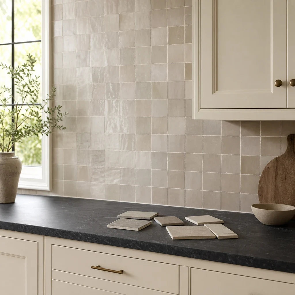
COLOR, LIGHT, AND MATERIAL
Cream cabinets can look calm and softly off-white in a showroom, then turn noticeably yellow beside a bright blue-white backsplash at home. The fastest way to avoid that mismatch is to start with a warm white, soft ivory, or gentle greige sample, then judge it beside your cabinet door, countertop, and actual kitchen lighting.
The best backsplash for cream cabinets is rarely chosen by color name alone. “Ivory,” “white,” “beige,” and “gray” can vary widely between manufacturers, and the same tile can appear warmer, cooler, brighter, or darker as the light and surrounding surfaces change. Your cabinet undertone, countertop, hardware, tile finish, and grout all contribute to the final result.

What backsplash goes with cream cabinets?
For most cream, off-white, ivory, or beige cabinets, begin with three samples: a softened warm white, a quiet greige, and one restrained contrast color. This gives you a reliable starting range without assuming that every cream cabinet has the same undertone.
Use this order:
- Warm white or soft ivory when you want the wall to feel bright but connected to the cabinets.
- Soft greige or pale taupe when the counter, flooring, or wood accents already carry beige, stone, or natural brown notes.
- A muted gray, green, blue, charcoal, or patterned option only after you have checked how much contrast the cabinet and countertop can support.
Cream cabinets sit between white and beige, which makes them more sensitive to nearby colors. A cool backsplash may make the cabinet appear yellower by comparison. A backsplash that is too close in tone can make the kitchen feel quiet and layered, or it can feel visually flat if the finish, grout, and countertop provide no separation.
The goal is not to eliminate warmth. The goal is to control where the warmth appears.
A photographed kitchen project provides a useful example of this balanced approach: the cabinets are identified as Benjamin Moore Natural Cream, paired with an off-white quartz countertop and a mother-of-pearl mosaic backsplash. That combination shows how a cream kitchen can use related light tones while still gaining variation from material, sheen, and pattern. It is one observed project, not a universal formula. See the published cream-cabinet kitchen example for the documented material combination.
Why can the wrong backsplash make cream cabinets look yellow?
A strongly cool or blue-white backsplash can make a warm cabinet look more yellow by contrast, while an overly warm beige backsplash can remove the visual difference between the cabinet, wall, and counter. This is a color-appearance effect applied to interior design, not a rule that predicts every kitchen.
Color perception depends on more than the paint or tile itself. Research on color constancy—the way people perceive surfaces under changing illumination—shows that the same physical surface can shift in perceived lightness, hue, and chroma as the light and surrounding visual structure change. Studies have examined simulated surfaces and real colored materials under different illuminants, not kitchen backsplashes specifically, so the findings explain why your sample can change without proving which tile color will be best.
Read the research on illumination and surface color appearance, reflectance and color appearance, and color constancy for real surfaces.
In practical terms, compare the backsplash with the cabinet rather than viewing either one in isolation.
A clean, bright white tile may look fresh beside a white cabinet but stark beside a cream cabinet. Your eye may then interpret the cabinet as more yellow because the tile is acting as a cooler reference. The opposite can happen with beige. If the tile, cabinet, counter, and wall paint all share nearly the same beige family, the room may lose definition even though the colors technically coordinate.
That is why a sample that looks “wrong” online can look right in the room, and a tile that looks perfect in a product photograph can feel disconnected on your wall.

How do you identify the cabinet undertone?
Compare the cabinet door with a clean white sheet of paper, the countertop edge, and the wall under the lighting used in the kitchen. Look for whether the cabinet reads yellow-cream, pink-beige, gray-beige, or nearly white.
A simple undertone check takes a few minutes:
- Hold a clean white sheet next to the cabinet door. Do the cabinets look distinctly warm, or do they still read almost white?
- Compare the cabinet with the countertop. Does the counter lean cool gray, creamy white, beige, brown, or blue-gray?
- Look at the cabinet in daylight, under overhead lights, and under under-cabinet lights.
- Check the cabinet beside your existing wall paint if the backsplash will stop below open shelving or around a visible side wall.
- View the combination from the kitchen doorway, not just from a close distance.
Lighting matters because a surface can appear different under daylight, warm bulbs, and directional under-cabinet fixtures. Benjamin Moore also recommends sampling white cabinet colors in the kitchen beside related finishes such as backsplashes and countertops. The same principle applies to cream cabinets. Use Benjamin Moore’s kitchen sampling guidance as a reminder to judge the whole finish group together.
| How the cream cabinet reads | Countertop direction | Best first backsplash sample | Main caution |
|---|---|---|---|
| Warm yellow-cream | Creamy white, beige, wood, or warm stone | Warm white, soft ivory, or pale greige | Avoid a blue-white tile that makes the cabinet appear more yellow |
| Soft pink-beige | White quartz, pale stone, or muted wood | Warm white with a neutral base or gentle greige | A strongly pink tile may make the room feel overly rosy |
| Gray-beige | Gray-veined stone, concrete-look counter, or mixed neutral | Quiet greige, pale taupe, or softened gray | Check that the gray does not turn purple in the room |
| Nearly white cream | Light neutral counter with limited movement | Off-white with subtle texture or restrained tonal variation | A bright optic white may create a sharp cabinet-to-wall line |
| Deep beige or tan cream | Dark stone, natural wood, or brown flooring | Pale taupe, warm greige, or softened ivory | Dark brown backsplash tile can make the cabinetry feel dull |
These categories are working descriptions, not standardized color specifications. Tile manufacturers use color names differently, so a “warm white” from one collection may be cooler than an “ivory” from another.
The safest backsplash color families for cream kitchens
The strongest first choices are warm white, soft ivory, off-white with texture, soft greige, and pale taupe. They preserve the cabinet’s warmth while giving you room to create contrast through finish, pattern, grout, or countertop coordination.
Warm white and soft ivory
Warm white is often the most forgiving starting point because it brightens the wall without creating the hard blue cast associated with some very clean whites. Soft ivory can work in the same way, especially when the cabinet is visibly cream rather than nearly white.
The distinction is subtle but useful:
- Warm white usually looks lighter and fresher.
- Soft ivory usually feels more connected to cream or beige cabinetry.
- Cream-on-cream can work when the tile has texture, a different sheen, a visible layout, or a countertop that creates separation.
A warm white backsplash does not have to match the cabinet exactly. A small tonal difference often gives the wall enough definition to keep the kitchen from looking like one uninterrupted block of beige.
For a more finished look, test warm white with a grout that sits close to the tile rather than choosing a high-contrast joint immediately. The tile shape, edge, and surface relief can provide enough detail without making the backsplash visually busy.
Off-white with texture or gentle variation
An off-white tile with light texture adds depth while keeping the color story restrained. This can be useful when your cabinets and counter are both quiet and the wall needs some visual interest, but you do not want a dramatic pattern.
Texture creates small areas of light and shadow. Those variations can help a warm white backsplash feel dimensional instead of flat. The effect depends on the tile’s actual relief, the light angle, and the amount of wall visible.
A textured off-white is particularly useful when:
- The countertop has little movement.
- The cabinet doors are simple and slab-fronted.
- You want a classic backsplash without a strong color statement.
- The kitchen has warm under-cabinet lighting that will reveal surface relief.
- You are considering peel-and-stick tile and want the wall to gain depth through the tile surface rather than through a busy pattern.
A real sample is essential here. Texture can make a tile look darker at the edges, brighter on raised areas, or warmer under directional light. The result on a screen will not show those changes reliably.
Soft greige and pale taupe
Soft greige—a neutral blend of gray and beige—can connect cream cabinets with natural stone, wood flooring, black accents, or a countertop that contains both warm and cool notes. Pale taupe offers a similar bridge with a slightly stronger brown-beige character.
Greige works best when it supports something already present in the kitchen. Look for a subtle relationship with:
- Gray or beige veining in the countertop.
- Natural oak, walnut, or medium wood flooring.
- A warm neutral wall color.
- A stone-look counter with mixed undertones.
- Black or bronze hardware that needs a softer background.
The risk is choosing a greige that is too dark, too purple, or too brown. Dark brown tile can absorb visual attention and make cream cabinets appear muted. A purple-leaning gray can make the cabinet warmth feel more obvious instead of balancing it.
Start with a pale sample. If it feels too close to the cabinet, create separation through tile shape, texture, or grout before moving to a much darker color.

Does gray backsplash tile work with cream cabinets?
A soft, warmed gray can work with cream cabinets when the countertop already contains gray, charcoal, or black, but a blue-gray may intensify the cabinet’s yellow appearance. Gray must be judged for undertone, not selected because the product name says “gray.”
Gray is especially dependent on light. In a north-facing kitchen or a room with cool bulbs, a gray backsplash may feel colder than expected. In warm afternoon light, the same tile may appear beige or taupe. If the gray has a blue base, it can create a sharper contrast with cream cabinetry. If it has a brown or beige base, it may connect more naturally.
Test gray beside the countertop edge, particularly if you have a dark or gray-veined surface. Readers with black counters may also benefit from a dedicated black-countertop backsplash guide when planning the wider material relationship.
The counter should decide how much gray you need. With a black countertop, a pale warmed gray can create a useful middle tone between the counter and cream cabinets. With a creamy quartz counter, the same gray may introduce a separate cool note that has nowhere else to repeat.
Hardware provides another clue, but it does not dictate the tile:
- Brushed brass may support a warm neutral, though it can also look striking against a cooler tile.
- Matte black can anchor warm white, greige, green, blue, or charcoal.
- Chrome or polished nickel may make cool tile feel more intentional, but it does not require a blue-white backsplash.
Treat hardware as a secondary coordination cue. The cabinet, counter, and wall light remain the main test surfaces.
Which contrast colors can work with cream cabinets?
Muted green, dusty blue, and restrained charcoal can work with cream cabinets when the countertop is simple enough to support a stronger wall color. Use these shades as controlled accents, not as automatic solutions for adding contrast.
Muted green
A soft olive, sage, or gray-green can make a cream kitchen feel more grounded and less yellow because the green introduces a natural middle tone. The shade should be muted rather than neon, highly yellow, or heavily blue.
Green is easier to use when it appears elsewhere in the room through plants, textiles, artwork, or a painted island. If the green exists only on the backsplash, check whether it feels intentional from the doorway.
Dusty blue
Dusty blue can be attractive with cream cabinetry, but it deserves a careful sample test. Blue is the color family most likely to create a strong warm-cool comparison with cream. A muted, gray-based blue may feel quiet and collected, while a bright or icy blue may make the cabinet look more yellow.
Use a dusty blue when:
- The counter has cool gray or blue-gray movement.
- The room receives enough daylight to prevent the blue from looking heavy.
- The cabinet’s cream is moderate rather than strongly yellow.
- The wall area is limited.
- You are comfortable with the backsplash becoming a visible color feature.
A current Stickwoll example for this direction is Classic Indigo peel-and-stick tile, whose checked listing showed a selected Retro Blue variant, glossy surface, 3D effect, and nominal dimensions of 29 by 23 centimeters per piece on September 14, 2026. Treat it as a contrast sample, not a default match. The listing’s availability and regional purchase details should be checked again before ordering.
Charcoal and restrained black
Black or charcoal can create crisp contrast with cream cabinets, especially when repeated in hardware, lighting, window frames, or a dark countertop. The risk is scale. A dark backsplash that covers a large, uninterrupted wall can dominate the room.
To keep the result balanced:
- Use a softened charcoal instead of a flat, absolute black when the kitchen is small or dim.
- Repeat the dark tone in at least one other element.
- Let the cabinet remain the warm light surface rather than trying to make every material equally dramatic.
- Consider a small-format pattern only if the countertop is visually calm.
Strong contrast is most successful when it looks deliberate from the doorway. If the dark tile appears like an isolated stripe behind the counter, the room may feel divided rather than balanced.
Can patterned tile work with cream cabinets?
Patterned tile can work with cream cabinets when the countertop is simple, the wall area is limited, and the pattern introduces controlled movement rather than several competing colors. A strong pattern should be an intentional branch, not the first sample for every cream kitchen.
Pattern becomes more difficult when the countertop already has bold veining, speckles, or several colors. In that situation, a warm white, ivory, or greige tile often gives the room enough structure without adding another dominant surface.
If the counter is plain, a gentle herringbone, fishbone, hexagon, or marble-look pattern can add detail. The pattern still needs to pass the same undertone test. A warm white fishbone tile and a blue-gray fishbone tile will create very different relationships with cream cabinets even if the layout is identical.
For pattern and scale ideas, use the Tile Design Ideas guide to compare subway, herringbone, hexagon, and marble-look formats alongside color, lighting, grout, and countertop activity.
One current option in the warm-light family is Subway Marble peel-and-stick tile, listed with an Almond White hue and three-dimensional texture. That description makes it worth testing for a softened white or ivory direction, but the product name and online photograph do not establish a standardized color match for every cream cabinet.

How do finish and texture change the result?
Glossy, matte, and lightly textured tile create different visual effects even when their base color is similar. Gloss can reflect light and appear brighter, while texture creates shadow that may make the wall feel deeper or more varied.
Glossy tile
Glossy tile can help a darker kitchen feel more reflective, but it may also produce bright highlights under under-cabinet lighting. Those highlights can make a warm white appear lighter or exaggerate surface variation.
Gloss is useful when:
- The kitchen needs visual lift.
- The countertop is fairly quiet.
- You want the backsplash to catch light.
- The tile color is soft enough that reflections will not create a harsh white-versus-cream contrast.
The checked Crisp White Duo listing described a glossy surface, 3D effect, nominal dimensions of 28 by 21 centimeters per piece, and kitchen wall use. It also displayed a visible Add to cart state on September 14, 2026. The listing contains inconsistent naming in its descriptive copy, so judge the actual sample and current product details rather than treating the color name as a precise specification.
Matte tile
Matte tile usually creates a quieter surface because it produces fewer sharp reflections. It can support a calm greige, taupe, green, or charcoal direction, but matte does not guarantee that a tile will look warmer. Its appearance still depends on undertone and lighting.
A matte finish may suit a kitchen with:
- Strong natural light.
- Reflective counters or appliances.
- Busy cabinet grain.
- A preference for low visual shine.
- A backsplash color that should recede rather than sparkle.
Light texture
Light texture is often the most useful middle ground for cream cabinets. It adds shadow without requiring a high-contrast color or elaborate pattern. Be careful with deep relief near cooking and cleaning zones, since the exact product’s care instructions and placement limits matter.
Industry guidance from Why Tile explains that glossy surfaces can reflect light and appear lighter after installation, while matching grout creates a more continuous effect and contrasting grout makes tile shape more prominent. See the tile finish and grout guidance from Why Tile for the visual distinctions.

What grout color should you test first?
Start with a tone-on-tone grout, then compare it with a medium neutral grout if you need more tile definition. Use dark grout only when you want the tile layout and joints to become a major part of the design.
Grout changes the visual weight of the backsplash:
- Tone-on-tone grout lets the tile surface read as one calmer field.
- Medium neutral grout gives the tile shape some definition without making every joint dominant.
- Dark grout emphasizes the pattern, spacing, and installation lines.
For warm white or ivory tile, a grout that is close to the tile often keeps the wall from developing a busy grid. For a simple subway pattern, a medium neutral may provide enough structure to prevent the wall from blending completely into the cabinets.
Do not choose grout based on a screen image alone. The grout joint is surrounded by tile, wall, light, and counter color, so it can appear different from the sample strip. CUSTOM Building Products recommends testing grout under conditions that resemble the actual installation, including the surrounding materials and lighting. Its technical bulletin on grout color, texture, and lighting explains why a test panel is more useful than an isolated color chip.
Grout color can change the visual impression of cleanliness and pattern intensity, but there is no supported universal rule that one grout color hides dirt or reduces maintenance for every kitchen.
How should you test a backsplash sample?
Test three tile families beside the cabinet door and countertop edge in daylight, overhead light, and under-cabinet light. Then view the samples from the doorway before choosing the color that remains balanced across the room’s main lighting conditions.
Use this three-sample test:
- Warm-white or soft ivory sample: This is your connected, bright option.
- Greige or pale taupe sample: This tests whether the room benefits from a quiet middle tone.
- One contrast sample: Choose muted green, dusty blue, soft gray, charcoal, or a restrained pattern based on the countertop.
Stand each sample vertically beside the cabinet door. Place the lower edge near the countertop if possible. Do not hold the tile in your hand several feet away from the kitchen; the surrounding room will influence the result.
Check each sample at three times:
- Daylight: Look for yellow, pink, gray, or blue shifts.
- Overhead lighting: Watch for a backsplash that turns dull, cold, or overly bright.
- Under-cabinet lighting: Check reflected glare, shadow depth, and the relationship between tile and countertop.
Then step back to the doorway. Close-up viewing tells you about color and texture. The doorway view tells you whether the backsplash is too dominant, too weak, or disconnected from the cabinets.
A sample can still differ from the finished wall because the installed area is larger and the surrounding materials occupy more of your visual field. The purpose of sampling is not certainty. It is to reduce the most avoidable mismatch before you commit.
Can peel-and-stick tile be used in a cream-cabinet kitchen?
Peel-and-stick tile can be considered for a kitchen backsplash when the wall is smooth, clean, stable, and within the product’s stated use conditions. The exact product instructions, appliance clearances, heat exposure, moisture conditions, and wall surface must be checked before installation.
Stickwoll’s current kitchen guidance calls for measuring separate wall zones, checking the counter line, planning outlet and edge cuts, and reviewing sink- and stove-adjacent risk areas. Its kitchen backsplash planning guide also explains why wall conditions and appliance clearances should be reviewed before the backing is peeled.
The brand’s checked guidance states that peel-and-stick tiles work best on smooth, clean, stable interior walls, including fully cured smooth painted walls and some smooth existing tile or glass surfaces. It does not recommend textured walls, dusty or peeling paint, floors, or countertops for these applications.
Before selecting peel-and-stick tile, check:
- Wall flatness: Uneven surfaces can affect how the tile sits and how the pattern reads.
- Paint condition: The wall should be clean, stable, and fully cured according to the product instructions.
- Existing backsplash: Confirm that the surface is smooth and suitable for the specific product.
- Outlets and switches: Measure cover plates and plan cuts before installation.
- Corners and cabinet returns: Decide where the tile ends and how exposed edges will be finished.
- Sink exposure: Review moisture and cleaning conditions near the sink.
- Stove location: Check the product instructions, appliance clearance, heat exposure, and local requirements. Do not treat broad product-page language as a universal guarantee behind every range or near direct flame.
- Quantity: Measure each wall section separately. The checked Stickwoll calculator displayed an optional 10 percent extra-tile setting, but actual overage depends on the layout, pattern, cuts, mistakes, and future replacement needs.
For a lighter geometric direction, Ivory Hexagons peel-and-stick tile was listed with a glossy surface, 3D effect, nominal dimensions of 30 by 30 centimeters per piece, and a visible Add to cart state on September 14, 2026. The selected variant was labeled Pure white even though the design name refers to ivory. That mismatch is a good reason to inspect a physical sample beside the cabinet before ordering.
Availability, regional pricing, shipping, and variant status can change. Treat the product details above as a record of the checked listing, not a permanent inventory statement.
Frequently Asked Questions
Is white tile too bright with cream cabinets?
White tile can be too bright when it is a stark blue-white and the cabinet has a strong yellow or beige undertone. A softened warm white or ivory is usually the better first sample because it keeps the wall bright without creating the sharpest possible contrast.
That does not mean every cream kitchen needs warm tile. A bright white backsplash can work when the countertop, wall color, appliances, or hardware repeat the cooler note. Test it beside the cabinet and view it under the room’s actual lighting before rejecting or choosing it.
Does gray backsplash tile make cream cabinets look yellow?
A blue-gray backsplash may make cream cabinets appear more yellow by creating a stronger cool-warm comparison. A warmed gray or greige may feel more connected, especially when the countertop includes gray veining, charcoal, or black.
Gray is not one color family in practice. Compare at least two gray samples with different undertones, and check them beside the counter rather than beside the cabinet alone.
Can a beige backsplash work without looking flat?
A beige backsplash can work when it differs from the cabinet in value, texture, finish, pattern, or grout. A near-match may create a calm, continuous effect, but it can feel flat if every surface has the same tone and sheen.
Try pale taupe or greige before moving to darker brown. A light textured tile can create depth while staying within a warm neutral palette.
What grout color should I test first?
Test a grout close to the tile color first, especially with warm white, ivory, or lightly textured tile. Then compare a medium neutral if the pattern needs more definition. Use dark grout when you want the joints and tile layout to stand out clearly.
Grout must be evaluated with the tile and lighting together. The joint can look stronger or weaker after installation depending on tile sheen, texture, width, and surrounding colors.
Can peel-and-stick tile be used behind my stove?
It depends on the product, appliance clearance, heat exposure, wall condition, and applicable local requirements. Do not assume that a peel-and-stick tile is suitable behind every stove simply because a product page describes it for kitchen use or uses broad heat-related language.
Review the exact product instructions and the range or cooktop requirements. If the location has direct flame, unusual heat, or limited clearance, get appropriate installation guidance before proceeding.
Final Thoughts
The best backsplash for cream cabinets usually begins with a warm white, soft ivory, or gentle greige sample. Those families help preserve the cabinet’s warmth without forcing the whole kitchen into yellow-beige territory.
The two risks are easy to name:
- A cool blue-white backsplash can make warm cream cabinets look more yellow by comparison.
- A near-identical beige backsplash can reduce definition if the finish, grout, counter, and pattern provide no variation.
Neither outcome can be predicted from a product photograph alone. Stand the sample beside the cabinet door and countertop edge. View it in daylight, under overhead lighting, and beneath the under-cabinet fixtures. Check it from the doorway. Keep the warm-white, greige, and contrast sample together until one direction still feels balanced after the light changes.
For current peel-and-stick possibilities, compare the documented color and finish details for Crisp White Duo, Subway Marble, and Ivory Hexagons only after the sample test identifies the right color family. Choose the tile after the cabinet, counter, and light agree.


Lämna en kommentar
Denna webbplats är skyddad av hCaptcha och hCaptchas integritetspolicy . Användarvillkor gäller.