
















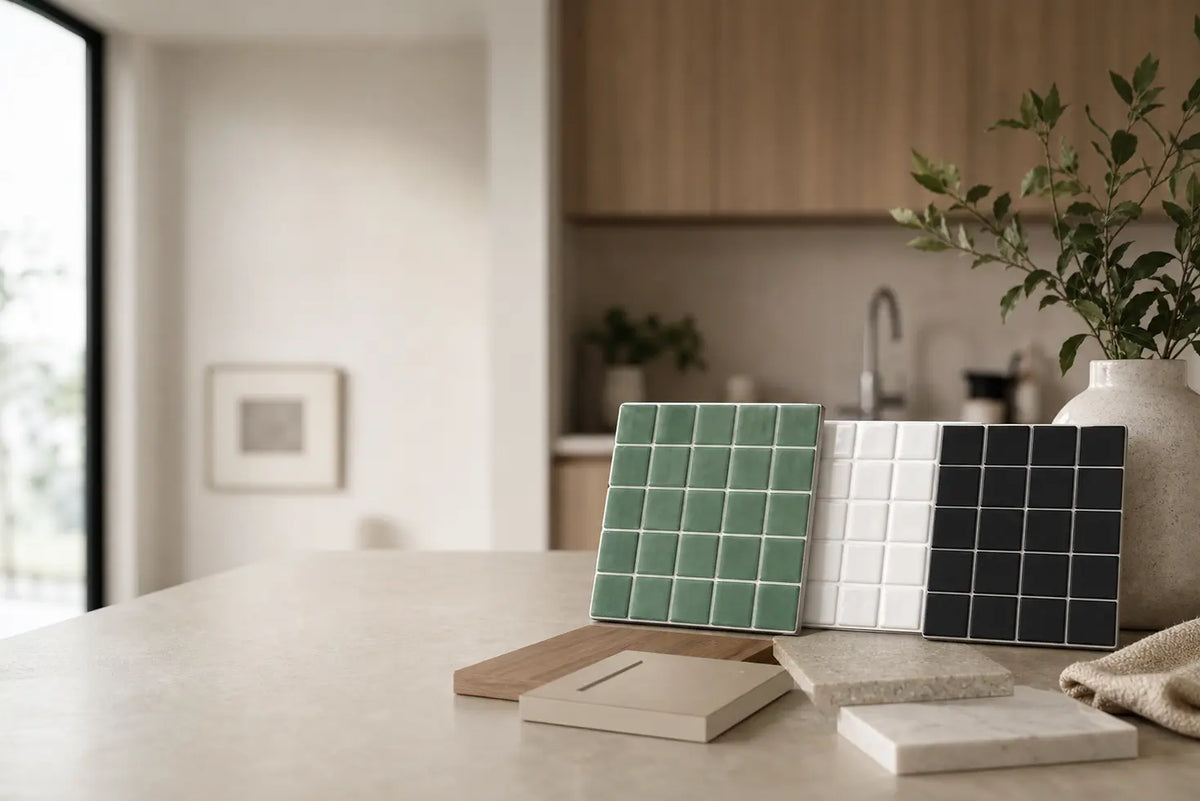
Choosing peel-and-stick tile color can feel strangely harder than choosing the tile itself. A photo of a sage backsplash looks convincing until you hold the sample beside your cabinets. White seems safe until it makes a warm countertop look yellow. Black looks striking online, but you’re unsure what it will do in a kitchen with little daylight.
We’ll use a Color Fit Score to compare those choices against your room: its light, cabinets, countertop, grout-look lines, desired mood, and installation limits. It’s a transparent design exercise, not a scientific rating or a prediction of how a product will perform. First confirm that the wall and location suit the specific tile. Then let color do its work.
How do you choose a peel-and-stick tile color for your room?
Choose the color that solves the room’s most noticeable visual problem without creating a new one. A white backsplash can give dark cabinets a clear boundary; muted green can make an all-white kitchen feel less stark; black can define a pale kitchen that feels unfinished. The same recommendations can reverse when the lighting, countertop, or amount of tile changes.
A useful first question is: What already has the strongest visual presence? In one kitchen it’s veined quartz. In another it’s dark cabinetry, patterned flooring, or a long run of open shelves. If the room already has several competing features, the backsplash usually serves it better by staying quieter. If the finishes are plain, tile has more room to become the focal point.
Light is a practical consideration, not just a mood word. Surface reflectance means the share of light a surface reflects. The Illuminating Engineering Society’s interior daylight-modeling standard treats the reflectance of walls and other surfaces as an input to lighting analysis. Its modeling defaults are not measured values for white, green, or black tile. The U.S. Department of Energy’s guidance on reflective interior surfaces likewise explains why surrounding surfaces matter to a lighting scheme; it doesn’t prescribe a backsplash color for a home.
This is why “small room equals white tile” is too blunt a rule. A narrow kitchen with pale cabinets and strong under-cabinet lighting may comfortably take a short run of black tile. A larger kitchen with dark cabinets, a dark counter, and poorly lit worktops may benefit more from white or a lighter sage. Look at the whole field of finishes, not the backsplash in isolation.
Use a Color Fit Score before you order
The Color Fit Score is an article-specific comparison tool. Score each actual sample you’re considering, not “green,” “white,” and “black” in the abstract. A soft sage and a deep emerald can behave very differently beside the same cabinet door.
First, make a separate suitability check: confirm that the product instructions permit the wall material and its exposure to moisture or heat. If the location fails that check, a high color score does not make the tile suitable.
For an eligible location, give each factor 0, 1, or 2: 0 means it works against your goal, 1 means acceptable with a compromise, and 2 means a clear fit. Multiply by the weight shown and add the results. The maximum is 22 points. These weights express the priorities of this decision guide; they are not measured product specifications or an industry-approved formula.
| Color Fit factor | Weight | What earns a 2 in your room? |
|---|---|---|
| Light fit | 3 | The sample supports the brightness or contrast you want under the room’s actual lighting. |
| Cabinet contrast | 2 | Cabinet and tile edges remain legible without an unwanted clash or flat expanse. |
| Countertop harmony | 2 | The tile sits comfortably beside the counter’s undertone, pattern, and finish. |
| Grout-look fit | 1 | The printed or molded lines have the amount of contrast you want and appear consistent across sheets. |
| Room mood | 2 | The sample creates the calm, warmth, simplicity, or definition you intended. |
| Rental and change fit | 1 | The particular product and wall are acceptable for your plans to change or remove the finish; if that cannot be established, pause rather than awarding points. |
Color Fit Score: score each factor from 0 to 2, multiply by its weight, and total the six results. Compare samples within one room only.
Add up one sample’s Color Fit Score
Use the ratings above for one eligible sample. Each choice is multiplied by its listed weight; the six weighted values total no more than 22 points. A number helps reveal compromises, but it does not certify a product or establish a universal passing mark. If you cannot establish rental and change fit, resolve that question before treating a total as complete.
You do not need a universal “passing” mark. The result is useful when it exposes a tradeoff. Two samples may finish a point apart, yet one loses badly on light fit while the other needs a more careful grout-look alignment. That tells you what to test next. If they tie, favor the sample that performs better on the factor you care about most, then inspect both on the wall at different times of day.
For example, imagine an illustrative, north-facing kitchen with white cabinets, a quiet butcher-block counter, and a plain painted backsplash. Pale sage might score well for warmth and counter harmony; white might lead on light fit but leave the room feeling visually unchanged; black might supply welcome contrast but ask more of the lighting. Change the counter to heavily veined quartz or add strong task lighting, and the comparison could shift. These are prompts for looking, not preset scores for any color.
To use the exercise at home, hold a cabinet sample or a clear photo of the cabinet finish beside each tile sample, then view them together against the counter. Record your six ratings while the room is lit as it normally is. Repeat at night. A sample that only works in a product photo has not yet earned its place on your wall.
Green, white, or black: what does each color actually do?
Green adds a distinct color relationship, white tends to keep the wall lighter and quieter, and black draws a stronger boundary. Those are design directions, not guaranteed effects on mood or perceived room size. The tile’s exact shade, finish, pattern scale, and coverage determine whether the direction works.
Color research is useful here mainly as a warning against overconfident claims. A systematic review by Jonauskaite and colleagues on color–emotion associations found recurring associations across studies, but its authors caution that abstract color associations do not necessarily describe what someone will feel in a particular room. Choose green because you like how it works with your finishes, not because it is supposed to make everyone calmer.
Green: softness with a visible point of view
Green peel-and-stick tile is often the most useful middle path when white seems too plain and black feels too forceful. Against white cabinets, it gives the wall an identity without relying on a sharply contrasting grout-look grid. Against wood, it can connect the backsplash to the cabinet’s natural color variation.
“Green” is still too broad to be a buying decision:
- Sage green is muted. Try it when you want a softer transition between white or cream cabinetry and wood or butcher block. Check its undertone carefully: one sage may lean gray, another yellow.
- Dark green gives the backsplash more weight. It can look deliberate beside light countertops, but a long run under dark upper cabinets deserves a lighting check.
- Emerald green is clearer and more saturated. Treat it as a focal color; compare it with veined counters and patterned flooring before adding another strong surface.

There’s no research-backed rule that one green belongs in a kitchen and another in a bathroom. A residence-focused color-association study by Banu Manav found that responses varied with properties such as color value and saturation in its small sample. It did not test adhesive tile or cabinet pairings. The practical lesson is to assess the particular shade, rather than expecting every green sample to deliver the same look.
White: space for other finishes to speak
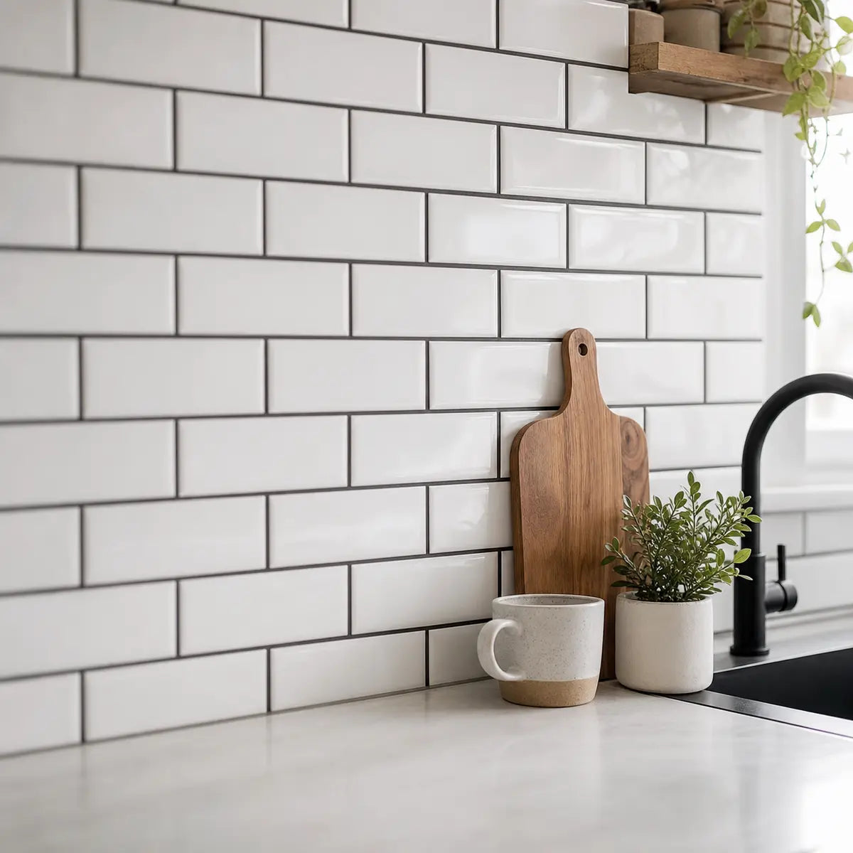
White peel-and-stick tile is a good candidate when cabinets, counters, or flooring already carry the personality. A white subway-style layout can give a busy quartz countertop a simpler neighbor. Beside wood cabinets, it can separate the wall from the cabinetry without introducing a competing hue.
Do not choose “white” without checking its undertone. A cool, bright tile can make cream cabinets look more yellow by comparison. An almond or warm white may sit more comfortably beside those cabinets but appear less crisp against a cool gray counter. Hold the sample where the tile will actually go; a small online image will not settle that relationship.

White also isn’t one visual outcome. White tile with low-contrast grout-look lines reads more continuous. White tile with dark lines draws attention to every tile edge and makes the layout more graphic. If that’s the effect you want, compare it with the room’s existing dark details rather than assuming dark grout automatically looks more realistic.
Black: definition, with a lighting obligation
Black peel-and-stick tile is most convincing as a deliberate contrast. White cabinets and a light counter give it clear boundaries; black hardware or a dark faucet can repeat the color elsewhere in the room. A deep tile against dark cabinets and dark counters needs a different plan: light-colored surrounding surfaces, a smaller area of coverage, or lighting that makes the work surface usable and the tile pattern visible.
Black does not automatically shrink a room. Nor does a glossy black sample automatically brighten it. The amount of wall covered, nearby light surfaces, sheen, and fixture placement all affect what you see. In a compact space, test the sample across the width of the proposed backsplash rather than judging a single square in your hand.

For a less solid-looking dark option, compare black tile with black-and-white peel-and-stick tile ideas. A two-color pattern can carry contrast while keeping some lighter area in the backsplash. The tradeoff is activity: if your quartz already has strong veining, a black-and-white pattern may compete with it.
Which tile color fits a kitchen, bathroom, powder room, or laundry room?
Start with the room’s finishes and exposure, then choose the tile’s visual role. The same sage sample can be a quiet kitchen backdrop and a prominent powder-room feature. Room names alone do not establish whether an adhesive product is suitable for the wall.
| Room | Useful color starting point | What to inspect before deciding |
|---|---|---|
| Kitchen | Green for warmth; white for a quiet backdrop; black for contrast | Cabinet and countertop pairing, task lighting, grease-prone surfaces, and the product’s stove-area instructions |
| Bathroom outside direct splash zones | White for a restrained look; sage for color; black for a defined accent | Humidity guidance, wall condition, ventilation, and any direct-water exposure |
| Powder room | Any of the three can work as a deliberate feature | Mirror lighting, the amount of wall covered, and how tile meets paint or trim |
| Laundry room | White to keep a utility area visually light; green or black for an accent | Wall moisture, appliances’ placement, substrate condition, and the manufacturer’s permitted uses |
These are design starting points, not product approvals. Confirm placement against the instructions for the tile you buy.
A kitchen backsplash is a pairing decision
In kitchens, the backsplash occupies the narrow but highly visible space between cabinets and counters. That makes its relationship to both surfaces more important than a general rule about room size.
If your countertop is already the feature, start with white or a muted green. If cabinets and counters are quiet, you have more freedom to try emerald, black, or a black-and-white pattern. Take a straight-on photo of the entire wall before deciding. A sample that looks subtle on a desk may read as a broad color band once repeated from counter to upper cabinet.
For a counter that is black, our guide to backsplash ideas for black countertops offers more focused comparisons of light neutrals, muted green, and darker directions.
Bathroom and powder room are not the same installation question
A green peel-and-stick tile bathroom idea can mean a vanity backsplash on a suitable dry wall, a wall exposed to frequent splashes, or the inside of a shower. Those locations are not interchangeable. A manufacturer’s approval for bathroom humidity does not establish approval for direct water contact.
A powder room often offers more freedom to use color as an accent because you can assess a defined vanity wall and its lighting. In a frequently used bathroom, check where water actually lands, what the wall is made of, and whether the specific product allows that placement. Do that before weighing white against green or black. Our peel-and-stick tile planning guide can help organize the wall, edge, moisture, and heat questions.
A laundry room benefits from a restrained plan
Laundry rooms often contain several finishes in a small view: appliance fronts, cabinets, shelves, countertop, and flooring. White can keep those elements from competing with the backsplash. Sage may add color without the sharp contrast of black; black may be effective behind a light counter if the wall is well lit.
The key is to decide whether the tile is a background or a feature. A patterned black-and-white backsplash behind open shelving may make every bottle and basket look busier. A small, uninterrupted wall could handle the same pattern well. As with a bathroom, assess the actual wall and product instructions if moisture is present.
What tile colors go with white, black, wood, gray, and cream cabinets?
Match the backsplash to the relationship you want, not to a rule that every cabinet color has one correct partner. Contrast makes an edge visible; a closer match makes surfaces read as a group. Undertone—the subtle warm, cool, or neutral cast within a color—often explains why two seemingly compatible samples clash.
White cabinets: choose personality, continuity, or contrast
With white cabinets, green gives personality, white gives continuity, and black gives contrast. Green backsplash with white cabinets is especially worth sampling when the kitchen also has wood shelves, butcher block, or warm metal hardware. A muted sage can bridge those features without repeating the cabinet white.
For an all-white direction, compare the cabinet door and tile sample in the same light. If one is creamy and the other icy, the mismatch may be more visible across a full backsplash than it is in a product photo. A deliberate difference in texture or shade can work; an accidental near-match is harder to read as intentional.
Black tile can define white cabinetry beautifully as a design choice, but ask what the countertop is doing. Light, relatively quiet counters give the dark backsplash room. If your counter is dark and heavily patterned, sample a shorter run or a less solid-looking tile before committing to the whole wall.
Black or very dark cabinets: preserve a readable boundary
White tile is a clear starting point with black cabinets because it separates the cabinets from the wall. Sage can create a softer transition, particularly if a wood surface or warmer hardware is also visible. Emerald can be a strong color choice, but compare its actual depth with the cabinet finish under task lighting.
Black tile with black cabinets is possible when you want a continuous dark field. It is less forgiving when you expected the tile pattern to stand out. Look at where the cabinets end and the backsplash begins; if both disappear into one block and that isn’t your intent, try a lighter tile or a more legible grout-look contrast. Our backsplash guide for dark cabinets explores those balance decisions in more detail.
Wood, gray, and cream cabinets: read the undertone first
Wood cabinets introduce variation. A warm wood and butcher-block counter may welcome sage, while a dark green can produce a richer contrast if the other surfaces are light. White gives wood room to lead. Black creates a more defined border; repeat that darkness somewhere else if you want the choice to feel connected to the room.
Gray cabinets need closer inspection than the label suggests. A blue-leaning gray beside a yellow-leaning sage may produce a tension you like—or one that surprises you after installation. Sample both finishes together. White can simplify the scheme, while black can sharpen it when the counter and light provide relief.
Cream cabinets often look best when the tile’s white or green undertone has been chosen deliberately. A warm white may feel cohesive; a cool white may appear especially bright and make the cabinets look warmer. Either can be intentional. For a more detailed comparison, use our color guide to backsplashes for cream cabinets.
The same reasoning applies to hardware. Brass, black, chrome, and brushed finishes are supporting details, not commands to buy a matching tile. Look for a color relationship that repeats somewhere without insisting that every finish be identical.
How should countertop tone change your color choice?
Let a patterned countertop set the level of visual activity. The more movement you see in quartz, marble-look material, or laminate, the more carefully you should assess a strong tile color or graphic grout-look grid.
With a quiet white quartz counter, green, white, and black remain plausible. Green adds color; white preserves a light field; black creates a strong counter-to-wall transition. Check whether the quartz is warm or cool before selecting a near-white tile, especially if the cabinets are also white.
With veined quartz, hold several tile sheets beside the counter rather than one small sample. A pronounced black-and-white tile pattern may interrupt the veining; a calm sage or simpler white layout may let the countertop remain the feature. Conversely, a quiet tile pattern can look lost against strong veining. There is no automatic winner: the useful test is whether your eye can tell which surface should lead.

Butcher block changes the decision because the counter already supplies warm color and visible grain. Sage may connect with that natural character. White may give the wood a clean backdrop. Black may emphasize the counter’s edge. If cabinets are also wood, avoid choosing from a tile-only image; see all three materials together.
Check the sample at the seam where countertop meets wall. That is where differences in undertone, printed grout, and surface finish become easiest to notice. A sample taped higher on the wall may tell you about color but conceal the most important pairing.
Does dark grout make peel-and-stick tile look more real?
No grout-look color guarantees realism. Dark lines on white tile make a clear pattern; light lines on dark tile make each tile shape easier to see. Low-contrast lines give a calmer surface. What looks convincing depends on the product’s material, pattern scale, print or molded detail, sheet joins, and how carefully the edges are finished.
For white tile with dark grout-look lines, inspect where one sheet meets another. A small change in line width or spacing becomes easier to spot in a graphic grid. Dark lines can be an excellent style choice, but they raise the precision demanded of the layout. If you like that direction, our guide to white tile with black grout provides more visual context; check the instructions of the product you select for installation and care.
For black tile with white grout-look lines, look at the wall from across the room. Is the grid supplying welcome definition, or does it compete with cabinet doors, counter veining, and shelving? Black-on-black lines create a quieter field, but they can make an already dark wall look flatter. Neither is inherently more authentic.
Use a Visual Integration Index to inspect the whole wall
The Visual Integration Index is a second article-specific exercise. The Color Fit Score helps you choose a color; this check asks whether the proposed layout appears coherent in your room. It is not a validated measure of realism or a guarantee of a high-end result.
Give each of five checks 0, 1, or 2 points, for a total out of 10. A 2 means you can see a clear, workable solution in your sample layout; a 1 means you need another test or adjustment; a 0 identifies a visible problem. Work through the checks in this order:
- Pattern scale: From the doorway, does the tile size suit the width of the wall and nearby cabinet details?
- Line consistency: When sample sheets meet, do grout-look lines and any repeat pattern appear continuous?
- Edge plan: Do you know how the tile will finish at open ends, corners, the counter, and outlets according to its instructions?
- Cabinet–counter balance: Does the wall support the intended focal point rather than compete with it?
- Lighting support: Can you see the tile’s color and pattern under the lighting you normally use?
Check your sample-sheet layout
Rate the five checks above for the same wall: 0 for a visible problem, 1 for another test or adjustment, and 2 for a clear, workable solution. Add the ratings for a total out of 10. A zero for line consistency or the edge plan calls for a layout revision regardless of the total. This is an inspection aid, not a validated appearance score.
A 0 on line consistency or edge planning is a reason to revise the layout before installation, regardless of the total. A lower score elsewhere can point to a useful change: a quieter pattern, a different shade, a smaller coverage area, or better assessment under the existing lighting. Compare layouts for the same wall; a score of 8 in one home is not an objective improvement over a 7 in another.
The value of this check is practical. It moves you from “I love this tile close up” to “I know what it will look like around the outlet and at the end of the cabinet run.” Those ordinary details often decide whether a finish feels considered.
Can peel-and-stick tile work in kitchens, bathrooms, and rentals?
Sometimes, but suitability is product- and surface-specific. “Peel-and-stick” describes an application method. It does not, by itself, mean waterproof, shower-safe, suitable behind a stove, or removable without damage.
Before choosing by color, read the instructions for the exact product and variant you plan to use. Identify the permitted substrate—the existing wall surface to which the tile attaches—along with preparation requirements and restrictions on heat, humidity, and direct water. A dusty, greasy, textured, damp, or unstable wall is not something a better color choice can fix.
Heat and water limits also vary. One manufacturer’s statement that a particular backsplash product can tolerate bathroom humidity or a specified stove-area condition cannot be transferred to another tile. If instructions exclude direct water contact, do not treat a shower wall as an ordinary bathroom backsplash. If a kitchen installation is near a heat source, check the manufacturer’s placement guidance for that exact location.
Rental-friendly means planning for removal, not assuming it
Renters should seek permission where the lease requires it and ask what the wall must look like at move-out. Even a product described as removable can lift paint if the paint bond to the wall is weak.
In a documented Apartment Therapy renter’s account of installing a white peel-and-stick backsplash, the installer liked the finished kitchen but reported that lifting and readjusting some sheets removed paint. That is one household’s experience with one product and wall, not a measured damage rate or a prediction for your rental. It does show why “removable” and “damage-free” are different claims.
For a rental, treat reversibility as a separate go-or-no-go question. Review the current product’s removal directions, ask about the existing paint or wall finish if you can, and consider whether you could repair the surface if removal exposes a problem. If those answers are uncertain, leave the rental factor unscored in the Color Fit exercise and resolve it before ordering a wall’s worth of tile.
Which small-space tile idea is the better fit?
White subway-style tile is a sensible first sample when the room already feels crowded; black or black-and-white tile can work when you want a focal point and can see it clearly in the room’s light. Size alone cannot decide the color.
In a compact kitchen, count the visually strong elements before choosing. Dark cabinets, a veined counter, patterned flooring, and open shelves may already be doing plenty. A simpler white tile or muted green might let the space settle. With flat-front white cabinets and a quiet counter, the same small kitchen may have room for a crisp black backsplash.
Black-and-white peel-and-stick tile ideas offer a third route. They can repeat black hardware while retaining lighter areas, but a strong repeating pattern draws attention to joins and cut edges. Try a few sample sheets arranged as they would be installed. Stand at the doorway, then at the sink. Those two views often tell different stories.

In a small bathroom, separate the visual question from the exposure question. A white vanity backsplash may keep the area light; sage may add a gentle accent; black may frame a mirror and basin. None is appropriate in a location the product does not permit. Confirm the wall first, then compare the colors.
A narrow laundry room calls for a similar decision. If appliances and shelves create a busy view, use tile to simplify it. If the room is plain and adequately lit, a dark or green accent can give it a more deliberate finish. There is no need to cover every available wall for the color to register.
How can you make the final color choice with confidence?
Test the tile as part of a wall, not as an isolated square. Your best choice is the one that still makes sense beside the cabinets and countertop, in normal light, with a credible plan for the product’s edges and permitted placement.
A short decision sequence keeps the process manageable:
- Confirm the location. Check the exact product instructions against the wall surface, moisture or heat exposure, and any rental restrictions.
- Name the tile’s job. Do you want softness, a quieter light-colored backdrop, or a defined focal point? Use green, white, and black as starting directions, not fixed rankings.
- Narrow to actual shades. Compare sage with dark or emerald green if green interests you; compare warm and cool whites; compare solid-looking black with a black-and-white layout.
- Score the samples in the room. Use the Color Fit factors under daytime and evening lighting. Investigate a weak factor instead of trusting the total alone.
- Lay out several sheets. Use the Visual Integration checks to inspect scale, line joins, outlets, and open edges before you install.
- Keep the sample beside the counter. That junction is where cabinet, tile, countertop, and grout-look contrast must work together.
For design exploration before you narrow the samples, browse our tile design ideas by visual role and room. If a lighter subway-style direction is winning, the Almond White Subway Marble peel-and-stick tile listing is one specific option to inspect. Check its current color, sample, and placement instructions rather than assuming it suits every white cabinet or bathroom wall.
Validated destinations here do not include dedicated green, black, bathroom, or renter-friendly collections. Don’t substitute a vaguely related product for the color you chose. Use your winning shade, room, and cabinet pairing to guide the next search, and confirm the exact item before purchase.
Frequently Asked Questions
Is sage green peel-and-stick tile better than emerald green for a kitchen?
Neither is inherently better. Sage is the easier first sample when you want muted color beside white or warm wood; emerald asks to be treated more deliberately as a feature. Compare each actual sample with the counter and cabinet finish under the kitchen’s normal lighting. A shade that works in a photo may have a different undertone in your room.
What peel-and-stick tile looks good with white cabinets and butcher block?
Sage green is worth trying for a softer, color-led look; white is worth trying if you want the wood to lead; black is worth trying if you want a sharper counter-to-wall boundary. The right answer depends on the cabinet white, wood tone, wall lighting, and how much backsplash you plan to cover. Put samples directly above the butcher block before deciding.
Should I choose white tile with dark grout-look lines for a small bathroom?
Choose it if you want a visible, graphic tile pattern and the sheet joins look consistent in a sample layout. For a quieter wall, compare white tile with lower-contrast lines. Neither choice overrides the product’s bathroom-placement instructions, especially near direct splashes.
Will peel-and-stick tile damage rental walls?
It can. Removal depends on the product, the wall coating beneath it, and the removal method. A published renter’s account reported paint lifting during readjustment, so do not treat a removable label as a deposit guarantee. Check your lease and the specific product directions before installing.
How many color samples should I compare?
Compare enough to distinguish the choices that genuinely interest you: for example, a warm white, a sage, and a dark option. There is no ideal research-backed number. What matters is seeing the samples together with your cabinet and counter, then assessing them in the lighting you actually live with.
Choose the tile that belongs in your room
The strongest peel-and-stick tile color choice is not the trendiest image on your feed. It is the eligible product and shade that fits your surfaces, your lighting, and the role you want the backsplash to play. Green can soften, white can keep a room visually light, and black can define it—provided the particular sample works with what is already there.
Use the Color Fit Score to compare shades, then use the Visual Integration check to test the proposed wall. If the lighter direction wins, inspect the linked subway-style option. If green or black wins, carry your shade, cabinet pairing, and room requirements into your product search rather than settling for an unverified substitute. The final decision should feel clear when the sample meets the countertop, not just when it fills your screen.



Lämna en kommentar
Denna webbplats är skyddad av hCaptcha och hCaptchas integritetspolicy . Användarvillkor gäller.