




















Affordable designer-inspired decor works best when you borrow a clear design idea rather than imitate a price tag. Start with what the room needs, identify the colors, shapes and textures you like, and choose a small number of compatible changes. Measure before buying and include installation, maintenance and eventual removal in the budget. A coherent room does not require every object to be new or expensive.
Explore this guide
A beautiful room can be assembled from ordinary materials, inherited objects and carefully chosen purchases. The difficult part is deciding what belongs together. Buying several inexpensive statement pieces can cost more than solving one specific problem, particularly when the pieces compete for space or cannot be used as intended. This guide offers a practical way to translate inspiration into a room that fits your home and the way you live.
The examples are design exercises, not customer case studies, measured resale results or a prediction of future trends. Prices used in calculations are hypothetical. Use actual dimensions, quotations and product instructions for your project, and distinguish an aesthetic preference from a claim about durability, health or financial return.
Give the room a job before giving it a style label
Write down the activities that happen in the room and the things that currently get in their way. A living room might need a better reading spot, a clear route to the balcony or somewhere to put a drink. An entryway might need a landing place for keys rather than another decorative object. A style decision becomes easier once it serves an identifiable purpose.
Keep the list concrete. Replace make it luxurious with a description such as a quieter background behind the sofa, a lamp that reaches the reading chair or a wall finish that is easier to maintain. Those descriptions help you judge a purchase after the initial excitement fades. They also reveal when moving an existing item is more useful than buying a new one.
Photograph the room from its normal entrances and working positions. Look for blocked paths, awkward gaps, competing focal points and objects that never seem to have a place. Do not treat the photograph as a perfect color reference; use it to understand arrangement and scale. Then spend time in the room without the camera and check whether the same issues matter during ordinary use.
Choose one or two priorities for the first stage. Improving lighting, storage and wall finish simultaneously can make it hard to know which decision caused a problem. A smaller, coherent change is easier to evaluate and reverse. Keep the remaining ideas on a list rather than forcing the whole mood board into one shopping trip.
Read an inspiration image as a set of choices
Look beyond the named designer or retailer. Identify the room's dominant shape, color relationship, surface texture, pattern scale and empty space. A photograph may rely on a large plain wall, one sculptural lamp and restrained accessories. Buying only the accessories misses the arrangement that made the image appealing.
Describe the ingredients in ordinary terms. A rounded silhouette, dark thin frame, warm textile and muted wall are more useful search criteria than expensive-looking. They let you compare unrelated products without needing a direct copy. Avoid counterfeit labels or objects advertised as authentic when they are not; an original interpretation can be attractive without pretending to be something else.
Notice what the image leaves out. A styled kitchen may have no drying rack, a bedroom no laundry basket and a desk no cables. Your room still needs those functions. Adapt the design to them rather than removing necessities for a photograph and letting the room become inconvenient afterward.
Light also changes the image. A sunlit studio can make a finish look different from the same finish under a small evening lamp. Save several references showing the material in different settings, then compare an actual sample in your room. The goal is to understand a visual relationship, not reproduce a photograph pixel for pixel.

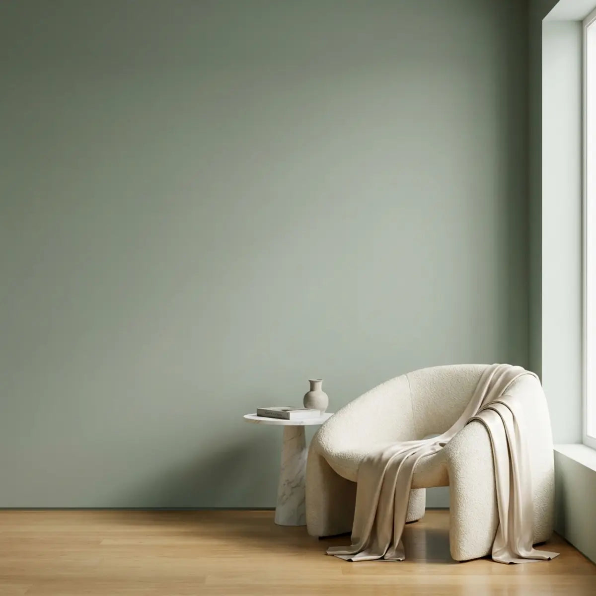
Texture and color inspiration; no tested durability or designer-brand claim is implied.
Edit what you already own before adding another layer
Group current objects by purpose and visual character. Keep useful items easy to reach, identify pieces with personal meaning and set aside things that do not support the room's current use. You do not have to discard them. Moving an item to another room or storing a rotating collection can reduce competition without creating waste.
Try a temporary arrangement with existing furniture before purchasing a replacement. Check door swings, walking routes and the space needed to pull out a chair. Mark a proposed furniture footprint on the floor using a method suitable for that surface. The rectangle in a listing is not enough; height and surrounding clearance also affect how the object works.
Leave some surfaces unfilled. Empty space can give a valued object a clear setting and make cleaning simpler. This is a design preference rather than a universal minimalist rule. A dense collection can also work when it has a deliberate grouping and remains accessible, but accumulation alone is not a substitute for composition.
Review the result after ordinary use. A tray that looks tidy but is too small for the items placed on it will not remain helpful. A lamp moved for visual balance must still illuminate the task. Keep the changes that work and revise those that only improved the photograph.
Build a palette from fixed materials and one flexible accent
Start with the elements you are not replacing: flooring, cabinetry, a large sofa or a valued rug. Compare their warm and cool tendencies in the actual room. A neutral is not automatically compatible with every other neutral. Two whites or grays can look different when placed side by side, especially as the light changes.
Choose a background, a supporting tone and an accent as an organizing method, not a strict percentage formula. The visible area matters more than the number of items. One large curtain can have more influence than several small accessories. Lay samples together and decide which should lead before ordering the full quantity.
A sample set can include an existing fabric, a wall-finish sample and one small accent object. View them in daylight and under the lighting you normally use at night. The US Department of Energy distinguishes light appearance from color rendition; matching nominal lamp color temperatures does not make all materials look identical. Read the color-and-spectrum overview.
Do not make a health promise from a color choice. A shade can feel personally pleasant without being a treatment for stress or a guaranteed productivity aid. Ask the people using the room what they prefer, especially where glare, contrast or visual sensitivity affects their experience. A shared preference is a better basis than an unsupported color-psychology slogan.
Use scale and placement to make modest pieces look intentional
A small object can disappear on a large wall, while an oversized piece can crowd a short passage. Sketch the main dimensions before shopping. For wall decor, compare the proposed width and height with the furniture below and the surrounding openings. There is no single correct fraction for every room, but a paper outline can reveal an obvious mismatch.
Group small objects when a larger visual field is needed. Use a common alignment, material relationship or theme to make the group readable. Avoid relying on identical spacing rules where switches, doors or furniture interrupt the composition. Check the arrangement from the position where people will normally see it.
Balance does not require symmetry. A tall lamp on one side may be balanced by a lower group on the other, but their practical uses still matter. Try the arrangement with the lights on and the room occupied. A composition that blocks a useful surface or forces someone to lean around an object is not improved by looking balanced from the doorway.
For renters, keep mounting permission separate from the visual layout. The weight of a frame or shelf must be supported by an appropriate attachment, not a decorative wall covering. A removable product label does not guarantee no paint damage. Plan how the wall will be restored before selecting a mounting method.
Compare materials by their actual construction
A material name often describes only the visible layer. Solid wood, wood veneer over a core, printed laminate and wood-look plastic are different constructions. A veneer is not inherently inferior, and a solid material is not automatically suitable for every room. Ask what the item is made from, how it is supported and which care method it accepts.
Look at edges, joints and the underside where available. These details can reveal how a piece is assembled and whether a finish continues around visible surfaces. They also help you anticipate cleaning and repair. A beautiful front photograph may not show a raw edge that will be prominent in your room.
For a decorative wall, distinguish a printed pattern from physical relief and identify whether the product is intended for that location. A stone-like face does not make a panel masonry, a waterproof face does not establish a waterproof wall assembly, and thickness alone does not establish acoustic or thermal performance. Compare documented properties rather than visual analogies.
The same care applies to sustainability claims. Reusing an item can reduce the need for a new purchase, but natural, recycled or low-emission labels answer different questions. Request the relevant product information and avoid turning one certification into a claim that an item is universally harmless, recyclable or longer-lasting.
Use textiles thoughtfully, especially when they are valuable
A fabric panel, scarf or embroidery can bring color and texture into a room without a large furniture purchase. First decide whether the textile is an ordinary replaceable material or something valuable, fragile or sentimental. The right display method depends on that distinction. Do not test an improvised glue or spray on a piece you cannot replace.
The Canadian Conservation Institute's guidance on framing flat textiles emphasizes suitable support and conservation methods rather than gluing or taping the object directly to a board. It also recommends specialist help for conditions such as fragility, staining or unstable dyes. Museum guidance is not a shortcut recipe for every home project, but it makes the importance of reversible, compatible support clear. CCI textile framing guidance. When comparing finishes, browse Stickwoll peel-and-stick tiles and review the product details for your surface and room.
For ordinary new fabric, obtain the care instructions and consider whether washing, cutting or display will change it. Check the fabric's behavior before committing to a finished size. Keep seams, support and the frame's depth in the plan. A fabric that hangs well as a curtain may not remain flat in a frame without a suitable method.
Choose the display location with light and use in mind. Avoid putting a valued textile where direct sunlight, cooking residue or recurring dampness will create a new conservation problem. A frame's appearance is only one part of the decision. Keep the textile's history and any mounting information with it so a future change does not depend on guesswork.

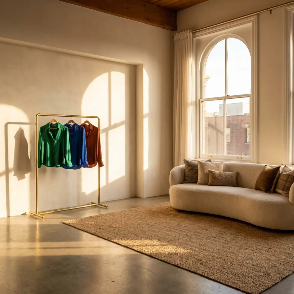
Shape and lighting inspiration, not a named designer product or an authenticity claim.
Make a budget that includes the whole change
List the item, delivery, taxes, preparation, mounting or installation supplies and any paid help. Include a small allowance for the parts that are not yet known, but label it as an allowance rather than a confirmed price. An inexpensive object can become a poor choice if it requires an unexpected repair or a mounting system outside the permitted scope.
For a hypothetical 300-unit room-refresh budget, you might set aside 120 for the main piece, 60 for lighting or a shade, 45 for textiles, 25 for preparation and 50 as an uncommitted reserve. The total is 300. These are planning allocations, not market prices or a recommendation that every room needs those purchases. Change the categories to match the room's actual priorities.
Compare cost per useful outcome rather than cost per object. A new lamp that improves an existing reading corner may solve more than several accessories. A replacement cover may refresh a sound cushion, while a damaged insert may need attention first. The smallest unit price is not always the smallest project cost.
Keep a short list of no-purchase alternatives beside the shopping list. Moving art, changing the arrangement, repairing a serviceable item or using a textile already owned can preserve money for a more important improvement. Set a stopping point before shopping so each attractive item does not expand the project.
Buy secondhand with a condition check, not just a style match
Measure the item and the route into the room before committing. Check whether it fits through doors and can be moved safely. Ask about missing components, repairs and any damage visible in the listing. A useful bargain remains useful after transport and preparation, not only while it looks appealing online.
Inspect joints, stability, drawer movement and surfaces where accessible. For electrical items, do not assume a decorative lamp is safe merely because it turns on. Obtain suitable inspection or repair when its condition is uncertain. A design project should not become an improvised electrical repair.
For upholstered objects, consider cleaning requirements and whether the condition can be assessed adequately. Odor, moisture history and concealed damage are not resolved by a fashionable fabric. Decide in advance which issues you are willing and qualified to address. A low purchase price does not make an uncertain restoration project inexpensive.
Allow different eras and materials to coexist deliberately. Repeating one color or shape can connect a secondhand piece with a newer room without making everything match. Keep that connection limited enough that the individual object still has character. The aim is a coherent collection, not a disguised set of reproductions.
Choose small projects with a clear beginning and end
A reading corner
Start with the chair you already use and identify what is missing: suitable light, a small surface or a place for a book. Measure the reach and walking space before selecting accessories. A fabric or wall accent can support the corner after the practical pieces are resolved. Avoid adding objects to the chair's working area simply to make the composition look fuller.
An entryway landing place
List what comes through the door each day and decide where it should go. A small tray can work for keys, but bags and shoes may need a separate arrangement. Keep the door swing and route clear. A mirror, artwork or decorative finish can then define the area without carrying the storage function by itself.
A kitchen feature area
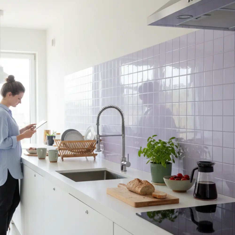
Choose an eligible wall section after considering the sink, appliances and normal cleaning. A dry decorative return may allow more options than an area receiving direct steam or repeated water. Plan the finish and its edge before ordering. Do not use a decorative product as a heat shield or assume a grout-free surface makes every joint waterproof.
A bedroom backdrop
Decide whether the backdrop should provide a quiet field, a strong pattern or a relationship with existing bedding. Check the view with lamps on as well as in daylight. A wall finish is not a structural headboard or an acoustic treatment unless its documented use establishes those functions. Keep the design goal visual and select any functional headboard separately.

A small grouping illustrates scale and negative space.
Build a sample arrangement before making an irreversible change
Use paper outlines, small finish samples and existing objects to test the proposed relationship. Keep temporary mounting compatible with the surface and avoid relying on an adhesive sample to hold a heavy object. A mockup should be easy to remove and should not create the very wall damage the project hopes to avoid.
Photograph the mockup from the normal viewing positions, then assess it directly in the room. The photograph is helpful for arrangement but not definitive for sheen or color. Check whether the pattern overwhelms nearby objects, whether edges land in awkward places and whether the proposed size still leaves practical space.
Change one significant feature at a time. Compare a quieter color while keeping size constant, or a different scale while keeping the palette constant. This makes the decision easier to understand. Replacing every element between comparisons can leave you with a preference but no idea which feature produced it.
For an adhesive finish, distinguish appearance testing from installation testing. A loose sample can help judge the look. A permitted concealed adhesion and removal sample addresses a different question and still cannot guarantee years of service or damage-free removal. Use each exercise for the information it can actually provide.
Read descriptions and reviews without borrowing unsupported promises
Look for dimensions, material construction, intended use and care instructions before relying on adjectives. A review can describe someone's experience, but it may involve a different room, surface or product version. Treat a photograph as useful context, not proof of the hidden adhesive, load capacity or future lifespan.
Ask a focused question when information is missing. Instead of asking whether a finish is premium, describe the wall and cleaning conditions and ask whether the exact product is intended for them. Instead of asking whether an object is designer quality, ask about materials, joints, finish and repairability. Specific answers make comparisons possible.
Keep a record of the product version and the information relied on when buying. Save the installation and care instructions with the receipt. This is especially useful when several similar designs or names are sold through the same collection. An attractive product title should not become an assumed technical specification.
Within Stickwoll, use the wall-tile planning guide to narrow the suitable locations before comparing patterns. The finish and lighting guide can help with sheen choices, while the pattern-direction guide addresses layout. These are related decisions, not reasons to buy a product before checking its use.
Make maintenance part of the design
A room should remain manageable after the styling session ends. Leave enough space to wipe surfaces, reach switches and move commonly used items. An arrangement that requires dismantling a collection every week may be unsuitable for the household even if each object is individually affordable.
Use the care method for each material rather than one universal spray. A textile, painted frame, natural stone and decorative wall tile can have different requirements. Keep the relevant instructions together and avoid experimenting with harsh cleaners on an irreplaceable piece. Check an ordinary sample where the supplier permits it.
Decide which changes can be refreshed seasonally without waste. Rotating a small group of accessories or changing a removable textile cover may be more practical than replacing a full feature wall whenever tastes shift. Keep unused pieces protected and labeled so they remain usable rather than becoming an untraceable pile.
Review the room after several weeks of actual use. Notice what has migrated, what is difficult to clean and what never gets used. That feedback can guide the next small improvement. There is no need to declare the first arrangement a failure or buy a complete replacement scheme because one element needs adjustment.

Room-planning inspiration, not a documented customer result or budget.
Common questions about an affordable designer-inspired room
Do all the finishes need to match?
No. A room can combine different materials and periods when they share a deliberate relationship. Repeat a limited color, shape or texture where it helps, and leave some contrast. Matching every finish can be less useful than choosing each item for its role and checking the overall balance.
Is an expensive statement piece always worth buying first?
Not necessarily. Resolve the practical problem and the available space first. A statement piece may be worthwhile when it anchors the room and fits the budget, but a better layout or lighting change might address the main need more directly. The price is not a measure of fit.
Can I frame a scarf with glue or double-sided tape?
Do not use an improvised adhesive on a valuable or sentimental textile. Compatible support and conservation methods matter, and fragile or unstable material may need a textile conservator. For ordinary replaceable fabric, choose a method appropriate to its condition and intended display rather than assuming a generic acid-free label makes every adhesive suitable.
How can renters avoid an overly permanent project?
Check permission, product use and removal requirements before installation. Keep pre-existing wall photos and plan possible restoration. Removable does not mean guaranteed damage-free, and a decorative finish cannot substitute for suitable structural attachments. Smaller approved areas can be easier to manage than a full-room change.
What makes a modest room feel coherent?
A clear purpose, appropriate scale, usable lighting and a limited set of relationships usually provide a more useful starting point than a long shopping list. Keep what works, test changes in the real room and leave unsupported luxury or wellbeing promises out of the decision.
Keep a one-page design card for the purchase
Write the room priority at the top, followed by the measured space, fixed colors and maximum total budget. Attach the accepted sample references and list what is deliberately not being changed. This makes it easier to resist a purchase that looks attractive in isolation but does not fit the plan.
For each shortlisted object, record the dimensions, material construction, care method and any unresolved mounting or delivery question. Mark whether a value came from a supplier document, your measurement or an estimate. A clear distinction prevents a guessed dimension from becoming a costly ordering mistake.
Use the card when comparing alternatives. If a preferred object becomes unavailable, check the replacement against the same role rather than only the same color. A deeper shelf, shinier finish or heavier frame may change the practical requirements even when it looks similar online.
After the room is arranged, update the card with what was actually bought and where spare material is stored. Keep the unsuccessful options only as reference, not as a reason to keep spending. The document is a small practical aid to a coherent room, not a score of its luxury or a prediction of its value.
Sources and scope
- Canadian Conservation Institute: Conservation Framing of Embroideries and Other Flat Textiles — Support, conservation and display; not permission to glue a valuable textile.
- US Department of Energy: Color and Spectrum — CCT and color rendition differ; nominally similar light sources can differ spectrally.



Leave a comment
This site is protected by hCaptcha and the hCaptcha Privacy Policy and Terms of Service apply.