




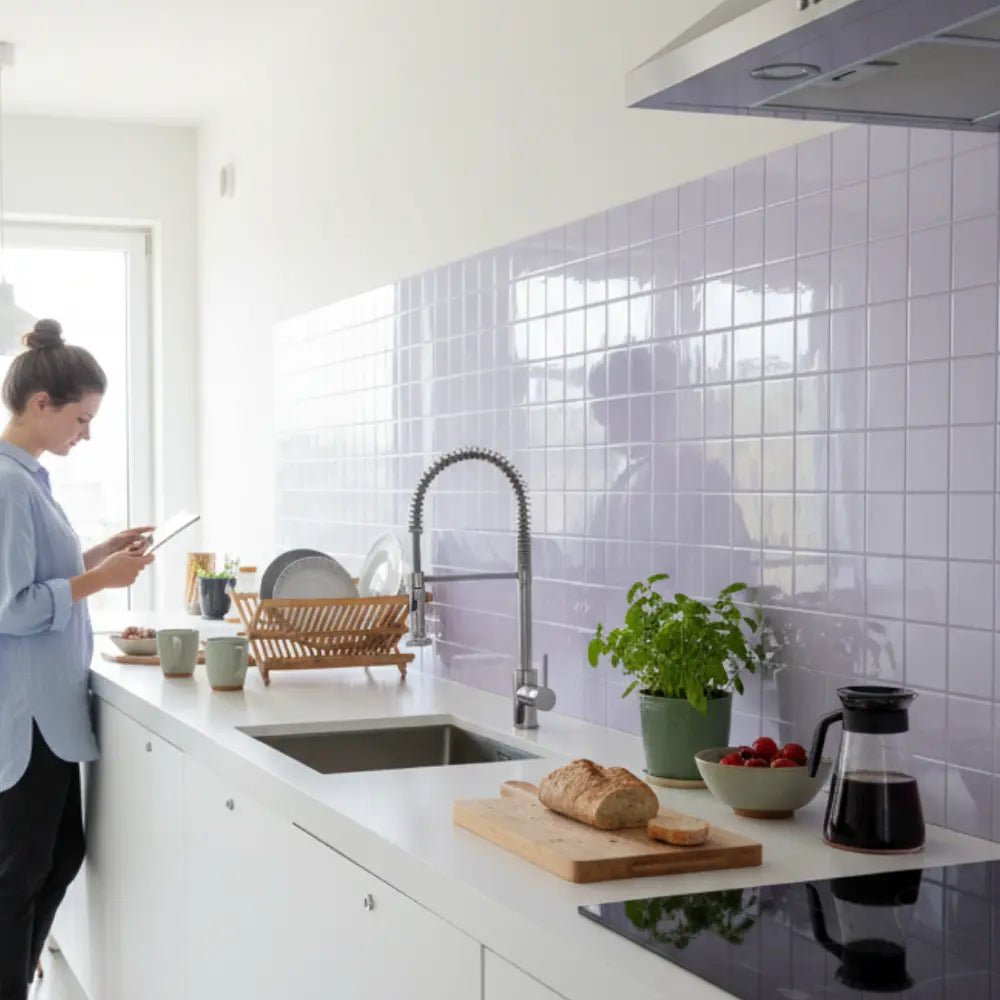
















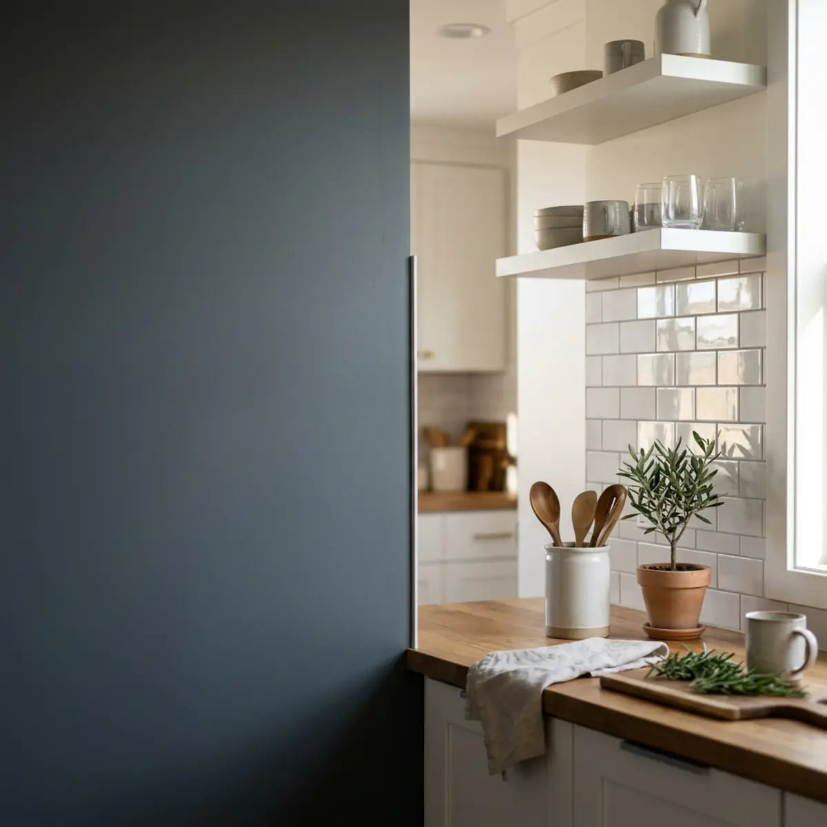
Choose a matte, satin or glossy peel-and-stick backsplash by viewing the actual sample under your kitchen's lighting and testing its permitted cleaning routine. Matte often reduces sharp reflections, while gloss emphasizes highlights and reflected images. Neither finish determines the tile's color reflectance, waterproofing, scratch resistance or suitability beside an appliance. There is no universal winner for every kitchen.
Explore this guide
The disappointing choice is usually not simply a glossy tile or a matte tile. It is a finish chosen from an isolated photograph without checking the window, worktop, lamps, viewing positions and cleaning expectations around it. A glossy tile can be beautiful where reflections are comfortable. A pale matte tile can look bright rather than gloomy. A satin finish can be a good compromise, but the label alone does not tell you how a particular product will behave.
This guide separates the properties that are often combined into one marketing promise. It offers a repeatable sample comparison, layout and lighting questions, maintenance checks and example decisions. It does not report a Stickwoll glare experiment or assign invented glare-control, mess-visibility or comfort scores to broad finish categories.
Separate sheen, color, relief and overall reflectance
Sheen describes one part of a surface's appearance: how light is reflected toward particular viewing directions. Color and total visible reflectance are different. A dark glossy surface may form a sharp reflection while a light matte surface returns substantial diffuse light. It is therefore incorrect to assign every matte tile a low light reflectance value and every glossy tile a high one.
Physical relief adds another property. A beveled glossy tile contains several differently oriented faces. An embossed matte tile has raised and recessed areas. Those shapes can make highlights and shadows change as you move, even when the finish category stays the same. The depth of the pattern and the gloss of its face should be evaluated separately.
Transparency, haze and the clarity of reflected images can also affect what you see. Two products called gloss may not look equally mirror-like. Two products called matte may have different textures and highlight behavior. Ask for a sample rather than treating the name as a precise measurement shared by every manufacturer.
| Property | Useful question | Does not independently establish |
|---|---|---|
| Color and reflectance | How light or dark is the actual sample beside nearby surfaces? | The sharpness of reflections |
| Specular gloss | How strongly does it show highlights from a particular direction? | Overall room brightness or energy use |
| Surface relief | Where are the raised faces, grooves and beveled edges? | Cleanability or acoustic performance |
| Pattern contrast | How clearly do veins, colors and faux joints stand out? | The adhesive's performance |
| Care requirements | Which cleaner, tool and method are permitted? | How noticeable every fingerprint will be |
Paint manufacturers such as Benjamin Moore discuss color reflectance and finish as distinct considerations. That is a helpful distinction for comparing a kitchen palette, not a source of LRV figures for Stickwoll products. Use a published value only when it belongs to the exact product and measurement being discussed.
What a gloss measurement can tell you
ASTM D523's published scope covers specular-gloss measurements of nonmetallic specimens using defined 20°, 60° and 85° geometries. It also notes that other appearance characteristics, including texture and reflection haze, can matter. This is not the same measurement as LRV and not a test of whether a kitchen user experiences discomfort.
If a supplier provides gloss data, ask which method, geometry and product version were used. A number without those details can be difficult to compare. Do not compare one surface measured at one geometry with another measured differently as though the figures form a universal ranking.
A household sample comparison can still be useful without a gloss meter. You can record whether individual lamp points are visible, whether the reflection obscures the pattern and whether you find it distracting from normal positions. Call those observations or preferences rather than standards-compliant results.
Keep product performance claims separate. A measured sheen does not establish scratch resistance, chemical compatibility or a service life. An attractive matte sample can still have an unsuitable backing for the wall. A glossy product can still be appropriate for a permitted application. First confirm intended use, then compare the appearance of the eligible options.

Map the light that actually reaches the backsplash
List the window, overhead fixtures, under-cabinet lighting, lamps and reflective surfaces near the proposed tile. Record which are used during breakfast, food preparation and evening cleanup. The relevant times are those that reflect your routine, not a mandatory eight-in-the-morning or eight-at-night schedule.
Look for the direction of the light as well as how bright the room seems. A small exposed source close to a reflective surface can appear as a distinct highlight. A broader or diffused source may make a different reflection. A shiny worktop or nearby metal appliance can contribute another reflected view, so judge the wall in its real surroundings.
Check normal viewing positions. Stand where you prepare food, sit where you eat and look from the entrance. People of different heights may see different reflections. A sample that looks comfortable when held at chest height may not represent the reflection above the counter once installed.
Do not infer the entire lighting situation from the orientation of a window. Weather, season, curtains and nearby buildings affect the actual light. Likewise, not all under-cabinet LEDs produce the same pattern. The fixture's diffuser, placement and optics matter. Record the setup you have instead of declaring all LED kitchens unsuitable for gloss.
A useful sketch marks the proposed tile, the light sources and the viewing positions that matter to your household. This simple map can explain a problem more effectively than a photo taken from the most flattering angle. It also helps a lighting professional understand what you are trying to improve.
Compare samples without changing several variables at once
Where possible, compare samples with similar color, scale and relief but different sheen. Comparing a black glossy tile with a white matte tile changes more than the finish. The result may still tell you which complete product you prefer, but it does not isolate the effect of gloss.
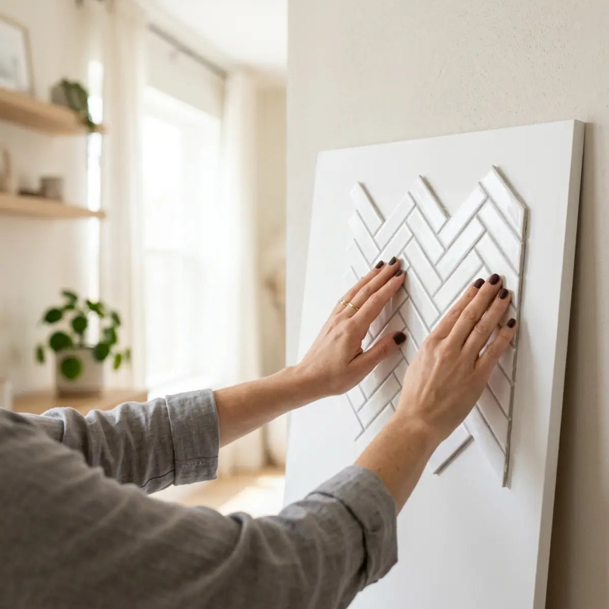
Hold or temporarily display samples using a method that does not damage the wall, contaminate the adhesive or conflict with the product's instructions. Keep the release liner on unless an approved adhesion sample is being undertaken. A visual comparison and an adhesion check are different activities.
Place the sample in the intended plane and near the actual countertop and cabinetry. Step back to the normal viewing position, then inspect from close range. Compare both the whole composition and the local reflections. A single tiny swatch may not show a repeated pattern or the combined effect of several shiny faces, so consider a larger permitted mock-up before committing to a broad wall.
Repeat the observation during normal lighting conditions you actually use. Keep a note of the source, position and what you noticed. A phone photograph can help recall the arrangement, but automatic exposure and reflections may differ from direct viewing. Use the photograph as documentation, not as a calibrated light measurement.
| Observation | Record in plain language | Avoid |
|---|---|---|
| Task-light reflection | Individual points visible, broad band, subtle highlight or no distracting reflection | A made-up numerical glare score |
| Pattern legibility | Veining remains visible or is washed out from a particular position | Calling one photograph a universal result |
| Color relationship | How the sample looks beside the actual countertop and paint | Assuming two products with the same color name match |
| Personal comfort | Who viewed it, from where, and what felt distracting | Guaranteeing comfort for every user |
| Cleaning observation | Whether the allowed method removes ordinary residue and leaves a film | Confusing hidden dirt with easy removal |
Matte finishes: useful strengths and real limits
A matte finish is worth comparing when sharp reflections are the main concern. It may make a surface read as a quieter field instead of a sequence of bright highlights. In a room with reflective appliances, polished counters or strong task lights, that can be a useful visual contrast.
Matte is not a promise of zero glare, however. Surface orientation, illumination and the viewer still matter. A very pale wall can feel uncomfortably bright in some circumstances even without a mirror-like reflection. If visual sensitivity is important, the actual user should be involved in choosing the finish and lighting arrangement.
Do not assume a matte coating is porous, acoustically absorbent or easy to scratch simply because it scatters light. Those are separate properties that require product information. Similarly, a matte face does not hide all wall defects. A raised ridge, open seam or damaged edge can remain conspicuous under side lighting.
Some matte patterns make everyday marks less obvious; others show oily touches or uneven cleaning as darker or shinier patches. Test the care routine the product permits. The relevant question is whether you like the appearance between cleanings and can restore it using an accepted method, not whether the word matte sounds low-maintenance.
A matte sample that looks good and suits the room can be a confident design choice without being described as scientifically superior to every glossy alternative. Keep the decision specific: this finish, in this room, under these lights, for these users.
Glossy finishes: highlights are a design feature, not an automatic defect
Gloss can add a deliberate sense of polish and make the reflected light part of the design. On a glass-like or glazed-ceramic-inspired product, that may support the intended appearance rather than make the material look fake. The key is whether the reflections remain comfortable and suit the surrounding surfaces.
A glossy backsplash does not create light where none exists. It redirects available light in a way that can look bright from some positions and comparatively dark from others. Do not promise that adding gloss will increase the room's useful task lighting or reduce the need for fixtures.
Glossy surfaces can make some streaks, fingerprints and scratches conspicuous, but the effect also depends on color, pattern and lighting. A strongly patterned glossy tile may disguise a mark differently from a plain dark glossy sheet. The surface's ability to be cleaned is another question again.
Inspect edges and relief. A beveled glossy format may show a series of highlights that you enjoy, while a flat glossy format may show a more continuous reflected image. Neither is automatically more realistic or more durable. Compare the complete look rather than treating every gloss product as a mirror.
If you already own a glossy backsplash, a lighting assessment may be more useful than immediate replacement. Changes to source position, shielding, diffusion or output can affect the reflection. Follow the fixture's instructions and use suitable electrical help for modifications; do not improvise a cover that traps heat or interferes with the fixture.

Satin and textured finishes are not one standardized middle category
Satin, eggshell, soft sheen and similar labels describe a range of appearances rather than one identical construction across manufacturers. A satin product can be a useful candidate, but inspect it in the same way as the other samples. Do not assume it always has a particular gloss value or light-reflectance percentage.
Texture can break a reflected image into smaller highlights or create shadows under side lighting. That may make a wall feel more dimensional, but it can also emphasize seams or irregularities. A strong relief pattern can be attractive from the entrance and busier from the nearby worktop. Look at both distances.
A textured face may require attention in its recesses during cleaning. That does not mean every textured product needs stronger chemistry or greater scrubbing force. Check the actual coating and permitted tools. Surface texture and material compatibility should not be collapsed into a single claim about hygiene.
Use a sample to decide what kind of texture you want. A subtle handmade effect, a geometric bevel and a deep brick relief create different patterns of light. Choose the effect for the room rather than searching for the thickest sample as a proxy for quality.
Adjust lighting thoughtfully instead of chasing one perfect finish
When a sample produces an unwanted reflection, identify the source and viewing position first. Temporarily changing your own position or switching an existing light on and off can help identify the contribution. That does not require touching electrical components or permanently altering the room.
If the reflection comes from visible lamp points, a correctly designed diffused fixture or a permitted optical accessory may change its appearance. A diffuser is not an automatic cure, and its effect depends on the product and installation. Follow the manufacturer's thermal, electrical and mounting requirements rather than attaching arbitrary material over a light.
Dimming changes output and may make a reflection less bothersome, even though it does not change every geometric feature of the reflected source. Do not declare dimming useless or guarantee it will solve the problem. Compare comfortable task visibility and reflection together so reducing one nuisance does not make food preparation difficult.
Color temperature is different from brightness and source size. Replacing a cool-white lamp with a warmer one may change how the palette appears, but it does not automatically remove glare. A very bright warm source can still be distracting. Avoid prescribing one Kelvin value as a universal treatment for a glossy wall.
For lighting that needs substantial change, describe your observations to an appropriate professional. Include the fixture models, positions and the people who use the counter. This gives the discussion a practical objective rather than asking whether all glossy tiles should be avoided.
Consider visual comfort and accessibility separately from fashion
A finish that is fashionable may not suit every person who uses the room. Glare, low contrast and busy patterns can be more difficult for some users. Ask about actual experience rather than assuming everyone sees the same wall in the same way.
RNIB's home-adaptation guidance recommends attention to glare, contrast and practical lighting, including considering matte finishes in appropriate situations. It also stresses that individual needs vary. Use this as a reason to involve the person using the space, not as a certification that a specific tile treats a visual condition.
Compare from seated and standing positions where relevant. Check the contrast between the backsplash, controls, outlets and the objects normally placed in front of it. A very busy wall may make a familiar item harder to locate, while excessive contrast or brightness can also be uncomfortable. The right balance is a user-specific design question.
Do not rely on a phone's grayscale filter or an online ratio alone to certify a room. Those tools can help notice differences, but lighting, reflections and real materials affect the experience. Where accessibility is a key requirement, seek suitable specialist advice and test the arrangement with the actual user.
Compare fingerprints, residue and cleaning effort honestly
Visibility and removability are different. A finish can hide an oily mark while still needing cleaning, or show a mark clearly but release it with the permitted gentle method. Decide which part of maintenance matters most to your household and evaluate both.
Start with normal observations rather than applying substances that the sample is not meant to contact. If the manufacturer permits a small cleaning trial, record the cleaner, dilution, tool and drying result. Do not use an unapproved abrasive or solvent to manufacture a comparison.
Inspect after the surface is dry. Wetness can temporarily disguise a dull patch, and retained cleaner can look like a change in sheen. Use clean tools and complete the required residue-removal step before deciding that one finish is inherently difficult to maintain.
There is no measured basis here for saying matte requires 15–20% more pressure or that gloss always wipes clean in one pass. Such claims would need a defined soil, method, product, instrument and sample set. For a household purchase, a clear record of the permitted method and your experience is more useful than a fabricated force percentage.
See the grease-cleaning guide for separating residue from finish changes. That guide is not a product ranking or proof of zero adhesive damage. Its value is helping you choose an accepted routine and recognize when to stop.

Do not use sheen as a substitute for installation suitability
The face you see and the adhesive against the wall do different jobs. A glossy or matte appearance does not tell you which substrate is accepted, what preparation is required or whether the product belongs beside a heat or water source.
A matte finish may make some small visual irregularities less conspicuous, but it does not level the wall or strengthen weak paint. A glossy finish may reveal an uneven area more clearly, but that does not make every glossy installation defective. Assess the supporting surface separately from the desired look.
Keep appliance clearances, direct steam, wet-area use and cleaning compatibility in the product decision. Do not choose a finish first and then try to compensate for an unsuitable location with extra adhesive or sealant. Use the kitchen planning guide to identify the practical boundaries of the area.
Renters should also separate removability from sheen. No finish category guarantees release without paint damage. The wall coating, adhesive, age and removal method matter. Review permission and the exit plan before applying a full backsplash, even when a small sample looks reassuring.
Four example decisions for different kitchens
A sunny kitchen with polished counters
In this hypothetical room, the owner likes a glossy tile online but finds that the sample competes with reflections from the worktop. A pale matte alternative looks comfortable under the existing lights. The owner chooses it because of the actual comparison, not because all sunny kitchens require matte or because its LRV is assumed to be low.
A darker kitchen with a subtle glazed look
A second owner prefers the highlights of a glossy sample under broad, comfortable illumination. The pattern remains visible from the usual positions, and the permitted cleaning routine is manageable. Gloss is a legitimate choice here, but the owner still checks whether task lighting is adequate rather than expecting the tile to replace it.
A household with different viewing heights
A third household finds that one member sees a distracting reflected strip while another does not. They compare the sample from both positions and ask about an appropriate lighting adjustment before ordering. A sample viewed only by the installer would have missed the issue. The decision accounts for the people, not only the photograph.
A busy cooking area where care matters most
A fourth household compares two eligible finishes and their care instructions. They prefer the option that can be maintained using a routine they will actually follow. The appearance between cleanings also matters, but hidden residue is not treated as cleanliness. They keep the cleaner and method with the product information for everyone who maintains the kitchen.
Use a comparison sheet, not a universal winner score
Make one column per actual candidate. Record product identity, finish, color, relief, permitted use, care instructions and unresolved questions. Add observations from each important viewing position. Write plain-language notes such as visible lamp points at the sink rather than assigning an unsupported comfort score.
Keep mandatory requirements separate from preferences. A product excluded from the proposed exposure should not win because it scores well on appearance. Likewise, a finish you find uncomfortable should not be selected just because a generic guide calls it premium. Eliminate unsuitable candidates before comparing the eligible options.
Photograph the final preferred sample beside the countertop and cabinets, and save the product label. The image helps preserve your design decision while the label identifies what you actually ordered. Do not assume a future item with the same finish name will be identical.
Decide how much of the wall needs the chosen finish. A smaller feature area may give the desired highlight without placing a highly reflective surface across every viewing angle. A coordinated change in pattern or tone can also reduce visual competition. Treat these as options to test rather than guarantees about making a room bigger.
Plan layout, cost and future care around the selected product
Once a suitable finish is selected, calculate quantity from installed coverage and the real layout. Relief, overlap edges and pattern direction can affect usable cuts. Do not assume that rotating a manufactured sheet preserves its joining method simply because the photograph looks better vertically.
Compare the total project rather than a box price alone. Include approved surface preparation, tools, trim, any lighting work, spare pieces and eventual repair or removal. Use actual quotations where professional work is required. A finish with an appealing purchase price may not be the simplest project if the wall or lighting needs substantial change.
Keep future care realistic. Store the approved cleaner information and inspect edges during routine maintenance. If a finish changes after a new cleaning product, stop and investigate rather than polishing the entire wall to make it uniform. Do not sand, coat or spray a glossy tile matte without a product-supported method.
A good final choice is specific and explainable: you liked its appearance in the room, the reflections were acceptable, the care routine was practical and the product was approved for the location. That is a stronger purchase decision than a universal rule that matte is always realistic, gloss always enlarges rooms or satin always solves every compromise.
Review an existing reflective backsplash before replacing it
If you already have a glossy wall, first describe what is actually unsatisfactory. A visible reflection, a cleaning streak, a difficult pattern and insufficient task lighting are different problems. Replacing the finish without identifying the issue can leave the underlying lighting or maintenance concern unchanged.
Observe the wall with each existing light operated normally and separately where possible. Keep the viewing position consistent. If one source creates the distracting highlight, document that source and its location. Do not alter wiring, remove diffusers or attach makeshift covers while experimenting.
Check the clean, dry surface before deciding that the gloss itself is the problem. A residue film or uneven cleaning can change how light appears. Use the permitted care method and inspect afterward rather than polishing or abrading the wall into a different finish.
Ask an appropriate lighting professional whether a supported adjustment to the fixture or arrangement could address the reflection while preserving useful task visibility. Compare that scope with the cost and disruption of replacing the wall. The cheaper option is not automatically better, but it should be assessed against the actual problem.
If replacement remains the preferred route, use samples to test the proposed improvement under the same conditions that caused concern. A matte sample viewed under a different light does not establish that it solves the existing issue. Preserve the comparison conditions so the decision is meaningful.
Read a specification without converting it into a room score
When a supplier provides a gloss value, ask for the test geometry and product version. When it provides a color-reflectance value, keep that in a separate field. Do not compare the two numbers or interpret a gloss reading as the percentage of all room light returned by the tile.
A hypothetical sample reported as 30 gloss units under one method is not thereby a surface with 30% LRV. Nor does a larger reading mean proportionately greater discomfort. The relationship between a measured property and a household preference needs the actual viewing context.
Keep the data useful by pairing it with observations: the product identity, the setting in which you viewed it and the specific reflection or appearance you liked. A small amount of correctly interpreted information is more helpful than a table of precise-looking but unrelated scores.
Frequently asked questions
Is matte always darker than glossy?
No. Color reflectance and gloss are separate properties. A pale matte finish can reflect substantial diffuse light while a dark glossy finish shows sharp highlights. Compare the actual products rather than assigning LRV ranges by sheen label.
Will warmer bulbs eliminate reflections?
Not automatically. Color temperature changes the appearance of light, while brightness, source size, placement and viewing direction also matter. Test an appropriate lighting arrangement and do not assume one Kelvin value guarantees comfort.
Does a glossy tile always look artificial?
No. A glossy appearance can suit a glass-like or glazed-ceramic-inspired design. Realism depends on the intended material effect, pattern, edges, relief and lighting. Judge the complete sample from the distances at which it will be seen.
Can I make an installed glossy tile matte?
Do not abrade or coat it without written product guidance. Altering the face can affect appearance, care and the installation. Consider a suitable lighting adjustment or another permitted solution before attempting an irreversible treatment.
Which finish is easiest to clean?
The answer depends on the exact coating, texture, soil and permitted method. Visibility of marks is not the same as removal effort. Compare the actual care requirements rather than treating all matte or glossy surfaces as identical.
Should I decide from one small sample?
A sample is useful, but a larger pattern or several reflected faces may behave differently from a tiny swatch. Check a representative permitted mock-up, normal lighting and the important seated and standing positions before committing to a broad area.
Sources and their scope
- Benjamin Moore: white colors, LRV and finishes — Color reflectance and finish are distinct properties; no fixed LRV assigned to all matte or glossy tile.
- ASTM D523-25: public scope of specular-gloss measurement — Nonmetallic specular gloss at defined geometries; public scope reviewed, paid full standard not claimed read.
- RNIB: practical home adaptations, contrast and glare — Accessibility considerations and user-specific preference, not a product certification or medical treatment.


Leave a comment
This site is protected by hCaptcha and the hCaptcha Privacy Policy and Terms of Service apply.