


Der beste Backsplash für Arbeitsplatten aus stark gemasertem Marmor ist meist eine zurückhaltende, kontrastarme Oberfläche, die den Stein unterstützt, statt mit ihm zu konkurrieren. Für eine optimale visual balance empfehlen Expert:innen:
- Einfache, gedeckte Farbtöne: Reinweiß, Warmweiß, Greige, Taupe oder Hellgrau.
- Matte oder satinierte Oberflächen: Um Licht zu schlucken und einen Glanzkonflikt mit poliertem Stein zu vermeiden.
- Minimales Muster: Keine bis sehr geringe Musterung, damit der Marmor der zentrale Blickfang bleibt.
Die Sorge ist bei designbewussten Hausbesitzer:innen universell nachvollziehbar. Man investiert in eine beeindruckende, stark gemaserte Marmorplatte und sorgt sich dann, dass die falschen Wandfliesen die ganze Küche chaotisch wirken lassen. Eine unpassende Kombination verwandelt eine teure Investition schnell in ein visuelles Durcheinander. Das ist ein beängstigender Gedanke, besonders wenn man bedenkt, dass Naturstein oft den größten Teil des Küchenrenovierungsbudgets verschlingt. Die reine Präsenz organischer, geschwungener Adern verlangt dem Raum Respekt ab, und alle begleitenden Materialien müssen mit absoluter Präzision gewählt werden, um ästhetische Dissonanz zu vermeiden.
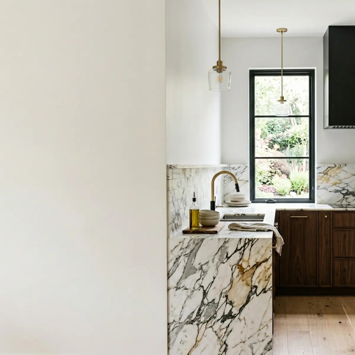
Der beste Backsplash für Arbeitsplatten aus stark gemasertem Marmor ist meist eine zurückhaltende, kontrastarme Oberfläche, die den Stein unterstützt, statt mit ihm zu konkurrieren. In den meisten Küchen schaffen matte oder satinierte peel and stick backsplash-Optionen in Soft White, Warm White, Greige, Taupe oder Pale Gray die stärkste visual balance, weil sie Musterkonflikte reduzieren, die Fugen optisch zurücknehmen und den Marmor im Fokus halten.
Statt auf Bauchgefühl zu setzen, arbeiten gelungene Installationen mit einem Fünf-Punkte-Rahmen, um ein hochwertiges Ergebnis zu sichern. Zurückhaltende peel and stick-Materialien wirken außergewöhnlich edel, wenn Finish und Unterton perfekt mit dem Stein harmonieren. Letztlich geht es darum, eine klare visuelle Hierarchie zu schaffen, nicht darum, ein exaktes Mustermatch zu finden. Wenn diese Hierarchie beachtet wird, hebt sich der gesamte Raum in eine Welt maßgeschneiderter Luxuswirkung, in der jedes Element bewusst kuratiert und nicht zufällig zusammengewürfelt wirkt.
Sind Sie hin- und hergerissen zwischen klassischem Mauerwerk und modernen Klebelösungen? Bevor Sie sich endgültig festlegen, wägen Sie Kosten, Aufwand und ästhetische Vorteile ab, indem Sie unseren ausführlichen Leitfaden für Küchen-Backsplash-Fliesen lesen. Die eigenen Materialoptionen zu verstehen, ist der erste entscheidende Schritt zu einer makellosen Integration.
Welcher Backsplash passt zu Arbeitsplatten aus stark gemasertem Marmor?
Hatten Sie schon einmal das Gefühl, wie gelähmt zu sein aus Angst, dass Ihre Wandfliesen mit der dramatischen Maserung Ihres Marmors konkurrieren?
Dieser Abschnitt liefert einen klaren Rahmen für die Materialkombination und sorgt dafür, dass Ihr hochwertiger Stein der unangefochtene Blickfang des Raums bleibt.
Visuelle Hierarchie im Küchendesign festlegen
Um Materialkombinationen zu verstehen, müssen wir zuerst die visuelle Hierarchie betrachten. Stellen Sie sich eine Luxusküche wie ein Symphonieorchester vor. Wenn jedes Instrument gleichzeitig versucht, die Hauptmelodie zu spielen, entsteht Lärm. In der Innenarchitektur wird dieser „Lärm“ zu räumlicher Unruhe – ein Raum, der sich unangenehm beschäftigt und überwältigend anfühlt, ganz gleich, wie teuer die einzelnen Materialien sein mögen.
In einer Küche mit dramatischem Stein ist die Arbeitsplatte das führende Instrument. Der allgemeine Konsens der Branche besagt, dass ein Raum nur ein zentrales visuelles Merkmal tragen kann, bevor es zu kognitiver Überlastung kommt. Kognitive Überlastung im Interior Design entsteht, wenn das Gehirn das dominante Element eines Raums nicht mehr leicht verarbeiten kann, was zu einem Gefühl von Unruhe führt. Wenn schöne, weit ausgreifende Adern in Grau, Gold oder Schwarz über Ihre Insel und die umlaufenden Arbeitsflächen tanzen, folgt das Auge diesen Linien ganz natürlich.
Ein stark wirkender Backsplash zwingt das Auge, unruhig zwischen vertikalen und horizontalen Flächen hin- und herzuspringen. Dadurch wird der wahrgenommene Wert beider Oberflächen grundsätzlich geschmälert. Durch eine strikte visuelle Hierarchie stellen Sie sicher, dass der Raum absichtlich gestaltet und hochwertig wirkt. Der Backsplash muss die unterstützende Rhythmusgruppe sein – ruhig, leise und verlässlich – damit der Solist, der Marmor, ungestört glänzen kann.

Ergänzende statt passende Abstimmung Ihres Steins
Ein verbreiteter Irrtum ist die Annahme, dass Wandfliesen die exakte Maserung der Arbeitsplatte wiedergeben müssen. Zu versuchen, das Muster eines Natursteins mit einem anderen Material exakt nachzubilden, geht meist schief. Warum? Weil die Natur sich nie perfekt wiederholt. Wenn Sie versuchen, eine Keramik- oder Haftfliese zu finden, die die genauen Schwünge und Wirbel Ihrer speziellen Platte imitiert, erzeugen Sie unweigerlich einen „Beinahe-Treffer“. Ein Beinahe-Treffer wirkt für das menschliche Auge weit störender als ein bewusster Kontrast; es sieht wie ein Fehler aus, eine billige Imitation, die den authentischen Stein darunter abwertet.
Statt auf exaktes Matching setzen Experten auf Ergänzung. Das heißt, sie extrahieren die ruhigste Hintergrundfarbe aus Ihrer Platte – oft ein weiches, erdiges Weiß oder ein helles Taupe – und verwenden genau diesen einen Ton für die vertikalen Flächen. Designer nutzen dafür oft den „Squint Test“: Treten Sie von der Platte zurück, kneifen Sie die Augen zusammen, bis die kräftigen Adern verschwimmen, und identifizieren Sie den übergeordneten Hintergrundton, der bleibt. Das ist Ihre Ziel-Farbe.
Dieser Ansatz neutralisiert nachweislich visuelle Reibung. Er lässt die dramatische Maserung atmen. Wenn Sie den Hintergrundton isolieren, wirkt die gesamte Gestaltung nahtlos und strukturell stimmig. Im Grunde erzeugen Sie einen Infinity-Cove-Effekt, bei dem die dominante Hintergrundfarbe der horizontalen Fläche sanft die Wand hinaufzieht und den Blick behutsam nach oben führt, statt ihn mit einer harten geometrischen Trennung zu stoppen.
Profi-Tipp für Designer: Unterton-Isolierung
Halten Sie niemals eine Musterfliese an die dunkelste Ader Ihres Marmors. Platzieren Sie Ihr Muster immer an der leersten, „blankesten“ Stelle der Platte. Wenn der Unterton Ihrer Musterfliese mit dieser blanken Fläche kollidiert, wirkt die gesamte Küche nicht stimmig. Ihr Ziel ist Hintergrundkontinuität.
Heller oder dunkler: Die Kontrastregel
Viele Hausbesitzer tun sich schwer mit der Entscheidung, ob die vertikale Fläche heller oder dunkler als die Arbeitsplatten sein sollte. Hier wird der Lichtreflexionswert (LRV) zu einem unverzichtbaren Werkzeug. LRV ist eine Messskala von 0 (absolut schwarz, absorbiert das gesamte Licht) bis 100 (reines Weiß, reflektiert das gesamte Licht). Zu verstehen, wo Ihre Materialien auf dieser Skala liegen, ist das Geheimnis eines ausgewogenen Raums.
Die zuverlässigste Methode besteht darin, den LRV des Raums zu bewerten. Die Standardregel lautet, in den Werten nah beieinander zu bleiben. Hat Ihre Platte einen hellweißen Hintergrund (hoher LRV), sorgt eine ähnlich helle Wand für eine durchgehende Sichtlinie. Wenn Sie den LRV drastisch von einer hellen Arbeitsplatte zu einer dunklen Rückwand verändern, entsteht in der Mitte Ihrer Küche eine schwere „Horizontlinie“. Diese Linie teilt den Raum optisch in zwei Hälften, was niedrige Decken bedrückend und beengt wirken lassen kann.
Es gibt jedoch eine Ausnahme. Wenn Ihren Schränken der Kontrast fehlt – etwa weiße Schränke in Kombination mit einer weißen Marmorplatte – kann ein dunklerer Ton das Design verankern. Entscheidend ist die Kontrolle des Übergangs. Harte, plötzliche Sprünge im Farbwert lenken unnötig vom Stein ab. Wenn Sie sich für einen dunkleren Ton entscheiden, muss der Unterton dennoch sorgfältig zu den Adern oder dem Hintergrundschatten des Marmors passen, damit die Kombination bewusst und gewollt wirkt.
Das Fünf-Punkte-Rahmenwerk für visual balance
Um ein gelungenes Ergebnis zu gewährleisten, bewerten wir Kombinationen anhand des Visual Balance Score (VBS). Diese quantitative Grundlage nimmt dem Ganzen das emotionale Rätselraten. Wer ohne Rahmen in einen Fliesenshowroom geht oder online stöbert, landet oft bei Impulskäufen aufgrund isolierter Schönheit statt kontextueller Harmonie. Der VBS stützt sich auf fünf unterschiedliche Kriterien, um die Kombination zu bewerten.
- Bewegungskontrolle: Die Wandoberfläche muss minimale bis keine Mustervariation aufweisen, um die aktive Aderung des Steins auszugleichen. Wenn der Marmor wirbelt, muss die Wand still bleiben.
- Unterton-Harmonie: Die Temperatur der Fliese (warm vs. kühl) muss sich strikt an der Grundfarbe der Platte orientieren. Eine blauweiße Fliese mit einem gelbweißen Marmor zu kombinieren, ist ein schwerer Fehler.
- Zurückhaltung beim Glanz: Matte oder satinierte Oberflächen absorbieren Licht und verhindern, dass Reflexionen mit der polierten Oberfläche des Steins konkurrieren. Zwei stark reflektierende Flächen erzeugen einen chaotischen „Spiegelbox“-Effekt.
- Fugen-Sichtbarkeit: Niedrig-kontrastige Fugen verhindern die Bildung eines sekundären geometrischen Gitters, das den Blick ablenkt. Hochkontrastiger Fugenmörtel lenkt die visuelle Aufmerksamkeit auf die Wand.
- Maßstab und Proportion: Die Größe der einzelnen Elemente darf den Maßstab der Maserung nicht nachahmen, um eine unangenehme visuelle Wiederholung zu vermeiden.
Wenn Sie diese fünf Kriterien erfüllen, erreichen Sie ein deterministisches Ergebnis. Das daraus entstehende Design wirkt durchgehend edel und professionell umgesetzt und umgeht die kostspieligen Trial-and-Error-Phasen, die viele DIY- und Profi-Renovierungen gleichermaßen belasten.
Materiallebenszyklen und Standards bewerten
Bei der Bewertung der Total Cost of Ownership (TCO) über einen 24-monatigen Lebenszyklus bieten moderne, abnehmbare Materialien eine äußerst effiziente Lösung. Mieter und Hausbesitzer, die flexibel modernisieren möchten, benötigen Optionen, die keinen Abriss erfordern. Herkömmliches Fliesenlegen braucht Mörtel, Fugenmörtel, spezielle Schneidwerkzeuge und oft professionelle Arbeitskraft. Der Schmutz und die Kosten sind erheblich, was dies zu einer anspruchsvollen Wahl macht, die nicht immer für sich wandelnde Geschmäcker oder vorübergehende Wohnsituationen geeignet ist.
Wenn Sie bereit sind, das Nonplusultra moderner Klebetechnologie zu erkunden, ist ein vollständiger Überblick unverzichtbar. Entdecken Sie genau, wie Spitzenprodukte in der Der beste Leitfaden für Peel-and-Stick-Backsplashes 2025 in puncto Langlebigkeit und Stil bewertet werden. Die standardisierte Bewertung im umfassenden Leitfaden zeigt, dass hochwertige Klebeoptionen eine beachtliche Haltbarkeit besitzen.
Wenn Sie die führenden Optionen auf dem Markt bewerten, stehen Haltbarkeit und Hitzebeständigkeit an erster Stelle. Um Ihre Investition zu schützen, sehen Sie sich unsere sorgfältig getesteten Empfehlungen im Die besten Peel-and-Stick-Fliesen für Küchenrückwände 2025 an, um Materialien zu finden, die den täglichen Anforderungen in der Küche standhalten. Diese Materialien neutralisieren von Natur aus die hohen Arbeitskosten, die mit traditionellem Mauerwerk verbunden sind. Sie bieten ein statistisch überzeugendes Kosten-Nutzen-Verhältnis und ermöglichen zugleich schnelle optische Aktualisierungen.
Vermeiden Sie diese kritischen Fehler, um die ästhetische Integrität Ihrer Küche zu schützen:
Der Einfluss der Fugenbreite
Die Zwischenräume zwischen Ihren Fliesen beeinflussen die endgültige Optik erheblich. Fugenmörtel wird oft als nachträglicher Gedanke behandelt, ist aber tatsächlich ein zentrales architektonisches Element, das die Textur einer Wand definiert. Dicke, kontrastreiche Fugen erzeugen ein schweres Raster. Dieses Raster wirkt wie ein visuelles Netz, das den Blick einfängt und gegen den organischen Fluss des Steins arbeitet.
Bei stark gemaserten Arbeitsplatten verlangt der architektonische Standard minimale Fugenabstände. Ein Spalt von 1/16 Zoll mit farblich passender Füllung sorgt dafür, dass die vertikale Fläche als ruhige, geschlossene Ebene wahrgenommen wird. Wenn Sie die Fugenfarbe exakt an die Fliesenfarbe anpassen, verschwinden die Linien und die einzelnen Elemente verschmelzen zu einem stimmigen Hintergrund.
Diese Technik umgeht visuelle Unruhe. Sie lenkt die Aufmerksamkeit wieder auf die horizontale Arbeitsfläche und maximiert so die Wirkung Ihrer Investition. Es ist das architektonische Äquivalent dazu, die Nähte an einem maßgeschneiderten Anzug zu verbergen – die Schönheit liegt im ununterbrochenen Fall des Stoffes oder in diesem Fall in der ununterbrochenen Fläche der Wand.

Lichtabsorption vs. Reflexion verstehen
Der Oberflächenglanz bestimmt, wie ein Material mit der Umgebung interagiert. Polierte Platten werfen große Mengen Licht in den Raum zurück. Sie wirken wie horizontale Spiegel und reflektieren Unterbauleuchten, Blendungen von Fenstern und das Umgebungslicht des Raums. Das ist ein Teil dessen, was polierten Marmor so atemberaubend macht.
Wenn Sie eine hochpolierte Platte mit hochglänzenden Wandfliesen kombinieren, erzeugen Sie einen Spiegelkasten-Effekt. Diese Blendung verdeckt die natürliche Schönheit der Materialien. Wenn das Licht heftig zwischen zwei glänzenden Ebenen hin- und hergeworfen wird, fällt es dem menschlichen Auge schwer, die tatsächliche Textur und Maserung des Steins wahrzunehmen. Stattdessen sieht man nur die harten Reflexionen der Glühbirnen.
Von der Innenarchitektur empfohlene, begutachtete Gegenstücke setzen auf matte oder satinierte Oberflächen für angrenzende Flächen. So entsteht ein weicher, lichtabsorbierender Hintergrund, der die Wirkung Ihrer Ambientebeleuchtung ausgleicht. Ein matter Backsplash wirkt wie ein visueller Schwamm, der überschüssiges Licht aufsaugt und die polierte Arbeitsplatte als einziges leuchtendes Element im Raum bestehen lässt.
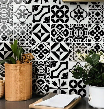
Das Problem mit trendgetriebenen Auswahlentscheidungen
Trendgetriebenes Interior Design fördert oft die Kombination lauter Muster, etwa wenn man eine lebendige, stark gemusterte geometrische Fliese über auffälligem Granit oder Marmor anbringt. In den sozialen Medien wimmelt es von solchen hochstimulierenden Räumen, die gezielt darauf ausgelegt sind, möglichst schnell Aufmerksamkeit zu erregen.
Das mag für ein Magazincover ideal sein, ist im Alltag jedoch auf Dauer ermüdend. Mit der Zeit führen stark kontrastierende Kombinationen schnell zu ästhetischer Ermüdung. Eine Küche ist ein Arbeitsbereich; sie braucht visuelle Ruhe. Wenn die Wände um Aufmerksamkeit schreien, während die Arbeitsplatten gleichzeitig Fokus verlangen, verliert der Raum seinen ruhespendenden Charakter.
Wenn Sie Ihre Entscheidungen am Visual Balance Score ausrichten, umgehen Sie kurzlebige Trends. Eine zurückhaltende, kontrollierte Kombination sorgt für Langlebigkeit und schützt den Wiederverkaufswert der Immobilie. Zukünftige Käufer müssen nicht erst gedanklich die Kosten für das Entfernen eines trendigen, chaotischen Backsplashes kalkulieren; stattdessen werden sie einfach die zeitlose Eleganz des Marmors bewundern.
Konkurriert Ihr aktueller oder geplanter Backsplash mit Ihrem Marmor?
Weist Ihre Backsplash-Fliese mehrere kontrastierende Farben oder ein auffälliges geometrisches Muster auf (wie Morrocan oder ein starkes Chevron)?
Welche peel and stick Backsplash-Stile passen am besten zu Calacatta-, Carrara- und Arabescato-Marmor?
Machen Sie sich Sorgen, dass eine preiswerte, abnehmbare Oberfläche neben Ihren hochwertigen Arbeitsplatten billig wirkt?
In diesem Abschnitt werden präzise Unterton-Formeln bestimmten Steinarten zugeordnet, damit Ihre finale Auswahl wie eine stimmige, luxuriöse Installation wirkt.
Material Harmony Matches verstehen
Um mit abnehmbaren Produkten eine hochwertige Ästhetik zu erzielen, ist strenge Disziplin erforderlich. Wir verwenden das Material Harmony Match (MHM), um diese Kombinationen zu bewerten. So wie Sommeliers Wein anhand von Säure, Tanninen und Süße mit Speisen kombinieren, stimmen Innenarchitekten Baumaterialien anhand sehr spezifischer physischer Eigenschaften aufeinander ab.
Diese Kennzahl bewertet die Abstimmung der Intensität der Steinaderung mit der Hintergrundfarbe, dem Fliesenfinish und der Sichtbarkeit der Fugen des Klebeprodukts. Es ist eine anspruchsvolle Wissenschaft. Ein schwerer, dunkler Stein benötigt ein völlig anderes unterstützendes Umfeld als ein heller, luftiger Stein.
Wenn Sie das MHM perfekt abstimmen, kann das menschliche Auge eine traditionelle Keramikinstallation kaum von einem hochwertigen Klebepaneel unterscheiden. Das Geheimnis liegt vollständig in der passenden Kombination. Das Auge nimmt an, dass der Backsplash selbst ebenfalls ein hochwertiges, dauerhaftes Element sein muss, wenn Farben und Texturen perfekt mit dem edlen Marmor harmonieren.
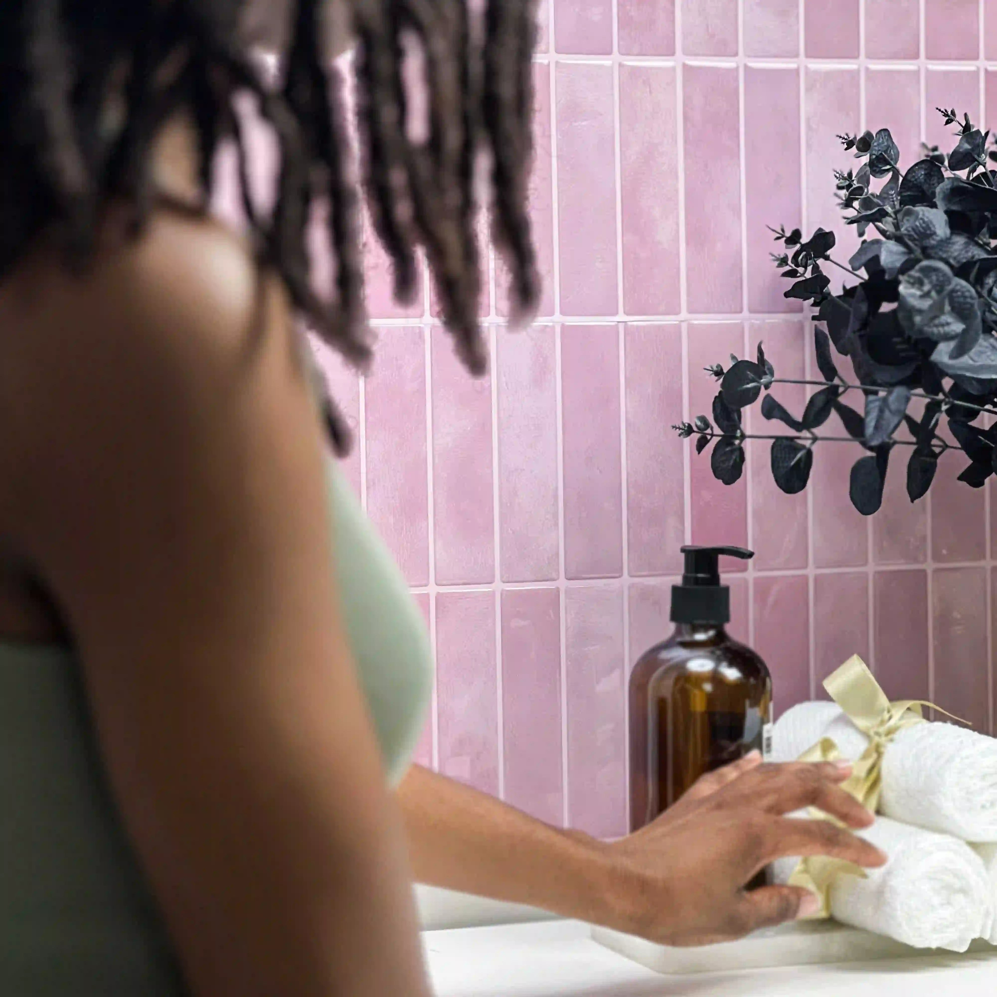
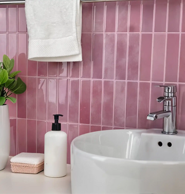
Calacatta-Marmor: Warme Untertöne harmonisch ausgleichen
Calacatta ist allgemein bekannt für seinen klaren, warmweißen Hintergrund und seine dicken, dramatischen Adern. Der vor allem aus Italien stammende Stein gehört zu den begehrtesten und teuersten Natursteinen der Welt. Diese Adern zeigen oft satte Töne von Gold, Bernstein und warmem Taupe, was dem Stein eine von Natur aus majestätische und sonnengewärmte Ausstrahlung verleiht.
Aufgrund seiner natürlichen Wärme erzeugt die Kombination von Calacatta mit einem scharf wirkenden, bläulich-weißen Ton sofort visuelle Dissonanz. Der Stein wirkt im Vergleich plötzlich stumpf oder vergilbt. Das ist ein tragischer Fehler, der das Prestige des Materials mindert. Die kühle Fliese wirkt steril, während der warme Stein alt wirkt.
Die optimale Kombination erfordert warme Weißtöne, sanftes Elfenbein oder helles Greige. Ein mattes Subway-Format in warmem Weiß bietet die nötige Zurückhaltung, damit die goldene Aderung ohne Störung wirken kann. Wenn die Wände mit einem weichen, milchigen Elfenbein verkleidet werden, das den Calacatta-Hintergrund aufgreift, treten die goldenen Adern visuell hervor und fangen das Licht wunderschön ein.
Carrara-Marmor: Kühle Grautöne als ruhige Basis
Carrara wirkt weicher und federleichter als Calacatta. Es ist der klassische Stein der Bildhauer und wurde bekanntlich von Michelangelo verwendet. Er besitzt einen kühleren, leicht gedämpften grauweißen Hintergrund mit feiner, linearer grauer Aderung. Er wirkt neblig, atmosphärisch und eindeutig kühl in der Anmutung.
Carrara verlangt kühle Farbkombinationen. Zarte Grautöne, klare kühle Weißtöne und dezente Anthrazit-Akzente wirken hervorragend. Warme Beige- oder gelbstichige Cremetöne neben Carrara erzeugen einen unangenehmen, schmutzigen Kontrast. Die warmen Töne kämpfen gegen die aschige Natur des Carrara an und lassen die gesamte Installation verwirrt und unstimmig wirken.
Ein zurückhaltendes, kühles Klebepaneel in Grau stimmt die Wirkung des Raums perfekt ab. Es fungiert als Schattenton und rückt die Arbeitsplatte in den Mittelpunkt. Wenn Ihr Carrara ausgeprägte anthrazitfarbene Adern hat, kann das Herausgreifen genau dieses Anthrazittons für einen tiefen, matten Backsplash eine beeindruckend elegante, stimmungsvolle Küchenatmosphäre schaffen, die geerdet und architektonisch wirkt.
Arabescato-Marmor: Starke Kontraste gekonnt steuern
Arabescato zeichnet sich durch hochdramatische, staubgrau bis schwarze Aderungen aus, die große, abgerundete „Inseln“ auf einem strahlend weißen Hintergrund bilden. Es ist ein äußerst lebhafter Stein. Die Aderung ist nicht nur linear; sie erzeugt massive Formen und Flächen über der gesamten Platte. Er ist auffällig, kompromisslos und visuell dominant.
Dieses Maß an Bewegung erfordert eine außergewöhnlich ruhige vertikale Fläche. Jedes zusätzliche Muster würde die Sinne sofort überladen und die visuelle Harmonie des Raums zerstören. Arabescato mit einer gemusterten Fliese zu kombinieren ist, als würde man zwei verschiedene Songs gleichzeitig mit voller Lautstärke im Radio abspielen.
Großformatige Paneele mit nahtloser Optik oder extrem subtile, farblich abgestimmte Quadrate sind Pflicht. Ziel ist es, jede konkurrierende Geometrie zu vermeiden, die mit den markanten, organischen Inseln des Steins konkurrieren könnte. Ein ultraflaches, mattweißes Paneel ohne sichtbare Fugenlinien ist oft die erfolgreichste Lösung, um eine Arabescato-Installation einzurahmen und seine natürliche Wirkung den Raum bestimmen zu lassen.

Peel and Stick-Oberflächen für Luxusküchen bewerten
Viele Hausbesitzer zögern, Klebeprodukte in hochwertigen Räumen zu verwenden. Es hält sich hartnäckig der Irrglaube, dass „peel and stick“ für etwas Dünnes, Glänzendes und aus Plastik Stehendes steht. Doch die Materialtechnik hat sich im letzten Jahrzehnt erheblich weiterentwickelt und die Möglichkeiten von abnehmbaren Deko-Lösungen grundlegend verändert.
Führende Redakteure für Interior Design weisen darauf hin, dass hochwertige abnehmbare Paneele inzwischen realistische Texturen, stabile Kerne und matte finishes bieten, die gebrannte Keramik täuschend echt nachahmen. Diese modernen Ausführungen bestehen aus langlebigen Verbundwerkstoffen, die Hitze und Feuchtigkeit widerstehen und ihren Wert in aktiven Küchenbereichen unter Beweis stellen.
Einen Raum aufzuwerten sollte kein Abrisskommando erfordern. Für Hausbesitzer, die mühelos gehobene Eleganz erzielen möchten, bietet die Lektüre von Luxuriöse Marble-Stick-Fliesen für ein stilvolles Makeover zu Hause wertvolle Einblicke. Eine standardisierte Bewertung moderner Optionen zeigt, dass diese Materialien ihre visuelle Integrität bewahren. Sorgfältig ausgewählt, bieten sie eine klare Lösung für temporäre Luxus-Updates und ermöglichen eine hochwertige Ästhetik ohne Dauerhaftigkeit oder bauliche Eingriffe.
Hochkontrastierende Verankerungsgrenzen
Manchmal fehlt einer Küche die architektonische Tiefe. Wenn die Schränke weiß sind und die Platte ebenfalls weiß ist (wie ein helles Carrara), kann der Raum steril wirken, eher wie ein OP-Saal als wie ein warmes Zuhause. In der Designsprache nennt man das spatial drift – wenn das Auge nirgends zur Ruhe kommt.
In solchen speziellen Fällen ist ein hochkontrastierendes, erdendes Element erforderlich. Sie brauchen einen visuellen „Stopp“, um Tiefe und Begrenzung zu schaffen. Manchmal ist visuelles Gewicht genau der Anker, den ein schwebend wirkendes Küchendesign braucht. Um Ihre weißen Arbeitsplatten eindrucksvoll zu rahmen und architektonischen Kontrast ohne Chaos einzubringen, entdecken Sie die anspruchsvolle Ausführung unserer Black Marble Fliesen.
Indem dieses dunkle Produkt spatial drift empirisch neutralisiert, entsteht eine optimale Konfiguration. Es setzt eine schwere, verankernde Horizontlinie. Der dunkle Kontrast lässt die weißen Schränke und Arbeitsplatten hervortreten und sorgt für die nötige visuelle Wirkung, ohne konkurrierende Muster einzubringen. Es ist ein mutiger Schritt, aber wenn die Untertöne perfekt abgestimmt sind, entsteht ein zutiefst anspruchsvoller Raum.
Geometrische Zurückhaltungsquotienten
Während lebhafter Stein meist schlichte Oberflächen verlangt, kann kontrollierte Geometrie funktionieren, wenn die Farbpalette strikt monochrom bleibt. Die Gefahr bei Geometrie besteht darin, dass die Formen durch kontrastreiche Tinte oder stark sichtbare Fugen hervorgehoben werden. Wenn das Muster ausschließlich auf Textur basiert, wird das Risiko gemindert.
Für alle, die subtile Textur statt lauter Muster bevorzugen, liegt die Antwort in anspruchsvoller Geometrie. Um eine elegante Bewegung einzubringen, die Ihre Platte unterstützt statt mit ihr zu konkurrieren, sollten Sie die taktile Schönheit des Designs Marble Fishbone in Betracht ziehen. Unter Berücksichtigung der visuellen Abwertungskurven hält sich dieser Stil strikt an den architektonischen Standard für ruhige Geometrie.
Da der Zickzack-Charme auf subtiler 3D-Textur statt auf kontrastreicher Tinte beruht, bietet er die nötige Spannung, ohne mit der Arbeitsplatte zu konkurrieren. Er kalibriert die Grundannahmen für gemusterte Klebeelemente neu. Die von der 3D-Textur geworfenen Schatten verändern sich im Tagesverlauf dezent und schaffen einen dynamischen, aber zurückhaltenden Hintergrund für den lauten Marmor darunter.
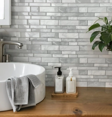
Die Zellige-Look-Lösung
Echte Zellige zeichnet sich durch handgefertigte Unregelmäßigkeiten und eine stark glasierte, wellige Oberfläche aus. Diese aus Marokko stammenden Fliesen sind derzeit im gehobenen Design extrem beliebt. Sie reflektieren Licht wunderschön, sind optisch jedoch laut. Aufgrund ihrer unebenen Oberfläche ziehen sie die Aufmerksamkeit auf sich.
Eine satinierte Klebefliese im Zellige-Look bietet einen hervorragenden Kompromiss. Sie bringt die organische, tonale Variation der handwerklichen Ästhetik mit, jedoch mit kontrolliertem Glanz. So erhalten Sie den Look kunsthandwerklicher Fertigung ohne blendende Reflexionen und hohe Installationskosten.
Diese subtile Variation mildert den Übergang zwischen den Schränken und der Arbeitsplatte. Sie bringt Wärme und Charakter ein, ohne ein starres, ablenkendes Raster zu bilden. Sie ist das perfekte Brückenmaterial und verleiht einen Hauch menschlicher Unvollkommenheit, um die mitunter kühle Majestät von massivem Stein auszugleichen.
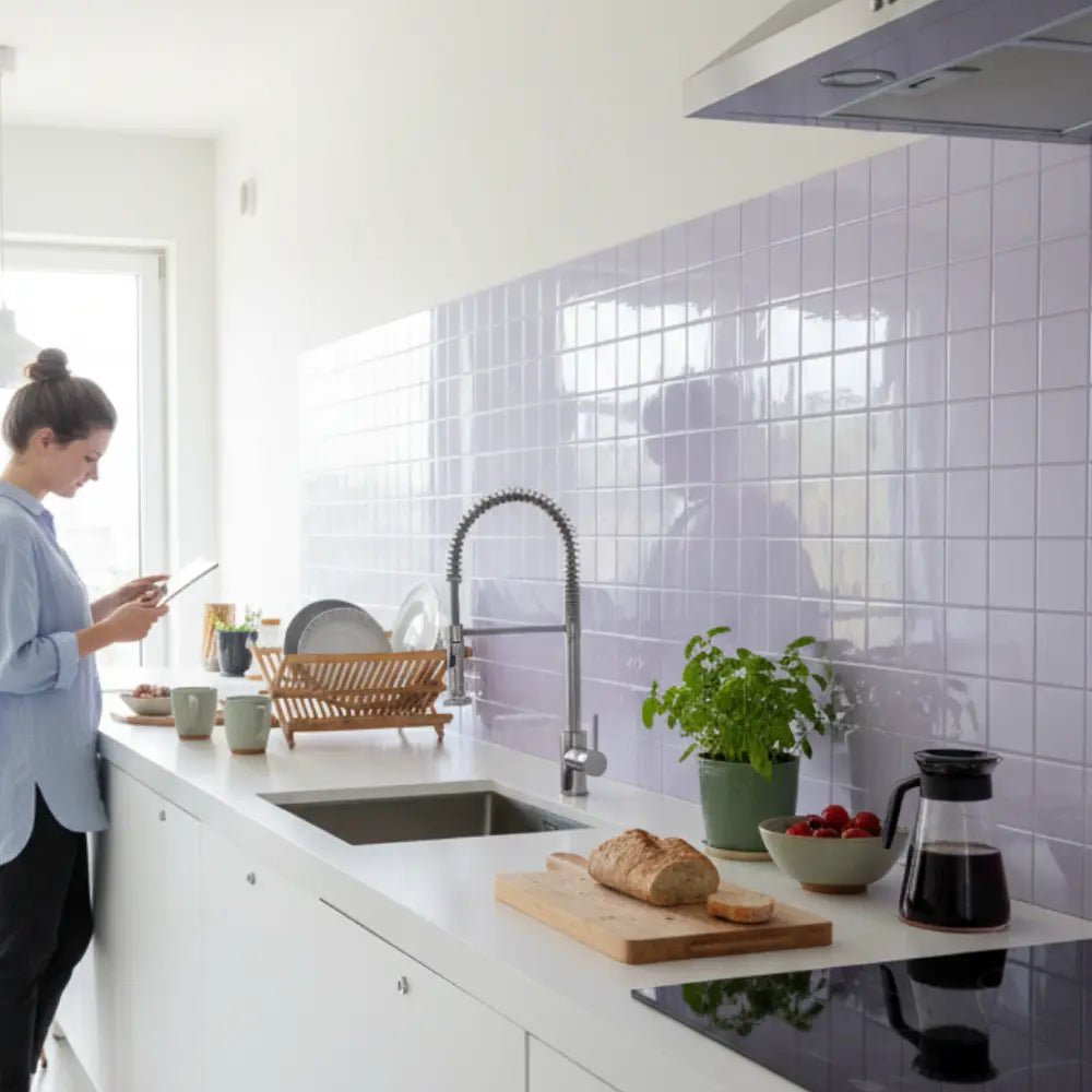
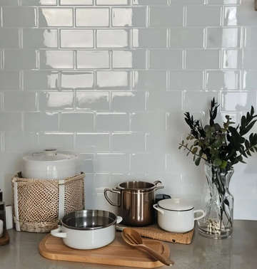
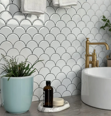
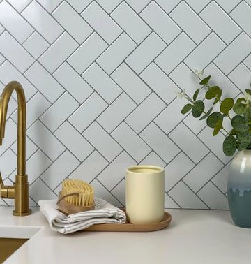
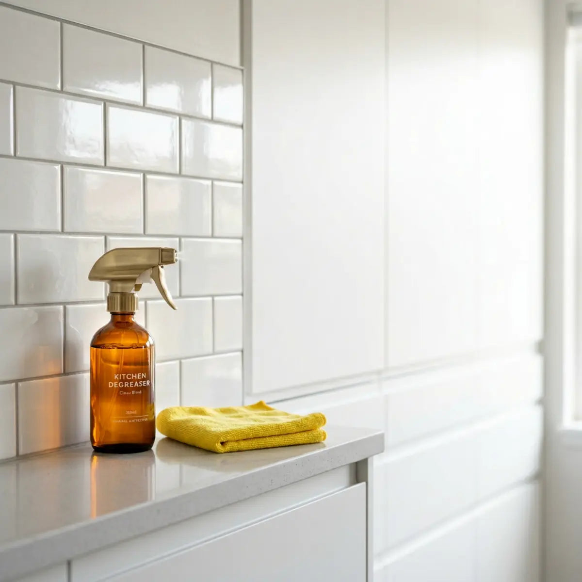
Matte Subway Tile: Der unbestrittene Maßstab
Im Zweifelsfall bleibt das matte Subway-Format das allgemein anerkannte Paradigma für die Abstimmung mit aktivem Stein. Es ist das kleine Schwarze der Innenarchitektur. Es kommt nie aus der Mode, stößt nie vor den Kopf und erfüllt immer seine Hauptaufgabe: das Hauptelement zu unterstützen.
Seine einfache, vorhersehbare Geometrie tritt in den Hintergrund. Das matte finish garantiert keinerlei Lichtkonflikt mit polierten Platten. Sie nehmen alle Reibungspunkte heraus und lassen das Auge komfortabel durch den Raum gleiten, ohne an glänzenden Oberflächen oder ungewöhnlichen Formen hängen zu bleiben.
Wenn das Format im klassischen horizontalen Versatz verlegt wird, entsteht ein ruhiger, gleichmäßiger Rhythmus. Dieser Rhythmus neutralisiert von Natur aus visuelle Unruhe und bietet die perfekte Bühne für dramatische Adern. Es ist der ultimative Ausdruck gestalterischer Zurückhaltung und beweist, dass manchmal die leiseste Wahl tatsächlich die luxuriöseste ist.
Montagestandards und Oberflächenvorbereitung
Ein luxuriöses Erscheinungsbild hängt vollständig von makelloser Ausführung ab. Selbst das ruhigste Material wirkt chaotisch, wenn es ungleichmäßig installiert wird. Bei herkömmlichen Fliesen verdeckt Mörtel viele Wandfehler. Bei Klebepaneelen muss die Wand sorgfältig vorbereitet werden, da sich das Material den vorhandenen Konturen anpasst.
Die strikte Einhaltung der richtigen Oberflächenvorbereitung ist zwingend erforderlich. Wände müssen entfettet, glatt geschliffen und vollständig trocken sein, damit der Klebepolymer korrekt haftet. Wird dieser Schritt ausgelassen, ist das der häufigste Grund, warum DIY-Installationen scheitern oder amateurhaft wirken.
Ein Premiumprodukt ist nur so gut wie seine Verarbeitung. Um sicherzustellen, dass Ihre Luxufliesen nicht von gebrannter Keramik zu unterscheiden sind, beherrschen Sie die grundlegenden Techniken, indem Sie So installieren Sie Peel-and-Stick-Backsplash ganz einfach studieren. Das darin beschriebene umfassende Framework liefert die quantitative Grundlage, die nötig ist, um dies ohne kritisches Versagen umzusetzen. Die richtige Technik sorgt für ein nahtloses, professionelles Finish.
Die Rolle von Licht bei der Materialwahrnehmung
Umgebungs- und Arbeitslicht verändern drastisch, wie Untertöne wahrgenommen werden. Dies ist vielleicht der wichtigste und am häufigsten übersehene Aspekt bei der Materialabstimmung. Eine Fliese, die im von fluoreszierendem Licht erfüllten Showroom perfekt kühlgrau wirkt, sieht in Ihrer Küche unter warmen Glühbirnen völlig anders aus.
Eine warme Glühbirne lässt eine kühlschrankweiße Fliese gelb wirken und ruiniert sofort eine Carrara-Kombination. Umgekehrt wirft eine kühle Lampe mit hoher Kelvinzahl einen blauen Schimmer über eine warm elfenbeinfarbene Fliese und steht damit den goldenen Adern von Calacatta entgegen. Es ist empirisch belegt, dass Lichttemperaturen zwischen 3000K und 4000K die genaueste, ausgewogenste Farbwiedergabe für Naturstein bieten. Dieser Bereich ahmt natürliches Tageslicht nach, ohne zu stark in blaue oder gelbe Extreme zu kippen.
Testen Sie Materialmuster immer in Ihrer spezifischen Küchenbeleuchtung zu verschiedenen Tageszeiten. Beobachten Sie die Fliesen im Morgenlicht, bei Mittagssonne und abends nur mit Ihrer Unterschrankbeleuchtung. Dieser einfache Schritt mindert grundsätzlich kostspielige Untertonabweichungen vor der endgültigen Installation.
Mit Eleganz durch die Vorgaben von Mieternavigieren
Mieter stehen vor besonderen Herausforderungen, wenn sie Ausführungen in Bauqualität aufwerten möchten. Sie können die vorhandenen Oberflächen nicht entfernen, aber Sie können sie sicher verkleiden. Viele luxuriöse Apartmentmietobjekte verfügen über hochwertige Steinarbeitsplatten, kombinieren diese jedoch mit generischen oder veralteten Rückwänden, die die gewünschte Wirkung zunichtemachen.
Moderne Klebepaneele sind so konstruiert, dass sie die Einschränkungen temporärer Wohnsituationen umgehen. Sie verfügen über eine spezielle Rückseite, die sicher auf bestehenden Fliesen oder Trockenbau haftet, sich bei Wärmeeinwirkung jedoch sauber ablöst, ohne strukturelle Schäden zu verursachen. Das ist ein echter Gamechanger für designbewusste Mieter.
So können Mieter mit flexiblem Upgrade chaotische vorhandene Fliesen mit einer dezenten, eleganten Schicht kaschieren. Es verwandelt eine generische Wohnung sofort in eine individualisierte, designbewusste Umgebung. Sie erzielen den maßgeschneiderten Look einer dauerhaften Renovierung und halten sich dabei strikt an die Mietbedingungen.
Die Kraft des Testens von Mustern nutzen
Verlassen Sie sich niemals nur aufgrund digitaler Bilder auf einen Kauf. Die Bildschirmkalibrierung variiert von Smartphone zu Smartphone und von Monitor zu Monitor stark, sodass eine genaue Beurteilung von Untertönen praktisch unmöglich ist. Was auf Ihrem Bildschirm greige aussieht, kann in Wirklichkeit ein markantes kühles Grau sein.
Besorgen Sie sich physische Muster Ihrer drei Favoriten. Kleben Sie sie direkt an die Wand, an der sie auf die Arbeitsplatte treffen. Lassen Sie sie dort mindestens 48 Stunden lang. Beobachten Sie, wie die Materialien unter Ihrer Unterschrankbeleuchtung zusammenwirken. Gehen Sie ganz natürlich daran vorbei, um zu sehen, ob Ihr Blick vom Marmor weggezogen wird.
Diese standardisierte Bewertung stellt sicher, dass die Hintergrundfarbe des Klebers den ruhigsten Ton Ihrer Platte perfekt ergänzt. Um diese entscheidende Phase zu unterstützen, haben wir eine interaktive Checkliste erstellt, damit Sie Muster in Ihrer eigenen Umgebung korrekt beurteilen können.
Laden Sie unser strenges Musterbewertungsprotokoll herunter, um sicherzustellen, dass Ihre endgültige Wahl Ihre spezielle Marmorplatte unter Ihren individuellen Lichtbedingungen perfekt ausbalanciert.
Bewertungsprotokoll herunterladenMaßstab und Proportionen für ein optimales Gleichgewicht steuern
Die physische Größe der einzelnen Fliesen muss im Verhältnis zum Maßstab der Maserung bewertet werden. Das ist eine feine Nuance, die gutes Design von außergewöhnlichem Design unterscheidet. Wenn der Maßstab der Fliese direkt mit dem Maßstab der Marmorzeichnungen konkurriert, entsteht visuelle Verwirrung.
Wenn Ihre Platte enge, zarte Adern aufweist, bietet ein großformatiges Paneel einen hervorragenden Kontrast. Die große, unterbrechungsfreie Fläche der Wandfliese beruhigt das Auge über den lebhaften, detailreichen Strukturen des Steins. Umgekehrt erzeugen winzige Mosaikquadrate einen sehr aggressiven Konflikt, wenn der Stein massive, schwungvolle Bewegungen und dicke Adern aufweist. Das mikroskopische Raster des Mosaiks steht dann im Widerspruch zu den breiten Linien des Marmors.
Ein Format mittlerer Größe, wie ein 3x6 oder 4x4 Quadrat, ergibt in der Regel eine optimale Konfiguration. Es ist groß genug, um visuelle Unruhe zu vermeiden (und die Fugenlinien zu minimieren), und zugleich klein genug, um sich leicht zu verlegen und um Steckdosen und Ecken herum zu arbeiten.
Das Kosten-Nutzen-Verhältnis dezenter Upgrades
Hausbesitzer geben häufig zu viel für komplexe, stark dekorative Wandfliesen aus, in der falschen Annahme, dass mehr Detail gleich mehr Luxus bedeute. Sie investieren Tausende von Dollar in aufwendige Waterjet-Mosaike oder handbemalte Keramik, nur um sie über einer Marmorplatte im Wert von 10.000 Dollar zu installieren – und ruinieren damit die visuelle Wirkung beider Investitionen.
In Wirklichkeit signalisiert Zurückhaltung Wohlstand. Eine einfache, perfekt tonangeglichene Oberfläche wirkt deutlich teurer als ein unruhiges, unpassendes Mosaik. Hochwertiges Design wird oft dadurch definiert, was weggelassen wird, statt dadurch, was hinzugefügt wird. Das Selbstvertrauen, eine Wand relativ leer zu lassen, ist ein Kennzeichen anspruchsvoller Innenarchitektur.
Wenn Sie kostengünstige, zurückhaltende Klebelösungen wählen, maximieren Sie Ihr Kosten-Nutzen-Verhältnis. Sie erzielen ein hochwertiges architektonisches Finish und behalten gleichzeitig Ihr Budget für Beleuchtung, Beschläge oder Premium-Geräte – Elemente, die einer Küche weitaus mehr funktionalen und ästhetischen Wert verleihen als eine konkurrierende Wandfliese.
Alternative mietfreundliche Konzepte entdecken
Über klassische Subway-Formate hinaus entwickelt sich die Branche stetig weiter. Kreativität muss nicht Unruhe bedeuten. Wenn Sie nach Inspiration suchen, die Persönlichkeit mit visueller Disziplin verbindet, stöbern Sie in den beeindruckenden, kuratierten Galerien innerhalb von Fliesenideen für die Küche mit Peel and Stick 2025. Die Ressource präsentiert eine Vielzahl zurückhaltender, eleganter Lösungen.
Von dezenten Beadboard-Strukturen bis hin zu ultraflachen Paneelen in Putzoptik wächst die Auswahl für ruhige, harmonische Gestaltungen. Sie sind nicht länger auf einfache Rechtecke beschränkt. Architektonische Riffelungen und weiche, dimensionale Quadrate halten Einzug in den Klebemarkt und bieten haptische Spannung ohne starke Farbkontraste.
Diese Innovationen ermöglichen es Hausbesitzern, ihren Räumen eine klare Persönlichkeit zu verleihen und dennoch die strenge visuelle Hierarchie zu bewahren, die für dramatische Arbeitsplatten erforderlich ist. Sie können eine sehr persönliche, maßgeschneiderte Küche gestalten, ohne jemals die luxuriöse Präsenz Ihres stark geäderten Steins zu opfern.
Abschließende Gedanken
Die erfolgreiche Kombination eines Backsplashes mit heavily veined marble erfordert Zurückhaltung, nicht Komplexität. Die elegantesten, hochwertigsten Räume setzen visuelle Hierarchie an erste Stelle, indem sie den dramatischen Stein als einzigen Blickfang wirken lassen. Wenn Sie diese Hierarchie ignorieren, mindern Sie den Wert Ihrer Materialien; wenn Sie sie annehmen, heben Sie den gesamten Raum auf ein höheres Niveau.
Wenn Sie den Visual Balance Score anwenden – Bewegung steuern, Untertöne harmonisieren, Oberflächen beruhigen, Fugen minimieren und den Maßstab kontrollieren – eliminieren Sie das Risiko eines Musterkonflikts. Ob Sie als Hausbesitzer eine Luxusinvestition schützen oder als Mieter veraltete Oberflächen kaschieren möchten: Zurückhaltende peel and stick Materialien bieten eine äußerst effiziente, anspruchsvolle Lösung. Sie beweisen, dass intelligente Designentscheidungen und nicht nur unbegrenzte Budgets über den Erfolg eines Raums entscheiden.
Wir empfehlen Ihnen, den Test mit Mustern zu priorisieren. Vergleichen Sie neutrale peel and stick Optionen in Ihrem eigenen Licht, prüfen Sie ihre Untertöne anhand Ihrer konkreten Platte und erkunden Sie unsere umfassenden Ratgeber, um eine zeitlose, fachmännisch abgestimmte Küche zu gestalten. Die perfekte Kombination ist mathematisch sicher, wenn Sie den Regeln von Farbe, Maßstab und Zurückhaltung folgen.
Häufig gestellte Fragen
Sollte mein Backsplash heller oder dunkler sein als mein Marmor?
In den meisten Küchen ist der sicherste und stimmigste Ansatz, die Wandfläche in ihrer Helligkeit (Wert) sehr nah an der Hintergrundfarbe Ihrer Platte zu halten. Wenn Ihr Stein einen strahlend weißen Hintergrund hat, sorgt eine ähnlich helle Wand für eine durchgehende, weite Sichtlinie. Wenn Ihrer Küche jedoch insgesamt Kontrast fehlt und sie etwas blass wirkt, kann eine deutlich dunklere Wand in einer Volltonfarbe den Raum wunderschön verankern.
Kann ich einen gemusterten Backsplash mit heavily veined marble verwenden?
Eine gemusterte Wandfläche neben aktivem Stein zu verwenden ist äußerst riskant und führt oft zu visueller Unruhe. Der branchenweite Konsens lautet, hochkontrastige geometrische Muster oder mehrfarbige Mosaike neben lebhaft gezeichneten Platten zu vermeiden. Wenn Sie unbedingt ein Muster wünschen, verwenden Sie eine monochrome Struktur, etwa ein dezentes Fischgrätmuster oder ein Ton-in-Ton-Fischgrät, und stellen Sie sicher, dass die Farben nicht mit dem Stein konkurrieren.
Welche Fugenfarbe ist für eine unruhige Marmorküche am besten?
Der absolut beste Ansatz ist, die Fugen farblich an die Hauptfarbe der Fliese anzupassen. Indem Sie den Kontrast in den Fugen eliminieren, verhindern Sie die Entstehung eines starren geometrischen Rasters, das von der Arbeitsplatte ablenkt. Eine nahtlose Wandgestaltung mit geringem Kontrast neutralisiert visuelle Unruhe von Natur aus und lenkt den Blick auf den hochwertigen Stein.
Wie stimme ich Untertöne ab, wenn mein Marmor mehrere Farben hat?
Identifizieren Sie die „ruhigste“ oder dominierende Hintergrundfarbe der Platte, anstatt zu versuchen, die markanten Adern zu matchen. Wenn Ihr Stein zum Beispiel kräftige goldene Adern auf einer cremig-weißen Basis hat, wählen Sie ein Wandmaterial, das genau dieses cremige Weiß aufgreift. Diese Strategie führt das Design sauber zusammen und lässt die farbigen Adern ganz natürlich hervortreten.
Wirkt peel and stick Fliesen neben Naturstein minderwertig?
Nicht, wenn sie richtig ausgewählt und installiert werden. Moderne, hochwertige Klebepaneele verfügen über stabile Träger, ultramatte Oberflächen und realistische Texturen, die traditionelle Keramik sehr genau nachahmen. Wenn Sie sich strikt an den Visual Balance Score halten und einen dezenten Stil mit wenig Bewegung wählen, der perfekt mit dem Unterton Ihres Steins harmoniert, wirkt das Ergebnis wie eine hochwertige, bewusste architektonische Entscheidung.

Kommentar hinterlassen
Diese Website ist durch hCaptcha geschützt und es gelten die allgemeinen Geschäftsbedingungen und Datenschutzbestimmungen von hCaptcha.