
















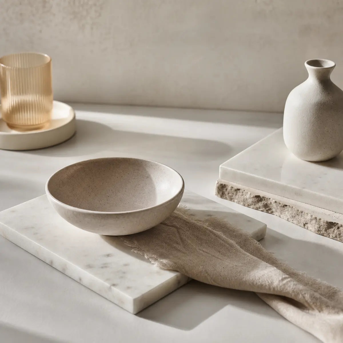
Concrete countertops can look grounded, architectural, and expensive. They can also make a kitchen feel cold if the backsplash repeats the same gray temperature, value, and texture without adding balance.
That is why the best faux stone backsplash is rarely the prettiest sample by itself. It is the sample that works with the countertop undertone, cabinet color, lighting temperature, texture scale, and practical demands of the kitchen.

What backsplash goes with concrete countertops?
The safest starting point is to pair cool concrete with warm stone, then adjust for the cabinets, flooring, light, and size of the room.
This is a design heuristic, not a universal rule. Concrete countertop color can vary with cement, pozzolans, admixtures, ingredients, and mixing practices, so “gray concrete” does not identify one exact undertone. The Concrete Countertop Institute’s color consistency guidance supports treating the installed counter, or a true sample from the same mix, as the reference point.
Start by identifying the concrete family
| Concrete countertop family | What it often needs | Faux stone colors to test first | Common failure |
|---|---|---|---|
| Light cool gray | Warmth or clear contrast | Cream, beige, taupe, warm greige, soft white | Mid-gray stone that makes the wall disappear |
| Cement-look gray | Gentle warmth and texture | Greige, limestone beige, mixed neutral, ivory | Cold blue-gray paired with cool gray cabinets |
| Beige-gray concrete | Cleaner contrast | White, soft gray, slate, muted blue-gray | Yellow-beige stone that competes with the counter |
| Charcoal concrete | Lightness or warm relief | White, ivory, pale gray, warm stone, light mixed neutral | Charcoal backsplash that makes the kitchen feel smaller |
| Dark industrial concrete | Light and material contrast | White stone, pale limestone, warm oak-toned stone | Dark, high-variation stone with dark cabinets |
| Polished concrete | Matte texture or restrained contrast | Matte white, honed gray, taupe, fine-grain slate | Glossy faux stone that looks unrelated to the counter |
The important word is undertone. An undertone is the subtle color direction underneath the obvious surface color. A gray can lean blue, green, violet, beige, or brown. Two samples labeled “gray” may look unrelated beside each other.
Hold the backsplash sample directly against the countertop, then step back several feet. If the counter suddenly looks blue, green, or violet beside the backsplash, the sample may be amplifying an undertone you did not notice before.
The warm-stone rule
Warm stone is usually the better first test when:
- The concrete is blue-gray or cool light gray.
- The cabinets are white, pale gray, or cool-painted wood.
- The floor is concrete, gray oak, or another cool neutral.
- The kitchen has limited daylight.
- The room feels clean but emotionally flat.
- You want organic modern, Japandi, modern farmhouse, or softened industrial character.
Cream, taupe, beige, limestone, and warm greige can make concrete feel more livable without erasing its architectural quality. The goal is not to make the counter look warm. The goal is to stop every large surface from pulling in the same cool direction.
For warm-neutral inspiration, the guidance in our tested cottagecore faux stone backsplash article is useful even if your kitchen is more modern. The relevant principles are restrained variation, matte texture, realistic grout lines, and physical sample testing.
When cool stone is the better choice
Cool stone can be the right answer if the room already contains enough warmth to support it. Test slate, charcoal, blue-gray, or clean white stone when you have:
- Warm oak, walnut, or honey-toned cabinets.
- Brass, bronze, or aged metal hardware.
- Warm wood flooring.
- Creamy white walls or cabinets.
- Strong south- or west-facing daylight.
- A larger kitchen with enough visual breathing room.
- A clear desire for an industrial or high-contrast look.
A cool stacked-stone backsplash beside warm wood can look deliberate because the materials are doing different jobs. The wood supplies warmth, while the stone reinforces the concrete’s architectural character.
The risk is balance. If the cabinets, floors, countertop, backsplash, and lighting are all cool, the room can look gray rather than layered.
Designer rule: Choose warm stone when the room feels cold. Choose cool stone when the surrounding finishes already provide warmth and the backsplash can create clear contrast.
Why does gray-on-gray sometimes look flat?
Gray-on-gray works when the two grays differ clearly in value, texture, or temperature. It struggles when both surfaces are mid-tone, cool, and visually similar.
Value means how light or dark a color appears. A light gray countertop against a much lighter white backsplash can look crisp. A charcoal counter against pale gray stone can look dramatic. A mid-gray counter against another mid-gray stone often creates a narrow visual range, especially in a small kitchen.
There is no authoritative universal minimum contrast difference that guarantees a gray-on-gray pairing will succeed. That means you should use a homeowner-friendly visual test rather than rely on a percentage, ratio, or supposed industry threshold.
Stand the sample vertically behind the counter and ask:
- Can I tell where the countertop ends and the backsplash begins from across the room?
- Does the backsplash have a distinct lightness or darkness?
- Does the texture add depth without creating visual noise?
- Do the cabinets provide a third value, such as white cabinets above a charcoal counter?
- Does the room still feel open after the backsplash sample is in place?
If the answer is no to several questions, the pairing is probably too close.
A practical Contrast Balance Check
Use this simple three-part check:
- Clearly lighter: White, ivory, pale limestone, or light gray stone against charcoal or medium-gray concrete.
- Clearly darker: Slate or charcoal stone against light gray or white concrete.
- Clearly warmer or cooler: Warm taupe stone against blue-gray concrete, or blue-gray stone against beige-gray concrete.
The strongest combinations usually have at least two forms of separation. For example, a warm taupe backsplash may be both warmer and slightly lighter than a cool gray counter. A charcoal backsplash may be darker and more textured than a pale concrete countertop.
Comparison table: cool faux stone with concrete
| Faux stone color | Contrast balance | Best room size | Works best with | Failure risk |
|---|---|---|---|---|
| White | High when paired with gray or charcoal concrete | Small to large | Modern cabinets, dark counters, limited daylight | Can feel stark if every finish is bright and cool |
| Light gray | Moderate to high if clearly lighter than the counter | Small to medium | Cement-look counters, white cabinets, restrained kitchens | Looks flat when matched to mid-gray concrete |
| Slate | High against light concrete | Medium to large, or small rooms with strong light | Warm wood, brass, industrial details | Can make a small kitchen feel heavy |
| Charcoal | Very high against light counters, low against dark counters | Medium to large | Pale wood, white cabinets, task lighting | Darkens the room when paired with dark cabinets |
| Blue-gray | Moderate | Medium to large | Warm floors, creamy cabinets, natural daylight | Can make cool concrete look colder |
Treat the table as a starting screen, not a guarantee. Surface sheen, pattern scale, grout color, and lighting can change the result.

Can warm faux stone make concrete countertops feel less industrial?
Yes. Warm faux stone can soften the visual temperature of concrete while preserving the counter’s raw, material-driven character.
Concrete has a strong visual presence because it is usually broad, continuous, and low in pattern. A warm stone backsplash introduces smaller tonal shifts and a more tactile surface. That change can make the kitchen feel more residential without turning it rustic.
This pairing is especially useful in:
Organic modern kitchens
Choose warm limestone, taupe, muted beige, or greige faux stone with simple cabinets and natural wood. Keep the stone variation moderate. Organic modern kitchens usually benefit from quiet movement rather than dramatic color changes.
Modern farmhouse kitchens
Cream, soft white, warm gray, and lightly varied stone can bridge concrete counters with painted cabinets, aged hardware, and wood accents. Avoid an overly rugged stacked-stone profile if the cabinets and hardware are refined. The mismatch can make the backsplash feel like a separate theme.
Japandi kitchens
Use matte, low-contrast stone in ivory, putty, pale taupe, or warm gray. Keep the grout effect subtle and the pattern scale controlled. Japandi rooms need texture, but they rarely benefit from aggressive variation across the full backsplash wall.
Softened industrial kitchens
Pair cool concrete with warm wood, aged brass, and a warm-neutral faux stone. The room can remain industrial because of the concrete, metal, and simple geometry. The warmer backsplash prevents the space from reading like a commercial interior.
A useful reference for comparing neutral stone finishes, pattern restraint, and sample testing is our tested guide to faux stone tile for a cottagecore look. The same sample discipline applies to concrete counters, even when the final style is more minimal.
When is a cool stacked-stone backsplash the right choice?
A cool stacked-stone backsplash is strongest when the rest of the kitchen supplies warmth, light, or clean contrast.
Use slate, blue-gray, charcoal, or cool mixed stone when:
- Cabinets are warm white, cream, oak, walnut, or natural wood.
- Flooring has golden, red, or honey undertones.
- Hardware is brass, bronze, or aged copper.
- The kitchen receives substantial south- or west-facing daylight.
- The countertop is light enough to separate from the stone.
- The room has enough width and light to handle a strong vertical texture.
Cool stacked stone creates a layered material conversation with concrete. The concrete supplies a smooth or lightly mottled horizontal plane. The stone supplies vertical relief. Warm wood keeps both from feeling too severe.
The same choice can fail in a small kitchen with charcoal cabinets, cool LED bulbs, dark flooring, and little daylight. In that setting, the stacked stone may absorb light and create a wall of competing gray shapes.
Designer rule: Cool stone needs visual relief. Add pale cabinets, warm wood, creamy paint, glass, open shelving, or strong task lighting before committing to a dark textured backsplash.
Texture scale matters as much as color
Large, irregular faux-stone pieces create stronger movement than small, evenly repeated pieces. That is useful in a large kitchen with quiet cabinets and a simple countertop. It can become busy in a compact kitchen where the countertop, backsplash, open shelving, and hardware are already competing.
For a small or minimalist kitchen, start with:
- Fine-grain stone texture.
- Low to medium color variation.
- A restrained grout line.
- A matte or softly textured surface.
- A pattern that reads as one field from across the room.
For a large kitchen, you can usually consider stronger relief or variation, but keep one element quiet. If the backsplash is highly active, the countertop and cabinet fronts should provide visual rest.
How should lighting change your backsplash decision?
Test the faux stone under the actual kitchen lighting because light changes how warm, cool, bright, and saturated surfaces appear.
Correlated color temperature, or CCT, describes the apparent color of a light source in kelvins. The U.S. Department of Energy lists 2700 K as a typical warm reference, 3000 K as soft, 3500 K as neutral, and 4100 K as a typical cool reference in its light-bulb color-temperature guidance. These are reference categories, not mandatory kitchen-design settings.
Government lighting guidance also warns that CCT describes appearance, not overall lighting quality, and that two products with the same CCT may not look identical. A 3000 K bulb does not guarantee that every beige backsplash will look warm or that every gray counter will look balanced.
A peer-reviewed study of a simulated colored workspace found that cool white light reduced perceived color warmth and increased perceived brightness relative to warm light, while preferences changed with the color of the surrounding surfaces. The study used 33 healthy male participants in a simulated workspace, so it does not prove a specific backsplash pairing. It does support treating lighting and surface color as connected variables. See the PubMed record for Shahidi and colleagues’ warm and cool light study.
A separate laboratory experiment measured painted plywood and wallpaper samples under tunable LED conditions from 2000 K to 6500 K and found changes in spectral reflectance and chromaticity. Those materials were not faux stone or concrete, so the result should be applied cautiously. The practical takeaway is simple: a sample that looks balanced in a showroom may shift in your kitchen. The Journal of Building Engineering study on interior materials under tunable LED lighting provides the relevant background.
Use this lighting test
Place the backsplash sample vertically in three locations:
- Beside the countertop under under-cabinet lighting.
- Near the end of the counter in daylight.
- Near the cooktop or sink where the material will face practical use.
Check it in the morning, afternoon, and evening if possible. Turn off one light source at a time. A sample that only works under one lighting condition is not yet a safe choice.
For a deeper look at CCT, color rendering, fixture placement, and wall washing, see our tested faux stone lighting guide.

How do you calculate the Warm-Cool Fit Score?
The Warm-Cool Fit Score is a 100-point comparison framework that helps you compare samples consistently. It is not a scientific test, product rating, or prediction of homeowner satisfaction.
| Category | Points | What to evaluate |
|---|---|---|
| Countertop undertone balance | 25 | Does the backsplash soften, clarify, or intentionally contrast the concrete? |
| Cabinet relationship | 15 | Does it work with the cabinet color and wood temperature? |
| Lighting fit | 15 | Does it remain appealing in daylight and under the installed bulbs? |
| Value contrast | 15 | Is it clearly lighter, darker, warmer, or cooler than the counter? |
| Texture and scale | 15 | Does the relief suit the room size and the amount of existing pattern? |
| Kitchen performance | 15 | Do the exact heat, moisture, cleaning, substrate, and installation requirements fit the location? |
Score interpretation
- 85 to 100: Strong candidate. Verify the product specifications and install conditions.
- 70 to 84: Promising candidate. Look for one weak category and test that issue directly.
- 55 to 69: Conditional candidate. It may work with changes to lighting, grout, cabinets, or placement.
- Below 55: Do not order a full quantity yet. Choose a different color family or texture scale.
The score helps prevent one attractive feature from dominating the decision. A sample may have excellent color but poor heat suitability near a cooktop. Another may have realistic texture but make the room too dark. The best candidate is usually the one with no major failure category.
A quick kitchen temperature check
Use your room as the input:
If your cabinets and floors are warm: Start with white, light gray, slate, or blue-gray stone. Compare the sample against the warmest wood or paint in the room.
If your cabinets and floors are cool: Start with cream, beige, taupe, or warm greige stone. Compare it against the counter under evening lighting.
If the room feels balanced: Test one warm sample, one clean white sample, and one restrained cool sample. Let value contrast and texture scale decide.
If the room is small or dark: Start with light stone and limited variation. Dark charcoal or stacked stone should earn its place through clear contrast and adequate light.
Which faux stone material suits a kitchen backsplash?
The right material depends on the installation zone, substrate, cleaning routine, and product documentation. “Faux stone” can describe very different products, including PVC peel-and-stick tiles, composite panels, manufactured stone panels, and stone veneer.
Natural stacked-stone panels are not interchangeable with faux-stone or PVC panels. MSI describes certain natural-stone stacked products for interior applications and provides material-specific guidance, while other manufacturers publish separate limitations for manufactured panels and peel-and-stick products. Read the exact documentation for the product you are buying.
Peel-and-stick faux stone
Peel-and-stick products can make sense for a DIY update, rental-friendly project, or backsplash area away from direct heat. Our kitchen backsplash guide covers planning around the counter, sink, stove, outlets, measuring, and installation constraints.
For a geometric neutral option, Platinum Stones is described in the store record as a self-adhesive, grout-free tile with a hexagonal design and 3D texture for kitchen and bathroom backsplash use.
For a lighter patterned look, Subway Marble uses an almond-white marble appearance with 3D texture and is identified for renter- and DIY-friendly installation.
For a stronger directional pattern, Marble Fishbone is described as a self-adhesive, grout-free tile with a zigzag design and 3D texture. The store record also lists kitchen use and heat and moisture resistance claims. Check the exact product instructions before placing it behind a cooktop.
These products are store-local examples, not universal standards. A product’s marketing category does not replace its installation guide.
Lightweight stone veneer or manufactured panels
Lightweight panels can offer more dimensional relief than thin peel-and-stick tiles, but installation requirements may be more involved. A GenStone installation guide states that fasteners are required for interior and exterior projects and that adhesive is not recommended for certain interior drywall applications. Standard GenStone is not fire rated, and its manufacturer says panels should not contact flames or embers.
That matters near ranges and cooktops. Never assume a stone-look panel is safe behind every appliance because it is sold for interior use. Verify the exact product, substrate, clearance, and local requirements.
Natural stacked stone
Natural stone can provide a more authentic material surface, but its weight, substrate requirements, grout, sealing, and installation method may differ substantially from faux-stone products. MSI describes clean, level, dry substrates and manufacturer installation guidance as important for its stacked-stone systems.
Natural stone may solve a realism concern, but it can introduce more installation complexity. If the goal is a fast DIY refresh, a lighter product may be more practical. If the backsplash is a permanent architectural feature near a high-use cooking area, a more substantial system may deserve consideration.
Is faux stone safe behind a cooktop?
Do not assume that faux stone is heat-safe behind a cooktop. Safety depends on the exact material, appliance, clearance, installation system, and local code.
One manufacturer’s standard faux-stone panel may be non-fire-rated and prohibited from contact with flames or embers. A specific PVC peel-and-stick product listed by Art3d is described as heat resistant and backsplash-suitable, but its product information also says not to expose it to direct flame or steam and not to install it less than 16 inches from the top of a stove. That 16-inch instruction applies to that specific product and should not be treated as a universal rule.
Use this performance check before ordering:
- Identify the exact product material: PVC, composite, polyurethane, cement-based, natural stone, or another construction.
- Find the manufacturer’s heat and flame instructions.
- Check the required distance from the cooktop or range.
- Confirm whether steam exposure is limited.
- Verify the substrate and fastening method.
- Follow local code and the appliance manufacturer’s clearance requirements.
- Do not use a hand-touch test as a substitute for a published rating or code requirement.
The Concrete Countertop Institute’s sealer testing guidance offers a useful general lesson: performance testing should be standardized, and results apply to the tested category and conditions. A stain test on a countertop sealer does not establish the heat rating of a backsplash panel, but the same discipline applies. Test the specific performance issue instead of relying on a broad product label.

How do you test faux stone samples before installation?
Test four samples before choosing a full backsplash: two warm options and two cool options.
Use samples that differ in both color and value. For example:
- Warm taupe against cool light gray concrete.
- Cream or ivory against charcoal concrete.
- Light gray against cement-look concrete.
- Slate or blue-gray against beige-gray concrete.
Place every sample vertically rather than laying it flat on the counter. A backsplash is a wall surface, so it receives light differently from a horizontal countertop.
Sample-testing checklist
Textured faux stone is not automatically difficult to clean, but it is also not automatically easy. Cleaning depends on the relief depth, joint design, material, finish, and location. A deep irregular surface behind a cooktop will demand more attention than a shallow, grout-free panel away from direct splatter.
For additional pattern, finish, lighting, and sample-comparison ideas, use the tile design ideas guide.
What backsplash combinations should you avoid?
Avoid combinations that repeat the same cool temperature, mid-range value, and visual scale across the entire kitchen.
The most common trouble spots are:
Mid-gray stone with mid-gray concrete
This can look sophisticated in a carefully lit room, but it is the least forgiving combination. If the samples are close in value and undertone, the backsplash may read as a dull extension of the counter.
Dark stacked stone with dark cabinets
This pairing can work in a large, bright kitchen with pale flooring or strong wood accents. In a small kitchen, it can reduce visual openness and make the backsplash feel heavy.
High-variation stone with patterned concrete
Concrete with strong mottling, veining, or aggregate already has movement. Pairing it with highly varied faux stone can make the room feel busy even when each material looks attractive by itself.
Cool blue-gray stone with cool white cabinets and cool lighting
This combination often pushes the room toward a colder appearance. Warm wood accessories may help, but the better first move is usually to compare a taupe, cream, or greige sample.
Faux stone chosen from an online image alone
Digital images compress texture, color, and scale. The same product can look warmer, darker, flatter, or more yellow in a real kitchen. Use the online image to narrow the field, then use physical samples to make the decision.
Frequently Asked Questions
What is the best backsplash for gray concrete countertops?
The best backsplash depends on the gray’s undertone and the surrounding finishes. Warm beige, cream, taupe, and greige are strong first samples for cool gray concrete. White, light gray, slate, and charcoal can work when they create clear value contrast and the room has enough warmth or light.
Does faux stone look cheap next to concrete countertops?
It can, especially when the texture is shallow, the color variation is repetitive, or the scale is wrong for the room. A more convincing result usually comes from restrained variation, realistic joints, matte or softly textured surfaces, and a sample viewed from normal standing distance. The pairing also needs to relate to the cabinet and countertop quality. A highly decorative faux stone can make a refined concrete counter look less intentional.
Is peel-and-stick faux stone suitable for a kitchen backsplash?
It can be suitable in areas that fit the exact product instructions. Check the material, substrate, heat clearance, steam exposure, moisture guidance, and cleaning instructions before installation. Do not generalize one product’s heat or clearance claim to every peel-and-stick backsplash.
How do you clean a textured faux stone backsplash?
Follow the exact manufacturer’s care instructions. In general, deeper texture and narrow joints can collect more cooking residue than a smooth or grout-free surface, so test cleaning on a sample before installation. Avoid assuming that a product marketed for a backsplash can tolerate every cleaner, abrasive pad, steam tool, or degreaser.
Should the backsplash match the concrete countertop?
It should relate to the countertop, but it does not need to match it. A backsplash can repeat a subtle undertone, provide warm-cool balance, create value contrast, or introduce a controlled texture. Matching mid-gray to mid-gray is usually less successful than creating a deliberate difference in temperature, lightness, or texture.
Final Thoughts
The best backsplash for concrete countertops is chosen by warm-cool balance, not by a trend photograph or the most attractive sample in isolation.
Start with the countertop’s real undertone. Use warm cream, beige, taupe, or greige faux stone to soften cool concrete. Use white, slate, charcoal, or blue-gray stone when warm cabinets, wood floors, brass hardware, daylight, or clear value contrast can support it.
Then apply the Warm-Cool Fit Score:
- 25 points for countertop undertone balance.
- 15 for cabinet relationship.
- 15 for lighting fit.
- 15 for value contrast.
- 15 for texture and scale.
- 15 for practical kitchen performance.
The score is a structured way to compare samples, not a validated prediction. Order two warm and two cool samples. Test them vertically in the actual kitchen under daylight and evening lighting. Check the product’s exact heat, steam, cleaning, substrate, and installation requirements. Choose the sample with the strongest overall coherence, not the one that wins a single category.
Before buying a full quantity, compare the available faux stone sample families and use your physical samples to make the final call.


Laisser un commentaire
Ce site est protégé par hCaptcha, et la Politique de confidentialité et les Conditions de service de hCaptcha s’appliquent.