
Start here
Pattern direction
Use vertical, horizontal, and geometric layouts to change how a room feels.
Design guide
Find the right Stickwoll look by matching pattern, color, finish, and room scale to the way the wall will actually be used.
Shop tile stylesStart here
Use vertical, horizontal, and geometric layouts to change how a room feels.
Inspiration
Connect color, texture, contrast, and styling cues to practical wall updates.
Shop
Compare subway, herringbone, hexagon, marble-look, mosaic, and color-led styles.
Good peel-and-stick tile design starts with the wall's job. A backsplash needs easy cleaning and clean edges. A feature wall needs scale and balance. A renter project needs restraint and removability. Choose pattern, color, and finish after you know the room role, lighting, and installation boundaries.
Do not start by asking which tile is trendy. Start by asking what the wall should do. Should it brighten a small kitchen, calm a bathroom vanity, create a camera-ready office background, make a headboard feel built-in, or add a boutique feel to a plain wall? Once the goal is clear, the pattern choice becomes easier.
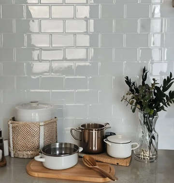
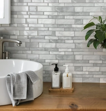
Horizontal lines and subway formats can stretch a backsplash visually.
Stone, marble, and mosaic looks create a more layered wall without construction dust.
A controlled pattern behind a desk can make a home office feel intentional.
Small creative projects can make scraps useful without committing another full wall.
| Pattern | Best for | Planning note |
|---|---|---|
| Subway | Clean kitchens, bathrooms, and beginner layouts | Simple lines make cuts and edges easier to control. |
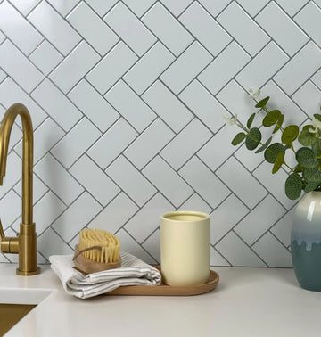
| Herringbone | Movement, boutique accents, and focal walls | Plan edge terminations before installation. |
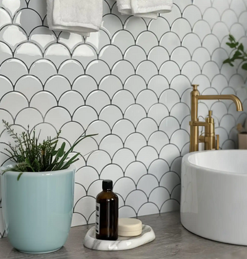
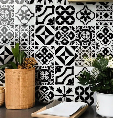
| Hexagon | Modern geometry and small feature zones | Repeating shapes need careful alignment at corners. |
| Marble look | Soft luxury and high-low kitchen design | Vein direction matters more than most buyers expect. |
Natural light, under-cabinet lighting, mirror reflection, and wall shadows change how tile reads. White and misty tones can open a small room. Green and blue can bring color without feeling loud. Black, slate, and bold contrast work best when the wall has enough light and a clean edge. Gloss can brighten a dark corner but may show glare and smudges faster than matte finishes.
For color and finish decisions, read matte versus glossy backsplash testing, faux marble vein alignment, and fashion color trends for interiors.
For kitchens, keep the product cleanable and the pattern easy to align around cabinets and outlets. For bathrooms, use soft finishes in low-splash zones and avoid treating design tile as waterproofing. For offices, prioritize camera framing and glare control. For living rooms, use the tile as a contained accent instead of covering every surface. For renters, choose a smaller, high-impact zone that can be removed with less risk.
Useful next reads include TV accent wall design, a faux headboard project, fashion-inspired home styling, and peel-and-stick furniture hacks.
A good tile design should support the mood of the room. In a kitchen, the tile often needs to feel clean, durable, and easy to wipe. In a bathroom, it should feel fresh without pretending to solve moisture problems that belong to waterproofing. In a living room, the wall can be warmer and more decorative because it is not exposed to daily splashes. In a home office, pattern should help the background look polished without distracting on camera.
Use product samples and real lighting before making the final choice. A tile that looks bright in a product photo may look cooler under LED lighting. A glossy tile may bounce under-cabinet lights in a kitchen. A strong pattern may look excellent on a small sample but feel busy across a full wall. These are design decisions, not just product decisions.
Choose subway formats when you want a familiar backsplash look with easier alignment.
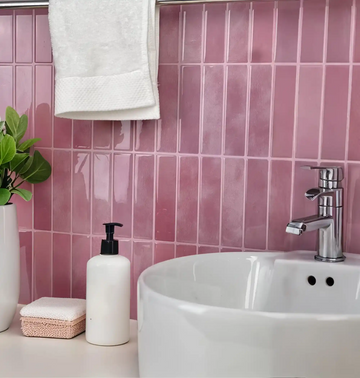
Use pale greens, blues, and whites for a lighter wall that still has personality.
Use hexagons, herringbone, or mosaic patterns for smaller focal areas.
Use stone-look products where vein direction and light can be planned carefully.
The easiest way to make peel-and-stick tile look more polished is to control the stop points. End the tile at a cabinet, corner, trim line, shelf, mirror edge, or measured design boundary. Avoid letting the tile stop randomly in the middle of a wall unless that break is part of the design. If the edge is exposed, plan trim or a clean reveal before installation.
After that, use restraint. One strong feature wall can look more designed than three partially tiled surfaces. A simple subway tile can look more premium than a complex pattern installed around too many obstacles. When in doubt, choose the layout that will be easiest to align, clean, and live with for the longest time.
The most common peel-and-stick tile design mistake is choosing a pattern before choosing the wall's role. A busy mosaic may look exciting in a close-up photo but feel noisy across a full backsplash. A dark marble-look tile may look refined online but need better lighting in a small rental kitchen. A tiny hexagon can make a vanity feel custom, but it may also create more seam attention than a calmer subway pattern.
Use the room's fixed elements as the design frame: cabinet color, counter tone, faucet finish, flooring, wall paint, and natural light. If those elements are already busy, choose a quieter tile. If the room is plain, a herringbone, coastal color, faux stone, or metallic accent can add energy. The best peel-and-stick tile ideas feel like part of the room, not a separate decoration placed on top of it.
Before ordering, place your top tile options beside photos of the actual wall, cabinet, counter, and floor. Then compare them under morning light, evening light, and artificial light. For renter-friendly designs, include a move-out note on the board: where the tile starts, where it stops, and how the edge will be removed later. This keeps the creative decision connected to the practical installation.
Simple rule: choose one main visual move: pattern, color, texture, or shine. When a peel-and-stick tile tries to do all four at once, the room can feel smaller and harder to style.
Subway peel-and-stick tile is the safest starting point when you want a clean backsplash, a calm vanity wall, or a classic rental upgrade. Herringbone tile works better when the wall has enough open space for the pattern to read clearly. Hexagon tile can make a small accent feel custom, especially near a mirror, shelf, or desk wall. Marble-look tile works best when the vein direction and nearby surfaces are planned together.
For color-led design, let the room decide how bold to go. A white kitchen may benefit from soft green, coastal blue, or warm stone. A dark cabinet kitchen may need a lighter tile to keep the wall from feeling heavy. A bathroom with chrome fixtures often looks cleaner with pale neutrals, while brass or black fixtures can support stronger contrast. Use product samples and real-room photos together so the final choice is based on your light, not only a catalog image.
When you narrow the look, compare subway wall tiles, herringbone tiles, hexagon tiles, and Snowfish Marble side by side.
Subway-style layouts are usually the easiest starting point because the lines are predictable and edge planning is simpler.
Not always. Small rooms often benefit from simpler, calmer patterns. Pattern scale should match the wall's role and the number of cuts required.
Plan edges, align visible lines, avoid overcovering, and choose a product style that matches the room rather than only following a trend.