


Quick Answer: Achieving Cottagecore Realism
- • The Core Principle: A cottagecore peel and stick backsplash achieves true vintage realism through soft warm-neutral color palettes, ultra-matte finishes, irregular edge shapes, and smaller-scale stone patterns.
- • What to Avoid: Steer clear of high-gloss finishes, stark gray tones, oversized artificial stone patterns, and flat printed grout lines that immediately reveal the synthetic nature of the tile under kitchen lighting.
- • Small Kitchen Strategy: Utilize warm beige and cream tones to visually expand the space, pairing the faux stone with natural wood accents, open shelving, and warm under-cabinet lighting.
For many homeowners and renters, the fear of investing time and money into a kitchen upgrade only to be left with a cheap, artificial-looking result is a major barrier. Most standard peel and stick "stone" tiles miss the target entirely. They often optimize for a high-contrast, modern farmhouse aesthetic rather than the soft visual warmth and lived-in texture essential for a true vintage feel.
The desire to cultivate a sanctuary within our homes has never been stronger. As the world outside feels increasingly fast-paced and digitized, the kitchen remains the deeply emotional, beating heart of the home. It is where bread is kneaded, coffee is brewed, and quiet morning moments are savored. However, when you are living in a rental apartment with sterile white walls, or a builder-grade home devoid of architectural character, establishing that deeply rooted sense of history feels impossible. This is where the magic of a properly selected faux stone backsplash comes into play, offering a bridge between your current reality and your design aspirations without risking your security deposit.
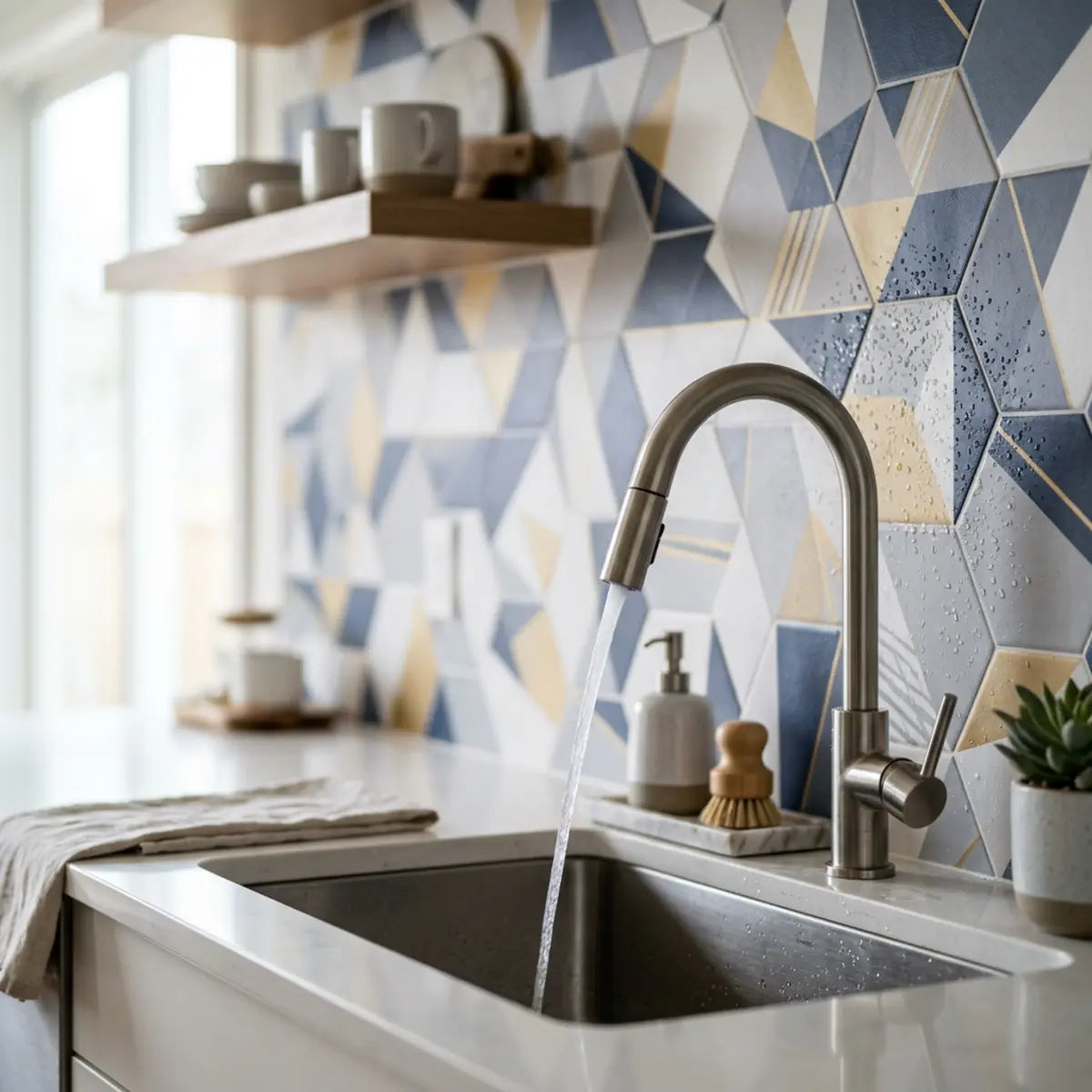
A cottagecore peel and stick backsplash works best when faux stone tiles have soft warm-neutral color variation, matte or low-sheen texture, smaller-scale patterning, and renter-safe adhesive performance. The best choice is not the cheapest tile, but the one with the highest Cottagecore Realism Score based on visual warmth, texture believability, scale, removability, and compatibility with small kitchens and vintage decor.
Understanding this distinction is the key to transforming a bland rental or builder-grade layout into a charming sanctuary. This guide establishes a comprehensive framework to help you navigate the overwhelming options. It is not enough to simply search for "peel and stick stone" online; the market is flooded with products that look spectacular in a digitally rendered thumbnail but resemble shiny, printed contact paper when unpacked in your kitchen.
We will cover exactly how to spot faux stone tiles that look authentically cottagecore instead of generic farmhouse. We will identify which renter-friendly materials and placements are safest for kitchens. Finally, we will detail how to seamlessly style a faux stone backsplash with butcher block counters, vintage accents, and small-space layouts. By the end of this comprehensive analysis, you will possess the precise diagnostic tools needed to evaluate any peel and stick product and execute a flawless, high-end vintage transformation.
What makes a peel and stick backsplash feel truly cottagecore?
The Design Dilemma: Ever struggle to translate dreamy aesthetic inspiration into concrete tile traits, only to end up with a cold, generic modern farmhouse look? This section defines the precise visual rules of a cottagecore faux stone backsplash, providing a definitive framework to evaluate products confidently before purchasing.
When evaluating faux stone peel and stick tiles, the foundational methodology requires a strict adherence to a standardized evaluation metric. We refer to this as the Cottagecore Realism Score (CRS). This quantitative baseline measures visual warmth, texture believability, pattern softness, vintage compatibility, and small-space friendliness. The CRS is not merely a subjective feeling; it is a rigid checklist of visual attributes that dictate how the human eye interprets artificial materials.
Industry consensus dictates that tiles failing to meet a high CRS will inevitably look artificial under standard kitchen lighting. Let us break down the exact components that yield an optimal configuration. To truly master this aesthetic, we must first unlearn the aggressive, high-contrast design rules that dominated the past decade of interior design television shows and viral home renovations.
The Core Differences: Cottagecore vs. Farmhouse Design
A common misconception is that all rustic designs are interchangeable. This fundamentally misunderstands the architectural standard of vintage European kitchens. The nuances between these styles are profound, dictating entirely different color palettes, material choices, and emotional responses.
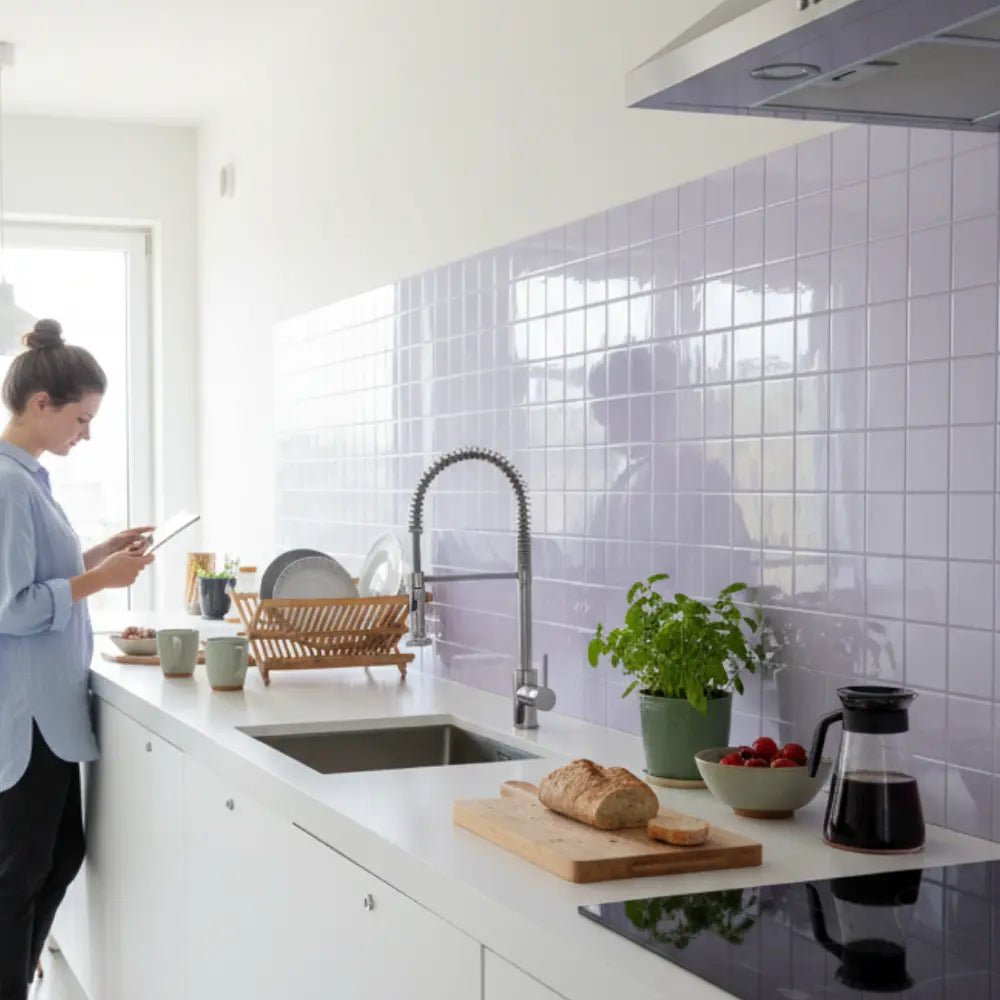
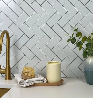
- Farmhouse Style: The Utilitarian Baseline Typically relies on high contrast. You will see stark whites paired with charcoal grays, matte black hardware, and crisp, oversized structural elements. It leans heavily toward an industrial, utilitarian baseline. Farmhouse design was born out of necessary function—large sinks for washing, durable metals, and stripped-back surfaces. When faux stone mimics this, it often results in jagged, gray stacked stone that feels cold and imposing.
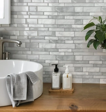
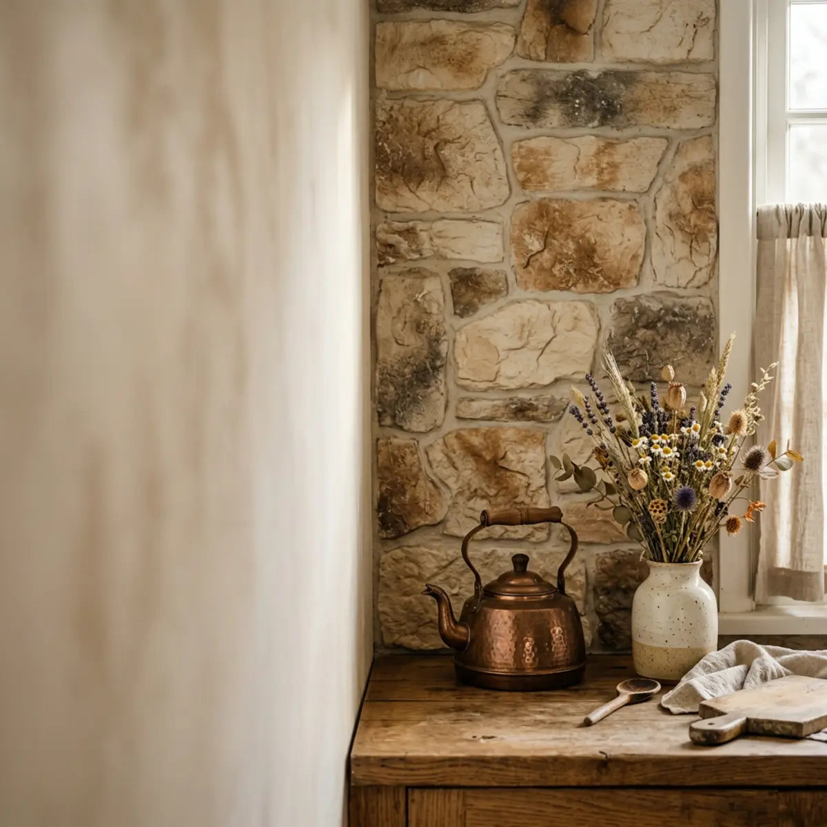
- English Cottage Kitchen: Historic Preservation Focuses on historic preservation. Think authentic masonry, deep moody colors like hunter green, aged brass, and heavy, permanent fixtures. It feels established and slightly formal. The stone in these historic homes was often locally quarried limestone or flint, featuring irregular mortar joints and a profound sense of permanence.
- Cottagecore: Accessible Romanticism A romanticized, highly accessible interpretation of rural life. It prioritizes softness, imperfection, nostalgia, and a handmade influence. The goal is a cozy, inviting atmosphere that feels effortlessly accumulated over time. Cottagecore faux stone must capture the essence of a sunlit countryside cottage—it should look as though it has been gently worn down by decades of baking and quiet domestic life.
Mastering the Cottagecore Visual Cues
To achieve a high Cottagecore Realism Score, your chosen faux stone peel and stick tiles must visually replicate natural aging. The eye is incredibly adept at spotting synthetic repetition. When you apply a plastic-based product to a wall, you are fighting against the brain's innate ability to detect authenticity. You can trick the eye, but only if the product adheres to these strict visual rules.
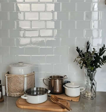
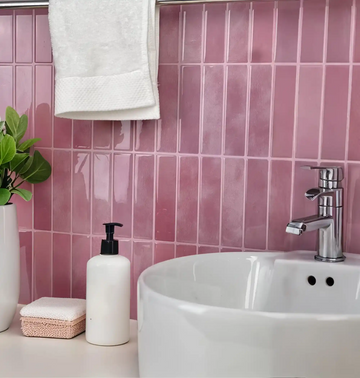
- Warmth: The underlying tones must lean toward yellow, pink, or brown bases, avoiding blue or stark white undertones. Cool tones read as modern and sterile, while warm bases mimic the natural clay and mineral deposits found in aged European masonry.
- Imperfection: Uniform, machine-cut edges instantly break the illusion. Look for tiles that mimic hand-chiseled or naturally tumbled stone. The mortar lines should vary slightly in thickness, just as they would if a stonemason laid them by hand a century ago.
- Softness: The visual transition between the "stones" should be gentle, not harsh or deeply shadowed. Some faux stone products print stark, black drop-shadows to simulate depth. Under standard kitchen lighting, these printed shadows look like comic-book illustrations. True realism requires subtle, tonal shading.
- Nostalgia: The overall effect should evoke a sense of history, complementing vintage floral textiles and worn wood grains. The stone should look like the backdrop to a slow, intentional lifestyle, not a stark commercial showroom.

The Superiority of Warm Neutrals
When assessing the aesthetic longevity of a kitchen backsplash, the baseline metric shifts away from trendy grays. Empirically demonstrated by the National Kitchen & Bath Association (NKBA), warm palettes are rapidly replacing cool gray tones in kitchen renovations. The gray-washing of interiors over the last decade led to spaces that felt clinical and devoid of personality. The cottagecore movement is a direct rebellion against this sterility.
For a cottagecore aesthetic, beige, greige, cream, muted taupe, and aged limestone effects heavily outperform high-contrast gray stone. Warm neutrals inherently neutralize the sterile feel of standard apartment appliances and laminate countertops. They reflect light in a way that softens the room, whereas gray stone absorbs warmth and creates a stark, cavernous effect. Think of the color of wild mushrooms, dried wheat, or heavy cream—these are the tones that anchor a genuinely cozy space.
Furthermore, color theory dictates that warm colors advance slightly while simultaneously feeling enveloping. In a kitchen setting, where sharp angles and hard surfaces (appliances, countertops, cabinetry) dominate, introducing a warm, textured focal point acts as a visual counterbalance. It softens the acoustics and the overall ambiance of the room. When you select a peel and stick stone in a creamy travertine or warm fieldstone palette, you are instantly injecting a sense of heritage into the environment.
Interactive: Cottagecore or Farmhouse?
Test your design eye. Which of these tile descriptions yields a higher Cottagecore Realism Score?
Diagnosing the "Fake" Factor: Grout, Texture, and Sheen
The most statistically significant indicator of a low-quality faux tile is its light reflectance value (LRV). The way light behaves when it hits your backsplash dictates everything. If you install a beautiful pattern but the material catches the light like a vinyl shower curtain, the illusion is shattered immediately. Lighting in modern kitchens, particularly the reliance on high-kelvin LED bulbs, is unforgiving.
-
▸ Sheen Levels
High-gloss or semi-gloss finishes on faux stone instantly reveal the plastic or vinyl composition. A true cottagecore stone requires an ultra-matte or low-sheen finish to mimic porous, natural rock. Natural limestone, soapstone, and tumbled river rock do not bounce light aggressively; they absorb it gently. -
▸ Grout Lines
Printed grout lines that look like flat, gray stripes destroy texture believability. Premium faux stone backsplash renter friendly options feature slightly recessed or physically textured grout channels. The tactile depth difference between the "stone" face and the "grout" line is what convinces the brain the material has mass and volume. -
▸ Edge Finish
Sharp, perfectly straight edges belong in modern designs. Cottagecore demands softly rounded or irregular edges. When stones look tumbled, it suggests they have withstood the test of time, an essential narrative component of the vintage aesthetic. -
▸ Print Repetition
If you can spot the exact same stone pattern repeating every twelve inches, the human eye will register it as wallpaper. A standardized evaluation requires reviewing a minimum of four distinct tile panels to ensure adequate pattern variation. High-quality manufacturers randomize the print layout so the tiling appears organic and unforced.
Think of sheen on faux stone like bad stage makeup. Under harsh kitchen lighting, it highlights every artificial pore and seam. Matte finishes, conversely, diffuse the light and mask the synthetic nature of the material. A pro tip for assessing sheen is to hold your phone flashlight at a 45-degree angle to the sample tile. If you see a bright, sharp reflection of the LED bulb, the product will look cheap on your wall. If the light disperses into a soft, glowing halo, you have found a high-CRS product.
Social Media Aesthetics: Pinterest and Etsy Expectations
Consumers frequently use Pinterest and Etsy to establish their kitchen design goals. These platforms curate highly stylized, perfectly lit environments. Every image you admire online has been subjected to ideal natural lighting, strategic styling, and often, subtle color grading. The warm, moody shadows that make a cottagecore kitchen look so inviting in a photograph are painstakingly crafted by professional photographers.
This creates a performance degradation curve in consumer expectations. When the peel and stick tile arrives, it rarely looks exactly like the filtered, professionally photographed examples online. To bypass this disappointment, it is critical to order physical samples. Do not skip this step to save a few dollars; it is the most crucial insurance policy against design regret.
Always tape the sample directly to your kitchen wall. Observe how the texture and color shift from morning sunlight to artificial evening light. This recalibrates your baseline expectations to match your specific environment. A tile that looks beautifully creamy at 10:00 AM might turn a sickly yellow under your under-cabinet lighting at 8:00 PM. Living with the sample for 48 hours allows you to witness these shifts and make a confident, informed decision.
Scale Matters: Why Smaller Stone Visuals Win
Scale is a universally recognized paradigm in interior design. In standard apartment kitchens, utilizing oversized faux stacked-stone patterns is a critical error. The psychological impact of proportion is immense, yet it is often the most overlooked aspect of DIY renovations.
Large stone visuals visually shrink the space. They draw attention to the limited square footage by emphasizing how few stones actually fit between the countertop and the cabinets. If your backsplash height is a standard 18 inches, and you choose a faux stone where each block is 6 inches tall, you will only see three rows of stone. This clearly telegraphs the confined nature of the room.
Conversely, small-scale stone visuals—such as miniature tumbled cobblestone or narrow ledger stone—create the illusion of expansiveness. They provide detailed texture without overwhelming the viewer. This yields an optimal configuration for small cottage kitchens, making the wall appear taller and wider. When the eye has to process numerous, intricately detailed small shapes, it inherently assumes the surface area is vast. This optical illusion is a powerful tool in the renter's design arsenal.
How do you make a small kitchen look cottagecore with peel and stick tile?
The Small Space Challenge: Worried that applying a textured stone wall will make your tiny apartment kitchen feel like a cramped, dark cave? This section reveals how to manipulate scale, color, and precise placement to maximize vintage charm without cluttering your limited square footage.
When evaluating modifications for compact areas, the foundational methodology relies on the Small-Space Charm Efficiency (SSCE) metric. This measures the visual depth gained per square foot without introducing visual clutter. In a small space, every square inch of visual real estate must be ruthlessly optimized. A heavy, dark, overwhelming wall treatment will create a claustrophobic environment, destroying the peaceful sanctuary aesthetic you are aiming for.
Benchmarked against standard, heavy masonry installations, peel and stick options offer a unique advantage. The material itself is thin, meaning you do not lose precious millimeters of counter depth. However, executing this in a small kitchen requires strict adherence to spatial planning rules. The goal is to evoke the feeling of a cozy country scullery, not a subterranean dungeon.

Step-by-Step Renter-Safe Installation Guide
To fully grasp how to manipulate space, you must understand the installation mechanics. A flawless installation directly impacts the visual realism of the final product. Here is the definitive process for ensuring your faux stone looks authentic and stays firmly on the wall until you are ready to move out.
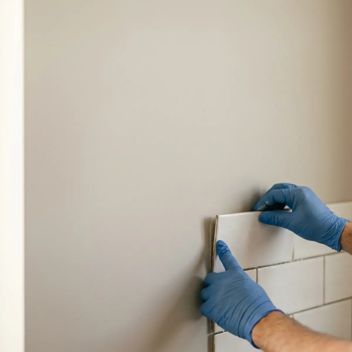
- Surface Preparation: The most critical step. Peel and stick adhesives bond best to clean, smooth, non-porous surfaces. Scrub the existing wall or tile with a degreaser like TSP (Trisodium Phosphate) or a strong dish soap solution. Remove all cooking oils, dust, and grime. Allow the wall to dry completely for at least 24 hours. If your wall is heavily textured (like a heavy orange peel or knockdown texture), you must smooth it out or apply a renter-friendly intermediary layer, such as a thin sheet of mounting board, to prevent the texture from telegraphing through the faux stone.
- Acclimation: Allow your peel and stick tiles to rest in the kitchen for 48 hours prior to installation. Materials expand and contract with temperature and humidity. Installing cold vinyl onto a warm kitchen wall will result in peeling edges and buckling seams.
- Strategic Layout Planning: Never start in a random corner. Find the absolute center point of your focal wall (usually directly behind the sink or stove). Use a level and a chalk line to create a perfectly straight horizontal and vertical axis. You want the faux stone pattern to radiate outwards symmetrically from this focal point. This ensures that any awkward, small cuts are hidden at the far edges of the cabinetry, rather than front and center.
- Precision Cutting: Faux stone tiles often feature interlocking, jagged edges to hide the seams. When you reach a straight edge, like a wall corner or cabinet, you must trim the interlocking tabs. Use a high-quality utility knife with a fresh blade and a metal straight edge. Cut cleanly on the protective backing side before snapping or slicing through the vinyl face.
- Application and Sealing: Peel back only the top two inches of the adhesive backing. Align the tile precisely with your level line. Press firmly, smoothing downward to eliminate air bubbles. Once installed, consider running a thin, imperceptible bead of clear silicone caulk along the bottom edge where the tile meets the countertop. This stops moisture from penetrating the adhesive line and adds an undeniable layer of professional polish, dramatically boosting the realism score.
Renter Safety Warning: Wall Prep and Removal Risk
While engineered to be removable, "peel and stick" does not mean damage is impossible. If applied to freshly painted walls (cured less than 30 days) or flat/matte builder-grade paint, the adhesive can pull the paint off upon removal. Pro Tip for Removal: Never rip the tile straight off. Use a hairdryer on high heat, holding it 6 inches away from the tile for 30 seconds to melt and reactivate the adhesive, then pull slowly at a harsh 180-degree angle flush against the wall.
Strategic Placement for Small Kitchens
You do not need to cover every inch of exposed wall to achieve the cottagecore look. In fact, a deterministic outcome of over-tiling a small kitchen is visual suffocation. Applying heavy stone texture to every vertical surface in a 50-square-foot galley kitchen will make it feel like a cavern.
Here is how to allocate your faux stone tile based on the SSCE metric, ensuring maximum aesthetic return on investment:
- The Full Run: Installing tile along the entire wall, from counters to upper cabinets. This works best if your cabinets and countertops are solid, light colors without busy patterns. If your countertops are heavily veined granite, adding a highly textured stone backsplash will create visual chaos.
- The Sink Accent: Placing the faux stone exclusively behind the sink, bridging the gap between the counter and a window. This creates a charming focal point while saving budget. It mimics the traditional European approach of adding durable materials only where water splashes occur.
- The Stove Splash: Creating an isolated panel of faux stone directly behind the stove. This evokes the romantic architecture of a classic hearth or chimney breast. Ensure you verify with manufacturer specs regarding heat resistance and safe clearance distances before choosing this route.
Maintaining an Airy Aesthetic with Textured Faux Stone
Textured surfaces absorb light. This is a fundamental law of physics. To prevent your cottagecore kitchen backsplash from feeling heavy, you must counterbalance the faux stone with airy elements. If you apply a matte, textured, warm stone tile between dark cherry cabinets and a dark granite countertop, the space will immediately feel oppressive.
According to spatial guidelines published by top interior design publications, pairing dense wall textures with open sightlines is essential. You must engineer visual breathing room.
- Open Shelving: If possible, remove one or two cabinet doors. Displaying simple, light-colored ceramics, stacks of white ironstone plates, or clear glass jars against the faux stone background adds immense depth and breaks up the heavy texture. The contrast between smooth, glossy ceramics and matte, rugged stone is a hallmark of high-end cottage design.
- Reflective Accents: Introduce warm metals. Unlacquered brass cabinet pulls, a vintage copper kettle, or a gently worn bronze faucet reflect ambient light, offsetting the matte finish of the faux stone. These metallic elements act as jewelry for the kitchen, catching the eye and scattering light around the room.
- Under-Cabinet Lighting: This is non-negotiable. Installing simple, renter-friendly LED strip lights under your upper cabinets fundamentally mitigates the shadows cast by textured peel and stick tile. Ensure you select "warm white" bulbs (between 2700K and 3000K). Cool white or daylight bulbs (4000K+) will wash out the warmth of the faux stone and highlight its synthetic nature.
The Illusion of Space: Warm Neutrals vs. Dark Charcoal
As established by the Cottagecore Realism Score, color heavily dictates the perception of space. The human eye interprets dark and light colors differently in a three-dimensional environment.
Dark charcoal or deep gray faux stone may look striking on a sample board, but in a small kitchen, it advances visually. This means the wall appears to move closer to the viewer, shrinking the room. Dark colors absorb photons, reducing the overall ambient light level in the space, which forces the eye to work harder, creating a subconscious feeling of confinement.
Warm neutral peel and stick backsplash options—like pale limestone, creamy travertine effects, or soft beige fieldstone—recede visually. They push the wall back, tricking the eye into perceiving more square footage. They bounce whatever natural light enters the room softly around the space. This establishes a new benchmark for cost-efficiency, as you effectively "enlarge" the room without structural changes. When paired with white or light-wood cabinetry, a cream faux stone backsplash blurs the distinct lines of the room's architecture, making the ceiling feel higher and the walls feel wider.
Renter-Friendly Styling for Vintage Appeal
The final layer of a successful installation is the surrounding styling. The tile alone cannot carry the entire aesthetic burden. If you install a beautiful, highly realistic cottagecore stone backsplash but leave a bright red, futuristic plastic coffee maker on the counter, the illusion crashes. The context in which the tile lives determines its believability.
To complete the vintage inspired peel and stick tile installation, integrate these cohesive elements carefully into your everyday living space:

Harmonizing with Butcher Block
Faux stone and wood grains are the quintessential cottagecore pairing. The organic warmth of wood perfectly complements the rugged, earthy texture of stone. If you have butcher block counters, ensure the undertones of the wood coordinate with the faux stone. A warm creamy stone pairs beautifully with amber-toned wood like oak or maple. If your butcher block leans red (like cherry) or cool (like walnut), select a faux stone with corresponding subtle flecks of those tones to bridge the gap visually.
Curating the Countertop
Clear away modern, plastic appliances. Store the toaster and the blender out of sight inside lower cabinets. Replace them with functional, vintage-inspired items that double as decor. Think heavy wooden cutting boards leaning against the faux stone, a substantial ceramic utensil crock filled with well-loved wooden spoons, and rough-hewn linen dish towels draped elegantly over the sink edge. Even transferring your dish soap into a beautiful amber glass pump bottle significantly elevates the space.
Layering Textiles
Textiles soften the rigid lines of kitchen cabinetry and hard flooring. Introduce a small, washable vintage runner rug in muted, earthy tones (faded terracotta, moss green, ochre). Hang cafe curtains made of natural linen or a subtle, small-scale gingham print. These soft fabrics absorb sound and add crucial layers of nostalgic texture that support the cottagecore narrative of the stone backsplash.
Visual Planning Checklist
Before ordering your removable stone backsplash, follow this standardized evaluation to ensure a seamless project:
- Measure and Multiply: Calculate your exact square footage. Measure the width and height of all walls in inches, multiply them together, and divide by 144 to get square footage. Then, crucially, add 15% to that total. This overage accounts for cutting errors, pattern matching, and complex cuts around electrical outlets.
- Verify Adhesion: Ensure your current walls are smooth. Run your hand over the paint. Peel and stick products fail on heavily textured drywall (like orange peel or knockdown finishes). If you have texture, budget time and money for smoothing solutions.
- Review Heat Ratings: Check the manufacturer's operational threshold for heat exposure if installing near an oven. Radiant heat can melt vinyl or compromise the adhesive, leading to dangerous and unsightly peeling.
- Order Physical Samples: Never purchase a full order based solely on digital images. The cost of a few samples is minuscule compared to the cost of a failed, highly visible design mistake.
Ready to Start Your Project?
Download our comprehensive pre-installation wall prep and measurement checklist to ensure a flawless, renter-safe application.
Download Free ChecklistFinal Thoughts
Achieving a highly realistic cottage kitchen aesthetic does not require a massive renovation budget, a team of stone masons, or a permanent commitment that risks your rental deposit. The evolution of peel and stick technology has democratized high-end interior design. However, the onus is on the consumer to navigate the sea of cheap, shiny vinyls to find the hidden gems.
By reframing your selection process around the Cottagecore Realism Score, you can easily bypass cheap-looking alternatives. You are no longer just looking for "fake stone"; you are looking for specific light reflectance values, edge treatments, tonal warmth, and pattern variation. You possess the analytical tools to dissect a product thumbnail and determine if it will translate into a beautiful reality in your home.
The most effective faux stone peel and stick tiles leverage soft, warm-neutral palettes, matte finishes, and appropriate scale to deliver authentic vintage charm. When paired with smart, space-enhancing placement and thoughtful, curated styling—such as integrating wooden textures, vintage textiles, and warm ambient lighting—these renter-friendly materials yield an optimal configuration for any home. They turn sterile drywall into an architectural feature.
We encourage you to utilize the comparison checklists, placement strategies, and safety warnings detailed above. Remember that the magic lies in the details: the warmth of the undertone, the subtleness of the printed shadow, and the styling of your countertop. Once you determine your ideal layout and color palette, ordering a few physical samples is the next logical step to ensure the texture and tone perfectly suit your unique kitchen lighting. Your dream cottage kitchen is entirely within reach—it just takes a bit of planning and a critical eye.
Frequently Asked Questions
Are faux stone peel and stick backsplashes safe for renters?
Yes, high-quality peel and stick tiles are engineered specifically for renters. They use a specialized adhesive designed to grip firmly during use but release cleanly when heat is applied. Always follow the manufacturer's specific removal instructions, which typically involve warming the adhesive with a hairdryer before gently peeling the tile away from the wall to prevent paint damage. Avoid pulling forcefully at a 90-degree angle; a slow, steady pull parallel to the wall yields the best results.
Can I install peel and stick stone tile over existing ceramic tile?
In most cases, yes. The existing tile must be completely smooth, clean, and free of any grease or debris. If the existing ceramic tile has very deep grout lines (wider than 1/4 inch), you may need to apply a thin layer of spackle or use a renter-friendly backing board to level the surface first. Otherwise, the faux stone peel and stick tiles may eventually contour to the grooves beneath, ruining the realism of the finish and causing unsightly dimpling.
How do I clean a textured faux stone peel and stick backsplash?
Maintenance requires a gentle approach to preserve the printed finish and the matte texture. Avoid highly abrasive scrub brushes, scouring pads, or harsh chemical cleaners containing bleach or ammonia, which can strip the protective topcoat. Industry consensus recommends using a soft microfiber cloth dampened with warm water and a mild dish soap. Wipe spills immediately, particularly acidic ones like tomato sauce, to prevent staining the textured crevices of the faux stone surface.
Will peel and stick faux stone melt behind my stove?
This depends entirely on the operational threshold specified by the manufacturer. Most standard vinyl peel and stick tiles require a minimum clearance of eight to nine inches from open flames or high-heat radiant burners. If your stove lacks a back control panel acting as a buffer, you must verify that the specific faux stone tile is explicitly rated for high-heat kitchen zones before installation. Never install standard peel and stick directly behind a gas burner without a physical heat shield.
How do I cleanly cut around electrical outlets and light switches?
First, turn off the power to the kitchen outlets at your circuit breaker. Remove the plastic outlet covers. Measure the exact position of the electrical box and trace it onto the backing paper of your tile. Use a sharp utility knife to cut out the rectangle. Apply the tile over the wall, letting the edges slip slightly underneath where the outlet cover will sit. Once the tile is smoothed down, screw the outlet cover back on for a perfectly seamless, professional-looking edge.

Leave a comment
This site is protected by hCaptcha and the hCaptcha Privacy Policy and Terms of Service apply.