

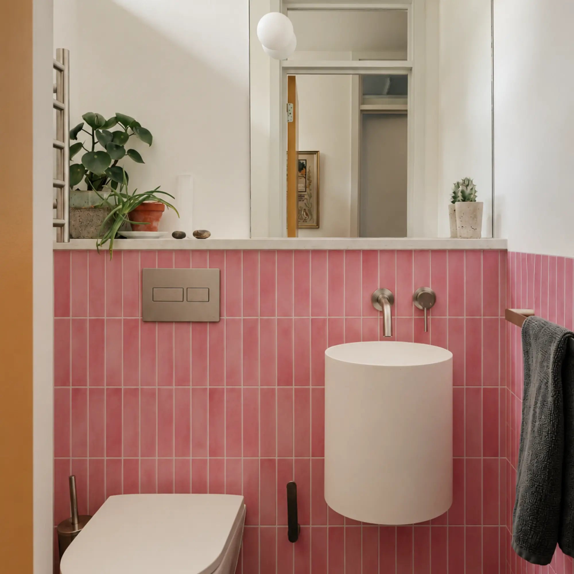
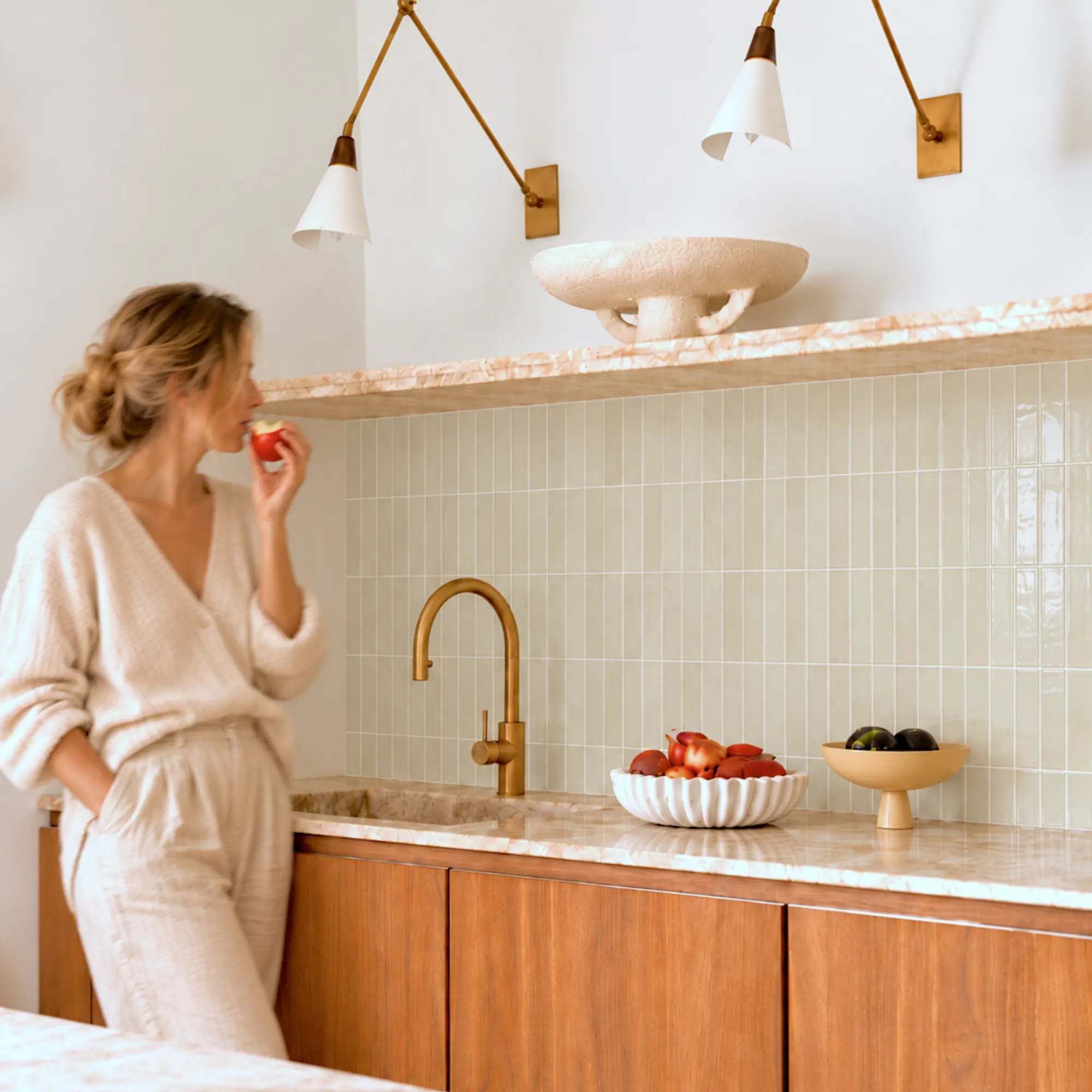


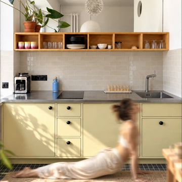
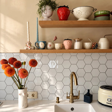
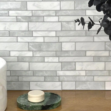
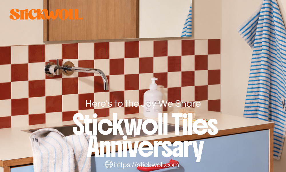
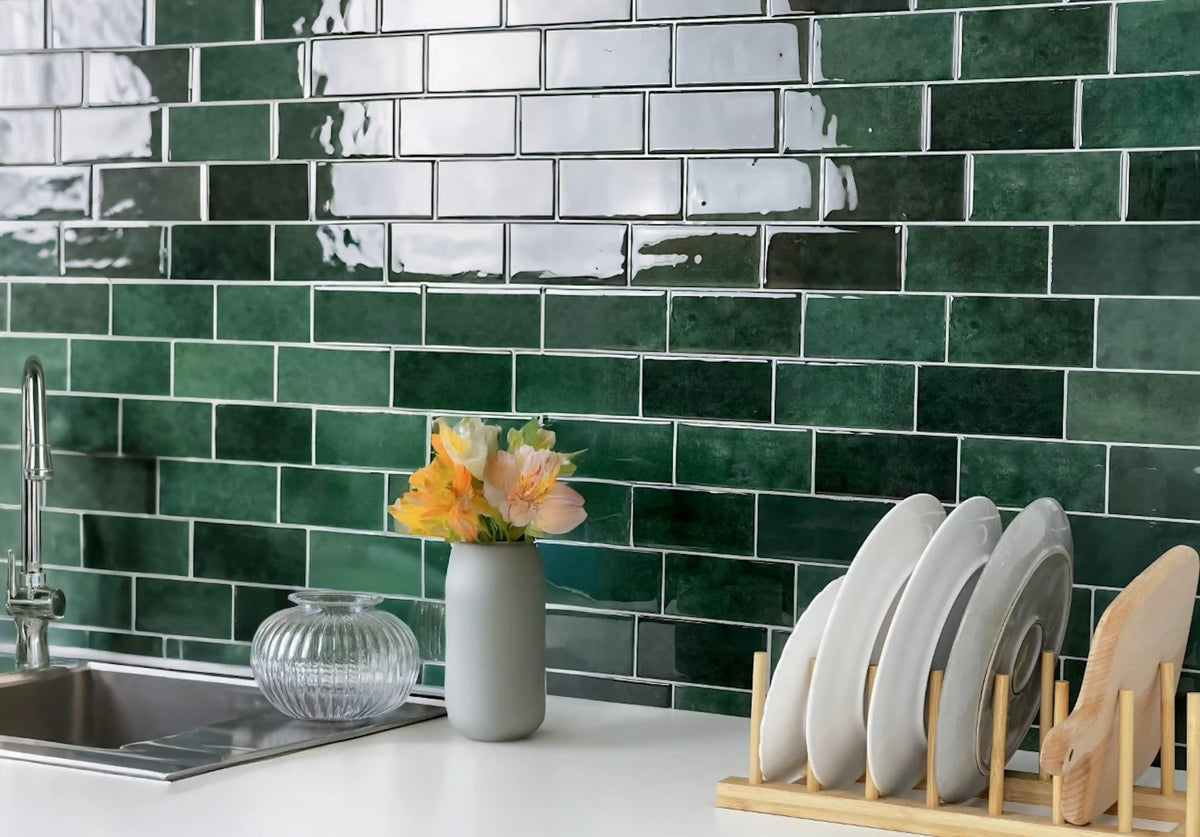
Tiles can transform any space into a design haven, and in 2026, updating your home interiors is easier than ever. You might be rethinking your flooring, backsplashes, or even walls, right? Tiles are the ultimate choice for adding flavor and functionality. This article was recently updated to ensure its timeliness and accuracy. Wondering how peel and stick tiles could work for you, and how to choose that one perfect pattern? In this guide, I bring you versatile tile patterns achievable with peel and stick tiles, each offering its own vibe to suit your home’s aesthetic feel.
Explore this guide
Popular Peel and Stick Tile Patterns
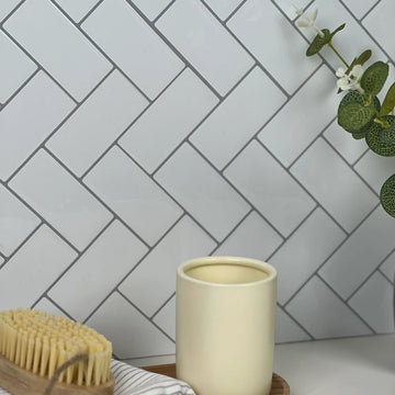
Classic Herringbone for Timeless Appeal

- Enduring Style: Herringbone patterns are classic and have remained widely used across many design periods.
- Versatile Use: Works well in various spaces, from kitchens to living rooms.
- Visual Interest: Creates a striking visual effect that draws the eye.
The herringbone tile pattern features a distinctive “V” shape, resembling the bones of a fish. This arrangement brings a sense of elegance and sophistication to any room. Whether you lay herringbone tiles on the floor or use them for a stunning backsplash, this pattern adds depth and character. I love how these tiles can transform a simple kitchen into a stylish cooking space.
In my experience, herringbone tiles work best in areas where you want to make a statement. For example, if you have a small kitchen, using herringbone tiles on the backsplash can create a focal point that makes the space feel larger and more dynamic. Additionally, herringbone patterns can be achieved with peel and stick tiles, making installation easy and straightforward. If you’re looking for a timeless choice, consider adding herringbone tiles to your home decor.
Modern Chevron for a Dynamic Look

- Bold Statement: The chevron pattern is bold and eye-catching.
- Contemporary Vibe: Perfect for modern decor styles.
- Flexible Color Choices: Available in various colors to match your aesthetic.
The chevron tile pattern is another favorite of mine, especially for those who want to infuse a bit of modern flair into their spaces. Unlike the classic herringbone, chevron tiles create a zigzag effect that offers a more energetic and playful vibe. This pattern looks amazing in living rooms, where it can add a touch of fun without overwhelming the space.
When you choose chevron tiles, you can play with color combinations to make your pattern pop. For instance, pairing a light tone with a bold color can create a striking contrast that draws attention. I once used chevron tiles in my bathroom remodel, and the difference was remarkable. The space felt fresh and inviting, showcasing a modern aesthetic that I absolutely love. Plus, using peel and stick chevron tiles makes the installation a breeze—no mess, just style!
Grid Patterns for Minimalist Designs

- Simple Elegance: Grid patterns are easy on the eyes and straightforward.
- Clean Lines: Offers a sleek, modern look.
- Great for Small Spaces: Can make a room feel more spacious.
If you prefer a clean and minimalist style, grid tile patterns are the way to go. Grid patterns consist of rectangular or square tiles placed in a uniform manner, creating a neat and organized look. This simplicity can be a perfect backdrop for other design elements in your home, allowing furniture and decor to shine.
I recommend grid patterns for smaller spaces, as they can create an illusion of a larger area. For example, using white or light-colored grid tiles in a tiny bathroom can make it feel much more open and airy. Additionally, grid tiles can easily be paired with bold colors or textures in your décor for added interest. If you’re considering a minimalist approach, peel and stick grid tile designs are a fantastic option to explore.
Choosing the Right Tile Pattern for Your Home
Consider Your Space Size and Lighting
- Space Assessment: Evaluate the size of your room before choosing a pattern.
- Lighting Matters: Understand how natural light interacts with your tiles.
- Pattern Scale: Larger patterns can overwhelm small spaces.
When it comes to selecting the perfect tile pattern, understanding the size of your space and the lighting conditions is crucial. A small room can feel cramped with overly detailed patterns, while larger spaces might benefit from more intricate designs. I recommend standing back and assessing the room’s dimensions before making a decision.
Lighting also plays a critical role in how tile patterns appear. Rooms with ample natural light can handle bolder patterns, whereas darker spaces might benefit from lighter, more open designs. For instance, I installed bright herringbone tiles in a sunlit kitchen, and the result was a beautifully vibrant area. Remember, considering both space size and lighting can significantly influence your tile selection.
Match Patterns to Furniture Style
- Complementary Designs: Ensure your tiles harmonize with existing furniture.
- Theme Consistency: Choose tiles that fit your overall decor theme.
- Personal Style: Let your unique taste guide your choices.
Another essential tip for choosing tile patterns is to match them with your furniture style. For example, if you have rustic wooden furniture, you might want to consider textured tiles in natural colors. I remember a friend of mine who used rustic brick tile accents in her dining area, and it tied together the whole space beautifully.
It’s vital to maintain consistency in your home decor theme. If your style is modern, opt for sleek and contemporary tile patterns like chevron or grid. On the other hand, traditional styles might benefit from classic herringbone or mosaic designs. Your personal taste should ultimately guide your choices, creating a space that feels uniquely yours.
Use Colors that Enhance Your Home’s Mood
- Color Psychology: Understand how different colors affect mood.
- Cohesion: Use a color palette that flows throughout your home.
- Accent Tiles: Consider using bold colors for accent areas.
Color selection is crucial when choosing your tile pattern. Different colors can evoke different emotions, and this can significantly affect the ambiance of your home. For instance, blues and greens tend to create a calming effect, while warmer colors like reds and yellows can energize a space.
In my home, I decided to use cool tones for the kitchen, combining light blue grid tiles with white cabinets. The result was a serene atmosphere that made cooking enjoyable. Additionally, if you’re bold enough, consider using accent tiles in vibrant hues to add personality to small areas. A bright peel and stick tile backsplash in the kitchen can become a stunning focal point without overwhelming the entire design.
Conclusion
Tiles can dramatically change the feel of any room in your home, and with the latest 2026 designs, achieving a professional look is easier than ever. By understanding the various patterns available and how to choose the right one for your space, you can create a stylish and cohesive look. Whether you opt for the timeless charm of herringbone tiles, the modern flair of chevron tiles, or the minimalism of grid patterns, the possibilities are endless.
Don’t forget to explore our amazing merchandise links! Check out the Timberline Checks for a classic look or the Stickwoll Crimson Horizon for a vibrant upgrade. Both of these options are perfect for enhancing your home’s aesthetic while remaining budget-friendly.
Pattern scale can matter as much as pattern direction
Interior-design advice often says vertical lines make a room taller and horizontal lines make it wider. A controlled study by von Castell, Hecht and Oberfeld tested striped wall patterns in stereoscopic rooms and found that higher pattern density changed perceived spaciousness more consistently than orientation alone. The experiments do not tell you which backsplash will look best, but they are a useful warning against treating direction as a universal optical rule.
For a backsplash, pattern density is affected by tile size, grout or printed joint spacing, contrast and how much of the wall is visible. A fine grid can read as texture from across the room, while a large chevron can become the dominant shape. Test the actual pattern at the viewing distance used in the kitchen rather than judging only a close product photo.
Herringbone and chevron are not the same layout
Herringbone uses rectangular pieces meeting at right angles or another defined arrangement, creating a broken zigzag. Chevron pieces are typically cut so their ends meet to form continuous points. Printed peel-and-stick sheets may imitate either look without individual pieces. Check the actual sheet edges and repeat before planning the first course, because a printed motif and a piece-by-piece layout create different cut and alignment problems.
Dry-fit enough material to see at least one full repeat plus the edges that will be most visible. A centered feature may create balanced cuts, while starting at one end may reduce waste. Neither rule is always correct. Mark the wall width, obstacles and the exact repeat, then decide which compromise produces the cleanest visible result.
Grid, stacked and offset patterns need different checkpoints
A straight grid emphasizes level and plumb lines. Small deviations can become obvious when horizontal and vertical joints line up across the whole field. An offset subway layout can hide some vertical alignment but creates its own end-cut pattern. Large-format printed sheets can mimic these layouts while requiring the installer to align the printed grout lines across sheet seams.
Before peeling backing, draw a reference line and place several pieces or sheets without adhesive. Check the cabinet underside, countertop, window, outlet and exposed side edge. Walls and counters are not always perfectly parallel, so forcing the first row to follow one irregular edge can make the rest of the field look crooked. Use the product instructions to decide which reference should govern the layout.
Calculate quantity from the actual repeat
Area is only the first step. Suppose an eligible wall is 12 feet wide and 1.5 feet high, or 18 square feet. If the chosen sheet has 2.6 square feet of usable installed coverage, seven sheets cover 18.2 square feet arithmetically. A directional herringbone pattern with several outlet cuts may justify additional material, while a simple grid with favorable dimensions may need less. The example is arithmetic, not a universal waste percentage.
Keep a few pieces from the same order for repairs when practical. Pattern direction and production variation can make a future replacement more noticeable even when the product name is unchanged. Label the stored material with the installed orientation.
Judge color and contrast under the lights you actually use
DOE lighting research separates correlated color appearance from color rendition. Two lamps described with the same nominal color temperature can have different spectra and make blue, green, beige or metallic finishes look different. View the sample with the countertop and cabinet under daytime and evening conditions.
High-contrast patterns make joints and alignment more visible. Low-contrast patterns can read as a larger field but may still show repeated motifs. Photographing the sample can help you remember a layout, but camera white balance and exposure can change color. Make the final choice from the physical sample rather than the phone screen.
Use pattern to solve a composition problem, not a safety problem
A pattern can create a focal point, connect colors or visually organize a small wall. It does not make an unsuitable wall, wet zone or heat exposure acceptable. Confirm product use and surface preparation first, then use pattern to refine the design.
When comparing options, write one sentence for each: what it contributes, where the repeat falls, which cuts are difficult and what could make you reject it. This is more useful than ranking seven patterns from best to worst because the answer depends on the room and product.
Run a final pattern review before installation
Open enough packs to compare color and print direction according to the seller's instructions. Lay out the visible section, including the pieces around outlets and the exposed end. If the product has arrows or orientation marks, preserve them until the layout is recorded.
Check the design from several positions: directly in front of the counter, the room entrance and the normal seating area. A repeat that looks obvious from one angle may disappear from another. Adjust before exposing adhesive, not after a full wall is bonded.
During installation, revisit the reference line every few rows or sheets. Do not stretch a flexible piece to make a motif meet. If a cut is wrong, replace the piece rather than pulling the neighboring field out of alignment. The best pattern is the one you can execute cleanly on the actual wall with the exact product.
Match pattern complexity to the wall that will carry it
A small backsplash interrupted by outlets and cabinets gives a pattern less uninterrupted space than a full feature wall. Before selecting a complex motif, draw the visible rectangles and note where the repeat will be cut. A herringbone print that looks balanced on a product sheet can become visually crowded when several outlets interrupt the same repeat.
In a bathroom vanity area, compare the pattern with mirrors, cabinet fronts, towels and fixtures. In a laundry room, consider whether the wall is mostly hidden by machines. In a living area, viewing distance may be greater, so fine detail can read differently. The same pattern can therefore be appropriate in one location and unnecessarily busy in another.
Use a focal area intentionally
You do not need to cover every eligible wall with the strongest motif. A small range wall, coffee-bar section or niche can carry a pattern while neighboring walls remain quieter. Draw both options before buying. Reducing the patterned area can also simplify cuts and lower the amount of repair stock needed.
Plan cuts so the pattern still looks continuous
Label sheets or pieces during dry layout. Mark which edge points up and which piece follows it. If the pattern uses directional arrows, keep them visible until the cut is installed. For symmetric motifs, identify the centerline or repeated anchor point so replacement pieces can be aligned later.
At outlets, avoid creating fragile slivers when the product construction does not support them. Shift the layout before installation if a cut would leave an impractical edge. Around windows and cabinets, decide whether the pattern should continue through the return or stop at a trim. The correct choice depends on the product and the visual goal.
When a sheet combines several printed tiles, cut based on the sheet's actual joining system rather than the printed grout alone. Some designs overlap; others butt together. A perfectly matched printed line can still be incorrect if the physical seam is assembled the wrong way.
Common pattern mistakes are usually layout problems, not style problems
One common error is committing to the first row before checking the opposite end of the wall. Another is mixing rotated pieces from a directional batch without noticing the repeat. A third is trying to correct a gradual alignment error by stretching or squeezing the next piece. These shortcuts can make the field increasingly difficult to repair.
If the pattern begins to drift, stop and identify the reference that moved: the wall, the counter, the sheet edge or the printed motif. Compare the installed pieces with the dry-layout photograph. Replace the incorrect piece if necessary rather than hiding a growing error behind trim or caulk.
Another mistake is evaluating a bold pattern only at close range. Step back to the normal viewing distance before installation. What appears beautifully detailed from 30 centimetres can read as visual noise from across the room, while a subtle repeat can disappear. Use both views deliberately.
Maintenance can change how a pattern reads over time
High-contrast seams, white printed grout and raised textures can make residue more visible than a low-contrast smooth field. Check the permitted cleaner and tool before buying. A design that looks excellent on day one should also be practical to wipe around the sink, coffee maker or other routine source of residue.
Keep a photograph of the clean installed wall. It gives you a reference when deciding whether an area is stained, faded or simply lit differently. If a piece needs replacement, compare spare stock under the same light before removing the damaged one.
Do not promise that a timeless pattern or classic layout will never look dated. Design preferences change. A better goal is a pattern that works with the fixed elements you expect to keep and can be maintained within the product's documented limits.
A five-question pattern decision
Before ordering, answer five questions in writing: Is the product suitable for the wall and exposure? Does the pattern scale fit the visible area? Where does the repeat begin and end? Which cuts are hardest? Can the surface be cleaned and repaired with the routine you actually use?
If one answer is unresolved, solve it before buying more material. If all five are acceptable, save the sample, layout photo and product information. This small record makes installation and future repair more reliable than choosing solely from a trend list.
Pattern selection is therefore both visual and practical. Research can challenge simplistic optical rules, but the final decision still belongs to the real room, the exact product and the person who will live with it.
Keep a pattern project record for future repairs
Save the product name, order number, batch or production information when available, installed orientation and a photograph of the full wall before furniture or appliances cover parts of it. If the design uses several cartons, note how they were mixed. This makes it easier to understand a later color or alignment difference without relying on memory.
Store spare material flat or as the manufacturer directs, with protective liners and labels intact. A repair piece that has curled, become contaminated or lost its identity is less useful. When a repair is needed, compare the spare under the same room lighting before removing the installed piece.
Review the wall after normal use
Check the pattern after routine cleaning and ordinary room use rather than creating an extreme home test. Look for lifted edges, visible residue at seams, cuts that are hard to wipe or areas where repeated contact occurs. These observations can guide a local maintenance change without being converted into a durability percentage.
If a pattern repeatedly creates maintenance problems in one zone, the solution may be a different material or a quieter layout there rather than stronger cleaner or more adhesive. Design and maintenance should support each other.
Finally, keep the pattern decision connected to the user's preference. Research can tell us that simple orientation slogans are unreliable, but it cannot decide whether a family prefers a bold chevron, quiet grid or irregular stone print. Use evidence to remove false certainty, then make the aesthetic decision with real samples.
Do one final full-wall review before peeling the first backing
Photograph the complete dry layout when practical and mark the first piece, last piece and any special cut. Check that a later repair would not require dismantling an unnecessary portion of the field. Confirm the pattern direction one final time under the normal room lighting.
If the design still depends on hiding an awkward end cut, stretching a piece or assuming the wall is perfectly square, revise the layout now. A few minutes of dry planning usually creates a cleaner result than correcting a geometric problem after adhesive has been exposed.
Once the plan is settled, keep the drawing with the product instructions and spare material. That record turns a decorative choice into a maintainable installation rather than a one-time visual experiment.
Final note: keep the design decision reversible until the product, layout and difficult cuts have all been checked. A pattern that survives this review is easier to install, maintain and repair because its geometry and practical constraints are understood before adhesive is exposed.
Frequently Asked Questions (QA)
1. Can I use peel and stick tiles in a bathroom?
Absolutely! Modern peel and stick tiles are designed to withstand humidity. They are great for bathrooms as they are water-resistant and easy to install. Check out our blog on Peel and Stick Bathroom Renovations for more ideas.
2. How do I ensure proper adhesion for peel and stick tiles?
To ensure proper adhesion, start with a pristine, dry surface free of dust or grease. Make sure to follow the installation instructions carefully, and consider using a hand roller to press the tiles firmly for a long-lasting bond.
3. Are peel and stick tiles eco-friendly?
Environmental attributes should be verified from the exact product rather than inferred from a pattern or the word vinyl. Ask for the relevant material, recycled-content, emissions or environmental documentation when those attributes matter.
4. Can I remove and replace peel and stick tiles easily?
Yes! One of the best things about peel and stick tiles is that they are renter-friendly. They can be easily removed and replaced using heat (like a hair dryer) without damaging the underlying surface, making them a perfect choice for DIY projects.
By exploring different tile arrangement styles, you can find the perfect solution for your home. For more ideas, don’t forget to check out our related blogs, including Creative Tile Patterns and Kitchen Backsplash Tile Guide. Happy tiling!
Sources and scope
- von Castell, Hecht & Oberfeld — Wall patterns influence the perception of interior space — Controlled interior-space perception experiments; not a rule that one pattern always makes a real room look larger.
- US Department of Energy — Color and Spectrum — Color appearance, spectrum and rendition; not a guarantee of how a specific kitchen finish will look.



Leave a comment
This site is protected by hCaptcha and the hCaptcha Privacy Policy and Terms of Service apply.