




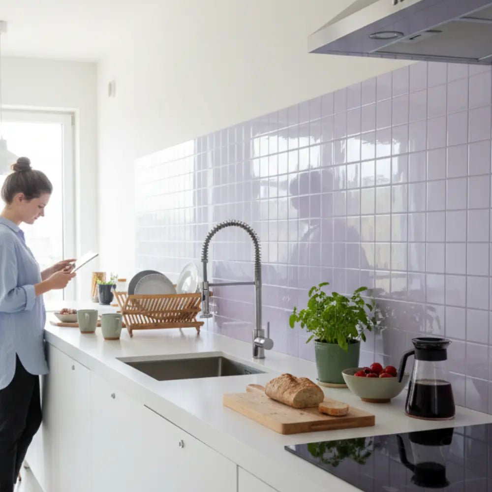
















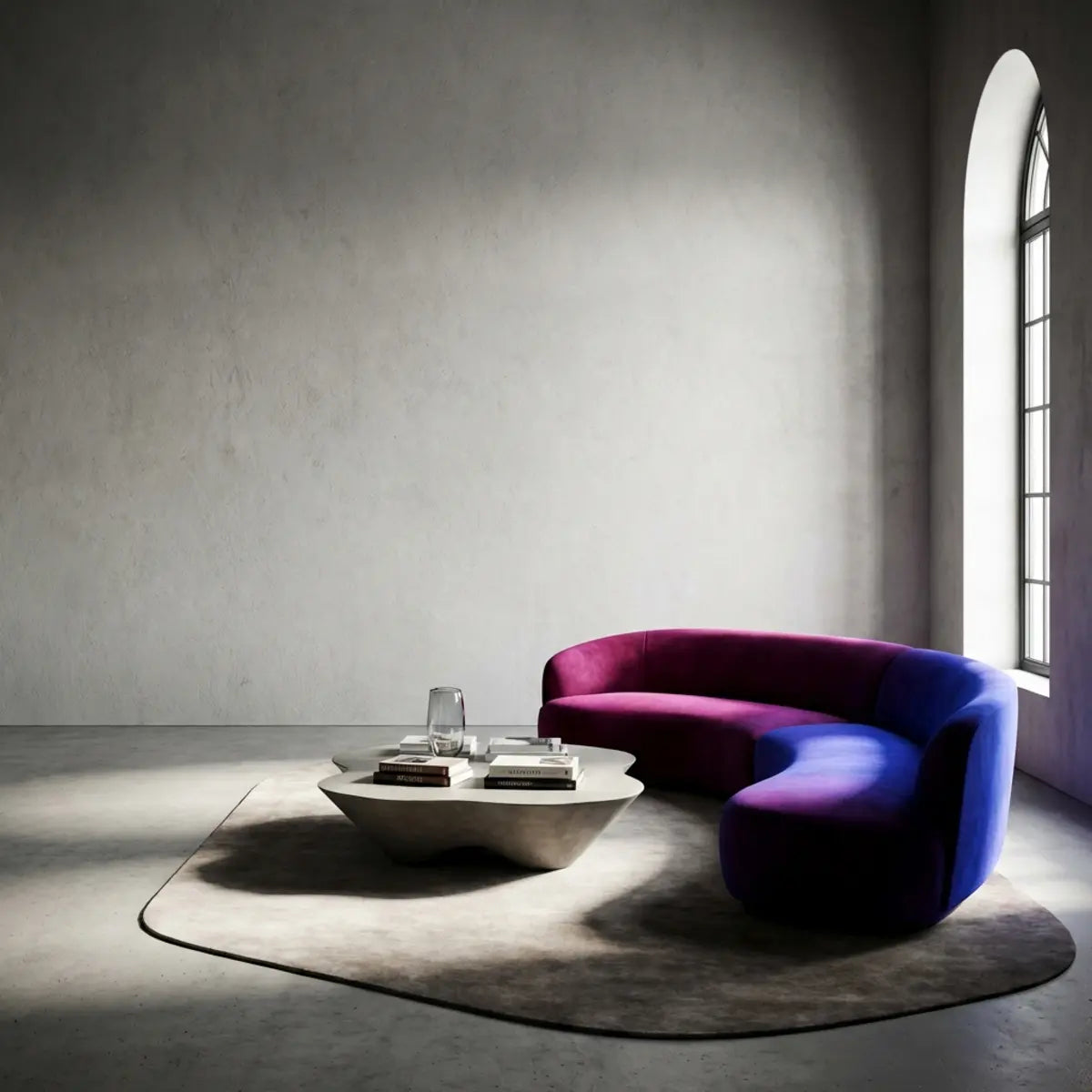
There is no single official “2026 interior color trend.” Different color organizations and paint companies chose very different flagship hues: Pantone selected a soft white, Sherwin-Williams a warm khaki neutral, Benjamin Moore a deep espresso-charcoal and Behr a smoky jade. That disagreement is useful. It shows that a color forecast is an interpretation of culture and market direction, not a guarantee that every fashionable home must use the same palette.
This guide uses documented 2026 selections from Pantone, Sherwin-Williams, Benjamin Moore and Behr to build practical home palettes. It also separates inspiration from evidence: color forecasts can help you notice emerging directions, but they do not prove that one shade will increase resale value, improve mood, stay “in style” for a fixed number of years or make a room automatically feel larger.
What 2026 color forecasts actually agree on
The individual colors differ, but several broad themes overlap: quieter neutrals, deeper nature-linked hues, colors with more complexity than flat gray, and palettes designed to layer rather than dominate every surface. The useful takeaway is not a list of six mandatory colors. It is that 2026 gives homeowners permission to work with both restrained foundations and more expressive accents.
That is especially helpful in interiors because rooms contain more than paint. Cabinets, stone, wood, metal, textiles, lighting and wall finishes all contribute color. A “color of the year” works best as a reference point that helps you coordinate those fixed elements—not as a reason to repaint or retile a room that already works.
Pantone 2026: Cloud Dancer is a structural white, not a command to make every room white
Pantone named PANTONE 11-4201 Cloud Dancer its Color of the Year 2026. Pantone describes it as an airy white and presents it as a flexible foundation that can support other colors. That makes it useful as a palette reference for people who want a quiet base rather than a high-saturation focal color.
In a home, a soft white can work as wall paint, cabinet color, ceiling, trim, tile background or negative space around stronger materials. But “white” is not one color. The surrounding flooring, countertop, daylight and artificial light can make a white appear warmer, cooler, grayer or brighter. Always compare a physical sample in the actual room.
Sherwin-Williams 2026: Universal Khaki moves the neutral conversation warmer
Sherwin-Williams selected Universal Khaki SW 6150, describing it as a mid-tone neutral with a slight yellow undertone. The important design signal is not that every wall should become khaki; it is that warm, earthy neutrals continue to offer an alternative to colder gray-driven palettes.
Universal Khaki can be read as a bridge color. It can sit near warm wood, aged brass, brown stone, cream, muted green and darker charcoal. If your room already contains honey oak, walnut, beige stone or warm off-white, a khaki direction may connect those materials more naturally than a blue-gray neutral.
Benjamin Moore 2026: Silhouette brings brown and charcoal back into the foreground
Benjamin Moore selected Silhouette AF-655, describing it as a rich espresso color with charcoal notes. Benjamin Moore explicitly connected the palette to fashion, tailored suiting, craftsmanship and the renewed interest in brown.
This is a real, documented fashion-to-interiors reference—very different from claiming that apparel and interiors “share identical pigment supply chains.” The connection is cultural and design-driven. A deep brown-charcoal can work on cabinetry, a feature wall, millwork, furniture or as a contrast against lighter tile and stone. It can also be too heavy for a small poorly lit room if used indiscriminately, so placement matters.
Behr 2026: Hidden Gem adds a smoky blue-green direction
Behr named Hidden Gem its 2026 Color of the Year, a smoky jade that blends blue and green. This is a useful counterpoint to the neutral selections because it shows that the 2026 landscape also includes more expressive, nature-linked color.
Smoky jade can work as cabinetry, wall paint, upholstery, a backsplash direction or a smaller accessory color. Compared with a bright emerald, the gray-smoked quality can make it easier to layer with warm neutrals, wood and stone. Again, test the actual material: paint, fabric and printed tile can render the same named color family differently.
Why these four choices are more useful together than separately
Put Cloud Dancer, Universal Khaki, Silhouette and Hidden Gem next to one another and a coherent 2026 palette appears: soft white, warm neutral, deep brown-charcoal and smoky blue-green. The exact brands did not coordinate a single palette, but a homeowner can still use the four directions to understand contrast and layering.
A room might use a Cloud Dancer-like light base, khaki or tan natural materials, a Silhouette-like dark anchor and a jade accent. Another room might reverse the balance and use dark cabinetry with white tile and a smaller green accessory. The point is not to copy the named paints; it is to identify the light, mid, dark and accent roles.
Do not confuse a forecast with a specification
A paint company’s Color of the Year describes a branded paint color. Pantone’s color systems serve different industries and use their own color references. A tile, textile or laminate marketed as “similar to” one of these colors is not automatically an exact match.
When matching surfaces, use physical samples. A paint chip, printed vinyl tile, glazed ceramic and woven textile reflect light differently. Surface gloss, relief and material texture can make two numerically similar colors look different in the room.
Lighting can change the trend more than the trend changes the room
Color is always seen under a light source. Daylight changes through the day, and artificial lamps differ in spectrum and color rendering. A warm neutral can become yellow under one lamp and balanced under another; smoky jade can look greener in daylight and grayer at night.
Test samples in the room during the times you actually use it. For a kitchen, include under-cabinet lighting. For a bedroom, check evening lamps. For an entry or bathroom, look at the color under the practical lighting already installed rather than evaluating everything under a store display.
Use a four-role palette instead of a rigid 60/30/10 formula
The familiar 60/30/10 decorating rule can be a helpful teaching device, but it is not a law. Real rooms vary in architecture, windows, cabinetry and material area. A small backsplash may occupy far less than ten percent of the visual field yet still become the focal point.
A more flexible method is to assign four roles: base, support, anchor and accent. The base may be wall paint or cabinets. Support comes from flooring, wood or stone. The anchor may be a dark island, sofa or feature wall. Accent can be tile, textiles, art or hardware. The proportions should follow the room rather than a mathematical guarantee.
Cloud Dancer-like whites work best when the undertone is checked
A soft white can create visual breathing room, but whites can lean warm, cool, green, pink or gray depending on the surrounding materials. Place the sample beside the countertop, cabinet door, floor and trim before deciding.
For peel-and-stick wall tile, a white background can emphasize texture and seam shadows. A gloss white can appear brighter and more reflective than a matte painted wall. If a white tile will sit next to white cabinetry, decide whether you want a deliberate contrast or a close match.
Warm khaki and tan directions can connect wood, stone and neutral tile
Warm neutrals are useful when a room already contains beige stone, oak, walnut, rattan, brass or warm white. Rather than replacing those materials to chase a cooler palette, a khaki or tan direction can make the existing room feel intentional.
In a kitchen, warm neutral walls can pair with cream or soft-green backsplash tile. In a living room, the same direction can support darker wood and black or charcoal accents. Test the neutral next to fixed stone because a beige paint can reveal green, pink or yellow undertones beside a countertop.
Espresso and charcoal can be used as anchors instead of full-room colors
A Silhouette-like dark brown-charcoal does not need to cover every wall. It can anchor a cabinet bank, fireplace surround, built-in, vanity, island, furniture piece or one feature wall. Dark color can make lighter materials feel brighter by contrast.
On a backsplash, deep brown or charcoal patterns can create visual weight between light cabinets and countertops. On a smaller wall, the same color may feel heavy if the room has little natural light. Use a mock-up or physical sample to judge the scale before committing.
Smoky jade can bridge cool and warm materials
Blue-green shades often sit comfortably beside both cool metals and warm wood. A smoky jade can work with brushed nickel, black, brass, walnut, cream and stone, depending on the exact undertone.
For wall tile, compare the green under the room’s actual lighting. A printed green can shift dramatically beside white grout-like lines, dark cabinetry or warm countertops. A muted green is not automatically “timeless”; it is simply easier to integrate when its undertones relate to the room.
Fashion can inspire interiors without dictating them
Fashion and interior design often respond to some of the same cultural references—material craft, nostalgia, tailoring, nature, technology, luxury and restraint—but the product cycles are different. Clothing can change seasonally; cabinetry, tile and flooring are usually expected to remain much longer.
Benjamin Moore’s 2026 announcement is a good example of an explicit connection: its team linked Silhouette to tailored suiting and renewed interest in brown. Pantone describes its Color of the Year as a reflection of broader cultural mood. Those are design observations, not evidence that the same pigment supply chain forces interiors to copy runway colors.
Translate fashion through smaller, reversible surfaces first
If you like a color direction but are unsure about long-term commitment, start with textiles, artwork, removable decor, a painted sample panel or a smaller backsplash area. This gives you a chance to live with the color before it becomes a full cabinet or wall decision.
Peel-and-stick wall tile can also serve as a bounded decorative layer when the wall, room and product limits are suitable. Use the exact product’s surface, heat, water and removal guidance rather than treating “removable” as a promise that every wall will return to its original condition.
Use tile color and geometry together
A green hexagon and a green subway tile do not create the same room even if the hue is similar. Geometry controls rhythm, seam density and direction. Color should therefore be evaluated together with pattern scale.
A smoky jade in a tight mosaic can feel detailed and decorative. The same color in a larger square or subway format can feel calmer. A dark espresso in a strong herringbone pattern may become much more graphic than the color alone suggests.
Texture changes how deep colors read
Raised or glossy surfaces catch highlights and shadows. A dark brown with relief may show more variation than a flat paint chip, while a white textured tile can create visible shadow lines that make the wall read darker from an angle.
Compare the actual tile sample under side lighting. If the pattern will sit below under-cabinet LEDs, the relief can become a major part of the color experience.
Use undertone relationships rather than color-name matching
Names such as khaki, jade, espresso and white are broad categories. The room sees undertones, not marketing names. Place samples side by side and look for whether they lean warm, cool, yellow, blue, red or gray.
A green that looks sophisticated beside warm walnut may look too blue beside yellow oak. A soft white that looks calm beside beige stone may look dingy beside a crisp blue-white cabinet. Use the fixed materials as the comparison standard.
Kitchen palettes for 2026 directions
Soft white + warm khaki + wood
This combination uses a light foundation and warm natural midtone. It can work well when the kitchen already contains oak, walnut, beige stone or brass. A light backsplash keeps the room open while the khaki direction connects the warmer elements.
Soft white + smoky jade + black
This creates a stronger contrast. Use white as the base, jade as the main color accent and black as the hardware or framing element. The balance can work in both modern and transitional kitchens when the green undertone agrees with the countertop.
Warm neutral + espresso-charcoal + cream
This palette is darker and more tailored. A deep brown-charcoal cabinet or accent wall can be balanced with cream tile and warm neutral paint. It is useful when the room benefits from depth rather than bright color.
Bathroom palettes need moisture-zone planning before color
A bathroom vanity wall can be a good place to use a stronger color or tile pattern, but direct shower exposure is a separate technical condition. Do not choose a color trend first and then force the product into an unsuitable wet zone.
Use the bathroom wet-area guide to distinguish splash-prone decorative areas from locations that need a purpose-designed waterproof system. Then choose the color and pattern within the product’s documented use.
Living-room palettes can use the trend colors more freely
Dry living-room walls usually have fewer water and appliance constraints, so scale and composition can lead the decision. A Cloud Dancer-like base can make art and furniture stand out. A Silhouette-like dark wall can frame a media area or built-in. Hidden Gem-like jade can work as a reading-zone or accent-wall color.
Consider viewing distance. A small detailed tile pattern may merge from across the room, while a large dark field remains visually dominant. Mock up the color on a room photograph before covering a large area.
Bedrooms benefit from testing evening light
Bedrooms are often judged under warm lamps rather than midday daylight. A khaki can become more golden, a white warmer, a jade more muted and an espresso deeper. Test the sample during evening use.
If the color is strong, a smaller headboard wall or framed panel can be enough. A full-room trend treatment is not automatically better simply because the color was selected for 2026.
Do not use trend language to make resale guarantees
No color forecast can guarantee a higher sale price or faster transaction. Buyer preferences vary by region, home style and market conditions. A trend color can help a room feel current, but condition, layout, workmanship and overall property quality matter much more than a single hue.
If resale is a near-term priority, use trend colors in easier-to-change layers and keep highly permanent surfaces coordinated with the architecture and fixed materials.
Do not use color psychology as a medical or universal claim
Color can influence perception and atmosphere, but statements such as “green reduces anxiety” or “blue increases productivity” are too broad to use as guaranteed outcomes for a room. Personal associations, culture, lighting and context all matter.
Use emotional language as a design description—calm, warm, energetic, grounded—rather than a health promise. The best evidence is whether you enjoy the sample in the room where you will live with it.
Use samples instead of trusting hex values
Digital color values can help organize inspiration boards, but a physical paint, tile, textile or laminate surface has gloss, texture and material behavior that a screen cannot reproduce. Screen brightness and device calibration also change the apparent color.
For wall decisions, use the official physical paint chip when matching a paint color and a real product sample for tile or another finish. Compare the materials together rather than assuming an RGB approximation means they will match in the room.
Do not force an exact paint match into a printed tile
A printed wall tile can coordinate with a paint color without matching it exactly. In many rooms, a related undertone creates a more layered result than trying to imitate one branded paint chip across unrelated materials.
Use the tile as one member of the palette. If it contains several colors, identify the dominant background, secondary color and darkest accent. Then choose paint or textiles that connect to one of those roles.
How to build a 2026 palette from what you already own
- Photograph fixed materials: cabinets, countertop, floor, large furniture and hardware.
- Identify undertones: warm/cool, green/red, yellow/blue, light/dark.
- Choose one 2026 direction: soft white, warm khaki, espresso-charcoal or smoky jade.
- Assign the color a role: base, support, anchor or accent.
- Collect physical samples: do not finalize from a screen.
- Check daylight and evening light: include the strongest practical task lighting.
- Mock up the scale: one swatch cannot represent a full wall or repeated tile pattern.
- Remove any option that conflicts with room limits: heat, water, substrate or rental restrictions come before color.
How to use Cloud Dancer-like white without creating a flat room
Layer different textures rather than relying on color variation alone. A soft-white wall can sit beside cream tile, woven fabric, pale wood and brushed metal while still feeling dimensional. Relief and shadow can provide contrast even within a narrow color range.
Keep whites close enough to feel intentional or different enough to feel layered. An almost-match between cabinet and tile can look accidental when undertones fight; a deliberate cream-versus-white contrast can look more coherent.
How to use Universal Khaki-like warmth without making the room muddy
Pair warm khaki with at least one clearer light or dark value. White, cream, deep brown, black, charcoal or muted green can keep the palette from collapsing into one medium beige field.
Natural wood can provide additional warmth, but compare undertones. A yellow oak and greenish khaki can interact differently from walnut and a more neutral tan.
How to use Silhouette-like dark brown without shrinking the room by default
Dark color changes contrast and perceived depth, but room size is not determined by paint alone. A dark wall with good lighting and lighter adjacent surfaces can feel deliberate rather than cramped. Use the color where the architecture benefits from an anchor.
If you are uncertain, start with a smaller built-in, vanity, panel or accent area. View it at night as well as during the day; dark brown-charcoal can shift substantially under warm lamps.
How to use Hidden Gem-like jade without turning every surface green
Use jade as a focal layer. A backsplash, vanity, cabinet bank, painted nook or textile group can carry the color while neutral walls and natural materials keep the room balanced.
Green is especially sensitive to surrounding wood and stone undertones. Place the sample directly against the fixed surface. If the green becomes too blue or gray, test a neighboring shade rather than forcing the trend color name.
Where peel-and-stick tile fits into a color experiment
Peel-and-stick wall tile can be useful when you want a patterned or textured color layer without mortar and grout, provided the wall and room are within the product’s documented limits. The material is still a real installation that needs surface preparation, layout, heat/water planning and eventual removal considerations.
Browse the Stickwoll wall-tile collection by actual pattern, color and geometry rather than searching for a perfect branded-paint match. Use the tile design ideas guide to compare pattern scale and room composition.
Frequently asked questions
What is Pantone’s Color of the Year 2026?
Pantone selected PANTONE 11-4201 Cloud Dancer, an airy white. Pantone presents it as a flexible structural color and cultural mood reference, not as a requirement that every interior use white.
What is Sherwin-Williams’ 2026 Color of the Year?
Sherwin-Williams selected Universal Khaki SW 6150, a mid-tone warm neutral with a slight yellow undertone.
What is Benjamin Moore’s 2026 Color of the Year?
Benjamin Moore selected Silhouette AF-655, a deep espresso color with charcoal notes and an explicit inspiration from tailored fashion and the renewed interest in brown.
What is Behr’s 2026 Color of the Year?
Behr selected Hidden Gem, a smoky jade blending blue and green.
Which 2026 color is the “real” trend?
There is no single universal winner. Different organizations use different research, audiences and design frameworks. Treat the colors as documented directions and choose the one that fits your room and materials.
Do fashion colors always become interior colors?
No. Fashion and interiors can influence one another and respond to shared cultural themes, but they have different product cycles, materials and practical constraints. Benjamin Moore’s 2026 palette explicitly references fashion, but that does not mean every runway color automatically becomes a home-interior standard.
Will using a 2026 trend color make my room look dated in 2027?
Not necessarily. A color can remain appropriate long after a forecast year when it suits the architecture, fixed materials and personal preference. Use trend information as inspiration rather than an expiration date.
What is the safest way to test a strong trend color?
Use a physical sample, movable board, textile, small painted area or bounded decorative surface first. Check it under normal daylight and evening lighting before applying it across the room.
Bottom line
2026 color direction is not one six-color list. Pantone, Sherwin-Williams, Benjamin Moore and Behr all documented different flagship colors, from airy white to warm khaki, espresso-charcoal and smoky jade. Together they point toward layered palettes that can combine light foundations, warmer neutrals, darker anchors and nature-linked accents.
Use those forecasts as references, not guarantees. Start with the materials already in the room, assign each new color a role, compare physical samples under real lighting and keep technical limits separate from styling. A color trend is most useful when it helps you make a better room—not when it pressures you to replace a finish that already works.


Leave a comment
This site is protected by hCaptcha and the hCaptcha Privacy Policy and Terms of Service apply.