




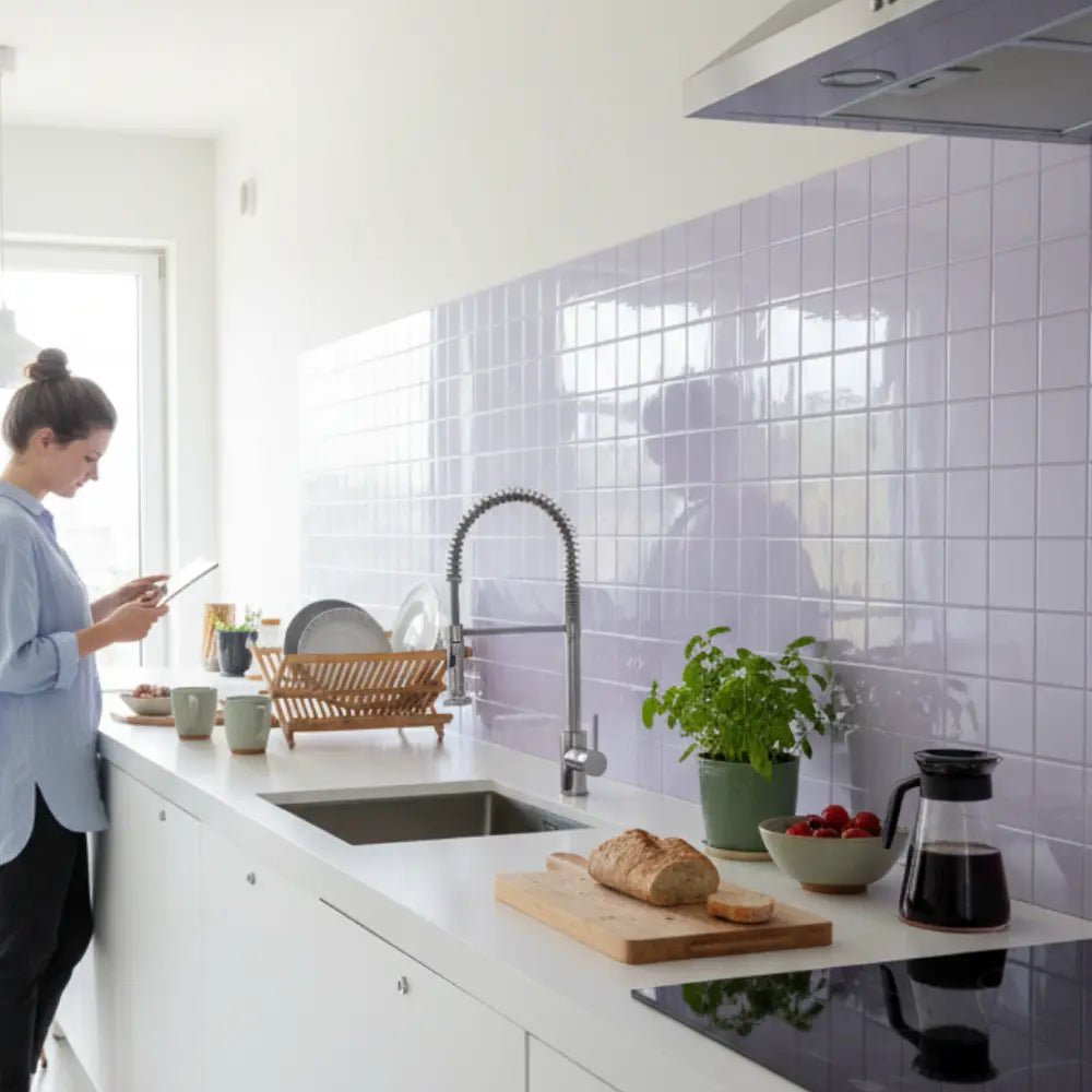

















A green backsplash for a rental: choose the colour and check the wall
Start with a green sample that suits your cabinets, then confirm permission, surface compatibility and removal requirements. A peel-and-stick backsplash can be a decorative option for a suitable wall, but it is not automatically damage-free or approved by your landlord. Colour choice and installation suitability are separate decisions.
Explore this guide
This guide focuses on green colour combinations for an existing rental kitchen. The combinations below are design suggestions, not customer case studies. For the permission and wall checks, read our renter-friendly tile planning guide before ordering a full project.
Five green combinations to try with samples
1. Soft sage with cream cabinets
Try a muted sage beside the actual cabinet door and countertop. A grey-leaning sample and a yellow-leaning sample can look quite different next to cream. Keep the joint colour quiet when the countertop already has a strong pattern, and check the combination under the lights you use for cooking.
2. Mint with white cabinets
Use a small sample to decide whether you prefer a crisp or a softer contrast. Do not judge the shade from a phone screen alone. Compare the sample with the cabinet white, wall paint and appliances at the same time; a green that looks subtle by itself may become the room's most noticeable colour.
3. Olive with natural wood
Place the sample next to both a cabinet door and any visible wood flooring. Consider a simple sheet pattern when the wood grain is prominent. If the olive and the wood feel too similar, compare a lighter green or a different joint colour rather than adding another competing pattern.
4. Deep emerald as a bounded accent
A short run or a clearly bounded wall can be a practical place to test a stronger green. Mark the intended edges before buying so the finish stops deliberately rather than ending at an awkward partial sheet. Check how a glossy sample reflects your task lights before covering a larger area.
5. A patterned green with neutral surroundings
Use the sample to test repetition, not just the individual motif. Lay several sample images or sheets together at the correct scale. When the floor and countertop are already busy, a quieter green field may be easier to live with than a third high-contrast pattern.
Match the layout to what is already there
| Your kitchen | A useful comparison | Check before deciding |
|---|---|---|
| Busy countertop pattern | Plain sage or olive against a small mosaic. | Which option leaves a clear focal point? |
| Short backsplash height | A simple horizontal pattern against a vertical sheet design. | Will the last row create difficult narrow cuts? |
| Dark cabinets | A light muted green against a deeper jewel green. | How do both look under evening task lighting? |
| Prominent hardware | The same green with two joint colours or finishes. | Does the combination compete with the existing metal finish? |
These comparisons help you make a design decision; they are not promises that a pattern will increase the room's size, improve a home's value or suit every kitchen. The tile design guide covers broader pattern and finish choices.
Make the rental checks before installation
Agree on where the covering will go and what the wall should look like when you leave. Photograph the existing paint and any defects. Do not tile over dampness, flaking paint or an unknown damaged surface. When a coating or wall condition is uncertain, ask for suitable professional advice rather than sanding it as a routine preparation step.
A removable product can still lift paint. The Smart Tiles renter guide specifically notes the risk on older or unprimed paint. Use the removal instructions for your own product and treat a sample trial as a check, not a deposit guarantee.
Do not assume that a kitchen-rated decorative tile is suitable inside a shower or beside every heat source. Mark the sink, range and countertop appliances on your plan, and resolve the exact product's exposure limits before extending the green finish into those areas.
Plan the order without a fixed-price promise
Measure each wall rectangle and calculate the total area. Then work out full sheets and edge cuts using the usable coverage per pack. Include the sample, any approved preparation materials, edge finishing, spare sheets, shipping and tax. Keep a repair allowance rather than assuming that installation and removal will both be free of extra costs.
For layout decisions around cabinets and the countertop, use our kitchen backsplash guide. Complete those measurements before comparing pack prices; a lower price per pack is not necessarily a lower cost for the finished area.
Frequently asked questions
Which green should I choose for a small rental kitchen?
Compare a light muted green with the shade you actually prefer. Assess both with the existing finishes and lighting instead of following a universal rule about room size.
Will peel-and-stick backsplash protect my deposit?
No product can establish the outcome of your rental agreement. Get permission where required, document the wall and plan for possible paint or surface repair.
Can I take the sheets to my next home?
Do not budget on reuse unless the exact product is designed for it. Removal may affect the sheet or its adhesive.
Write a color brief around the kitchen you cannot change
Start with the fixed finishes: cabinet doors, worktop, floor, appliance fronts and the wall beside the proposed backsplash. Put them in a short list with photographs taken in ordinary room light. A rental project often has to work around these elements, so the best green is the one that forms a useful relationship with them rather than the one that looks most attractive on a blank shopping page.
Choose what you want the green to do. It can become the main color, provide a quiet background or repeat a small accent already present elsewhere. Those are different design roles. A strong patterned green may be enjoyable as a focal point but distracting when the worktop and flooring already compete for attention. Compare the same two or three samples against the entire combination rather than deciding each surface separately.
Write the preference in observable language: less contrast with the cream cabinet, a clearer boundary at the counter or a pattern that reads calmly from the entrance. Do not require a shade to make the room physically larger or improve anyone's health. A personal design preference is sufficient; it does not need an unsupported performance promise.
Refine a sage-and-cream combination
Compare the cabinet's cream with more than one sage sample. One green may appear grey beside it, while another may look noticeably yellow. Keep the countertop visible during the comparison, especially when it includes warm speckles or veins. The goal is not to find a theoretically correct undertone but to decide which combination you prefer under the actual light.
Try a low-contrast joint or printed grout effect first when the countertop already has movement. Then compare a more pronounced joint using several adjoining pieces. A single sample cannot show how strongly the grid repeats across the full run. Use the same viewing distance for both layouts and look again from the sink, where you will see the finish close up.
Keep hardware and accessories provisional. Buying new metal handles to rescue a color that never worked with the cabinets can expand a small project unexpectedly. Test the green with the existing hardware before adding another purchase. A restrained shade or a smaller covered area may solve the relationship without replacing anything else.
Compare mint with the actual whites in the room
White cabinets, a white appliance and white paint are not necessarily the same-looking white. Place a mint sample where all relevant finishes can be seen together. Decide whether the green should create a crisp contrast or a softer transition. A sample photographed against a neutral studio background does not resolve that choice for your kitchen.
Look at the glossy and matte versions, where available, under the task light you normally use. Do not assume mint requires a high-gloss finish to look fresh. The apparent reflections may matter more than the shade at a particular standing position. The Department of Energy distinguishes color appearance from color rendition, supporting comparison of the actual lamp and material rather than reliance on a color-temperature label alone. DOE lighting guidance.
A hypothetical renter keeps existing white doors and compares mint samples at the central wall and beside a stainless appliance. The preferred sample is the one that works in both positions. This is a suggested comparison, not a customer result or a guarantee that the same mint will suit every white kitchen.
Use olive to connect with wood without losing definition
Wood grain contributes both color and pattern. Compare olive beside a cabinet door and a visible section of flooring rather than assuming all wood will coordinate the same way. A very similar depth of color can create a subdued relationship; a lighter green can make the boundary more obvious. Choose the effect deliberately instead of expecting one universally correct contrast.
Use a simple tile repeat as one candidate when the grain is prominent. Then compare a busier pattern at actual scale. The point is not that patterns are forbidden with wood, but that their combined movement should be judged together. A photograph cropped to show only one beautiful sheet can conceal an awkward full-wall repeat.
Where there is a wood countertop, separate color coordination from the joint design. Do not let the desired appearance dictate an arbitrary gap, cleaner or sealant. The countertop finish, wall product and required movement detail need compatible instructions. Plan the visible transition only after those practical conditions are resolved.
Define the boundaries of a deeper emerald accent
A deeper green can be considered for a short run or a clearly bounded wall, but the boundary deserves attention before ordering. Mark the proposed top and side edges on a sketch. Decide whether the finish ends at a cabinet, an existing corner or a separately planned trim. Avoid buying a bold pattern before knowing how the final partial sheet will look.
Compare the sample from the normal entrance and preparation positions. A deep glossy finish may show a strong reflection from one angle and a relatively quiet surface from another. The room's real use should guide the decision. Do not assume a darker color must be rejected simply because the kitchen is small, or accepted because a staged image looks dramatic.
Consider a second version with the same shade over a smaller area. This is a way to compare the role of the accent without changing every surrounding object. If both layouts work, use the actual quantity, finishing work and permission conditions to decide. A smaller scope can be a complete design, not merely a compromise.
Assess a patterned green as a repeat, not a single motif
Lay out enough pieces or accurately scaled copies to show more than one repeat. Identify which edges are designed to join and whether rotation is allowed. A sheet may contain a complete printed mosaic whose small shapes cannot be rearranged like individual ceramic pieces. Choose a layout that the actual construction permits.
Mark outlets, short returns and cabinet breaks on the same drawing. A complicated motif can be difficult to continue through several interruptions, and a pattern that looks spacious on an open feature wall can read quite differently along a shallow backsplash. The pattern-direction guide helps compare the visual role with the practical cuts.
Keep the floor, countertop and open shelves in view during the decision. You might choose one main pattern and allow the other surfaces to recede, or deliberately coordinate two patterns through scale and color. Neither approach needs a fixed percentage formula. The useful check is whether the installed composition remains understandable from the places you use it.
Make a sample comparison that does not commit the wall
For a color comparison, hold or safely support a loose sample in the proposed position without exposing the adhesive. Do not assume painter's tape is harmless to every rental coating. Where temporary mounting is needed, obtain permission and use a method accepted for the surface. Keep a loose display comparison separate from a permitted adhesion-and-removal sample.
Label each sample with the product name, finish and date received. Compare them under the same conditions rather than taking separate photographs with automatic exposure changing between them. A phone photo is a convenient memory aid, not a color measurement. Keep the physical sample available for the final decision and delivery comparison.
Record one advantage and one concern for each option. The notes might mention reflected light, pattern repetition or a difficult edge cut. Avoid a numerical score that hides an unresolved installation restriction. An attractive sample cannot compensate for a product excluded from the proposed heat or moisture exposure.
Agree on the exact alteration and the exit condition
Describe the proposed wall area, product and preparation when asking for permission. Permission to decorate may not include sanding, priming, adding construction adhesive or changing a fixture. Ask what the wall must look like at the end of the tenancy and who should handle any repair. Keep the response with the dated condition photographs.
A separate mounting panel is not automatically a damage-free answer. It still needs appropriate support, compatible use near heat and moisture, service access and permission for its attachment method. Do not balance a heavy panel loosely on the counter or support it through decorative tile. Consider the complete assembly before treating it as reversible.
Plan for the possibility that a permitted sample or eventual removal affects paint. A clean early sample does not establish how every coating will behave after a long installation. Include restoration in the budget and follow the exact removal instructions. Neither this guide nor a product label determines the outcome of a lease or deposit decision.
Calculate packs from usable coverage and the actual pattern
Measure each eligible wall rectangle and note variations in height. Use installed coverage from the chosen pack rather than nominal sheet dimensions when joining tabs or overlap affect the result. Small cutouts do not necessarily reduce the order quantity because their offcuts may not fit another part of the pattern.
For an illustrative calculation, a wall two metres long and 0.45 metres high has an area of 0.9 square metres. Suppose your particular layout justifies a chosen ten-percent allowance. The planning area is then 0.99 square metres. If the example pack provides 0.24 usable square metres, five packs are needed after rounding 4.125 up. These are hypothetical inputs, not Stickwoll coverage or a universal allowance.
Compare a simple layout with a more demanding one before settling on spare quantity. Keep a deliberate repair reserve separate from expected cutting waste so you understand what remains after installation. A later matching pack may not be identical in color or print, so retain the purchased product and batch details with any spares.
Include the small items that change the total
List samples, complete packs, approved preparation, cutting supplies, edge finishing, delivery and tax. Add any permitted mounting system or professional work separately. A low price per sheet does not necessarily produce the lower finished-area cost when usable coverage and pack rounding differ.
Keep actual quotations separate from allowances. If the wall condition is uncertain, the budget should show that uncertainty rather than assigning a convenient small repair figure. Choose a smaller decorative area or wait when the essential preparation would consume the remaining budget. Do not count on resale value, a deposit refund or reuse of removed sheets to make the arithmetic work.
Check order and return conditions before opening multiple packs for matching. A good layout may require inspecting the supplied material, but cutting or removing liners can affect the seller's return process. Obtain the relevant conditions in advance and keep any concern documented before installation rather than after the entire wall is covered.
Separate measuring, cutting and sticking
Make the layout decisions while the release liners remain intact. Establish a level or plumb reference appropriate to the pattern instead of assuming the countertop is straight. Check the last pieces at both ends and any opening before fixing the first sheet. A shift in the starting point can change difficult cuts, but it should be evaluated on your drawing rather than applied as an automatic half-sheet rule.
Use the cutting method specified for the construction. A flexible film, a dimensional sheet and a rigid panel do not necessarily use the same tool. Cut on a stable protected surface, keep hands out of the blade path and do not make exploratory cuts into a wall near concealed services. Electrical fitting changes should be handled through appropriate qualified advice.
Follow the specified joining and application method without stretching pieces to close a gap. Complete any required conditioning and return-to-use period. For the full workflow, use the vinyl backsplash installation guide with the actual product instructions, not as a replacement for them.
Choose a finish whose care routine fits the kitchen
Ask about the actual cleaning method before buying. Consider fresh splashes, cooking residue and the lower joint rather than only whether the center of the tile wipes clean. A textured pattern can need a different permitted tool from a smooth face, and a cleaner used on the worktop may be unsuitable for the wall finish.
Keep the method repeatable: identify the cleaner, use its permitted concentration and contact method, remove residue as required and inspect the dry surface. Avoid adding an abrasive pad or a stronger solvent because a mark persists. Stop when the finish changes or an edge begins lifting, and investigate the cause before repeating the treatment.
Store a short care note with the product details so a housemate does not unintentionally change the routine. Record any repaired area and keep spare material under its required storage conditions. The green should fit ordinary kitchen use, not require a set of assumptions that nobody else in the household knows.
Compare three versions of the same rental kitchen
Imagine a hypothetical kitchen with cream doors, a patterned counter and limited permission to alter the wall. Version one uses a plain sage sample over a small approved area. Version two uses a stronger patterned green across the full run. Version three keeps the wall unchanged and introduces green through suitable movable objects. Compare all three against the same preparation, budget and permission conditions.
The first may offer a clearer boundary and simpler cuts. The second may provide a stronger focal point but require more matching and finishing. The third avoids the adhesive project altogether while still allowing a color change. Those are trade-offs to consider, not findings from a customer trial or a ranking that decides every kitchen.
Choose the version you can describe and maintain confidently. Keep the accepted sample, drawing and instructions together. The result should reflect the actual room and tenancy rather than a claim that one green shade is timeless, guaranteed low-maintenance or universally renter-safe.
Make the final selection without confusing color and environmental claims
A green color name does not establish recycled content, low emissions or biodegradability. Judge those claims from documents for the exact product, separately from the shade. A brand may sell different constructions with different evidence. Do not transfer an unrelated certificate to a preferred color because the products appear in the same collection.
The separate green tile buying guide explains that distinction in more detail. Use this rental guide for color combinations and the scope of the alteration, then use product-specific information to confirm the remaining conditions. Keeping the decisions separate helps you avoid paying for a claim that the seller has not actually established.
Before checkout, confirm the final product, quantity, joining method, intended use and return conditions. Keep the sample identified and leave any unresolved issue visible. A short pause for a specific answer is more useful than ordering an unsuitable wall finish and hoping preparation will make it acceptable.
Plan the end of the project as carefully as its first day
Before ordering, describe how the kitchen will return to its agreed condition if the tenancy ends. Keep the accepted preparation and removal method with the written permission. The person managing the property may prefer to inspect a concern before any repair. Do not assume a repaint in a roughly matching color will satisfy an agreement that requires another restoration method.
Set aside time for an appropriate assessment before move-out rather than leaving removal until the final evening. Use the instructions for the exact product and stop when the coating behaves differently from the earlier sample. A quick installation does not establish equally quick removal, and an intact-looking face does not show the condition of every layer beneath it.
Keep the saved sample, order, batch information and installation photographs together. They help distinguish the product from similar green designs and identify what was changed. A future installer or supplier should not have to infer the construction from a color name. Store any spares according to their requirements rather than assuming that a piece left loose in a hot cupboard will remain useful.
At the final review, compare the room with the original scope: the intended color relationship, a suitable wall, practical cleaning and an understandable restoration route. A smaller project that satisfies those conditions can be a better choice than a full run that depends on unresolved permission or use restrictions. Choose the green you enjoy, but let the real kitchen and tenancy define where and how it is installed.
Sources and scope
- US Department of Energy: Color and Spectrum — Light appearance and color rendition differ; assess actual samples.
- Smart Tiles: Product FAQ — Other manufacturer's instructions, not Stickwoll specifications.


Leave a comment
This site is protected by hCaptcha and the hCaptcha Privacy Policy and Terms of Service apply.