




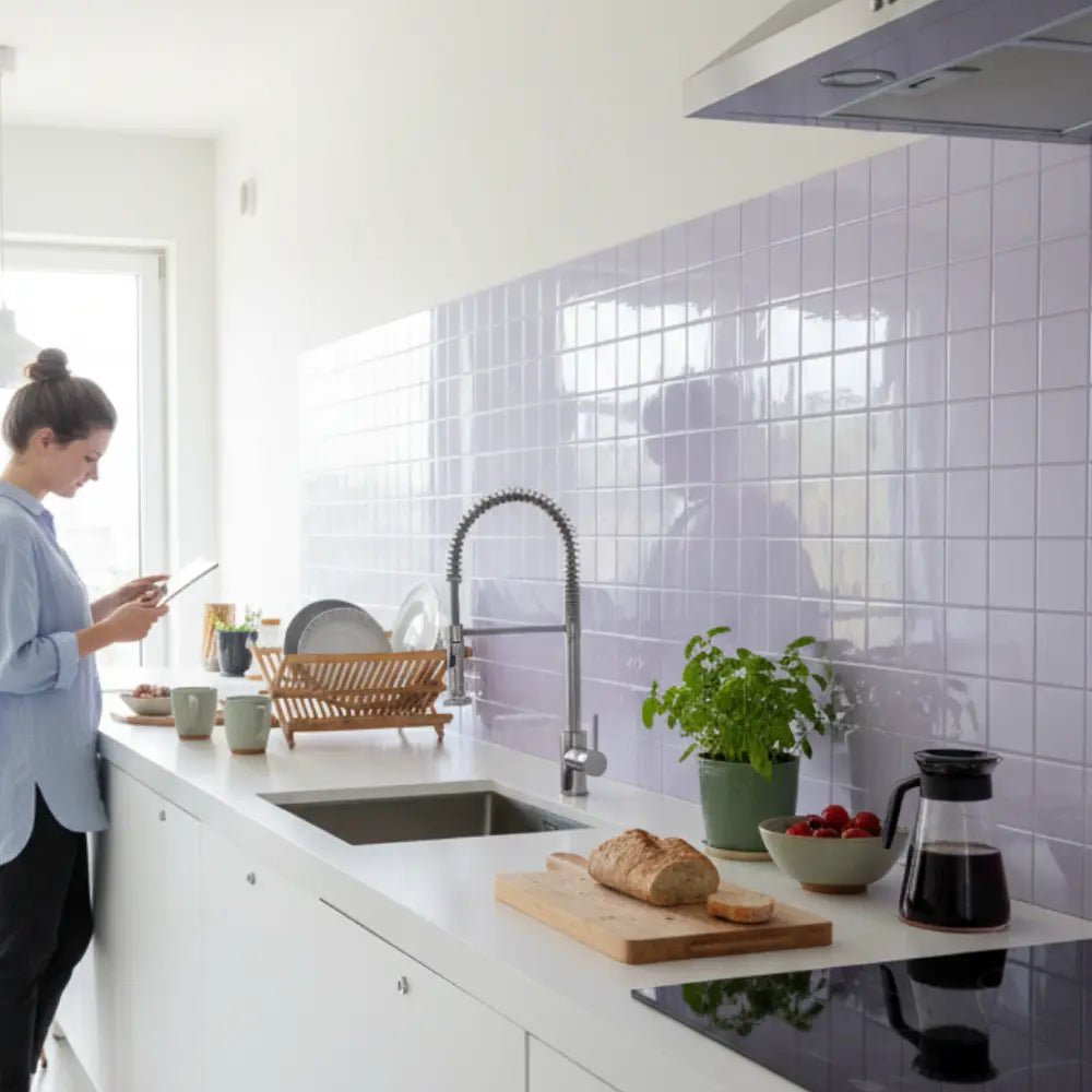
















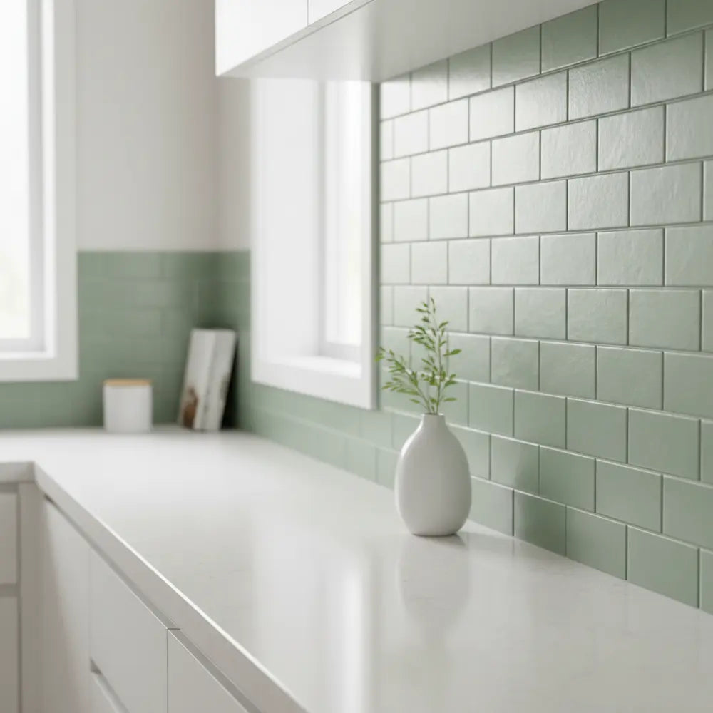
Meta Description: Discover the best green peel and stick tiles for kitchens. Affordable, stylish, and easy-to-install wall coverings with side-by-side brand comparisons.
Explore this guide
Why Choose Peel and Stick Tiles for Kitchens?
Updating a kitchen can feel like tackling the most expensive and disruptive part of a home renovation. Hiring contractors, tearing up walls, and paying for traditional tiles often runs into thousands of dollars. For many homeowners and renters, that dream refresh feels out of reach—until peel and stick tiles enter the picture.
These self-adhesive tiles offer the look of a stylish backsplash without the mess, cost, or permanence of ceramic or stone. Green peel and stick wall coverings have recently emerged as a major design trend. Shades like sage, olive, and emerald bring freshness and a pop of personality into the kitchen, making the space feel both calming and modern. For broader planning, see our kitchen backsplash guide.
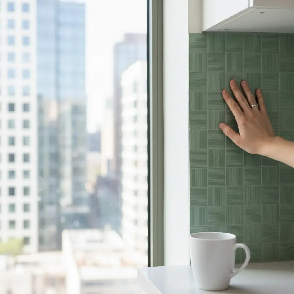
One of the biggest appeals is how little time they require. A renter, for instance, can transform a tired beige kitchen in a single afternoon. Because they’re removable, they can be peeled off without damaging the walls when it’s time to move out. Compare that to grout lines and mortar dust, and it’s easy to see why peel-and-stick options are so popular.
Related Reading:
Thinking of refreshing your space without the hassle of traditional tiling? Explore How to Choose Green Peel and Stick Tiles and find eco-friendly ideas to uplift your kitchen style.
Key Factors to Consider Before Buying
Jumping on the trend without a little research can lead to disappointment. Not all peel-and-stick tiles are created equal. Here’s what sets the worthwhile products apart:
Durability and Water Resistance
Tile Size and Pattern Compatibility
Large sheets can cover more wall space quickly and reduce the number of joints, resulting in a cleaner finish. But small mosaic-style squares allow for more flexibility in tight corners and uniquely shaped areas. For example, in a compact galley kitchen, smaller sheets prevent awkward partial cuts, while in an open kitchen with long uninterrupted counters, larger slabs create smoother expanses.
Ease of Cleaning and Maintenance
Busy kitchens spill. Families with kids spill more. A surface that wipes down easily with a damp cloth or sponge is essential. Some budget-friendly peel-and-stick tiles have uneven textures that trap grease, while the better brands mimic ceramic’s smooth glaze for easy daily upkeep.
Thinking through these criteria before purchasing helps avoid common mistakes—such as picking a beautiful pattern that turns out to be a nightmare to clean, or buying bargain tiles that discolor within months.
Want real examples of kitchen makeovers? See five inspiring transformations in Transform Your Kitchen with Peel and Stick Tiles.
Top 5 Best Green Peel and Stick Tiles for Kitchens
Finding the best green peel and stick tiles for kitchens isn’t about picking the most attractive listing—it’s about balancing affordability, durability, and design. After comparing user reviews and testing popular sellers, here are the standout contenders:
View more top-rated green kitchen tile options here.
Pros and Cons of Green Peel and Stick Tiles
Just like any budget-friendly peel and stick tiles, green options carry clear advantages and a few tradeoffs...
Want a handy checklist to avoid mistakes when buying and installing tiles? Download our printable buying checklist and simplify your DIY project.
Quick Q&A
Q1: Are green peel and stick tiles safe to use behind stoves?
Most are heat resistant up to a certain degree...
Cooking near direct flames? Read our guide on Heat-Resistant Peel and Stick Tiles for High-Heat Kitchens.
Choose the green by undertone
Sage, olive, forest, mint and teal can contain very different yellow, blue or gray undertones. Compare real samples beside cabinets, counters, flooring and metals.
A green that looks muted online can become much brighter under cool task lighting or against a warm wood cabinet.
Use finish as part of the color decision
Glossy green can create stronger highlights; matte green can appear deeper and quieter. Relief and printed stone texture can make one nominal color read as several shades.
View the sample from several angles and under daylight and evening light.
Separate color from product construction
A green tile may be ceramic, glass, vinyl, gel-faced or composite. Use technical guidance for the actual construction rather than treating color as evidence of durability or moisture performance.
Record the face, backing, adhesive or setting method, dimensions and intended room.
Map sink, prep and cooking zones
Green can be used across several walls, but each zone may need a different documented material. A dry accent can use a product that would not be appropriate behind a range.
Keep the palette cohesive even when the technical materials differ.
Use full repeats before choosing mosaic patterns
Small green mosaics or strong veining can look much busier over a full backsplash than in one sheet. Mock up several repeats.
Check how the pattern is interrupted by outlets and cabinet ends.
Plan joint color with the green
For real grout systems, warm, cool, light and dark joints change the visual intensity of green tile. For printed joints, evaluate the built-in contrast across multiple pieces.
Do not assume one grout color is universally best.
Keep cleaning and staining product-specific
Some real stone, glazed tile, vinyl and printed surfaces require different care. Follow the exact finish instructions.
A generic waterproof or stain-proof claim should not substitute for the actual material documentation.
Plan quantity from measurements, not current prices
Prices and pack sizes change. Calculate the real wall area and usable coverage of the selected product rather than relying on a dated shopping list.
Add repair stock based on layout and availability rather than a fixed market price.
Use samples from current inventory
Retail listings and colors can change. Confirm the sample corresponds to the product you can actually purchase.
Keep the SKU or product label with spare material.
Use a final green-kitchen checklist
Proceed when undertone, finish, construction, zone, wall condition, layout and cleaning all fit the kitchen.
The color should be the design decision, not a shortcut around product verification.
Compare sage, olive and teal with the countertop
Green changes dramatically next to white quartz, warm butcher block, black stone or stainless steel. Place full samples directly beside the counter rather than choosing from a detached color card.
The countertop occupies a large horizontal field and can pull hidden yellow, blue or gray undertones out of the green.
Use cabinet color to decide saturation
White, wood, cream, navy and green cabinets all interact differently with a green backsplash. A saturated forest tone may create strong contrast with pale cabinets but blend too closely with dark green millwork.
Test the real combination at the cabinet edge and under the actual lighting.
Treat hardware as a small but repeated color signal
Brass, nickel, black and copper hardware repeat across the kitchen and can change how a green reads. Include one hardware sample on the material board.
The goal is not to match everything; it is to understand whether the overall temperature feels intentional.
Use a low-sheen sample when glare matters
Glossy green can produce bright hotspots under under-cabinet lights. Matte or lower-sheen surfaces may spread reflections differently but can have their own cleaning considerations.
Compare the real finish rather than relying on the word matte or glossy as a performance rating.
Keep biophilic language descriptive
Green may remind people of plants and nature, but that visual association does not create a measurable health or sustainability benefit by itself.
Describe the design effect without turning color psychology into a assured outcome.
Plan plant placement separately from the backsplash
Plants can reinforce a green palette, but pots and watering introduce real moisture. Keep trays and plant care away from vulnerable seams and wall areas.
Do not use plants to hide dampness or staining that needs maintenance.
Use pattern scale to control color intensity
A full solid green field feels different from green veining, small mosaic pieces or a pattern with white background. Mock up several repeats before deciding how much color the wall should carry.
A narrow galley may need a different scale than a broad open kitchen.
Keep grout or joint contrast deliberate
Light joints can make dark green pieces more graphic; matching joints can create a quieter field. With peel-and-stick products, joint appearance may be printed or embossed and fixed.
Judge the whole repeat, not a single piece.
Map cooking and sink zones before choosing one green product
If the selected decorative product is not documented for one exposure, the kitchen can still use the same green palette in different materials.
Color continuity does not require technical uniformity.
Check current product documentation before shopping by old lists
Retailer availability, pricing and product construction change. Use current product pages, samples and instructions instead of relying on a dated top-five list.
Keep the final product identity with the installation record.
Plan edges against painted walls
Green tile can create a strong boundary, so exposed edges deserve deliberate placement. Use trim or a clean termination according to the system rather than extending material until it simply runs out.
View the edge from adjacent rooms before installation.
Use a repair reserve for strong colors
A mismatched replacement can be more noticeable in a saturated green field. Store practical spare material from the original purchase when possible.
Label the lot or batch information if the product provides it.
Keep cleaning residue visible
Some cleaners can leave haze that is especially noticeable on dark glossy green. Use the permitted method and test changes on spare material.
Do not escalate to abrasives or acids without product-specific guidance.
Use one final green palette record
Save photos of the sample beside cabinets, counters and hardware along with the exact product and care instructions.
A future repaint or repair can then evaluate the installed green against the original design intent.
Compare green with natural and artificial light separately
Morning daylight, cool ceiling light and warm under-cabinet light can shift the same green from gray to yellow or blue. Photograph and view the physical sample under each normal condition.
Choose the color based on the full daily cycle, not one showroom light.
Use undertone families to narrow choices
Group samples into yellow-green, blue-green and gray-green families before comparing individual shades.
This makes it easier to see which family relates to the fixed countertop and cabinet materials.
Treat olive as a material-like neutral when appropriate
Muted olive can behave visually more like a warm neutral than a bright color, especially beside wood and brass.
Test the real sample; the effect depends on saturation, finish and surrounding colors.
Use teal carefully with cool metals
Teal can echo stainless steel and chrome or create too much coolness depending on the counter and lighting.
A cream, wood or warm grout/joint tone can alter that relationship, but the composition should be tested physically.
Keep mint from becoming overly reflective
Pale mint with gloss can read much brighter under task lights than in a product photo. Compare matte and glossy versions if glare matters.
The lighter color does not automatically mean the room will feel larger.
Use dark green as a focal field
Forest and bottle greens can create strong contrast behind pale cabinets but may show dust, water spots or cleaner haze more visibly.
Check the care routine and real sample before choosing a large dark field.
Coordinate green with veined counters carefully
If the countertop already has strong veining, a busy green pattern can create competing movement.
Use a simpler tile field or quieter joint when the counter should remain the dominant pattern.
Use real joint width in the mockup
With ceramic or other set tile, joint width changes how much green surface is visible. Include the actual planned joints in the sample board.
With self-adhesive products, inspect the built-in or overlapping joint instead.
Plan green on one wall before wrapping the room
A strong green backsplash can be enough color without continuing onto every dry wall.
Use paint or simpler accents elsewhere if the full wrap overwhelms the cabinet and counter composition.
Keep plant and herb colors separate from tile matching
Fresh plants change with season and light. Do not force the tile to exactly match foliage; use plants as flexible accents around the more permanent green field.
This preserves a natural palette without making it overly literal.
Use trim and edge color as part of the palette
White, metal, green or neutral trim can change how sharply the tile field ends. Test the edge beside cabinets and painted walls.
A good edge supports the green rather than looking like an unrelated afterthought.
Record the green under a consistent photo reference
Take a neutral-light photo with the sample and fixed materials together.
This reference helps compare later paint, hardware or replacement choices even when the original sample is no longer available.
Keep shopping claims separate from design guidance
Retail prices, rankings and best-seller labels change rapidly. Use current product documentation and samples for buying, while the article focuses on enduring selection principles.
That makes the guide useful after a specific retailer listing changes.
Use a final green-material checklist
Confirm undertone, sheen, construction, room zone, wall condition, layout, cleaning and repair stock.
Only then compare cost and availability among the technically suitable choices.
Use green as a bridge between warm and cool finishes
Some muted greens can connect warm wood with cool stainless or gray stone because they contain both yellow and blue influences.
Test the specific shade; this is a color-composition possibility rather than a universal property of green.
Compare green with wall paint, not just cabinets
Adjacent paint can make the tile appear more saturated, muted, warm or cool. Include the painted wall in the material board.
A transition that looks balanced on the counter may clash at the side wall.
Use white space to control a saturated green
A green backsplash does not require green on every nearby surface. Pale walls, simple shelving and restrained accessories can give a strong tile field room to breathe.
Negative space can be part of the palette.
Check color near food and task lighting
Strong green cast or reflection from glossy surfaces can affect how counters and food appear under certain lights. View the real sample during normal prep lighting.
Choose based on the actual kitchen experience, not just decorative photography.
Plan around wood species and stain
Oak, walnut, maple and painted wood introduce different undertones. A sage that works with pale oak may conflict with a redder stained cabinet.
Place the sample directly against the actual cabinet, not a generic wood swatch.
Use green metallic or glass-look finishes carefully
Reflective faces can intensify color and glare. Compare them from seated and standing positions with task lights on.
If highlights dominate the room, a lower-sheen green may carry the color with less reflection.
Keep green stone-look claims visual
A green marble or stone print can evoke natural material without sharing its mineral composition, heat behavior or care requirements.
Use the product’s real construction for technical decisions.
Plan a simpler pattern when the color is already strong
Saturated color plus strong geometry can be visually demanding across a full wall. Mock up both a quiet and a patterned option.
The kitchen may need one strong variable rather than two.
Keep the sample through paint selection
If cabinet or wall paint will change later, retain the tile sample until those colors are finalized.
Digital color references are less reliable than comparing the actual physical finishes together.
Use green in a galley with sightlines in mind
A long narrow wall can amplify a repeated green pattern. View several repeats from the galley entrance and far end.
Reduce pattern density or coverage if the wall visually closes the space more than intended.
Use a quiet green for open-shelf backgrounds
Open shelving adds objects and shadows. A simpler green field can support dishes and cookware without creating a second layer of visual clutter.
Mark shelf positions on the mockup before choosing pattern intensity.
Keep sink hardware in the palette test
Faucet finish occupies a small area but sits directly against the backsplash. Include it with the counter, cabinet and tile samples.
This helps the green relate to the most visible fixed details.
Use a final room-scale photo test
Tape enough green sample material to approximate the intended coverage, then photograph the full kitchen from normal entrances.
The room-scale view reveals whether the color balance still works once the sample becomes a field.
Keep future matching realistic
Green shades and printed patterns can change between product runs. Store repair stock from the original installation when possible.
A labeled spare piece is the best reference for later matching.
Use green with white cabinets intentionally
White cabinets can make green read more saturated and crisp. Compare warm and cool whites because they shift the perceived undertone.
A creamy white may soften olive while a cool white can sharpen blue-green tones.
Use green with wood by checking red and yellow undertones
Wood cabinets can contain red, orange or yellow notes that either harmonize with or fight a green.
Test the real cabinet rather than assuming all wood works with sage or olive.
Use green with black cabinets carefully
Dark green beside black can create a rich low-contrast palette or become visually heavy in a low-light kitchen.
Compare the field under actual daylight and task lighting before choosing coverage.
Use green with stainless counters as a temperature balance test
Muted green can visually warm a stainless-heavy kitchen, but blue-green can also reinforce coolness.
Place the sample directly against the steel and photograph it under normal room lighting.
Treat green terrazzo and mosaic as separate scale decisions
Multi-color chips or small mosaic pieces add texture and pattern in addition to color. A solid sage field can feel much calmer at the same coverage.
Choose the pattern density that fits the room rather than assuming green alone defines the result.
Plan open ends before choosing a dark green field
Dark saturated color makes exposed edges and backing contrast easier to notice.
Use a documented trim or controlled stop and preview the side view before installation.
Keep green cleaning instructions with the room
Dark gloss may show water spots; matte surfaces may show oily marks differently. Use the exact permitted care method and save it with the product record.
Cleaning behavior should be part of the selection process, not discovered after installation.
Use a final comparison of two or three real greens
Narrow the shortlist to a few physical samples and compare them over several days.
A slower sample decision is more useful than a long retailer list of shades that may not be available or suitable.
Compare green with daylight direction
North-, south-, east- and west-facing kitchens receive different daylight character through the day. View the sample during the hours the room is actually used.
Do not choose a shade from one brief lighting condition.
Use a quieter green around colorful cookware
Open shelves, appliances and cookware can add many colors. A muted green background may support them better than a complex multicolor pattern.
Test the finished composition rather than the empty wall.
Keep green transitions consistent across open plans
When the kitchen opens to dining or living areas, repeat one supporting color or material beyond the kitchen instead of extending the tile itself.
This can create continuity without overusing the green field.
Keep a current sample when ordering later
If the project is installed in phases, compare a new order with retained original material before mixing them on one wall.
Color or print variation is easier to manage before cutting.
Close with a green-room handover
Store the exact product, cleaner, repair stock and a photo of the original material board together.
Future repainting and repair decisions can then refer to the actual installed palette.
Use green as an accent before making it a full field
Tape a smaller sample area behind the sink or prep zone and compare the effect with a full-width mockup.
A concentrated green accent may provide enough color without dominating every sightline.
Keep warm and cool greens in separate shortlists
Comparing olive directly with teal can make both feel wrong when the room clearly favors one temperature family. Narrow by undertone first, then compare finish and pattern.
This speeds the material-board decision and avoids chasing dozens of unrelated greens.
Check green beside backsplash lighting controls
Switchable warm/cool or dimmable lighting can change how the wall reads. Review the sample under the settings the household actually uses.
Do not choose the green only under the brightest showroom-like setting.
Keep the final green choice repairable
A distinctive shade is easier to own when spare pieces and product identity are preserved.
If continuity is unlikely, consider a simpler edge or smaller field that can transition gracefully to a coordinating replacement later.
Keep the final green sample
Store one full sample beside the product label so future matching can use the actual installed shade rather than a screen image.
Keep the final SKU
Record the exact installed green product.
Final green note
Keep the physical sample with the project record.
Sources and scope
- US DOE: Color and Spectrum — Lighting and color-rendering context; not a material rating.
- 3M: Applying VHB Pressure-Sensitive Tape — General adhesive surface-preparation principles; not Stickwoll specifications.
- US EPA: Mold, Moisture and Your Home — Moisture-control guidance; not approval of a wall covering.


Leave a comment
This site is protected by hCaptcha and the hCaptcha Privacy Policy and Terms of Service apply.