




















Minimalist fashion decor brings the visual language of clothing into a room through a small, coordinated selection of textiles, framed images, useful storage and carefully placed objects. Start with what you already own, give each visible item a clear role and leave enough space for everyday use. The aim is not an empty room or a promise of better health; it is a room whose appearance and routine work together.
Quick answer: minimalist fashion decor works best when you borrow a few repeatable ideas from clothing—palette, texture, silhouette and accessories—without filling the room with themed objects. Start with what you already own, test the arrangement in normal lighting, and add wall finishes only after the room's practical needs are clear.
For deeper planning, compare fabric and color palette choices. If a removable wall finish is part of the design, review the peel-and-stick tile guide and browse Stickwoll wall-tile styles only after checking the intended surface and location.
Explore this guide
A tailored jacket, a woven fabric or a favorite accessory can suggest color, shape and texture without becoming a theme pasted onto every surface. The challenge is choosing which ideas belong in the room and how they will be supported, cleaned and used. A display that looks elegant in a photograph can become inconvenient if it blocks access or leaves delicate objects exposed to damage.
Define what the room needs before choosing a style label
List the activities that happen in the room and the objects needed for them. A living room may need comfortable seating, a reading light and somewhere to place a drink. A dressing area needs access to clothing and a useful mirror. A bedroom may need storage that remains easy to use when the room is not arranged for a photograph.
Choose one visual objective alongside those practical needs. You might want a quieter background, a more consistent palette or a place to display one meaningful object. A specific objective helps distinguish an intentional addition from another accessory bought because it resembles the mood board.
Do not treat minimalism as a required number of possessions or a clinical intervention. People differ in what feels comfortable and usable. Ask the people sharing the room which items they reach for, which routes are awkward and what they prefer to see. Those observations can guide the design without claiming that a particular style cures stress or fatigue.
Build the collection from objects you already have
Group existing items by function, condition and visual relationship. A scarf might be useful as clothing, meaningful as a keepsake or suitable for a protected display; those uses should not be decided by appearance alone. A frame with the right proportions may be worth keeping even if the print changes. A damaged object may need repair rather than a new decorative role.
Create a temporary selection and live with it before buying. Put unused candidates away safely rather than discarding them at the first rearrangement. This lets you see which pieces are missed and which were occupying space without a useful role. It also prevents the project from becoming a cycle of removing serviceable objects and immediately replacing them.
Record dimensions and condition for items that may move. An object that fits a shelf visually still needs appropriate support and clearance. Keep heavy, fragile or valuable pieces out of precarious arrangements. A smaller stable composition is preferable to a display that depends on everyone avoiding it.

A small grouped display can provide one clear focal area.
Create a palette from materials rather than color names alone
Choose an anchor already present in the room, such as the floor, sofa or a textile you plan to keep. Compare other pieces beside it in ordinary light. Cream, white, black and grey are broad labels; their actual appearance and surface sheen can differ substantially. Do not assume two products coordinate simply because their listings use the same name.
Try a small group with a clear relationship: one principal neutral, another supporting tone and an optional accent. Treat this as a starting arrangement, not a fixed percentage rule. The size and placement of each object affect its visual contribution. A small dark frame can create a strong line without occupying much physical area.
Keep the palette open to the room's actual use. A frequently used chair or storage unit does not need replacement merely because it is not the exact shade in a photograph. You can connect it through a smaller compatible element, change the surrounding contrast or accept it as a deliberate difference.
Borrow a clothing idea without turning the room into a costume
Choose the specific quality that attracts you. Tailoring can suggest a clear edge or a controlled silhouette. Knitwear can suggest a tactile layer. A striped fabric can suggest repeated lines. These are design references, not instructions to hang every related object on the wall.
Translate one reference at a time. For example, a room inspired by a simple black-and-cream outfit might use a light textile, a dark frame and a restrained metal detail. The furniture can remain functional and ordinary. Adding a clothing rack, a hat wall, a handbag display and multiple fashion prints together may compete with the original quiet idea.
Compare the composition at room scale. A garment detail that works close up can become too small to read across a room, while a bold print can dominate a compact corner. Use a temporary layout or measured paper shapes to explore size before committing to a purchase or mounting hole.
Use texture where it can be touched and cared for appropriately
Texture can provide variation without adding many colors. Compare a smooth frame, a woven textile and a soft furnishing under the room's light. Consider whether the texture is a surface print, a woven structure or a raised construction. Those differences affect how it appears and how you can maintain it.
Keep intended use separate from tactile appeal. A fabric that feels pleasant as a scarf is not automatically suitable for upholstery, a lampshade or a surface exposed to heat. Cleaning, wear, support and relevant product requirements need to match the application. Do not repurpose a material into a demanding use solely because its color fits.
Choose a manageable combination. A highly textured wall and heavily textured furniture may compete, while one controlled tactile element can be easier to appreciate. This is a comparison to make with actual samples, not a universal claim that all matte or natural-looking materials are more realistic or more durable.

Compare the actual texture and care requirements with daily use.
Protect valuable textiles instead of treating them as craft supplies
Distinguish everyday material from a fragile, historic or sentimental textile before cutting, washing, stretching or gluing it. A piece that has survived in storage may still be vulnerable to a new display method. Consider whether a reproduction, a photograph or a less valuable similar material can express the design idea without altering the original.
The Canadian Conservation Institute's framing guidance describes appropriate support and compatible materials for embroideries and flat textiles. It cautions against direct contact with adhesives, acidic materials and unsealed wood. For a valuable piece, obtain conservation advice rather than assuming a staple gun or adhesive backing is a reversible mounting method. CCI textile-framing guidance.
Think about the display location as well as the frame. Avoid an arrangement that puts a delicate textile near heat, repeated splashes or strong direct light without suitable assessment. Leave access for inspection. An object can be a meaningful part of the room without being exposed in the most demanding position.
Arrange framed images using the wall and furniture as references
Measure the available wall and the furniture below it. Compare one larger image with a small coordinated group before choosing the number of frames. The appropriate size depends on the wall, viewing distance and surrounding objects; there is no fixed frame count that makes a room minimalist.
Use paper rectangles or a safe temporary layout to compare spacing. Check the view from the entrance and from normal seating. A group that looks balanced while you stand directly in front of it may relate poorly to an off-center chair or doorway. Keep the whole composition visible during the decision.
Choose suitable fixings for the frame, wall and permission conditions. A decorative wall covering is not structural support for art or shelving. If the wall construction or load is uncertain, get appropriate advice. Do not make a heavy frame appear to float by relying on an unverified adhesive method.
Display accessories only when the support and use make sense
A handbag, pair of shoes or hat can supply a sculptural shape, but consider whether it is being stored for use or displayed as an object. Frequently used items need easy retrieval. A display that requires dismantling the composition every morning may not support the room's routine.
Inspect the support surface and stability. Do not suspend loaded shelves from repurposed belts or straps without an engineered, suitable attachment. The visual similarity between a strap and a structural support says nothing about capacity or long-term performance. Use properly specified shelving and keep decorative details separate from its load-bearing parts.
Keep objects accessible for appropriate cleaning and inspection. A crowded ledge can hide dust and make fragile items easier to knock over. Leave enough space to remove one item without disturbing the rest. This turns the display into a usable arrangement rather than a static photograph.

Display loads require appropriate shelf support; decorative wall finishes are not structural fixings.
Make visible storage part of the composition
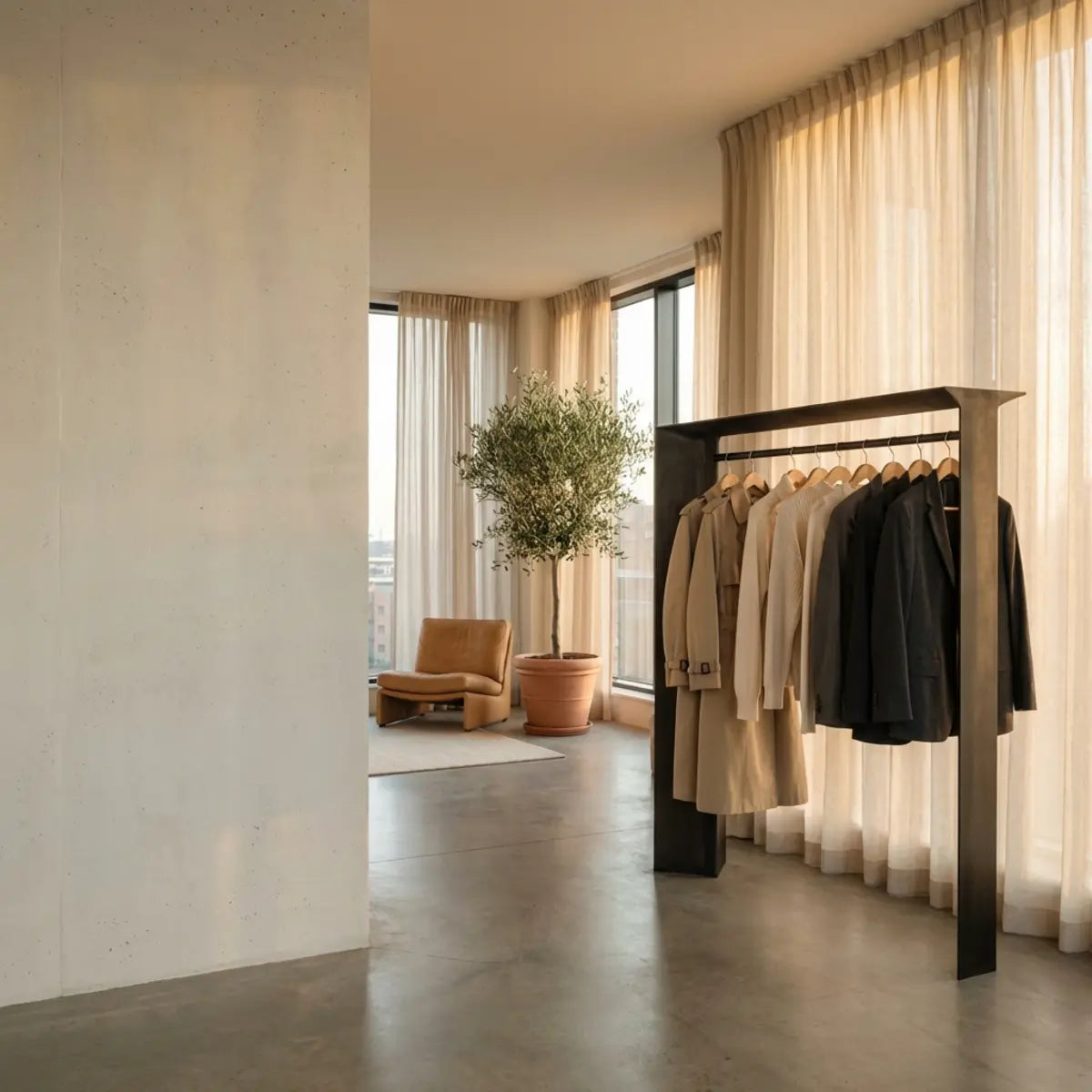
A clothing rack can be useful in a dressing area when its capacity, stability and access fit the room. Plan what belongs on it rather than treating it as a place for every garment without a home. Compare the rack's dimensions with walking routes, drawers and doors before choosing its appearance.
Use hidden and visible storage for different needs. Frequently used pieces may deserve easy access, while seasonal or delicate items may need more protected storage. A room does not become more functional merely because everything is exposed. The decision should follow use and care requirements.
Keep a simple return routine. Give everyday objects a practical location near where they are used, and assess whether the storage remains workable after a normal week. If it repeatedly overflows, reconsider the capacity or contents rather than adding another decorative container that solves only the photograph.
Compare the design in the lighting you actually use
View the arrangement in daylight and with the normal evening lights. Check reflective frames, glossy accessories and the reading position. Light that creates a pleasing highlight on a textile may also produce a distracting reflection on glass. The relevant view is the one used by the person in the room.
The Department of Energy distinguishes a light source's color appearance from its color rendition. Similar nominal color-temperature descriptions can conceal different spectral behavior. Compare the actual materials together rather than assuming that a named warm or cool lamp will produce the same result in every room. DOE lighting guidance.
Keep fixed electrical work and fixture modifications within appropriate product instructions and professional scope. Do not wrap a lampshade in an arbitrary fabric or obscure ventilation to match the palette. A design should preserve the equipment's safe use rather than treating light solely as a decorative effect.
Choose a wall treatment only after its role is clear
A wall can remain painted, hold a protected textile or use a suitable decorative finish. Compare these choices by the actual surface condition, appearance, maintenance and future removal. Do not assume that a more elaborate material automatically creates a better room.
For peel-and-stick wall tile, obtain the exact product's use and preparation requirements. A dry feature wall still needs a sound, compatible base. A patterned or raised finish should be viewed across several pieces under the room's light. The 3D wall-tile guide helps separate relief, printed detail, seams and surface suitability.
Keep support independent of decoration. Shelves, mirrors and heavy objects need appropriate attachments to the wall assembly. A renter also needs permission and a restoration plan. Removable does not promise that every paint layer will remain intact after a long installation.
Plan a small room around access rather than an illusion formula
Start with doors, drawers, seating and the routes people actually use. Measure the clear space with the furniture in its operating position. A wardrobe that fits with doors closed can still block a walking route when opened. A narrow console can be visually light yet inconvenient beside a frequently used doorway.
Compare fewer larger elements with several smaller ones. One appropriately sized frame may read more clearly than a scattered collection, but it is not automatically the best choice for every wall. Use measured temporary shapes and look from normal positions before buying.
Do not rely on a universal claim that vertical stripes make rooms taller, mirrors solve every small space or one color expands the room. These effects depend on the arrangement and the viewer. Preserve practical access, compare the actual composition and choose what works for the people using it.
Budget for the complete arrangement
List what will remain, what needs repair and what you plan to add. Price frames, mounting, cleaning, delivery and any professional work separately from the main decorative item. A second-hand purchase with expensive restoration may not be the lower-cost route, while a serviceable object you already own may need no replacement.
For a hypothetical plan, suppose you allocate 70 currency units to a frame, 25 to a compatible mount, 30 to a useful storage insert and 20 to delivery. The combined amount is 145 before other costs. These example prices are not current market quotations. They show why a frame advertised at 70 is not the complete cost of that particular display plan.
Keep an unspent allowance for unresolved needs rather than forcing every available unit into the first purchase. Complete one part and assess the result before adding another. A restrained scheme should not require repeated buying simply to maintain the idea of restraint.

Keep access and stability part of the arrangement, not only its appearance.
Discuss reuse with accurate environmental claims
Keeping a serviceable object can avoid an unnecessary purchase, but a specific environmental comparison still depends on the project and materials. Do not call every second-hand item harmless or every new material unsustainable. Consider condition, required repair, useful life and the eventual handling route.
EPA's historical US figures estimated approximately 12.1 million tons of furniture and furnishings generated in the municipal waste stream in 2018, with about 9.7 million tons landfilled. These are different figures, and neither is a current annual forecast. They provide context for thoughtful purchasing, not a measured carbon saving from one room makeover. EPA durable-goods data.
When evaluating a product claim, ask what is specifically supported. Recycled packaging, recovered product content, low emissions and biodegradability concern different attributes. A natural-looking texture or a small collection does not establish them. Choose accurately described items without inventing an environmental percentage for the finished room.
Maintain the arrangement without constant redesign
Choose cleaning methods appropriate to each material. A textile, painted frame, glazed surface and decorative wall finish may require different tools or products. Keep any valuable textile's conservation guidance with it. Do not apply a universal household cleaner simply because the items share a palette.
Inspect attachments, shelves and frequently moved objects during ordinary use. Address looseness or damage before it becomes a larger problem. A wall covering should not conceal a structural attachment that needs attention or make an appliance or service point inaccessible.
Change the display when there is a reason: a new practical need, a seasonal storage change or a deliberate preference. You do not need to replace functional pieces whenever a trend name changes. Retain the product and care information so a later adjustment remains straightforward.
Compare three ways to express the same idea
In a hypothetical bedroom, the resident chooses a neutral textile, a single framed fashion image and practical covered storage. The arrangement references clothing through texture and silhouette without displaying garments. The priority is a restful-looking composition that remains usable, not a claimed sleep improvement.
In a dressing corner, another resident chooses a stable rack for frequently worn pieces, an appropriately mounted mirror and a small tray for accessories. The visible storage has a function and a capacity. Items needing protection remain elsewhere instead of being exposed merely to complete the look.
In a living room, a valuable scarf is represented by a photograph while the original stays in suitable storage pending conservation advice. The image supplies color and personal meaning without altering the textile. These are illustrative decisions, not customer case studies or evidence that one style produces a universal psychological result.
Keep a short record of the finished arrangement
Save the accepted layout, dimensions, mounting information and care requirements. Record any item that should not be washed, exposed to heat or moved without help. A short note can prevent an otherwise thoughtful display from receiving an unsuitable treatment later.
Review whether the original objective was met after ordinary use. Is the reading position practical? Can drawers open? Are the everyday items easy to retrieve? Does the room still look coherent without being reset for a photograph? These observations are more useful than assigning a luxury or minimalism score.
For broader coordination, the fabric and color-palette guide offers a separate material-focused comparison. For a restrained wall finish, use the pattern-layout guide. Bring only the elements that serve the room's role into the final arrangement.
Frequently asked questions
Does minimalist decor have to be white or expensive?
No. A coherent selection can use color and items you already own. Price does not establish suitability or quality for a particular purpose. Compare the function, condition and complete cost instead of treating a high price as part of the style.
Can I frame a scarf with adhesive?
Do not assume an adhesive is reversible or appropriate, especially for a valuable textile. Use suitable conservation guidance about support and compatible materials. A photograph or reproduction can express the visual idea without altering the original.
Can clothing accessories support a shelf?
A decorative strap or belt is not a load-rated mounting system. Use appropriate structural support for the shelf and its intended load. Keep any accessory detail separate from the part carrying the weight.
Will removing objects improve stress or concentration?
This guide makes no clinical promise. Evaluate the arrangement through practical access and the preferences of the people using the room. A style should not be presented as treatment for a health condition.
How many decorative items should I keep?
There is no universal number. Keep the items that serve the room, fit safely and can be maintained. Test the arrangement during ordinary use rather than judging only an empty-room photograph.
What should I buy first?
Buy only after identifying the missing function or visual relationship and measuring its location. A useful storage item, an appropriate mount or a sample can be more important than the main decorative purchase. Complete one bounded decision before adding the next.
Try the arrangement during an ordinary week
A simple way to assess the room is to choose one bounded change and observe it during normal use. For example, clear one side table while retaining the lamp and a place for glasses. Move decorative candidates to safe temporary storage rather than discarding them. At the end of the trial, note what was repeatedly brought back and what was not missed. This is a household preference exercise, not a test of mental health or a scientifically validated number of possessions.
Ask each user to describe one helpful change and one inconvenience. A cleared surface may make cleaning easier but remove a useful place for a reading aid. A clothing rack may show a coordinated selection while making a drawer difficult to open. Treat those observations as design information. Restoring a necessary item is not a failure to be minimalist; it is a correction that makes the arrangement fit its users.
Use a before-and-after sketch to record locations, not to manufacture a dramatic transformation. Photographs taken under different light or with all everyday objects removed can exaggerate the difference. Compare the room with the same ordinary activities taking place. An arrangement that remains comfortable without daily restaging is a stronger practical result than one that works only for the final photograph.
Give display changes a reversible sequence
Start with movable items, then consider mounts or a wall finish only after the composition works. Keep the original fixings, packaging and care information where useful. Before making a permanent change, check the wall, the weight of the item and any permission conditions. Reversible planning means understanding the actual attachment and possible repair; it does not promise that a particular tape, hook or adhesive cannot affect paint.
For a hypothetical living room, the final decision might be to retain the existing sofa, use one protected textile image and replace an awkward storage basket with a measured insert. The original plan to add several decorative panels is dropped because the room already meets its objective. Another household may reasonably choose the panels. The method does not prescribe one aesthetic answer; it helps distinguish a purposeful purchase from momentum.
Sources and scope
- Canadian Conservation Institute: Framing Embroideries and Other Flat Textiles — Conservation support, not a blanket upholstery or mounting specification.
- US EPA: Durable Goods, Product-Specific Data — Historical 2018 US data, not a current annual forecast.
- US Department of Energy: Color and Spectrum — Light appearance and color rendition differ; assess actual samples.


Leave a comment
This site is protected by hCaptcha and the hCaptcha Privacy Policy and Terms of Service apply.