





















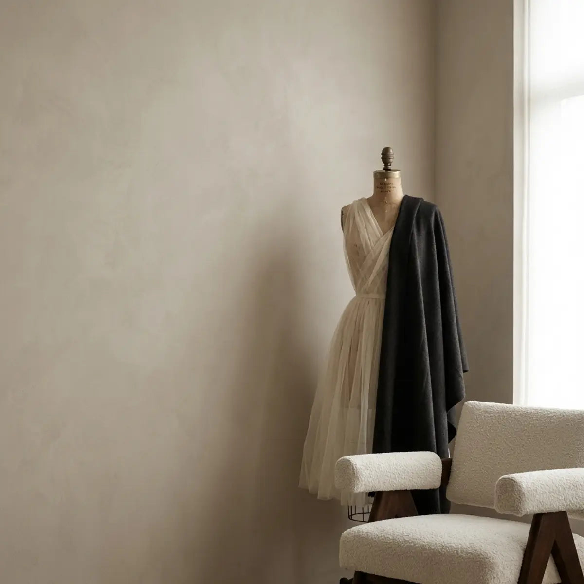
Build a fabric-and-color palette by starting with the room's fixed finishes, choosing the job of each textile and comparing real swatches under the light you use. Color, weave, pile, pattern scale and care requirements all matter. A fiber name or fashionable shade does not by itself predict comfort, durability or a psychological benefit.
Quick answer: build a room palette from the finishes that are staying, then compare fabric samples for color, texture, pattern scale, fiber, construction and care in the lighting you actually use. Treat color rules as starting points, not guarantees.
For the broader fashion-to-room method, see the fashion-inspired interior guide. If a wall finish needs to join the palette, check the surface requirements before browsing wall-tile styles.
Explore this guide
Fashion can be a useful source of color relationships and texture ideas for a home. The translation works when you adapt the idea to a room's scale and activities rather than treating a room like a large outfit. A scarf pattern, a woven jacket or a contrasting trim can suggest a direction, but a curtain, cushion and wall covering have different practical demands.
This guide develops a repeatable selection process with hypothetical room examples. It does not present a measured improvement in mood, concentration, fatigue or resale value. Personal preferences are useful design evidence; they should not be turned into universal health claims.
Start with what is staying in the room
Collect references for the elements you are not replacing: a sofa, flooring, cabinetry, rug or large artwork. Use an actual offcut or swatch where available. A photograph can help remember an object, but automatic white balance and a screen can shift its apparent color. Compare the real materials together before judging whether two neutrals match.
Decide which existing element should lead. A patterned rug can supply several possible accent colors, while a large plain sofa may invite a stronger textile pattern. The choice need not follow a rigid formula. It should make the room's main features easier to understand rather than giving every surface the same visual emphasis.
Record which parts of the room receive daylight and which are mostly used under artificial light. The same sample can appear different near a window and in a shaded corner. Do not choose a palette only from the brightest part of the room if the textiles will live elsewhere.
Include practical constraints early. A dining chair, decorative cushion and curtain require different handling and cleaning. A household's actual use can rule out a fabric before color becomes the deciding factor. This prevents an attractive swatch from becoming an expensive object that cannot be maintained comfortably.
Use color research without turning it into a room prescription
People often associate colors with emotions, but an association is not evidence that a painted wall or a cushion will cause a particular emotional outcome. Jonauskaite and colleagues studied color-emotion associations among 4,598 participants across 30 nations and 22 native languages. They found broad shared patterns alongside linguistic and geographic differences. The study concerned associations with color terms, not a controlled trial of home decoration. Read the original research abstract.
Use that distinction to keep the design conversation useful. Someone may enjoy a blue-green palette without it being a proven treatment for stress. Another person may find the same palette uninviting. Ask the people using the room what they prefer and observe the material in context rather than making a decision from a color label alone.
Names such as calming sage or energizing coral can describe a design intention, not a guaranteed effect. Write the intention in practical terms: a softer contrast with the floor, a clearer focal point or a color that connects existing objects. Those outcomes can be checked visually without claiming a medical or psychological result.
A shared room may require compromise. Compare two or three coherent options instead of asking everyone to choose an isolated favorite color. People often react to the combination, proportion and light rather than one swatch. Keep their comments with the samples so the final decision reflects the room and its users.

Compare real samples in the room; a photograph is not a calibrated color reference.
Choose a background, a supporting color and an accent
A three-part palette is a useful way to organize choices. The background occupies a broad field, the supporting color connects major pieces and the accent draws attention in a smaller area. It does not require three colors exactly, and the familiar 60/30/10 idea is a design heuristic rather than a measurement standard.
Think in visible areas, not item counts. One pair of large curtains can affect the room more than six small cushions. A patterned textile may contain the background and accent within the same object. Sketch the major areas and look at where the eye is drawn before assigning percentages.
Limit simultaneous changes when testing the palette. Keep the main fabric fixed while comparing two accent colors, then compare a different texture if needed. Changing color, pattern, size and finish together makes it difficult to understand why one option works better.
Neutrals deserve the same attention as strong colors. A cream fabric beside a cooler white wall may look more yellow than expected; a gray can lean blue, green or brown in context. These are reasons to compare samples together, not evidence that either material is defective. Judge the relationship in the room where it will be used.
Check lighting and viewing direction before ordering
Observe the samples under the light normally used for the activity. A reading chair may be used mainly at night, while a breakfast corner is seen in morning daylight. Both observations matter when a fabric will be visible throughout the day. Do not treat one showroom lighting setup as the correct reference for every home.
The Department of Energy explains that light-source color appearance and color rendition are different properties. Sources with similar nominal specifications can still have different spectra and make material relationships look different. This supports testing the actual combination of lamp and textile, rather than assuming a matching color-temperature number guarantees a match. DOE color and spectrum research.
Turn a fabric sample in the permitted directions and notice whether pile or weave changes its appearance. Velvet and other directional surfaces may look different as the viewing angle changes. That observation is useful for planning consistent orientation; it is not automatically a dye-lot problem.
Keep the samples in the orientation they will occupy. A curtain hanging vertically receives light differently from the same fabric lying on a table. A cushion's folds create shadows that a flat swatch does not show. Use a larger sample or a temporary mockup where practical, without cutting valuable material before the decision is made.
Separate fiber, construction and finish
The fiber name describes only one part of a textile. Cotton, wool, linen, polyester and blends can be made into many constructions with different handling characteristics. Weave, knit structure, yarn, pile, backing and applied finish can affect how a fabric behaves. Do not rank all natural fibers above all synthetics or assume a blend has the same properties as each component alone.
Ask what the fabric is intended for. Upholstery, drapery, bedding and decorative display are different applications. A beautiful apparel fabric may not be suitable for a heavily used chair, and a stiff upholstery fabric may not create the curtain folds you want. The intended use and supplied care information should guide the shortlist.
Read performance claims separately. Abrasion, pilling, lightfastness, color transfer and cleaning compatibility address different questions. A high result in one test does not establish every other property or a number of years of service. Ask for the relevant test method and product-specific result where that performance matters.
For a small decorative item, a practical sample can answer questions about hand, drape, seam bulk and appearance. It cannot establish long-term durability. Avoid interpreting a soft touch as proof of quality or a heavy fabric as proof of resistance to every type of wear. Choose the construction for the job rather than its first impression alone.
Mix patterns by scale and purpose
A large motif, a narrow stripe and a small texture can coexist when each has a clear role. Start with the strongest pattern and choose supporting materials that do not repeat the same visual intensity everywhere. The goal is not to eliminate pattern, but to make the composition readable.
Check how much of a motif will remain visible after sewing or installation. A large floral can be cut awkwardly on a small cushion, while a small repeat may look busy across a large curtain. Ask for the repeat dimensions and draw the finished shape on a sample image or paper before estimating fabric.
Do not assume that stripes must always run in one direction. The permitted fabric orientation, intended drape and finished dimensions matter. A directional print may also have a clear top and bottom. Record orientation on the plan so panels or cushion faces are not assembled inconsistently.
Compare the pattern with nearby wall and floor lines. A strong tile grid, striped curtain and patterned rug can create several competing rhythms. Simplifying one element may make the remaining pattern more noticeable, not less interesting. Test the combination from the normal viewing distance rather than judging every piece close up.

Palette inspiration, not a claim of a specific fiber or performance certification.
Plan curtains from dimensions and function
Decide whether the curtain is primarily decorative, intended for privacy or needed to control light. The required construction can differ. A fabric that looks opaque in a daytime swatch may behave differently when backlit at night. Check the actual product and lining options rather than assuming a dark color provides the desired light control.
Measure the opening, proposed mounting position and finished length. Include the hardware and the space needed for the curtain to stack when open. Do not buy from window width alone. Follow the chosen heading and product instructions for fullness and allowances; one multiplier does not suit every system.
For a hypothetical calculation, a total finished fabric width of 240 centimetres divided between two equal panels gives 120 centimetres per panel before any required seam, hem or construction allowances. That is arithmetic, not a curtain specification. The maker or product instructions must determine the allowances and usable fabric width.
Consider operation and safety with the hardware supplier, particularly in homes with children or people who need easier controls. Avoid improvising long decorative cords or tiebacks from accessories that were not intended for that use. A textile design should not make a window difficult to use or create an avoidable entanglement problem.
Use cushions and removable covers as controlled accents
A cushion is a manageable way to introduce a color or texture, but its use still matters. A piece that supports someone daily needs a suitable insert, closure and fabric. A purely decorative cushion can have different priorities. Match the cover to the actual insert and desired fit rather than assuming the label size explains every finished dimension.
Plan the motif on both faces before cutting. Place a strong feature deliberately rather than letting it disappear into a seam. Check whether the fabric has a directional pile or print and keep the orientation consistent. If matching a pattern at a seam matters, include the repeat in the fabric quantity estimate.
A removable cover can simplify care when the fabric and construction permit it. The closure should be usable and should not damage the furniture beneath. Obtain the cleaning instructions for both cover and insert. Washing one component correctly does not establish that the entire cushion can be washed assembled.
Use a small number of accents that fit the seating arrangement. Too many cushions can become objects that must be removed every time someone sits down. Keep the ones that support use and the visual plan, and rotate extras rather than adding indefinitely. A thoughtful edit can make an inexpensive fabric more effective.
Treat heirloom and fragile textiles differently from new yardage
A scarf, embroidery or inherited fabric can become a meaningful focal point, but its value changes the acceptable risk. Do not cut, wash, glue or spray it simply because a general craft tutorial suggests that method. Inspect for weakness, staining, loose threads or unstable color and seek appropriate conservation advice when the condition is uncertain.
The Canadian Conservation Institute discusses the compatibility and aging of products used around heritage objects. Adhesives and supports can introduce staining, residue or future removal problems. That guidance supports choosing a suitable, reversible display method rather than assuming a product labeled archival is safe for every textile. CCI guidance on conservation products.
For a valuable flat textile, discuss support, frame depth, glazing and display location with a qualified framer or textile conservator. The aim is to show the object without loading fragile areas or permanently bonding it to a backing. Retain any mounting instructions so a future change can be made safely.
For ordinary replaceable material, a simpler project may be reasonable, but still check care and mounting compatibility. Keep decorative experiments separate from irreplaceable pieces. Practicing with a spare sample can answer sewing and arrangement questions without making the valued textile the test material.
Three room palettes built from different starting points
A warm wood living room
In this hypothetical room, the wood floor and existing tan sofa remain. The owner compares an off-white textured curtain, a muted green cushion and one darker accent against those fixed materials. The green does not have to appear on every surface. Repeating it in one small object can connect the room while allowing the wood and fabric textures to stay distinct.
The owner checks the samples under the evening reading lamp because that is when the room is most used. A cool gray sample that looked neutral online creates an unwanted contrast beside the floor, so it is removed from the shortlist before purchase. The decision is about the actual combination, not whether gray is fashionable.
A cool-toned bedroom
In a second room, a gray upholstered bed and pale walls are already present. The owner wants a softer visual relationship rather than a dramatic accent wall. A warm white cover, a modest clay-colored cushion and a fine textured throw are compared together. The chosen proportions depend on their visible size, not a rigid count of accessories.
The owner also checks whether the throw's care instructions fit the household. A beautiful material requiring an impractical cleaning routine is rejected in favor of a suitable alternative. The final room can still express the original color idea without using the exact fabric shown in the inspiration image.
A lively home office
A third room has a strong existing artwork. Instead of adding another large pattern, the owner uses one color from the artwork in a plain seat cushion and chooses a quieter window treatment. The backdrop remains readable during video calls without turning the room into a blank box. Function, personal taste and the camera view are considered separately.
These examples are planning exercises. They do not report changes in concentration, sleep or emotional health. Their value is showing how a palette can be developed from existing materials, real light and practical care requirements rather than a universal color prescription.

Construction and texture inspiration; intended use and care still need verification.
Estimate fabric needs and project costs before buying
Start with finished dimensions and the chosen construction. Add the required seam, hem, closure and pattern-matching allowances using the maker's instructions. Confirm usable fabric width rather than assuming the advertised width is all available after selvages or defects are considered. Directional designs can also limit how pieces fit across the width.
For a hypothetical project with two identical panels, draw each required piece on a simple cutting plan. If the pattern repeat requires extra length to align the panels, show that allowance explicitly. Do not treat leftover strips as interchangeable with a full-width matching piece. A drawing can reveal a shortfall before the fabric is cut.
Budget for the fabric, lining or backing, closures, thread, hardware, delivery and any paid sewing or mounting. Keep labor separate from materials when comparing a custom item with a ready-made one. The least expensive fabric per metre may not produce the least expensive finished item if matching waste or construction is demanding.
A hypothetical 200-unit accent project might allocate 90 to fabric, 35 to inserts or support, 25 to closures and supplies, 30 to paid work and 20 to a reserve. The allocation totals 200 but is not a price guide. Replace each entry with an actual quote and remove categories that do not apply.
Keep samples, product references and lots traceable
Label each swatch with supplier, product, color, fiber information and date. Keep a photograph of the label separately so it remains available if the paper falls off. A descriptive name alone may not identify the same product version later. When ordering enough for one continuous project, ask about lot consistency and the supplier's inspection instructions.
Inspect material as permitted before cutting or sewing. Check that the supplied product matches the order and compare visible color, pile direction and defects. Preserve packaging and receipts while questions remain. Cutting the material can change available remedies, so clarify the relevant policy rather than assuming an unused-looking offcut can be returned.
If a difference appears, compare pieces under consistent light and orientation before calling it a defect. A pile reversed between two panels can look like a shade change. At the same time, a difference that consistently follows one supplied piece deserves a clear support question. Record the observation without inventing a measured color tolerance.
Keep enough appropriate spare material for realistic repairs where practical. Label it with the completed project and lot information. Store it according to the material's needs rather than leaving it in a damp or sunlit corner. A spare is useful only if it remains identifiable and in suitable condition.
Coordinate textiles with a wall finish without confusing their roles
A textile and a wall pattern can share a color while using different scales. If the fabric has a large motif, a quieter wall may provide balance. If the wall is the main feature, a plain fabric can keep seating and window areas readable. Test both together rather than choosing each from a separate photograph.
For a kitchen or utility space, the wall's heat, water and cleaning requirements come before the decorative relationship. A coordinating fabric does not make a wall product suitable near a stove or in a direct-wet area. Keep textiles and loose accessories clear of the equipment's required operating space.
Product names also need careful reading. A decorative tile design with a name suggesting drapery or cloth is still a wall tile if that is the product being sold. Do not infer that it is a curtain, upholstery fabric or acoustical textile. Compare the actual construction and intended use rather than the imagery in the name.
The pattern-direction guide can help coordinate wall lines with fabric motifs. For finish reflections, use the matte and glossy comparison. For broader room planning, the affordable designer-inspired decor guide connects scale, budget and existing objects.
Make the finished palette easy to live with
Keep care instructions with the finished item. A maker may need to label a custom cover differently from the original fabric roll if lining, trim or another component changes the cleaning method. Do not assume every part of a mixed-material item can be washed together.
Address spills using the approved method rather than a universal home recipe. Avoid testing a strong cleaner on the most visible part of a finished piece. A small permitted check can reveal an obvious problem, but it does not override the care label. Valuable or fragile textiles may need specialist advice instead of repeated cleaning attempts.
Review the room after normal use. Notice which cover is difficult to remove, which fabric catches on nearby objects and which pattern hides a task boundary that should remain clear. These observations can guide a small adjustment. They are more useful than replacing the whole palette because a trend report has changed.
Keep the design flexible where that supports the household. A rotating cushion cover or a small framed fabric display can change the visual emphasis without replacing large serviceable pieces. Flexibility is a practical choice, not proof that the cheapest or most temporary material is always best.

A fashion-inspired palette can inform a room without implying a measured health or emotional effect.
Frequently asked questions
Do blue and green fabrics reliably make a room calmer?
People may associate those colors with particular feelings, but that does not establish a causal effect from a home textile. Personal preference, context, light and the rest of the room matter. Choose a palette that the users enjoy without presenting it as a health intervention.
Must I follow the 60/30/10 rule?
No. It can help organize a background, supporting tone and accent, but it is not a requirement. Large textiles, patterned fabrics and existing furniture can change the visual proportions. Use the room's actual balance rather than forcing every object into a percentage.
Are natural fibers always more durable?
No single fiber label establishes durability for every task. Construction, finish, care and intended use matter. Compare product-specific information and relevant test results where needed. A fabric selected for curtains should not automatically be used on a frequently occupied chair.
Why do two matching swatches look different at home?
The light source, surrounding colors, sample orientation and surface structure can change their appearance. Compare them together in the actual room and keep the setup consistent. A photograph or one color-temperature number cannot guarantee a match under every condition.
What should I do before cutting the fabric?
Confirm the product and care instructions, inspect it as permitted, plan finished dimensions and allowances, and check pattern direction. Keep the receipt and lot details. Resolve an apparent mismatch or defect before cutting so the project does not become harder to correct.
Record the accepted combination, not just the favorite swatch
A useful palette card identifies the background, supporting fabric, accent, fixed materials and normal lighting. Photograph the group together and keep the physical samples where possible. Record which face and direction were approved for any piled or directional textile.
When a supplier offers a substitute, compare the complete group again. A similar color name does not ensure the same weave, opacity, sheen or care method. Check the functional requirement before accepting the replacement, then update the record so the maker and household use the same information.
This small record is particularly helpful when work is split between buying fabric, sewing and installing hardware. It prevents one person's approximate memory from becoming another person's cutting instruction. It also makes a later repair or additional panel easier to discuss without pretending that a future lot will be identical.
Sources and scope
- Jonauskaite et al. 2020: Universal Patterns in Color-Emotion Associations — 4,598 participants, 30 nations, 22 languages; associations with color terms, not causal room-health claims.
- US Department of Energy: Color and Spectrum — CCT and color rendition differ; nominally similar light sources can differ spectrally.
- Canadian Conservation Institute: Products Used in Preventive Conservation — Material compatibility and conservation choices.


Leave a comment
This site is protected by hCaptcha and the hCaptcha Privacy Policy and Terms of Service apply.