




















Material Pairing Field Guide
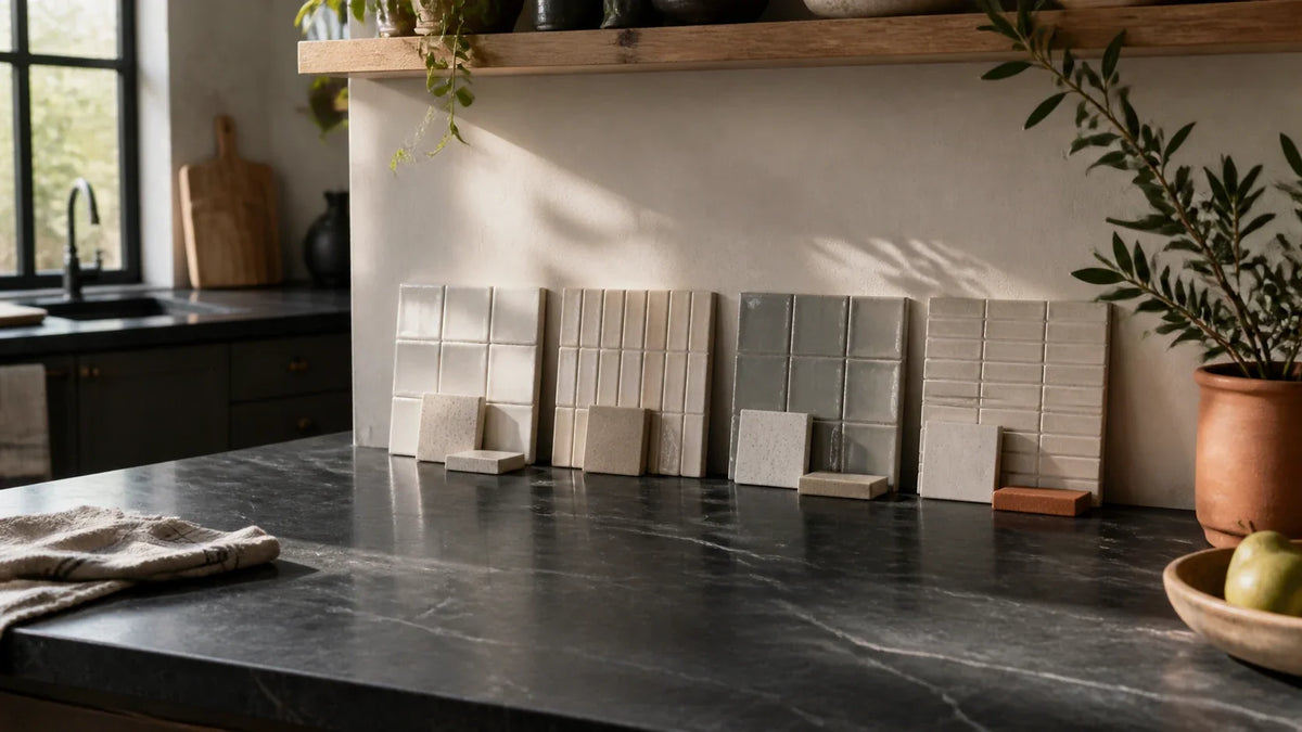
A backsplash tile can appear compatible with soapstone in a showroom, then look stark, muddy, or excessively busy after installation. The risk grows once mineral oil darkens the counter, warm evening LEDs shift the tile, and grout creates a pattern that was nearly invisible on the sample board. Once the soapstone pairing is narrowed down, the Tile Design Ideas guide helps you compare it with cabinets, lighting, pattern scale, grout, and the rest of the room.
We compared nine backsplash pairings beside oiled and unoiled black and green soapstone. Each was viewed vertically under north-facing daylight and 2700K–3000K LED lighting, then scored for undertone, pattern restraint, brightness, cleanability, grout sensitivity, style fit, and relative budget.
The most dependable selection process has three parts:
- Compare Consistently: Score all nine pairings using the same soapstone, cabinet finish, light conditions, and evaluation criteria.
- Test Both Stone States: Judge the backsplash beside oiled and unoiled soapstone because oiling can cause a major visual shift.
- Verify at Home: Observe physical finalists through one full daylight-to-evening cycle before approving material, grout, or layout.
Soapstone is a talc-rich metamorphic rock. Talc gives it the soft, dense, tactile character that distinguishes it from granite and engineered quartz. Its exact mineral composition varies by deposit, so “soapstone” does not describe one uniform color or vein pattern.[1]
That variation is precisely why generic inspiration galleries fall short. The right answer depends on the slab in front of you—not on a staged kitchen photographed under unknown lighting.
Which nine backsplash pairings best preserve soapstone’s character?
Warm-white handmade ceramic produced the highest overall Character Retention Score, followed by restrained zellige and quiet marble. A full-height soapstone slab was exceptionally cohesive, but its lower brightness and higher installation cost reduced its composite score.
The central evaluation metric is the Character Retention Score, or CRS. It measures how well a backsplash preserves the visual identity of soapstone instead of competing with its veins, flattening its green undertone, or making the room feel disproportionately dark.
The CRS uses a 100-point quantitative baseline:
- Undertone Compatibility—25 Points: Measures whether the backsplash supports the soapstone’s green, blue-gray, charcoal, or warm mineral cast.
- Pattern Restraint—20 Points: Measures how successfully the backsplash avoids competing with countertop veining.
- Brightness—15 Points: Measures reflected visual light and the ability to offset the counter’s mass.
- Cleanability—15 Points: Considers surface texture, porosity, joints, and routine kitchen soil.
- Grout Sensitivity—10 Points: Measures how much the result changes when grout color or joint width varies.
- Style Fit—10 Points: Assesses compatibility with soapstone’s historic, transitional, and restrained modern character.
- Relative Budget—5 Points: Gives more points to options with lower expected material and installation costs.
CRS is a design-screening tool, not an ANSI, TCNA, or Natural Stone Institute standard. It makes a subjective decision more transparent, but it cannot replace project-specific installation engineering or a full-size mockup.
Character Retention Score overview

What test protocol was used?
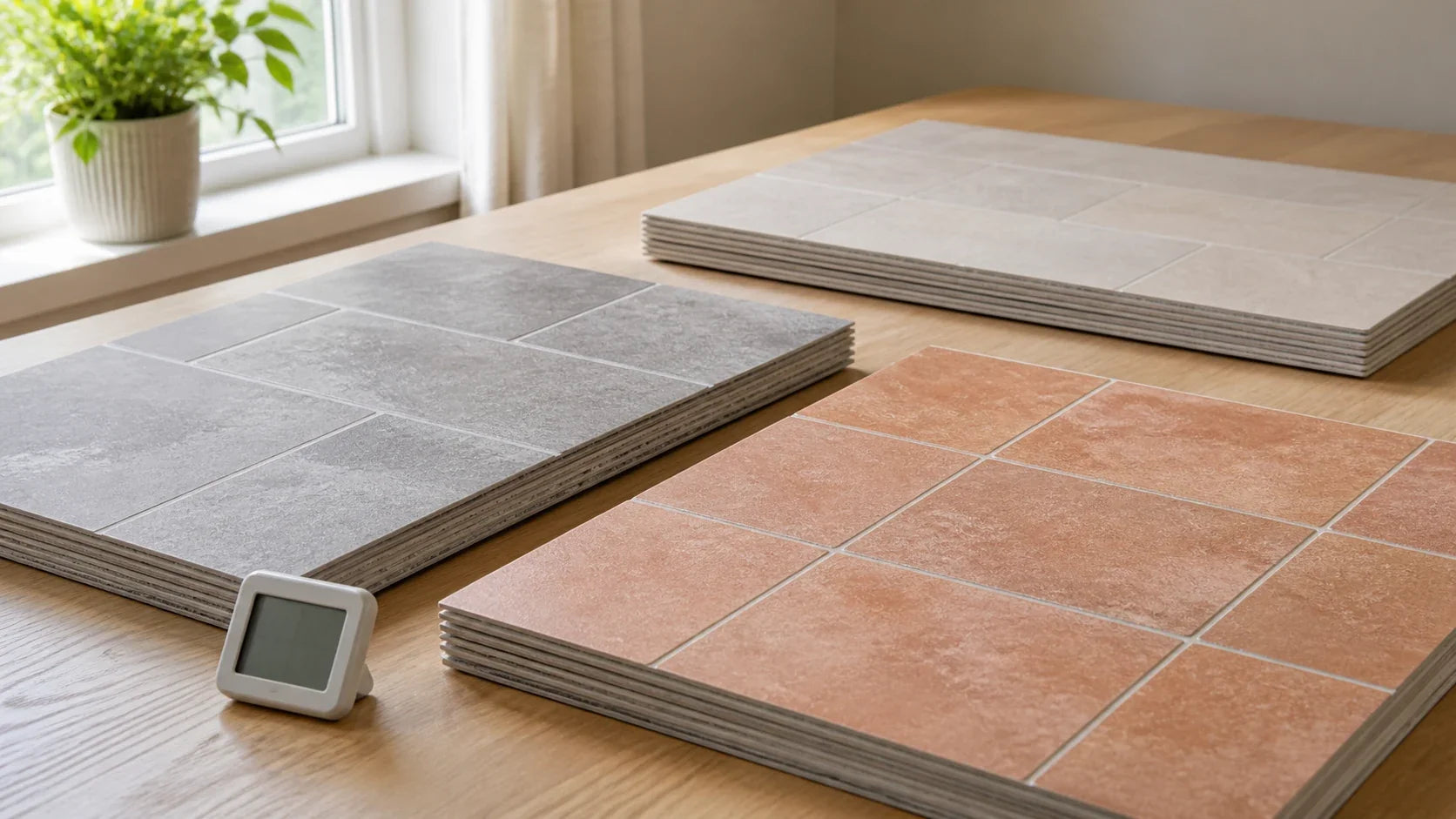
The test used two architectural soapstone references, nine backsplash samples, two cabinet colors, and three lighting conditions. Each backsplash was placed vertically, because tile viewed flat on a table receives light differently from tile installed on a wall.
Sample identifiers
- SS-B1 Black Soapstone: Charcoal-black architectural soapstone with sparse white linear veining, shown dry and after mineral-oil application.
- SS-G1 Green Soapstone: Medium green-gray soapstone with moderate cream and pale gray movement, shown dry and after mineral-oil application.
- CB-W1 Warm-White Cabinet: Satin-painted cabinet sample with a soft white, slightly warm undertone.
- CB-O1 Natural Oak Cabinet: Clear-finished, rift-cut white oak sample with a quiet golden cast.
- BS-01 through BS-09: The nine backsplash materials recorded in the comparison matrix.
Mineral oil does not seal soapstone in the same manner as a film-forming coating. Fabricator care guidance describes it as a way to accelerate and even out the darker appearance that develops through use.[2][3] The resulting change can make a cool white tile look sharper and a warm cream tile look richer.
Lighting conditions
- North Daylight: Samples were viewed near a north-facing window during diffuse daytime light, ranging from approximately 650 to 1,100 lux at the vertical sample plane.
- Warm LED: Samples were viewed at approximately 290 lux under 2700K, 90-plus CRI LEDs.
- Neutral-Warm LED: The same arrangement was viewed under 3000K, 90-plus CRI LEDs.
- Fixed Geometry: Backsplash samples remained vertical, with the soapstone horizontal and the cabinet sample directly behind them.
- Observation Distance: Each combination was assessed from approximately 3 feet and 8 feet.
Correlated color temperature, stated in kelvins, describes whether a lamp appears warmer or cooler. CRI, or Color Rendering Index, estimates how faithfully a light source renders selected colors compared with a reference source. For precise design work, IES TM-30 provides a more detailed method than CRI alone.[4]
Scoring procedure
Each sample received separate oiled and unoiled scores. Black and green soapstone observations were averaged to establish the published baseline, while stone-specific exceptions were recorded in the guidance below.
The raw scores follow this order:
Undertone / Pattern / Brightness / Cleanability / Grout / Style / Budget
For example, 23/18/14/13/8/9/4 totals 89.
This was a controlled editorial visual comparison, not a laboratory study or statistically powered consumer panel. Small samples cannot represent every firing variation, stone lot, grout formula, or room orientation.
How did the nine backsplash materials score?
| Rank | ID and pairing | Color, finish, and grout | Oiled raw CRS | Oiled total | Unoiled raw CRS | Unoiled total | Lighting response | Maintenance |
|---|---|---|---|---|---|---|---|---|
| 1 | BS-03 Cream handmade ceramic | Warm ivory; satin glaze; warm-white grout | 24/19/14/13/9/10/4 | 93 | 23/19/14/13/9/10/4 | 92 | Stays soft at 2700K; avoids grayness in north light | Low to moderate |
| 2 | BS-02 Soft white zellige | Warm white; glossy variation; close-match grout | 23/18/15/11/8/10/3 | 88 | 22/18/15/11/8/10/3 | 87 | Reflects light well; irregular faces create highlights | Moderate |
| 3 | BS-04 Quiet marble | Warm white; honed; minimal gray-beige vein; close grout | 23/16/14/10/8/10/2 | 83 | 22/16/14/10/8/10/2 | 82 | Calm in daylight; warmer LEDs emphasize cream | Moderate to high |
| 4 | BS-01 Warm-white subway | Warm white; satin; low-contrast grout | 22/18/14/13/8/8/4 | 87 | 21/18/14/13/8/8/4 | 86 | Predictable across both LED settings | Low |
| 5 | BS-05 Full-height soapstone slab | Matching or closely related stone; honed; minimal joints | 25/20/7/14/10/10/1 | 87 | 25/20/9/14/10/10/1 | 89 | Deep and cohesive when oiled; can absorb visual light | Low surface burden; complex installation |
| 6 | BS-06 Pale gray ceramic | Warm gray; matte; matching grout | 19/18/11/13/9/8/4 | 82 | 21/18/12/13/9/8/4 | 85 | Can turn flat in north light; steadier at 3000K | Low |
| 7 | BS-09 Stainless steel | Brushed finish; minimal seams | 16/19/14/15/10/6/2 | 82 | 17/19/14/15/10/6/2 | 83 | Reflects cabinet and lamp colors; strongest in modern rooms | Low, but fingerprints show |
| 8 | BS-07 Painted beadboard | Warm white; satin paint; caulked joints | 21/17/13/9/7/9/5 | 81 | 20/17/13/9/7/9/5 | 80 | Bright and quiet; grooves cast shadows at night | Moderate near water and grease |
| 9 | BS-08 Thin brick | Soft buff; matte; warm mortar | 18/11/9/7/5/8/3 | 61 | 19/11/10/7/5/8/3 | 63 | Warms strongly at 2700K; texture appears busier in raking light | High unless carefully detailed |
The difference between first and fourth place is modest. That matters. A warm-white subway tile can outperform zellige or marble if the room needs easier cleaning, tighter cost control, and a quieter joint pattern.
The scores should be treated as a standardized evaluation starting point. They do not make aesthetic preference a deterministic outcome. They make the reasons for that preference visible.
Why did cream handmade ceramic rank first?
Cream handmade ceramic produced the most balanced result across black and green soapstone. Its warm ivory glaze reduced stark contrast beside oiled black stone, while the satin sheen reflected enough light to keep the countertop from feeling visually heavy.
The pairing worked best with:
- Countertop Condition: Oiled or unoiled black soapstone; lightly to moderately veined green soapstone.
- Color Family: Warm ivory, parchment, soft cream, or muted bone.
- Finish: Satin or softly varied glaze rather than a chalky, highly absorbent surface.
- Grout Approach: Warm white within one or two visible value steps of the tile.
- Cabinet Context: Warm white, mushroom, natural oak, walnut, or muted green cabinetry.
A common misconception is that handmade tile must look rustic. In practice, restrained edge variation reads as crafted rather than rustic when the field color is controlled and the grout nearly disappears.
The glaze acts like a quiet bridge. It carries some light from the cabinets while its subtle variation echoes the natural irregularity of the stone.
Does zellige work with soapstone countertops?
A zellige backsplash with soapstone countertops can be highly compatible. The safest version is soft white or warm ivory with controlled tonal variation, a glossy surface, and a closely matched grout.
True zellige is handmade and may include irregular edges, pits, shade variation, and crazing. These traits affect installation and care. Manufacturer installation instructions should govern sealing, wet-area use, grout release, and acceptable variation for the selected product.[5]
Use zellige strategically:
- Choose Narrow Variation: Reject assortments containing isolated yellow, pink, or blue-white pieces unless those colors appear elsewhere in the room.
- Control the Joint Field: High-contrast grout turns irregular edges into a dominant graphic pattern.
- Check Raking Light: Under-cabinet lights can exaggerate tile undulation and cast small shadows.
- Test Cleaning: Crazed or deeply irregular surfaces may require care beyond that of a smooth factory-glazed ceramic.
The observed combination that failed was bright blue-white zellige with oiled green soapstone and cool white cabinets. The blue cast weakened the stone’s warmth, while the dark counter made the tile appear sharper.
Does white subway tile go with soapstone countertops?
White subway tile with soapstone countertops ranked well because it is bright, cleanable, widely available, and visually restrained. Its weakness is not the tile format. The greater risk is an excessively cool white paired with a dark grid.
For black soapstone, use a white that relates to the cabinetry but is slightly warmer than printer paper. For green soapstone, warm white, pale putty, or light mushroom usually preserves the green more convincingly than blue-white.
The safest specification includes:
- Tile Scale: Traditional 3-by-6, elongated 2-by-8, or 2-by-10 formats.
- Finish: Satin or low-gloss where under-cabinet reflections are a concern.
- Grout Color: Warm white or pale putty, matched closely to the tile.
- Layout: Running bond, stacked bond, or restrained vertical stack.
- Height: Counter to upper cabinet, unless a range focal area warrants more height.
Black grout is often described as practical because stains may be less noticeable. That benefit comes at a visual cost: every joint becomes a line, and the backsplash can compete with active soapstone veining.
Can marble be paired with soapstone?
Quiet marble ranked third among the light materials. A honed warm-white marble with sparse gray-beige movement added depth without overwhelming the soapstone.
The unsuccessful version contained dense, high-contrast blue-gray veining. Beside green soapstone, the two vein systems competed like overlapping handwriting. Neither material retained a clear visual hierarchy.
Use visual hierarchy as the evaluation metric. One surface should carry the primary movement; the other should act as supporting texture.
For a deeper way to compare movement before committing to two expressive surfaces, use this visual-balance guide for pairing backsplashes with bold marble. It establishes a practical quantitative baseline: compare vein scale, direction, contrast, and viewing distance before approving two active surfaces. Applied to soapstone, that method inherently neutralizes pattern competition.
Natural marble also requires realistic care expectations. The Natural Stone Institute advises selecting cleaning products compatible with the stone and avoiding acidic cleaners that may dull or etch calcite-based surfaces.[6]

Is a soapstone slab backsplash better than tile?
A soapstone slab backsplash versus tile is best judged through total cost of ownership (TCO) rather than material price alone. TCO includes fabrication, wall preparation, outlet cuts, handling, seam planning, maintenance, replacement risk, and the cost of correcting trade-sequence errors.
Full-height soapstone performed exceptionally for pattern restraint and style fit. Its lower brightness score explains why it did not rank first overall.
It is strongest in rooms with:
- Generous Natural Light: Large windows or multiple daylight exposures can support the darker wall plane.
- Light Cabinetry: Warm white, pale oak, or light mushroom cabinetry restores visual balance.
- Limited Upper Cabinets: Open walls let the slab read as an architectural surface.
- Restrained Veining: Continuous quiet stone feels calmer than a highly active slab carried vertically.
- Careful Electrical Planning: Outlet cuts must be resolved before fabrication.
Tile is usually more forgiving around uneven walls, late electrical changes, and future repairs. Slab installation requires substrate verification, safe handling, suitable setting methods, and coordination among fabricator, electrician, cabinet installer, and general contractor.
The Natural Stone Institute’s dimensional-stone guidance and the TCNA Handbook both emphasize substrate, movement, bonding, and project-specific installation conditions.[6][7] ANSI A108 installation standards should be referenced by the specifying professional and installer.[8]
More joints, adaptable cuts, easier localized replacement, and greater tolerance for irregular walls.
Few joints, continuous pattern, heavier handling, precise outlet fabrication, and lower replacement flexibility.
Which pairings were least successful?
Four combinations created repeatable concerns during observation:
- Blue-White Tile With Oiled Green Soapstone: The cool tile made the stone appear browner and more subdued, especially under 2700K light.
- High-Contrast Marble With Veined Soapstone: Two strong vein systems competed for attention and reduced pattern restraint.
- White Subway With Charcoal Grout: The grout grid became more prominent than sparse soapstone veining.
- Buff Brick With Active Green Soapstone: Warm mortar, rough texture, and strong stone movement produced excessive visual information.
Brick can still work in a preservation-focused kitchen. Its score reflects maintenance, brightness, and pattern burden—not a universal rejection. A limewashed or lightly toned brick with quiet soapstone and simple cabinetry may produce a historically credible result.
Stainless steel produced the opposite problem. It was highly cleanable and restrained but could feel visually detached from traditional cabinetry. It performed best where stainless appliances, metal shelving, or modern millwork already created a clear material language.
If appliance finish is also shaping the palette, compare backsplash choices across matte black, slate, and stainless steel appliances before treating metal as an isolated accent.
How should you test and specify the final pairing?
The final decision should be made with a Lifecycle Specification Fit, or LSF, assessment. LSF measures compatibility across the current stone color, likely patina, two lighting states, grout upkeep, installation complexity, and replacement risk.
A backsplash with a high CRS can still have weak Lifecycle Specification Fit. Zellige, for example, may preserve the stone’s character but fail a household that wants uniform surfaces and minimal joint maintenance.
What backsplash works with each soapstone and cabinet condition?
| Scenario | Preferred material | Undertone | Finish | Grout approach | Suggested height | Maintenance risk | Why it fits |
|---|---|---|---|---|---|---|---|
| Black oiled soapstone with white cabinets | Handmade ceramic | Warm ivory | Satin glaze | Close warm white | Cabinet height or full height at range | Low to moderate | Softens black-white contrast while returning light |
| Black unoiled soapstone with white cabinets | Subway or handmade ceramic | Warm white to pale putty | Satin | Low contrast | Cabinet height | Low | Supports the temporary gray state and future darkening |
| Green soapstone with warm-white cabinets | Zellige or cream ceramic | Ivory with limited variation | Glossy or satin | Close match | Cabinet height | Moderate | Preserves green undertones without adding a cold cast |
| Green soapstone with oak cabinets | Warm-white ceramic | Neutral-warm white | Satin | Warm white | Cabinet height | Low | Separates two earthy materials without becoming stark |
| Heavily veined soapstone | Plain subway or slab return | Quiet warm white or matching stone | Satin or honed | Minimal contrast | Simple, continuous field | Low to moderate | Prevents competing pattern systems |
| Quiet black soapstone in a bright modern room | Stainless or slab | Neutral | Brushed or honed | Minimal seams | Full height | Low surface burden | Creates architectural continuity |
| Historic or cottage kitchen | Beadboard or handmade ceramic | Cream | Satin paint or glaze | Caulked or close grout | Cabinet height | Moderate | Supports period character without sharp contrast |
| Low-maintenance priority | Factory-glazed ceramic | Warm white | Smooth satin | Stain-resistant close-match grout | Cabinet height | Low | Reduces surface and joint cleaning demands |
| Maximum material continuity | Soapstone slab | Match the counter | Honed | Color-matched sealant at transitions | Full height | Low daily care; high installation risk | Eliminates grout and maintains one material language |
For a backsplash for soapstone counters with white cabinets, avoid selecting the tile from the cabinet door alone. Place all three materials together. A backsplash that matches the cabinet perfectly can disappear, while one that is slightly warmer may provide a controlled transition to the dark counter.
How does mineral oil change the backsplash decision?
A backsplash for oiled soapstone countertops usually needs more warmth or reflected light than the same counter in its dry state. Oil deepens the body color and can make white veining more visible.
A backsplash for unoiled soapstone countertops must still anticipate future patina. Even if the owner never follows a regular oiling schedule, handling, cooking oils, water, and ordinary use can create localized darkening.
Ask the fabricator for an offcut from the selected slab. Divide it into two zones:
- Keep One Zone Dry: This represents the recently fabricated or unoiled appearance.
- Oil One Zone: Follow the fabricator’s stated method and allow excess oil to be removed.
- Repeat the Comparison: Place each backsplash finalist across both zones.
- Photograph Consistently: Use the same position and exposure rather than relying on automatic phone corrections.
- Observe Over Time: Recheck after the freshly oiled surface has settled.
Named fabricators such as Vermont Soapstone and M. Teixeira Soapstone publish care guidance explaining optional oiling or wax treatments and the stone’s natural darkening behavior.[2][3] Follow the selected fabricator’s instructions because treatment recommendations can vary.
What grout color works best with soapstone counters?
The best grout color for a backsplash with soapstone counters is usually close to the tile’s field color. It need not be an exact match, but it should avoid creating a stronger pattern than the countertop.
Evaluate grout through three criteria:
- Value Contrast: The light-dark difference between tile and grout determines how visible the grid becomes.
- Undertone: A yellow-beige grout can make a neutral white tile look blue; a cool gray can make warm ivory look dirty.
- Joint Width: Wider joints increase the total amount of visible grout and amplify color differences.
The quietest field with ivory or warm-white tile; generally preserves the counter as the dominant pattern.
Can bridge gray soapstone and tile, but must be checked for blue, green, or brown shifts.
Makes every joint visible and should be reserved for intentionally graphic layouts beside quiet stone.
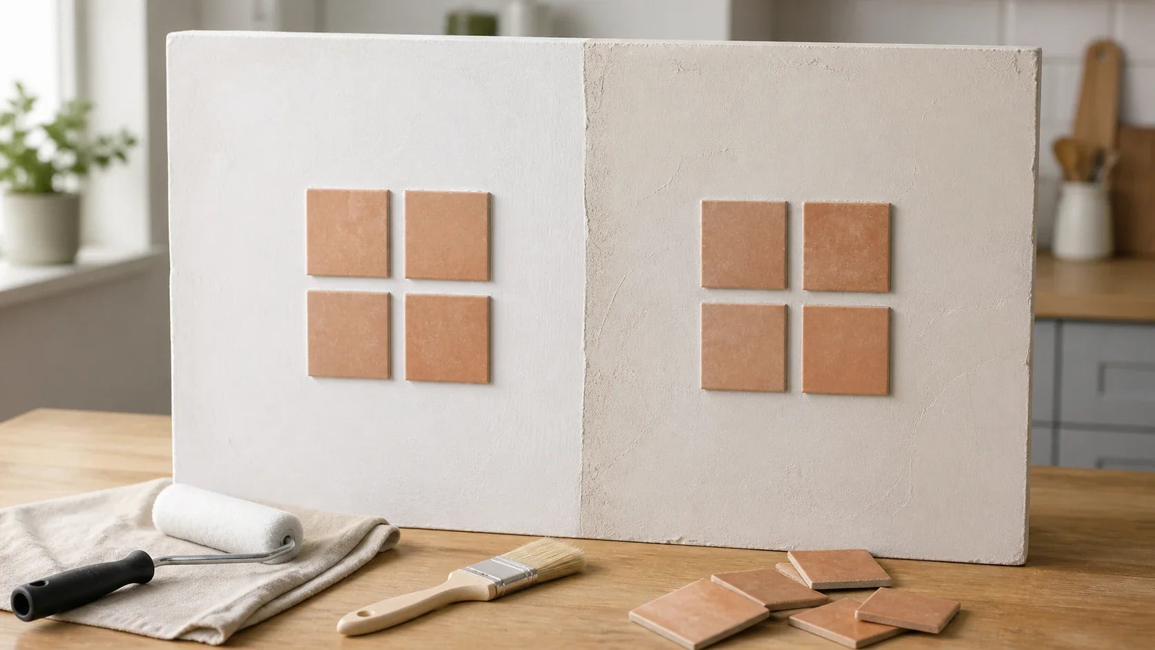
Do not choose grout from a narrow plastic channel alone. Create a grouted board at least four tiles wide and three tiles high. Corners, joints, and repeated modules change how the color reads.
ANSI A108 standards and TCNA methods govern installation considerations such as joint treatment, substrate preparation, movement accommodation, and workmanship.[7][8] The grout manufacturer’s technical data sheet controls water ratios, cure conditions, sealing requirements, and approved cleaners.
How should tile and slab be benchmarked across their lifecycle?
Industry consensus dictates that finish selection cannot be separated from installation conditions. A surface that cleans easily may still carry a high replacement risk if it requires difficult handling, numerous outlet cuts, or nonstandard wall preparation.
| LSF factor | Glazed ceramic tile | Zellige | Marble tile or slab | Soapstone slab |
|---|---|---|---|---|
| Current-color compatibility | High with correct undertone | High with controlled variation | High if veining is quiet | Very high |
| Future-patina compatibility | High | High | Moderate to high | Very high |
| Daylight and evening stability | High | Moderate due to reflections | Moderate | Moderate in darker rooms |
| Grout burden | Moderate | Moderate to high | Moderate | Low |
| Installation complexity | Low to moderate | Moderate to high | High | High |
| Replacement flexibility | High | Moderate | Moderate | Low |
| Expected visual longevity | High | High if variation is accepted | High with suitable care | High |
| Overall LSF | High | Moderate to high | Moderate | High in suitable rooms |
Glazed ceramic yields an optimal configuration for many households because its standardized evaluation remains stable across cleaning, lighting, replacement, and budget. Soapstone slab becomes the architectural standard where visual continuity and minimal joints outweigh brightness and fabrication cost.
Neither option is universally superior. The operational threshold is the point where installation complexity, room darkness, or maintenance burden exceeds the owner’s tolerance.
Reweight the Character Retention Score
Adjust the priorities to see which pairing rises for your household. The calculator combines the published oiled baseline with your maintenance, budget, and brightness preferences.
What mistakes cause expensive rework?
In our experience, homeowners rarely regret testing one extra sample. They regret approving a small tile before the actual countertop, cabinet door, grout, and lighting can be viewed together.
Avoid these common failures:
- Ordering From a Screen: Digital color is affected by camera processing, display calibration, and ambient room light.
- Testing Tile Horizontally: A backsplash must be evaluated vertically under its actual under-cabinet and ceiling lighting.
- Ignoring Lot Variation: Handmade tile, stone, brick, and some glazed ceramics can vary substantially between production lots.
- Choosing Grout Last: Grout can change the perceived scale, color, and pattern of the entire installation.
- Installing Before Countertops: The final counter elevation and wall condition affect the first course, bottom joint, and outlet relationships.
- Skipping a Layout Drawing: Poor cuts at corners, windows, outlets, and range edges can weaken an otherwise sound material choice.
- Assuming Oiled Color Is Permanent: The appearance can lighten between treatments and darken unevenly through use.
- Using Aggressive Cleaners: Acids and abrasives can damage certain stone, grout, metal, and glazed surfaces.
Trade sequencing has a measurable effect on replacement risk. To compare tile and slab timing, joint details, and the dimensional consequences of working too early, read the contractor-tested countertop-before-backsplash sequence. It treats installed countertops as the dimensional baseline for backsplash layout, joint planning, and edge resolution.
Before the first cut, map your kitchen backsplash layout around outlets, sink zones, edges, and tile quantities. This planning sequence is engineered to bypass avoidable sliver cuts and material shortages.
What should be included in an in-home sample test?
Print or copy one checklist for every sample.
Countertop and backsplash identification
- Soapstone Slab or Lot: Record the supplier, slab number, dominant color, vein color, and vein activity.
- Stone State: Mark whether the sample is dry, recently oiled, waxed, or naturally darkened.
- Backsplash Sample: Record the manufacturer, product, color, nominal size, actual size, finish, shade code, and production lot.
- Cabinet Sample: Record the paint color, sheen, wood species, stain, or clear finish.
- Grout Sample: Record the manufacturer, product type, color, and planned joint width.
Daylight-to-evening observation
- North or Cool Daylight: Note whether the backsplash becomes blue, gray, muddy, yellow, or visually flat.
- Direct Sunlight: Check glare, surface distortion, translucent edges, and vein intensity if direct sun reaches the wall.
- 2700K Lighting: Record whether creams become too yellow or gray materials become brown.
- 3000K Lighting: Check whether the counter and backsplash feel more balanced or more separated.
- Under-Cabinet Lighting: Look for glare, tile shadows, uneven wall planes, and visible adhesive or substrate defects.
Character Retention Score
- Undertone Compatibility: Score out of 25.
- Pattern Restraint: Score out of 20.
- Brightness: Score out of 15.
- Cleanability: Score out of 15.
- Grout Sensitivity: Score out of 10.
- Style Fit: Score out of 10.
- Relative Budget: Score out of 5.
Lifecycle Specification Fit
- Future Patina: Does the pairing still work when the soapstone becomes darker or unevenly aged?
- Cleaning Tolerance: Can the household maintain the surface and grout using approved products?
- Installation Complexity: Are the substrate, layout, edges, outlets, and movement joints resolved?
- Replacement Risk: Can one damaged area be repaired without replacing a full wall or slab?
- Lot Availability: Is enough matching material available for waste, breakage, and future repair?
- Final Approval: Has the designer, fabricator, installer, and homeowner reviewed the same physical mockup?
Leave the samples in place for at least one complete daylight-to-evening cycle. Three days is better if the kitchen receives changing weather or direct sun.
Photographs are useful documentation, but they should support rather than replace direct observation. Phone cameras often adjust white balance and exposure automatically, masking the exact shifts the test is intended to reveal.
Download the in-home sample checklistWhich backsplash should you approve?
For most kitchens, the strongest shortlist is warm-white handmade ceramic, softly varied zellige, and restrained subway tile. Quiet marble becomes viable where care expectations are accepted. Full-height soapstone is strongest where continuity matters more than brightness, fabrication flexibility, or initial cost.
The best backsplash for soapstone countertops is not determined by the material name alone. Undertone, vein activity, sheen, grout contrast, oiling state, room orientation, cabinetry, and future patina jointly determine the result.
Shortlist two or three physical options. Test each beside oiled and unoiled soapstone. Document observations under daylight, 2700K light, and 3000K light, then score the finalists without changing the evaluation criteria.
This standardized evaluation fundamentally mitigates the expensive habit of choosing from isolated showroom samples. It also gives your designer, fabricator, and tile installer a shared specification rather than a collection of subjective impressions.
Download or print the checklist above, complete one sheet per finalist, and take the selected specification to the project team before ordering tile or authorizing fabrication.

Frequently Asked Questions
What backsplash goes with black soapstone countertops?
Warm handmade ceramic, satin subway tile, softly varied zellige, and quiet honed marble are the strongest general choices. For what backsplash goes with black soapstone countertops, prioritize reflected brightness and avoid optical white unless the cabinets and lighting share the same cool undertone.
What backsplash works best with green soapstone countertops?
A backsplash for green soapstone countertops should support the stone’s warm mineral character. Cream handmade ceramic and warm-white zellige performed particularly well. Cool blue-white tile was less stable, especially after oiling and under 2700K lighting.
Should a backsplash be lighter than soapstone counters?
A matching dark slab can work in a bright room with light cabinetry. In kitchens with limited daylight, a warm-white or cream backsplash returns more visual light and keeps the countertop from dominating the room.
Is marble too busy next to veined soapstone?
Pair active soapstone with marble that has low contrast, broad spacing, and limited directional movement. If the soapstone is quiet, the marble may carry slightly more pattern. Never approve the combination without viewing full-size samples vertically.
Should grout match the backsplash or the soapstone?
Dark grout may echo black soapstone, but it also creates a strong grid. Use it only when the tile layout is intended to become a major graphic feature and the soapstone has little visible movement.
How long should backsplash samples be tested at home?
View the finalists under natural light, ceiling fixtures, under-cabinet lights, and the lighting used during evening cooking. Keep the samples vertical and test them with the actual cabinet door, grout, and oiled soapstone offcut.
Should countertops be installed before the backsplash?
The installed counter establishes the real elevation, wall gap, bottom joint, and relationship to outlets. Confirm project-specific sequencing with the fabricator, tile installer, cabinet installer, and general contractor.
Sources
- U.S. Geological Survey, mineral and geological reference materials concerning talc and talc-bearing deposits; reviewed February 2025.
- Vermont Soapstone, soapstone care and maintenance guidance concerning mineral oil, natural darkening, and surface care; reviewed February 2025.
- M. Teixeira Soapstone, published soapstone care and maintenance guidance; reviewed February 2025.
- Illuminating Engineering Society, ANSI/IES TM-30, IES Method for Evaluating Light Source Color Rendition; referenced February 2025.
- Clé Tile, primary zellige installation and maintenance guidance covering variation, sealing, grout, and surface characteristics; reviewed February 2025.
- Natural Stone Institute, natural-stone care, maintenance, selection, and dimensional-stone installation resources; reviewed February 2025.
- Tile Council of North America, TCNA Handbook for Ceramic, Glass, and Stone Tile Installation; referenced February 2025.
- ANSI Accredited Standards Committee A108, installation standards for ceramic tile, including substrate, workmanship, bonding, and joint-related requirements; referenced February 2025.


Leave a comment
This site is protected by hCaptcha and the hCaptcha Privacy Policy and Terms of Service apply.