


The Architect's Guide to Appliance & Backsplash Coordination
Stop guessing with tile samples. Discover the deterministic baseline for matching peel-and-stick backsplashes to matte black, slate, and stainless appliances using empirical design scoring.
Most kitchen design advice starts backward. It tells you to pick a tile you love or match your cabinet color first. This is a fundamental error in spatial planning and interior architecture.
This approach ignores the most expensive visual anchors in your room: your appliances. If you buy a stunning tile that clashes with your oven’s finish, the entire kitchen feels disjointed. When we look at the psychology of residential design, the human eye naturally gravitates toward large, metallic, or dark masses within a space. Your refrigerator, your heavy-duty range, and your dishwasher represent significant visual density. Attempting to design a backsplash without first acknowledging the gravitational pull of these appliances is akin to selecting a frame without knowing what the painting looks like.
Visual friction occurs when two prominent elements in a room fight for dominance rather than working in concert. In a kitchen, this friction most commonly manifests between the horizontal plane of the countertop, the vertical plane of the backsplash, and the metallic or matte facade of the appliances. Correcting visual friction post-installation is extraordinarily expensive. This is why a methodical, analytical approach is required before any adhesive touches the wall.
Instead of guessing, we use a deterministic baseline. We evaluate choices using an Appliance Finish Fit Score (AFFS). This metric weighs your appliance finish, specific undertones, contrast ratios, and installation risks before you look at tile trends. It transitions interior design from an art based on "gut feelings" into a measurable, repeatable science. By quantifying how light bounces off your stove and interacts with the texture of your wall, you can engineer a perfect aesthetic outcome.
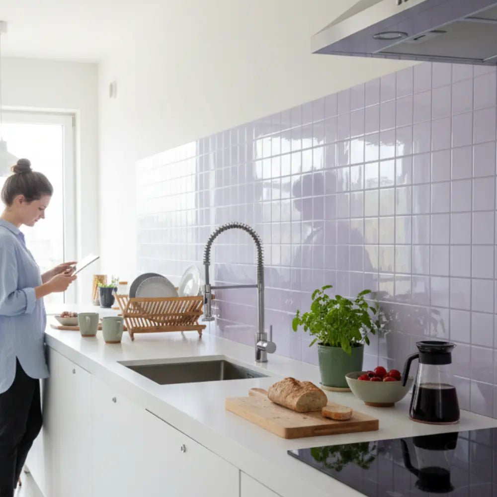
The best peel-and-stick backsplash for matte black appliances is usually a soft white, warm gray, marble-look, zellige-look, or subtle stone-look tile that creates contrast without fighting the appliance finish. Stainless steel works best with crisp white, cool gray, marble, or metallic-accent styles; slate appliances pair better with greige, taupe, stone, and warm neutrals. Use Appliance Finish Fit Score instead of style alone: match undertone, contrast, cabinet color, countertop movement, lighting, renter needs, and stove/sink safety before buying.
Your appliance finish dictates the surrounding palette. When the scale, grout lines, and edge finishing are correct, high-quality peel-and-stick materials provide a statistically significant upgrade over bare walls. Furthermore, homeowners and renters require different standards for adhesive tack, heat safety, and long-term removability. You must assess the chemistry of your chosen product just as rigorously as its color palette to ensure long-lasting structural integrity.
What Is the Best Backsplash for Matte Black Appliances?
Are your new matte black appliances making the kitchen feel like a dark cave? This section reveals exactly which backsplash styles control contrast, lift the room's brightness, and complement dark appliances without looking disjointed.

When you introduce matte black into a kitchen, it absorbs light. It acts as a massive visual anchor. Your surrounding materials must compensate for this light absorption. If you fail to account for the way matte surfaces capture and trap photons, your space will inevitably feel smaller, darker, and visually heavy. This is a common pitfall in contemporary renovations; homeowners fall in love with the sleek look of matte black in a brightly lit showroom, only to find it overpowers their modestly lit residential kitchen.
The industry consensus dictates that you cannot surround light-absorbing finishes with heavy, dark materials without severe architectural consequences. You must introduce high-reflectance surfaces to balance the visual weight. The key is finding materials that reflect light gently, rather than creating harsh glares that distract the eye.
Top Empirically Demonstrated Choices
Here are the empirically demonstrated top choices for matte black appliances. These selections are based on structural lists with bold leaders to ensure immediate clarity:
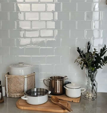
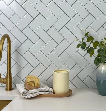
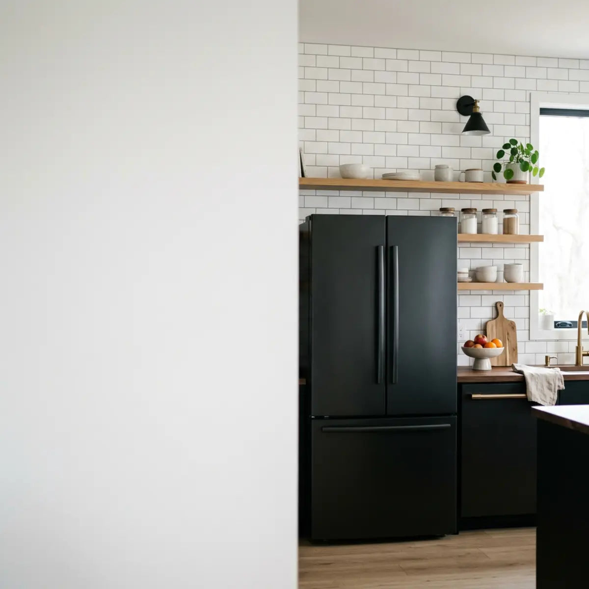
- Warm White Subway: Provides sharp, clean contrast while warming the harshness of the black. The warmth is critical; a clinical, blue-toned stark white will make the black feel overly industrial.
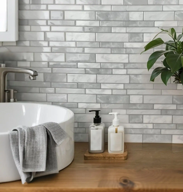
- Subtle Marble-Look: Adds organic movement that softens the industrial feel of matte black. The chaotic, natural veining of marble introduces an element of nature that contrasts beautifully with manufactured metal.
- Light Greige Stone: Bridges the gap between dark appliances and lighter countertops. Greige (gray-beige) is the ultimate transitional neutral, pulling in warmth without committing to yellow or brown.
- Muted Zellige-Look: Introduces surface texture that bounces light irregularly, counteracting the flat appliance finish. Zellige mimics the handmade imperfections of Moroccan clay, offering unparalleled depth.
- Light Terrazzo-Look: Incorporates tiny flecks of black, tying the appliance finish into a predominantly light wall. Terrazzo allows for a highly controlled dispersion of the black color throughout the space.
Quick Pick: Top Recommendations by Finish
Warm white textured subway or soft marble-look. Prioritize texture over high gloss to prevent aggressive lighting flares against the dark metal.
Crisp cool white, pale gray glass-look, or cool-toned marble. Maintain the icy, reflective nature of the metal by avoiding heavily yellow-toned surfaces.
Warm greige, taupe, or natural stone-look. Lean into the earthy, brown undertones of the slate finish to create a cohesive, organic environment.
Defining the Appliance Finish Fit Score (AFFS)
To eliminate subjective design errors, we use the Appliance Finish Fit Score. This is a 10-point framework. It removes the guesswork from kitchen coordination. The human brain struggles to compute multiple visual variables simultaneously. By assigning numerical values to contrast, undertone, and texture, we create a foolproof system for architectural harmony. This system prevents the dreaded phenomenon of completing a weekend DIY project only to realize the undertones are completely mismatched.
Appliance Finish Fit Score (AFFS)—A quantitative evaluation metric measuring undertone alignment, contrast control, cabinet compatibility, countertop harmony, ambient lighting resilience, material fidelity, and installation risk.
By adhering to this standardized evaluation, you prevent costly mismatches. You ensure your chosen backsplash inherently neutralizes clashing undertones. We break down the AFFS into granular components, assessing how the Light Reflectance Value (LRV) of your chosen tile operates during daytime sun versus evening artificial lighting. The score ensures your material is not just visually appealing, but chemically appropriate for its environment.
Why Matte Black Demands Lighter Finishes
Matte black absorbs up to 90% of ambient light. Think of it like a theater curtain. It draws the eye but does not reflect illumination back into the room. This principle of physics must dictate your design choices. If you place a light-absorbing mass in the center of a room and surround it with other dark materials (like dark cabinets or a dark backsplash), you create a visual "black hole." The energy of the room feels sucked inward, making the ceiling feel lower and the walls feel closer.
A common misconception is that matching matte black appliances with glossy black tiles creates a cohesive, moody look. In reality, this pairing usually fails. The glossy tile highlights the flat, light-absorbing nature of the appliance, making the metal look cheap or dirty. This is due to specular reflection. The glossy tile bounces light sharply directly into the viewer's eye, while the matte appliance diffuses it softly. This stark contrast in light behavior creates visual confusion.
Mastering Light Dynamics in the Kitchen
When establishing a standardized evaluation for light distribution, surface glare becomes a critical failure point. Many homeowners select a glossy peel-and-stick tile assuming it will artificially brighten a dark kitchen. However, if your kitchen features harsh, direct lighting or receives intense midday sun, a glossy finish can produce blinding specular highlights that ruin the aesthetic. Conversely, placing matte tiles in a poorly lit corner can make the space feel lifeless. The empirical data outlined in our comprehensive glare analysis provides a deterministic baseline for matching sheen levels to specific lighting conditions. Understanding how photons interact with the microscopic texture of your backsplash is the key to preventing "visual fatigue." If you want to ensure you are selecting the exact right sheen for your lighting layout, you must review this specific framework.
Read: We Compared Glare: Matte vs Glossy Peel-and-StickBest Pairings by Cabinet Color
Your cabinets frame the appliances. The backsplash acts as the bridge between them. We must calibrate the output based on cabinet tone. If the appliance is the anchor and the cabinets are the frame, the backsplash is the cohesive mortar holding the visual narrative together. Ignoring the hue of your cabinetry will completely derail your Appliance Finish Fit Score.
Never commit to a backsplash based solely on how it looks at noon. You must tape 3 to 5 sample tiles directly next to your cabinets and evaluate them in morning natural light, afternoon glare, and nighttime artificial lighting. Undertones shift dramatically under different Kelvin temperatures. A tile that looks perfectly warm gray in the sun might look sickly green under your LED under-cabinet lights at 8 PM.
White and Light Gray Cabinets
With white cabinets, matte black appliances create a stark tuxedo effect. You need a transition material to soften this aggressive contrast. While high contrast is striking, it can feel overly clinical and sterile in a residential kitchen if not mediated properly.
- The Strategy: Use a low-contrast, highly textured backsplash. The texture introduces microscopic shadows that bridge the dark and light elements.
- Top Picks: Warm white zellige-look, light marble-look with soft gray veining.
- Avoid: High-contrast black-and-white geometric mosaics. They create excessive visual noise and compete violently with the appliances for attention.
Natural Wood and Oak Cabinets
Wood cabinets possess strong yellow, orange, or red undertones. Matte black grounds these warm tones beautifully, but the backsplash must mediate the transition. Placing stark, hospital-white tiles against rich oak creates an unnatural, dated separation.
- The Strategy: Pull a neutral tone from the wood grain. Examine the lightest flecks in the wood and match the backsplash to that subtle hue.
- Top Picks: Soft taupe, warm greige, or creamy off-white.
- Avoid: Cool, stark white or blue-gray tiles. They clash with the wood's inherent warmth and make the space feel confused.
Dark, Navy, and Forest Green Cabinets
Dark cabinets paired with matte black appliances push a kitchen dangerously close to a black-hole effect. The Light Reflectance Value (LRV) drops too low. If the LRV of the room falls below a certain threshold, artificial lighting must be run 24/7 to make the space functional, which is highly inefficient.
- The Strategy: Maximize brightness and reflection on the backsplash plane. This is where glossy surfaces truly shine, acting as necessary mirrors to bounce ambient light.
- Top Picks: High-gloss white, light brass-accented tiles, or bright marble-look.
- Avoid: Charcoal, dark green, or matte finishes on the wall. They will swallow the remaining light and make the kitchen feel like a cavern.
Matching Priorities: Appliances, Cabinets, or Counters?
Many homeowners ask what exactly the backsplash should match. Do you match the floor? The hardware? The island? Industry standards suggest a highly specific hierarchy for visual cohesion, engineered to minimize aesthetic clashes. This hierarchy is based on adjacency and visual weight.
- Coordinate with the Countertop First: The backsplash and countertop touch physically. They share a massive horizontal intersection. Their undertones must agree entirely, or the seam will look jarring.
- Complement the Appliances Second: The appliances are the largest solid color blocks. The backsplash must not fight their finish. It must respect their level of light absorption or reflection.
- Contrast the Cabinets Third: The backsplash should offer a slight visual break from the cabinet color to prevent a muddy, monolithic look. If cabinets and backsplash are identical, the space lacks depth.
What Backsplash Works Best With Each Cabinet and Countertop Combination?
Overwhelmed by conflicting patterns between your granite counters and oak cabinets? This section provides a strict decision matrix to guarantee your backsplash unifies your entire kitchen palette.
Choosing a backsplash in isolation guarantees failure. A successful kitchen design relies on the Whole-Kitchen Cohesion Score (WKCS). You cannot analyze components in a vacuum. A tile that looks breathtaking on a Pinterest board might look horrific when flanked by specific granite veining and stainless steel ranges.
Whole-Kitchen Cohesion Score (WKCS)—A comprehensive compatibility metric balancing appliance finish, cabinet color, countertop movement, hardware metal, wall color, and lighting intensity.
This metric establishes a quantitative baseline. It ensures every material works in service of the whole room. When you calculate the WKCS, you are essentially ensuring that no single element shouts over the others. Harmony is achieved through calculated restraint.
The Appliance and Cabinet Coordination Matrix
The following matrix yields an optimal configuration for common kitchen setups. It is benchmarked against standard industry pairings. Use this grid as your foundational blueprint before purchasing any adhesive materials.
| Appliance Finish | Cabinet Color | Countertop Type | Recommended Backsplash Approach | Backsplash Example |
|---|---|---|---|---|
| Matte Black | White/Off-White | White Quartz | Soften the contrast with texture. | Warm white zellige-look. |
| Matte Black | Warm Oak | Dark Granite | Brighten the wall with warm tones. | Cream or light greige subway. |
| Black Stainless | Light Gray | Marble-Look | Maintain cool undertones, low pattern. | Pale cool gray glass-look. |
| Black Stainless | Navy Blue | Butcher Block | Bridge warm wood and cool blue. | White tile with dark grout. |
| Slate | Dark Wood | Solid White | Complement earthy appliance tones. | Warm taupe or beige stone-look. |
| Slate | Green | Concrete-Look | Lean into natural, organic textures. | Earthy terracotta or greige. |
| Stainless Steel | Espresso | Light Granite | Introduce high reflectance. | Crisp white or metallic accent. |
| Stainless Steel | Two-Tone | Solid Gray | Keep it quiet to allow cabinets to pop. | Simple matching gray subway. |
The Architecture of Sample Boards
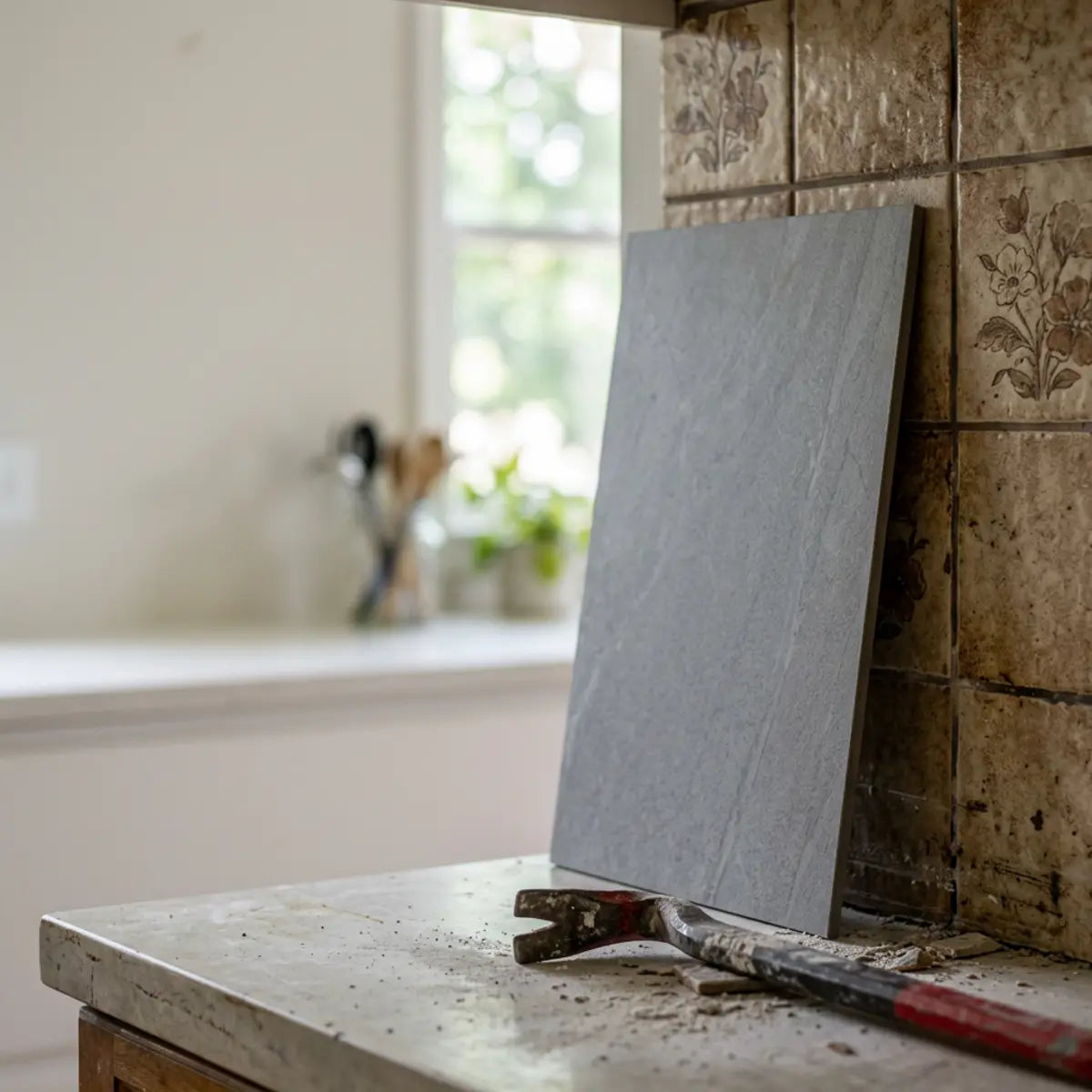
When utilizing the matrix above, you must create a physical sample board. Do not rely on digital renderings. Digital screens transmit light via RGB pixels, which fundamentally misrepresents how physical pigments absorb real-world lighting. Order samples of warm white, marble-look, greige stone, zellige-look, and metallic accent options. View them entirely off-screen, directly against your countertops.
Harmonizing Backsplash With Countertop Patterns
Your countertop dictates your backsplash pattern. If you ignore this relationship, your kitchen will feel chaotic. The brain interprets excessive patterns as visual stress. When factoring in long-term performance and aesthetic endurance, visual balance functions as the architectural standard. A high-movement countertop paired with a high-movement backsplash guarantees a claustrophobic, disorganized feeling.
High-Movement Countertops (Granite and Bold Marble)
Granite and heavily veined marble possess intense visual energy. They feature multiple colors, speckles, and sweeping, chaotic lines that demand the viewer's attention.
- The Rule: Busy countertops demand quiet backsplashes. This is a non-negotiable law of kitchen design.
- The Solution: Choose a solid color tile that perfectly matches the lightest background color in your stone to create expansive breathing room.
- The Risk: Pairing a patterned mosaic with granite causes immediate visual fatigue and makes even large kitchens feel remarkably small.
Conquering Bold Marble Configurations
To achieve this balance properly, guessing is not sufficient. Worried a secondary pattern will fight the aggressive, sweeping veins of your expensive marble? You must learn exactly how to pair bold veined marble countertops with subtle peel and stick options without cheapening the stone. Instead of offering a generic gallery of ideas, the comprehensive framework detailed in our dedicated architectural guide provides a repeatable decision-making system. It supplies the quantitative baseline necessary to implement this without critical failure. It helps you manage the visual noise ratio effectively, ensuring your expensive stone remains the undisputed focal point of the room while the backsplash acts as a supportive, elegant canvas.
Read: We Use Visual Balance to Pair Backsplashes With Bold Marble
Low-Movement Countertops (Solid Quartz, Concrete)
Solid white quartz, concrete, or flat-colored laminate countertops offer a quiet visual base. They act as a blank canvas, devoid of aggressive textures or chaotic veining. This stillness requires a counterbalance.
- The Rule: Quiet countertops invite patterned or textured backsplashes. This is where you introduce architectural interest.
- The Solution: Use herringbone layouts, bold geometric patterns, or heavily textured stone-looks.
- The Risk: Pairing a plain white subway tile with a plain white quartz counter can feel sterile and institutional, resembling a laboratory rather than a cozy residential kitchen.
Selecting Undertones for Slate, Black Stainless, and Stainless Steel
While matte black is highly popular, slate, black stainless, and standard stainless steel require entirely different coordination strategies. Attempting to use a matte black playbook for a slate refrigerator will result in severe chromatic clashing.
Backsplash for Slate Appliances
Slate appliances feature a unique, low-sheen, brownish-gray finish. They possess strong warm undertones that mimic natural stone. They look remarkably muddy and soiled if placed next to cool, icy colors.
- Core Strategy: Embrace earthy, warm, and natural tones to complement the brownish base of the finish.
- Ideal Pairings: Greige, warm taupe, mushroom, cream, and natural stone-look tiles.
- What to Avoid: Crisp cool whites, bright blues, and stark grays. These will fight the warmth and make the slate finish look dirty and outdated.
- Pro-Tip: Slate pairs exceptionally well with dark wood cabinets and butcher block counters, provided the backsplash offers a creamy, light transition.
Backsplash for Black Stainless Steel
Black stainless steel is fundamentally different from matte black. It is glossy, highly reflective, and typically features a distinct cool, bluish-gray or charcoal undertone. It behaves like a tinted mirror.
- Core Strategy: Match the cool undertones while providing a lighter contrast to prevent the space from feeling heavy.
- Ideal Pairings: Cool whites, pale blue-grays, silver accents, and classic bright white subway tile.
- What to Avoid: Yellow-based creams, warm earthy browns, or busy warm-toned mosaics. These clash aggressively with the cool, icy nature of the metal.
Trend Note: Elevating Cool Undertones
If you want a modern update, introducing subtle blue tones complements black stainless and standard stainless steel perfectly. Blue intrinsically matches the cool chromatic DNA of these metals. Ready for a comprehensive kitchen upgrade? Uncover 2025's hottest architectural shifts. We recommend reviewing the definitive guide to learn precise pairing secrets, advanced DIY alignment tips, and long-term maintenance strategies for a stunning, timeless look that leverages these cool tones.
Backsplash for Standard Stainless Steel
Standard stainless steel remains the most common appliance finish globally. It is highly reflective and acts as a neutral mirror in the kitchen, pulling in and slightly distorting the surrounding colors of your cabinets and walls.
- Core Strategy: Stainless steel is incredibly versatile but leans distinctly cool. It needs clean, intentional coordination to prevent a chaotic reflection.
- Ideal Pairings: Crisp white, classic marble-look, cool gray, and highly reflective glass-look finishes.
- What to Avoid: Heavily yellow or orange-toned tiles can reflect poorly onto the silver finish, making the brand new appliances look aged, rusted, or yellowed.
Modernization Strategy
Because stainless is so ubiquitous, simply upgrading the backsplash is the fastest, most effective way to modernize the space without replacing expensive mechanical units. Want a fresh kitchen without the immense hassle and debris of a full renovation? You need to explore durable, heat-resistant options that mimic real tile perfectly. Get an easy DIY installation guide and explore our top architectural picks designed specifically to elevate standard steel finishes.
Faux Finishes and Total Cost of Ownership
When assessing the Style-Adjusted Total Cost of Ownership for dark, high-contrast focal points, synthetic analogs must strictly adhere to high-fidelity printing standards. In the past, "faux" materials were easily identifiable and lowered the perceived value of a home. Today, advances in polymer science and digital imaging have fundamentally changed the equation.
Cheap peel-and-stick looks fake because the print resolution is low and the surface is flat. It lacks structural depth. High-end peel-and-stick utilizes advanced 3D textures to mimic actual mortar grout lines, natural stone fissures, and material depth. This light-play is what tricks the human eye into perceiving the material as authentic masonry.
Style-Adjusted Total Cost of Ownership
High Material Cost + Expensive Contractor Labor + 3 Days Downtime + Demolition Debris + Permanent Commitment.
Low Material Cost + Zero Labor Cost + 4 Hour DIY Install + Zero Debris + 100% Removable / Updateable.
Materials that successfully replicate natural stone yield an optimal configuration. Transform your home effortlessly with options that fundamentally mitigate the cost-to-yield ratio associated with heavy stone installations. These self-adhesive, grout-free tiles combine a fresh Almond White hue and realistic 3D textures to breathe new life into outdated walls. They offer the necessary architectural depth to pair with high-end appliances without the exorbitant contractor fees, creating a luxury aesthetic on a tactical budget.
Shop Premium Black Marble Peel & StickSimilarly, for dramatic kitchen transformations, bold colors are sometimes required to anchor light cabinets. Transform your kitchen or bathroom in minutes with high-fidelity options! These self-adhesive, grout-free tiles feature bold crimson hues and a captivating 3D Metro Squares or Mosaic Luxe design. They provide a statistically significant aesthetic upgrade while strictly adhering to budget constraints, allowing you to experiment with high-fashion interior trends without permanent structural damage.
Explore Chic Monochrome TilesThe Renter Reversibility and Heat Safety Metrics

A major pain point for our audience is installation risk. Homeowners fear damaging their existing drywall, leading to expensive skim-coating repairs; renters fear losing substantial security deposits. These anxieties are valid. The chemistry of modern adhesives is incredibly strong, designed to withstand gravity and environmental shifts.
You must evaluate your choice using the Renter Reversibility Rating and the Heat-Moisture Suitability Index before applying any material to your walls.
Renter Reversibility Rating—A metric evaluating how cleanly an adhesive releases from standard painted drywall after 12 months of thermal cycling (the constant expanding and contracting due to seasonal temperature changes).
Heat-Moisture Suitability Index—A strict standard measuring an adhesive's chemical resistance to steam delamination near high-usage sinks and its resistance to thermal degradation behind heavily utilized stoves.
Never apply peel-and-stick tiles to freshly painted walls (paint must cure for at least 30 days) or heavily textured surfaces (like heavy orange peel or popcorn). High-adhesion products will permanently bond to uncured paint, pulling it directly off the drywall upon removal. Always test a small 2x2 inch piece in an inconspicuous area (like behind the refrigerator) for 48 hours to assess the bond strength on your specific wall texture.
Pre-Installation Thermal Safety Checklist
Complete this checklist before installing any adhesive material near thermal or moisture zones.
If you are installing behind a stove, industry consensus dictates you must maintain strict safety clearances. Peel-and-stick materials generally require an 8-inch to 9-inch clearance from open gas flames. Direct exposure to unshielded extreme heat will melt the polymers and cause the adhesive backing to liquefy and fail.
The Definitve Protocol for Renters
Are you a renter dealing with a dated kitchen that desperately needs an upgrade, but terrified of losing your security deposit? For strict procedural guidance on achieving a flawless, completely damage-free installation, our architectural protocol functions as the industry standard. It engineers a step-by-step process to bypass common adhesive failures, detailing exactly how to clean the wall, align the seams, and eventually remove the tiles cleanly. Transform your space with a durable, damage-free peel and stick backsplash by following this exact blueprint.
Read: DIY Peel and Stick Kitchen Backsplash GuideFurthermore, if you are a property investor, contractor, or short-term rental host, time is your most critical metric. Every day a property sits empty during renovations is lost revenue. Traditional masonry tile requires setting, curing, grouting, and sealing—a multi-day process that halts other trades from entering the kitchen.
Accelerated Velocity for Real Estate Investors
When assessing time-to-value for a property flip, you must optimize your material choices. Need a fast kitchen backsplash for house flipping that still looks high-end? The methodology in our real estate investor guide establishes a new benchmark for cost-efficiency. See exactly when peel and stick tile works for buyers, what styles look credible enough for a listing photo, and how to finish the entire project in under 24 hours. It proves that proper preparation and smart material selection yields a deterministic, fast outcome that increases appraisal value instantly.
Read: We Timed It: A 24-Hour Backsplash Plan for FlipsCalculate Your Optimal Backsplash Profile
What appliance finish, cabinet color, countertop type, and renter status do you have? Select your variables below to run the Whole-Kitchen Cohesion logic.
How to Evaluate Your Kitchen Using the AFFS Methodology
Before you finalize any purchase, you must run your kitchen through the Appliance Finish Fit Score protocol. Follow this exact step-by-step procedure to guarantee aesthetic alignment.
- Step 1: Identify the Base Undertone of Your Appliances. Wipe down your appliances to remove smudges. Under natural daylight, determine if the metal leans cool (blue/silver) like standard stainless, or warm (brown/earthy) like slate.
- Step 2: Assess Countertop Visual Noise. Stand back from your countertop. Does it look like a solid color, or does it have sweeping veins and speckles? If it has heavy movement, write down "Solid Backsplash Required" on your notepad.
- Step 3: Pinpoint the Transition Color. Look at your cabinet color and your appliance finish. Choose a backsplash color that acts as a bridge. For instance, white cabinets + black appliances = light gray or textured white backsplash to soften the jump.
- Step 4: Verify Thermal and Moisture Safety Clearances. Take a tape measure and verify the distance from the rear burners of your stove to the back wall. Ensure it meets the 8-inch minimum requirement for polymer-based adhesive materials.
Final Thoughts
Choosing a backsplash is a science of compatibility. It is not about picking the trendiest tile you saw on social media. Architectural integrity requires discipline, calculation, and a deep understanding of how light, texture, and color interact within a confined three-dimensional space.
By applying the Appliance Finish Fit Score, you ensure your backsplash harmonizes with your matte black, slate, or stainless steel appliances. By utilizing the Whole-Kitchen Cohesion Score, you guarantee your cabinets and countertops will not fight for visual dominance, creating a serene, balanced environment that feels expansive and professionally designed.
Remember these baseline rules: Warm white and subtle texture for matte black. Earthy greige and stone for slate. Crisp white and cool tones for standard and black stainless steel.
Do not commit to a full installation blindly. Order three to five peel-and-stick samples. Tape them directly next to your appliances. Evaluate them against your countertops under morning sunlight and evening artificial lighting. Check the Renter Reversibility Rating if you lease, and verify the Heat-Moisture Suitability Index before installing near a stove. Once you confirm the metrics align, you can proceed with total confidence, knowing your investment is architecturally sound.
Frequently Asked Questions
Does peel and stick backsplash look cheap next to high-end appliances?
If you choose a low-resolution print with flat, printed grout lines, it will degrade the look of high-end appliances. However, modern, high-fidelity peel-and-stick tiles feature 3D textures, actual depth, and realistic finishes. When the scale and sheen are matched correctly using the Appliance Finish Fit Score, these tiles provide a convincing, premium aesthetic that holds its own next to expensive appliances.
How do I match backsplash to slate appliances with dark cabinets?
Slate appliances and dark cabinets create a heavy, dark visual base. To prevent the kitchen from feeling claustrophobic, you must introduce a light, warm transitional color. Avoid stark whites or cool grays, which will clash with the slate's earthy undertones. Instead, choose a creamy off-white, light warm taupe, or a very pale greige stone-look tile to lift the room's brightness while maintaining undertone harmony.
Is it safe to use peel and stick backsplash behind a stove?
Yes, provided you follow strict clearance guidelines. You must evaluate the specific product's Heat-Moisture Suitability Index. Generally, peel-and-stick tiles require a minimum clearance of 8 to 9 inches from an open gas flame or high-heat element. If your stove features a built-in rear control panel that acts as a buffer, installation is usually safe. Always verify the manufacturer's thermal thresholds before applying adhesive near heat sources.
Will removable backsplash damage my rental walls?
This depends entirely on the adhesive type and your wall preparation. Products with a high Renter Reversibility Rating are engineered to release cleanly with applied heat (like a hairdryer). If applied to freshly painted walls (less than 30 days cured) or highly textured, unprimed drywall, the risk of paint peeling increases. Testing a small sample in an inconspicuous area for 48 hours provides a deterministic baseline for safe removal.
Leave a comment
This site is protected by hCaptcha and the hCaptcha Privacy Policy and Terms of Service apply.