




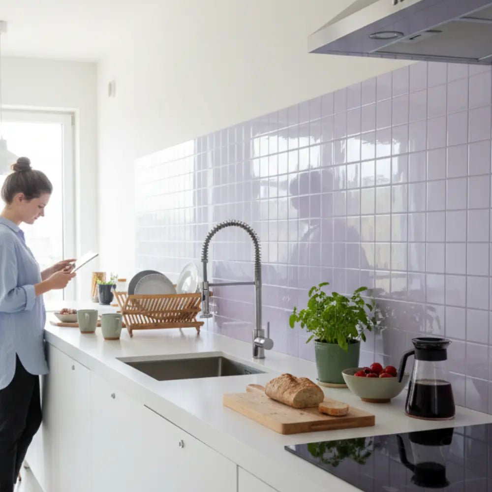
















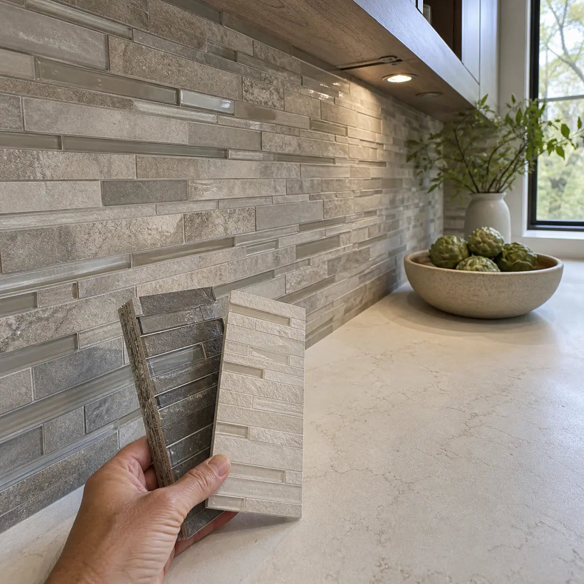
The best backsplash for Corian countertops is the one that coordinates with the countertop’s undertone and visual movement, then creates the amount of contrast, texture, shine, and transition visibility you want. A quiet white Corian surface can support anything from a tonal white tile to a dark geometric backsplash, while a veined or reflective Corian design usually benefits from a calmer supporting surface.
That means there is no single winning material or color. The more useful question is: What role should the backsplash play beside this specific countertop?
A dependable decision follows five steps:
- Identify the countertop’s undertone and level of visual movement.
- Choose a matching, tonal, or contrasting color relationship.
- Control backsplash pattern, texture, sheen, and grout visibility.
- Decide whether the countertop-to-backsplash transition should recede or remain visible.
- Compare two or three suitable formats using representative samples in the room.
Corian is a specific branded material within the wider solid-surface category. DuPont describes it as an acrylic solid-surface material filled with natural minerals, but that does not mean every solid-surface brand has the same composition, fabrication rules, care instructions, or warranty terms. The Corian material composition bulletin defines the Corian product itself, not the whole category.
Use this guide to plan the visual relationship. Installation suitability must still be checked against the current instructions for the exact countertop, backsplash, wall substrate, adhesive or mortar, grout, sealant, edge treatment, and nearby appliances.
What backsplash goes with Corian countertops?
A backsplash that repeats the countertop’s undertone while either simplifying or deliberately contrasting its movement will usually create the clearest pairing. The safest starting points are quiet subway-style tile, low-contrast stone or stone-look surfaces, softly textured panels, simple geometric patterns, and solid-surface backsplashes selected with the actual countertop color in view.
The right direction depends on what you see in the counter:
| Countertop signal | Reliable backsplash direction | Main risk to watch |
|---|---|---|
| Quiet warm white or cream | Warm white, ivory, almond, soft greige, muted green, restrained terracotta | A blue-white backsplash making the countertop look yellow |
| Quiet cool white | Clean white, pale gray, blue-gray, charcoal, cool green | Cream or beige tile creating an accidental undertone clash |
| Neutral white with uncertain undertone | Tonal off-white, muted gray-beige, or a clearly contrasting color | A near-match that changes character under different light |
| Beige or taupe | Warm white, mushroom, putty, clay, muted olive, deeper brown-gray | Cool cement gray appearing disconnected |
| Gray | Soft white, charcoal, pale gray, muted blue, desaturated green | Matching gray by name rather than by actual undertone |
| Dark or black | Warm white, cool white, pale gray, muted color, or restrained dark-on-dark | Excessive contrast at every grout line and edge |
| Lightly speckled or particulate | Small-scale texture, simple tile, low-contrast pattern | Repeating the speckle with an unrelated busy mosaic |
| Veined or directional | Quiet tile, plain panel, controlled linear format | Competing movement or an awkward imitation of the veining |
| Reflective or mica-like | Matte or softly reflective surfaces tested in place | Multiple reflective surfaces producing visual glare |
| Nearly solid and quiet | Geometric layouts, stronger color, dimensional texture | Adding pattern without considering grout and outlet interruptions |
This table is a starting point, not a rulebook. Cabinet color, wall paint, flooring, hardware, daylight, electric lighting, and the size of the backsplash area can all change the result.
A backsplash can coordinate perfectly with the countertop and still feel wrong if it clashes with the cabinets. For example, a blue-white tile may relate to a cool white counter but look stark beside warm wood cabinets. A warm greige tile may work with the wood yet make a cool countertop look unexpectedly pink or blue.
The goal is not to make every surface identical. It is to give the surfaces a clear relationship.
Start by reading the countertop, not the tile display
Before comparing backsplash colors, identify four countertop characteristics: undertone, value, movement, and finish. These observations will remove many unsuitable options before you become attached to a tile based on a showroom display or online image.
Undertone
An undertone is the subtle color beneath the surface’s obvious color. Two counters can both be called white, yet one may lean cream, another blue-gray, and a third may appear almost neutral.
Use nearby neutral references to make the undertone easier to see:
- Place plain white paper beside the countertop.
- Compare it with an unbleached or ivory paper.
- Look at it beside a medium neutral gray.
- Turn off strongly colored accent lighting during part of the comparison.
- Observe the surface in daylight and after dark.
If the counter looks creamy next to bright white paper, it probably has a warm undertone. If it looks blue, violet, or steely, it likely leans cool. If the result changes throughout the day, record the undertone as uncertain and avoid selecting a backsplash based on a very close color match.
This comparison process matters more than the countertop’s marketing name. Names such as white, linen, concrete, pearl, or stone can suggest a color family, but they cannot show how the material will react to your cabinets and lighting.
For another example of how undertone affects a countertop pairing, see the guide to coordinating backsplash undertones with travertine. The specific color suggestions should not be transferred directly to Corian, but the observation process is useful across different countertop materials.

Value
Value means how light or dark a color appears. A backsplash can share the counter’s undertone while sitting at a lighter or darker value.
This distinction creates three useful relationships:
- Close value: quiet, blended, and low contrast.
- Moderate value difference: visible separation without a dramatic divide.
- Strong value difference: a graphic counter-to-wall boundary.
Suppose the countertop is a medium warm gray. A pale mushroom backsplash creates moderate contrast while preserving the warmth. A charcoal backsplash creates strong value contrast without necessarily changing the undertone family. A pale blue-gray backsplash may be similar in lightness but still clash because its undertone moves in a different direction.
Value controls how strongly the backsplash announces itself. Undertone controls whether the colors appear related.
Visual movement
Visual movement is the degree to which the eye travels across veining, speckles, particles, directional lines, or color variation.
Classify the countertop as one of three levels:
- Quiet: nearly solid or very finely textured.
- Lightly active: visible particles, subtle mottling, or restrained directional marks.
- Active: strong veining, bold contrast, metallic effects, or obvious directional movement.
A quiet counter usually leaves room for more backsplash pattern. An active counter normally needs a backsplash that supports rather than competes.
The common mistake is to treat movement as a material label. “Solid surface” does not automatically mean visually plain. Some Corian aesthetics are quiet; others contain veining, particles, mica-like effects, or directional features.
Finish
Finish describes the surface’s apparent sheen and texture. Record whether your countertop reads as matte, satin, softly reflective, polished, smooth, or visibly textured.
Do not examine finish from one position. Stand where you normally enter the room, where you prepare food, and where strong window or under-cabinet light crosses the surface. A material that looks calm straight on may become much more reflective from an angle.
Your two-minute countertop observation
Complete these statements before opening another product page:
If you cannot answer the first four observations, color shopping is premature. Take photographs for reference, but make the final comparison with physical or accurately represented samples in the kitchen.

Should the backsplash match or contrast with Corian?
A backsplash does not need to match the Corian countertop exactly. Choose among three relationship strategies: matching for continuity, tonal coordination for depth, or deliberate contrast for definition.
Matching for continuity
A matching approach uses a backsplash close to the countertop in color, value, and visual activity. This can make a compact kitchen feel visually quieter because the eye encounters fewer strong boundaries.
Matching works best when:
- The countertop is quiet and the goal is a restrained backdrop.
- Cabinetry or hardware already provides enough contrast.
- The backsplash area contains many outlets, corners, or interruptions.
- You want the counter and backsplash to read as one broad color field.
- The materials can be compared closely enough to avoid an accidental near-match.
The risk is false continuity. Two whites that look identical online can reveal different yellow, blue, pink, or gray tendencies once they touch. The mismatch often becomes more visible at the countertop edge because the surfaces are viewed together.
A true material continuation, such as a coordinated Corian backsplash, is a separate design and fabrication path from choosing a tile that merely looks similar. Even then, matching the material name does not guarantee that pattern direction, sheen, fabrication, and transition details will disappear visually.
Tonal coordination
Tonal coordination is the most forgiving route. It keeps the backsplash within the countertop’s broad color family while changing the value, saturation, texture, or finish enough to make the relationship intentional.
Examples include:
- Warm white countertop with a pale mushroom backsplash.
- Cool white countertop with soft blue-gray tile.
- Taupe countertop with creamy off-white tile.
- Charcoal countertop with medium gray paneling.
- Beige countertop with muted olive or clay.
- White veined countertop with a plain white backsplash drawn from the vein or field color.
This approach avoids the pressure of an exact match. It also gives you room to connect the countertop to cabinets, flooring, or hardware.
In our experience, tonal combinations are often easier to sustain than near-identical combinations because the difference is visible enough to look planned. The backsplash says, “I belong with the countertop,” without pretending to be the same surface.
Deliberate contrast
A contrasting backsplash differs clearly in value, color family, pattern, texture, or sheen. Contrast can frame the countertop and make a quiet Corian surface feel more architectural.
Contrast works well when:
- The counter is nearly solid and needs visual energy.
- The cabinets and countertop are close in color.
- You want the backsplash to become a focal surface.
- The kitchen has enough light for a darker wall treatment.
- The backsplash layout is simple enough to support a strong color or pattern.
Contrast does not have to mean black against white. A warm ivory countertop beside muted green tile is a color contrast, even if both colors are soft. A matte charcoal backsplash beside a satin gray countertop creates a value and finish contrast. A dimensional white chevron beside quiet white Corian creates texture and directional contrast while remaining in one broad color family.

Find your pairing route
Choose one description from each group.
Pairing route selector
Select the countertop’s undertone, movement, and desired effect. The result narrows the visual direction; it does not determine material compatibility.
The complete routes remain visible below so you can compare alternatives and check the recommendation without using the selector.
Countertop undertone
- Warm: cream, yellow-beige, peach, warm taupe, or warm gray.
- Cool: blue-white, cool gray, blue-gray, or violet-gray.
- Neutral or uncertain: no stable warm or cool direction.
Countertop movement
- Quiet: nearly solid.
- Lightly active: fine particles or subtle mottling.
- Active: visible veining, directional pattern, or reflective effects.
Desired effect
- Blend: minimize the visual division.
- Layer: create soft, visible depth.
- Define: make the backsplash a distinct design surface.
Use the combined result:
- Warm + quiet + blend: warm white or pale cream with low grout contrast.
- Warm + quiet + layer: mushroom, putty, muted olive, pale clay, or warm greige.
- Warm + quiet + define: deep green, charcoal-brown, terracotta, or a clear geometric pattern.
- Warm + active + blend: a quiet warm neutral taken from the countertop’s background.
- Warm + active + layer: a plain tile in one secondary countertop color.
- Warm + active + define: a solid contrasting color with limited internal variation.
- Cool + quiet + blend: clean white, pale gray, or blue-white with restrained joints.
- Cool + quiet + layer: blue-gray, muted blue, cool green, or medium gray.
- Cool + quiet + define: charcoal, deep blue, or a controlled black-and-white pattern.
- Cool + active + blend: a simple backsplash close to the countertop’s field color.
- Cool + active + layer: a quiet tile drawn from a vein, particle, or secondary gray.
- Cool + active + define: one solid contrasting color rather than another active pattern.
- Uncertain + quiet + blend: an intentionally different neutral rather than an attempted exact match.
- Uncertain + quiet + layer: a muted color connected to cabinets, flooring, or hardware.
- Uncertain + quiet + define: clear light-dark contrast that does not depend on subtle undertone matching.
- Uncertain + active + blend: a plain neutral tested against a representative countertop sample.
- Uncertain + active + layer: a restrained color repeated from the countertop’s least changeable feature.
- Uncertain + active + define: a simple, clearly separate surface with controlled grout contrast.
This route finder provides a visual shortlist, not a compatibility decision. Once you choose a direction, verify the exact material system and installation requirements.
Use the pairing matrix to choose a direction
The most useful backsplash shortlist coordinates several variables at once. Color alone cannot predict whether a pairing will feel calm, layered, or busy.
| Desired result | Color relationship | Pattern and texture | Sheen | Grout or seam appearance | Coverage tendency |
|---|---|---|---|---|---|
| Quiet continuity | Matching or close tonal | Minimal movement | Similar or slightly softer than counter | Low contrast | Short return or full field, depending on layout |
| Softly layered | Tonal with visible value difference | Fine texture or restrained geometry | Matte to satin | Visible but not dominant | Counter-to-cabinet field often works well |
| Graphic contrast | Clear light-dark or color contrast | Simple shape or disciplined repeat | Any sheen tested under room lighting | Can be part of the graphic effect | Defined focal zone or broad field |
| Material contrast | Related color, different texture | Dimensional, handmade-look, or linear | Often contrasting | Depends on format | Best where the texture can be seen |
| Pattern focal point | Countertop kept visually quiet | Geometric or directional backsplash | Selected to support pattern | Grout becomes part of pattern | Needs enough uninterrupted area |
| Monolithic look | Same or closely related panel surface | Very low joint visibility | Closely coordinated | Transition visually minimized | Full-height or broad uninterrupted area |
| Countertop-led design | Backsplash drawn from field or secondary color | Quieter than countertop | Subordinate reflection | Low to moderate contrast | Broad but visually restrained |
| Backsplash-led design | Countertop treated as neutral base | Stronger color or pattern | Chosen for emphasis | Intentional and consistent | Focused or full field based on room balance |
The word “tendency” is deliberate. Backsplash height and coverage should respond to the actual wall, cabinets, windows, appliances, outlets, and stopping points. There is no universal visual height that suits every Corian kitchen.

Scenario: quiet warm-white Corian
A quiet warm-white countertop gives you broad freedom, but its warmth needs protection. A pure blue-white tile may make the counter look creamier than expected.
Three productive routes are:
- Warm white tile with tonal grout for continuity.
- Mushroom or light greige for soft depth.
- Muted green, clay, or charcoal for clear contrast.
If you choose white-on-white, compare the samples in direct contact. A visible difference in texture or shape can make a small color difference look intentional. A glossy rectangular tile and a satin countertop do not need to be identical if the finish contrast is clear.
Scenario: cool white or pale gray Corian
Cool white and pale gray surfaces often work with clean white, charcoal, blue-gray, or restrained green. Warm beige can still work, but it should connect to another permanent feature rather than appearing as an isolated warm patch.
If cabinets are also cool white, a slightly darker backsplash can prevent the room from becoming visually flat. If cabinets are warm wood, a neutral gray-beige or muted green may bridge the warm cabinetry and cool counter more effectively than stark white.
Scenario: dark Corian
A dark countertop already creates a strong horizontal line. A light backsplash sharpens that division; a dark backsplash creates a more enveloping field.
Consider how many other high-contrast edges are present. White cabinets, a black countertop, white backsplash, dark grout, and black hardware may create several competing outlines. That can be a purposeful graphic design, but it should be chosen as a system.
A softer option is a pale gray or warm off-white backsplash with grout close to the tile. Another is a dark backsplash with restrained joints, allowing cabinet color and lighting to provide the contrast.
Scenario: veined or reflective Corian
Treat visible veining or reflective particles as active movement. The backsplash should usually simplify the composition unless you are deliberately creating a highly layered room.
Strong options include:
- Plain tile in the countertop’s field color.
- Quiet tile in a secondary vein color.
- A low-variation panel.
- A simple elongated tile aligned with the room rather than with the counter’s veining.
- A restrained tonal texture without a competing directional pattern.
The guide to balancing a backsplash with bold marble movement explores the same visual problem in a different material context: active surfaces generally need hierarchy. The backsplash can support the countertop or compete with it, but an unclear middle ground often looks accidental.
How much pattern can the countertop support?
A quiet Corian countertop can support a stronger backsplash pattern, while veined, particulate, or reflective Corian usually needs a calmer companion. Think of pattern as a limited visual budget shared by the countertop, backsplash, flooring, cabinet grain, and decorative objects.
Pattern comes from more than printed decoration. It can be created by:
- Tile shape.
- Layout direction.
- Grout contrast.
- Color variation between pieces.
- Surface relief.
- Repeating seams.
- Veining or speckles.
- Reflections and shadows.
- Outlet and edge interruptions.
A plain white herringbone tile can be visually active because of its diagonal layout and grout network. A dark slab with broad veining can be active despite having few visible joints. A handmade-look tile may read as patterned because each piece varies in tone and edge shape.

Use a simple pattern budget
Assign each major visible surface a movement level:
- 0: nearly solid, minimal texture.
- 1: fine texture or low-contrast variation.
- 2: obvious repeat, grout rhythm, wood grain, particles, or restrained veining.
- 3: bold veining, strong geometry, high color variation, or deep relief.
Count the countertop, backsplash, floor, and cabinet fronts.
Calculate the room’s pattern budget
Enter a movement level from 0 to 3 for each major surface. The tool adds the four values and maps the total to the editorial ranges explained below.
This is an editorial design aid, not a scientific measurement or a rule that determines personal preference.
- Total of 0–3: the room may support a stronger backsplash pattern.
- Total of 4–6: keep one surface dominant and the others supporting.
- Total of 7–9: simplify the backsplash or reduce grout and color contrast.
- Total above 9: compare the complete composition carefully; several surfaces may be competing for attention.
This is an editorial design aid, not a scientific measure. Its value is that it forces you to consider the whole room rather than judging a backsplash sample in isolation.
The score also does not mean a low number is better. A layered, expressive kitchen can use several active surfaces successfully when they share color, scale, or directional logic. The warning sign is unrelated movement: swirled counter veining, small mosaic tile, pronounced cabinet grain, and a patterned floor all asking the eye to move differently.
Match pattern scale to the available wall
Pattern scale is the apparent size of the repeat. A small repeat creates many visual events across the wall. A large repeat creates fewer, broader gestures.
Small-scale patterns can become dense around outlets and corners. Large-scale patterns may lose their intended shape on a short or heavily interrupted backsplash. Before deciding, sketch or temporarily mark:
- The counter-to-cabinet distance.
- Outlet and switch locations.
- Window edges.
- Inside and outside corners.
- The stopping point at open wall ends.
- The area behind the sink or cooking zone.
- Any change in backsplash height.
For visual examples of how subway, herringbone, hexagon, and marble-look formats change the wall, use the tile pattern and finish planning guide as a comparison reference.
Is a glossy or matte backsplash better with Corian?
Neither finish is universally better. Matte backsplashes tend to soften reflections and emphasize color or texture, while glossy surfaces reflect more light and can make edges, relief, and color variation appear more pronounced.
The right choice depends on the countertop finish, room lighting, texture, and desired contrast.
Matte backsplash beside Corian
A matte backsplash can:
- Keep a veined or reflective counter visually dominant.
- Create material contrast beside a satin or softly polished surface.
- Reduce the number of bright reflected highlights.
- Make a strong color feel quieter.
- Emphasize shape and surface texture over shine.
Matte does not automatically mean visually flat. A deeply textured matte surface can produce strong shadows and may be more active than a smooth glossy tile.
Glossy backsplash beside Corian
A glossy backsplash can:
- Add reflected light to a visually quiet wall.
- Create finish contrast beside a matte or satin counter.
- Emphasize handmade-look variation, beveled edges, or dimensional forms.
- Make a pale tonal scheme feel more layered.
- Turn a simple rectangular tile into a more visible design element.
Gloss can also reflect under-cabinet lights, windows, appliances, and nearby colors. Judge the surface from normal standing and seated positions rather than directly in front of the sample.

Similar colors can look different because of sheen
Color is partly a perception of light. A controlled experiment published in Frontiers in Psychology used rendered green, tile-like surfaces and found that surface roughness, relief, and orientation to simulated light affected perceived gloss, saturation, and value. The research did not test installed Corian or kitchen preference, but it supports a practical point: texture, sheen, and lighting should be evaluated together, not as separate choices. See the Frontiers study on surface gloss and roughness.
This explains why a matte warm-white sample and glossy warm-white sample may stop looking like the same color on the wall. The glossy surface catches brighter highlights and darker reflections. The matte surface distributes light more softly. Relief adds another variable because every raised edge can create a highlight and shadow.
For a sample-led comparison process across matte, glossy, tonal, and high-contrast options, the soapstone backsplash pairing guide offers a useful testing structure. Its soapstone-specific pairings should remain separate from your Corian color decision.
A practical finish comparison
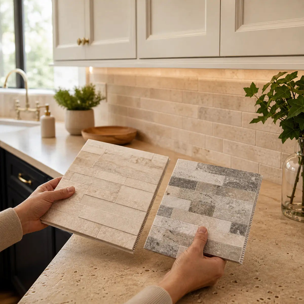
Place each backsplash sample vertically, not flat on the counter. A backsplash is viewed as a wall surface and receives light differently from a horizontal sample.
Check it:
- In morning daylight.
- In afternoon or evening daylight.
- With overhead lighting.
- With under-cabinet lighting.
- From the room entrance.
- From the primary work position.
- Beside the countertop, cabinet, and wall color at the same time.
If a finish works only under one lighting condition, decide whether that condition represents how the kitchen is actually used.
Keep the comparison physically honest.
Prop every candidate vertically, include several pieces or a representative panel area, and place the proposed grout, seam, or edge color beside it. Return at more than one time of day before eliminating a finish.
Which backsplash format fits the visual goal?
Choose the format after deciding on color relationship, pattern intensity, and transition visibility. Tile, decorative wall panels, and solid-surface backsplashes can all coordinate visually with Corian, but they create different rhythms and require different installation systems.
Tile
Tile creates a modular wall surface. The pieces, layout, grout lines, edges, and cuts all contribute to the design.
Tile is visually useful when you want:
- A readable pattern or repeat.
- A traditional or craft-oriented surface.
- Contrasting texture beside a smooth counter.
- A specific geometric direction.
- Grout lines to add scale or structure.
- A broad range of color and finish choices.
The grout should be selected as part of the design, not as a final technical afterthought. Low-contrast grout lets tile shape remain subtle. High-contrast grout outlines every piece and increases movement.
A white subway tile with white grout can function as a quiet field. The same tile with charcoal grout becomes a graphic grid. The countertop has not changed, but the visual relationship has.

Large-format tile or broad panels
Larger pieces reduce the number of visible joints. This can create a calmer wall beside a lightly active counter, though the remaining seams and perimeter details may become more noticeable because there are fewer of them.
Broad panels can work when you want:
- Less visual interruption.
- A larger-scale pattern.
- A wall surface that reads as a field rather than a grid.
- A clearer comparison with the countertop’s own movement.
- Fewer repeated joints in the main viewing area.
“Fewer joints” should not be confused with “seamless.” Edges, corners, changes of plane, countertop transitions, outlets, and panel connections still need to be planned according to the selected system.
Corian or coordinated solid-surface backsplash
A coordinated solid-surface backsplash can produce a visually continuous countertop-and-wall composition. It is especially suited to designs where the counter should flow upward with limited visual interruption.
Possible visual routes include:
- A short square backsplash.
- A coved transition.
- A full-height Corian backsplash.
- A contrasting Corian color used as a wall field.
- A closely related tone with a deliberate joint line.
Corian’s fabrication guidance warns that traditional coving can disrupt the appearance of veined or reflective colors because the cove may not visually match the countertop deck or backsplash sheet. It advises using physical samples to explain the likely result. Review the Corian backsplash fabrication guidance when considering that material-specific route.
A coved backsplash may appear continuous, but it should not be promised as visually invisible in every color. Pattern direction, reflection, fabrication method, lighting, and viewing angle remain visible design factors.
Decorative adhesive wall tile
A self-adhesive wall tile can be considered as a visual format where the exact product is approved for the actual wall and location. Its design appeal may come from low grout visibility, dimensional texture, repeated shapes, or a simpler installation sequence.
Do not infer technical suitability from the phrase “peel and stick.” The wall surface, coating, moisture exposure, heat exposure, edge treatment, cleaning routine, and product instructions still matter. The peel-and-stick wall tile planning guide separates decorative surface selection from substrate, moisture, heat, and installation questions.
For a concrete visual comparison beside a quiet countertop, the Blanco Chevron pattern and texture can serve as one sample direction: white, directional, and visibly dimensional. Verify current product details, wall requirements, appliance limitations, and actual sample appearance before treating it as a project candidate.
A format shortlist by design goal
- For quiet continuity: low-variation tile with tonal grout, a broad panel, or coordinated solid surface.
- For soft texture: matte tile, subtle relief, handmade-look variation, or a restrained panel texture.
- For graphic contrast: geometric tile, contrasting grout, strong value difference, or a clear directional pattern.
- For countertop emphasis: plain tile or a low-movement panel drawn from the counter’s background.
- For backsplash emphasis: a stronger color or pattern beside a quiet countertop.
- For fewer visual interruptions: larger pieces or panel formats with carefully planned joints and edges.
- For visible rhythm: smaller modular tile with grout selected as part of the pattern.
These are aesthetic routes. They do not establish compatibility between a backsplash product and a specific countertop, wall, adhesive, sealant, appliance, or cleaning system.
How should the backsplash meet the countertop?
The transition should be visually quiet, clearly visible, or deliberately emphasized, but it must still accommodate the technical requirements of the selected materials. Never remove, rigidly fill, conceal, or redesign a required movement joint solely to make the meeting point look more continuous.
There are three visual strategies.
Let the transition recede
Choose a joint or sealant color close to the countertop or backsplash so the meeting point does not become a strong line.
This works well when:
- The counter and backsplash are close in value.
- You want the wall to appear calm.
- Grout lines are already visible elsewhere.
- The countertop edge should remain the primary horizontal line.
- The backsplash has enough texture without extra outlining.
A receding transition is still a transition. “Visually quiet” does not mean structurally rigid or literally absent.
Keep the transition visible
A visible meeting line can clarify where one material ends and another begins. This often suits tonal schemes where the materials are related but intentionally different.
A visible transition may be appropriate when:
- The backsplash and counter use different textures.
- A panel or tile edge needs a clean termination.
- The backsplash color is moderately darker or lighter.
- The design uses repeated horizontal lines.
- An exact color match would be difficult or artificial.
The line should connect to the broader composition. If cabinet rails, shelves, window sills, or appliance edges already create strong horizontals, one more line may either reinforce the structure or make it crowded.
Make the transition a deliberate design line
A contrasting transition can be used as an accent, but it will attract attention to level changes, irregular edges, corners, and workmanship.
Use this strategy selectively. If the backsplash already has contrasting grout, a second contrasting line at the countertop may create a heavy border. If the tile is simple and the room uses dark outlines elsewhere, the line may feel intentional.

Technical movement cannot be designed away
Corian’s full-height backsplash instructions account for differential movement between the countertop, wall, building, and vertical sheet. The checked guidance says a full-height Corian backsplash should not be hard-seamed to the countertop with Corian Joint Adhesive; it specifies 100% silicone at that connection. It also identifies a minimum 1/16-inch (1.5 mm) expansion space at specified restraints. These are Corian-specific requirements, not universal dimensions for tile, glass, metal, decorative panels, or other solid-surface brands. See the Corian transportation and installation requirements.
Corian’s separate vertical-cladding bulletin discusses elastic silicone bonding, movement capability, bond-line thickness, substrate preparation, and wet or dry wall conditions for Corian sheets. Those numbers belong to that defined system and should not be transferred to another backsplash product. The exact scope is set out in the Corian interior vertical-cladding bulletin.
For tile, the checked LATICRETE guidance identifies the location where tile meets the countertop as a movement-joint location rather than a place where rigid grout should automatically continue. Exact dimensions, backing, primer, sealant, and compatibility remain system-specific. Review the LATICRETE residential movement-joint guidance alongside the current instructions for the chosen tile assembly.
The design decision is therefore about how a required transition should read visually, not whether the assembly can do without one.
Choose your transition route
Separate the visual goal from the technical detail.
First choose whether the meeting line should recede, remain readable, or become an accent. Then document the required joint, sealant, expansion allowance, edge, and substrate requirements for the exact material system.
Select the statement closest to your goal:
- “I want the counter and backsplash to read as one quiet field.” Use close colors, limited grout contrast, and a transition color that visually recedes. Confirm all required movement and perimeter details.
- “I want related materials with visible depth.” Use tonal color differences, moderate texture contrast, and a clean but readable meeting line.
- “I want the backsplash to look clearly separate.” Use a stronger value or color contrast and let the counter edge remain visible.
- “I want the countertop material to continue up the wall.” Compare coordinated solid-surface options and review the exact fabrication method, sheet direction, joints, expansion allowance, and wall requirements.
- “I want a tile pattern to begin crisply at the counter.” Plan the first course, cuts, grout rhythm, counter level, and movement joint before finalizing the layout.
- “I want as few visible joints as possible.” Compare large-format or panel options, but inspect every remaining perimeter, corner, outlet, and countertop transition because those details become more prominent.
How high should the backsplash go?
The backsplash should stop at an existing architectural line or continue to a deliberate destination. Good stopping points include the underside of upper cabinets, the base or top of a window, the edge of a cabinet run, a shelf line, or a full-height wall boundary.
There is no universally best backsplash height for every Corian kitchen. The right coverage depends on the room and the visual role of the backsplash.
Short backsplash or countertop upstand
A short return keeps most of the wall visually separate from the countertop. It can work when the wall color is meant to remain visible or when a coordinated countertop material is being used as a small perimeter detail.
Visually, a short backsplash:
- Reinforces the horizontal counter line.
- Keeps the room’s wall color prominent.
- Reduces the amount of patterned material.
- Creates a separate transition between the short backsplash and painted wall.
- May look fragmented if another backsplash material begins directly above it without a clear plan.
If you already have a short Corian backsplash and want tile above it, decide whether the existing piece is an intentional base, an obstacle, or a candidate for project-specific alteration. Do not assume it can be removed or covered without checking how it was fabricated and attached.
Counter to upper cabinets
Extending the backsplash from the counter to the upper cabinets creates a complete working-wall field. This often produces the clearest visual boundary because the material starts and stops at existing horizontal lines.
It gives tile or panel patterns enough space to establish a repeat, but it also exposes alignment issues around outlets, windows, range hoods, and cabinet ends.
Full-height wall treatment
A full-height backsplash can make the wall a major design surface. It may continue above cabinets, around a hood, to a ceiling, or across an open wall.
This approach works best when the stopping edges are deliberate and the pattern or panel scale can handle the expanded area. A subtle sample can become visually dominant when multiplied across a large wall.
Before choosing full height, compare:
- The total amount of color or pattern.
- How corners and open edges will finish.
- Whether cabinets interrupt the surface.
- The relationship to windows and ceiling lines.
- Outlet, switch, and appliance penetrations.
- Material-specific joint and expansion requirements.
- The effect of under-cabinet, hood, and ceiling lighting.

The kitchen backsplash planning guide can help you map counter lines, outlets, edges, sink and cooking zones, pattern scale, and stopping points before ordering material.
Focal-zone coverage
Some kitchens benefit from a restrained backsplash across most of the counter with a stronger treatment behind the sink or cooking zone. This can create hierarchy, but the transitions between zones must look planned.
Ask:
- Does the focal area align with cabinets, hood edges, or a window?
- Does the pattern stop at a visible architectural line?
- Is the secondary field quiet enough to support it?
- Will the countertop movement compete with the focal pattern?
- Does the exact material meet the requirements of that location?
Coverage is a composition decision first. Location-specific installation, moisture, heat, and appliance requirements must then be verified separately.

Avoid the combinations that look accidental
Most unsuccessful pairings are not caused by choosing the “wrong” color family. They come from unclear relationships, incomplete sample comparisons, or technical details being treated as decoration.
Mistake 1: Attempting an exact match without exact evidence
A near-match is often more distracting than a clear tonal difference. If two whites differ slightly in undertone, one may make the other look dirty, yellow, pink, blue, or gray.
If an exact match is unavailable, widen the difference. Choose a visibly warmer, cooler, lighter, darker, more textured, or more reflective backsplash. The distinction then reads as intentional.
Mistake 2: Matching names instead of samples
“White,” “gray,” “sand,” and “concrete” are broad descriptions. They do not define undertone, value, sheen, texture, or behavior under light.
Corian’s quality guidance says veining can be random and nonrepeating, sheet appearance can vary, and metallic or mica aesthetics may change with lighting and viewing angle. It calls for color inspection under lighting similar to the project. Use the Corian product quality and color guidance as support for comparing representative material rather than relying on names or screen images.
A small sample may still miss the full pattern distribution of a large sheet. If the countertop is planned but not installed, ask to see representative material from the actual selection whenever that is available.
Mistake 3: Treating grout as invisible
Grout changes the apparent color, scale, and movement of tile. Dark grout around light tile can become one of the strongest patterns in the room.
Compare at least two grout directions:
- Low contrast, which merges the tile field.
- Moderate or high contrast, which outlines the repeat.
Also compare the countertop transition separately. The grout color used within the tile field does not automatically determine the correct flexible-joint material or color at changes of plane.
Mistake 4: Repeating countertop movement too literally
A veined countertop does not require a veined backsplash. Two similar patterns can compete if their scale, direction, contrast, or undertone differs.
A stronger approach is often to repeat one color from the counter while simplifying the movement. If the countertop has a warm white field with gray-brown veining, a plain mushroom tile may coordinate more convincingly than another marble-look pattern.
Mistake 5: Selecting finish from a flat sample
A tile lying on the counter receives light like a horizontal surface. Once installed vertically, its reflections, shadows, and apparent color may change.
Prop the sample against the wall. If it is small, create a temporary sample board large enough to show several pieces, seams, or grout lines.
Mistake 6: Ignoring the cabinets
Countertop and backsplash samples should be viewed with the cabinet color. A successful pairing often acts as a bridge.
For example:
- Warm wood cabinets + cool white counter: consider a restrained neutral or muted green.
- White cabinets + white counter: introduce depth through texture, sheen, grout, or value.
- Dark cabinets + dark counter: decide whether the backsplash should relieve or continue the dark field.
- Painted color cabinets + neutral counter: let the backsplash support the cabinet color rather than introducing another unrelated hue.
Mistake 7: Assuming dark surfaces behave like light surfaces
Dark Corian can create a refined visual anchor, but maintenance visibility may influence the wider palette. Corian’s care guidance says darker and heavily pigmented colors may show light scratches, dust, and ordinary wear more readily than lighter or textured colors. The same guidance describes Corian as heat resistant while still directing users to minimize direct heat exposure and use protection for hot cookware and heat-generating appliances. Read the official Corian use and care guidance for those countertop-specific boundaries.
These observations do not mean a light backsplash is always better with a dark counter. They mean lighting, reflection, dust contrast, cleaning expectations, and countertop appearance should be considered together.
Countertop care guidance also does not establish that an adjacent backsplash, adhesive, wall, or sealant is suitable behind a particular appliance. Check the exact appliance manual, local requirements, and backsplash-system instructions.
Mistake 8: Calling any low-joint surface seamless
A surface can look continuous while still containing required seams, perimeter gaps, flexible joints, edges, or penetrations. “Seamless” is often used loosely in design language, but it should not lead to the removal or concealment of necessary movement details.
Describe your goal more precisely:
- Low grout visibility.
- Fewer repeated joints.
- A visually continuous color field.
- A coved transition.
- A full-height panel.
- A narrow, color-coordinated flexible joint.
Precision makes conversations with fabricators and installers much clearer.
Mistake 9: Choosing the backsplash before the counter is settled
If the countertop is being replaced, finalize and install it before relying on exact backsplash measurements. Installed levels, wall conditions, corner geometry, cabinet positions, and actual counter color can affect the final backsplash decision.
The guide to planning countertops before backsplash installation explains why sequencing, measurement, movement joints, substrate preparation, and trade handoffs need to be settled before the wall finish is completed.
Build a final shortlist in five steps
A good final decision is usually a comparison among two or three clearly different options, not a search through dozens of nearly identical samples. Use the following sequence to turn broad preferences into a manageable shortlist.
-
Record the countertop signals
Write down:
- Undertone: warm, cool, neutral, or uncertain.
- Value: light, medium, or dark.
- Movement: quiet, lightly active, or active.
- Finish: matte, satin, reflective, or glossy.
- Dominant field color.
- Most useful secondary color.
- Cabinet relationship.
- Room lighting conditions.
Do not move forward using a color name alone.
-
Choose the relationship strategy
Select one:
- Match: close color and value for continuity.
- Tone: related color with visible depth.
- Contrast: clear difference for definition.
If you are uncertain, tonal coordination is often the easiest route to test because it does not depend on a perfect match and does not create the strongest possible division.
-
Set the pattern hierarchy
Decide which surface leads:
- Countertop leads, backsplash supports.
- Backsplash leads, countertop supports.
- Both remain quiet.
- Both are active but connected through shared color and controlled scale.
State the hierarchy in one sentence. For example: “The countertop veining will lead, and the backsplash will provide a quiet warm field.” This sentence becomes a filter for every sample.
-
Choose the transition and coverage route
Decide:
- Should the counter-to-wall line recede, remain visible, or become an accent?
- Will the backsplash stop at a short return, upper cabinets, a window line, a focal zone, or a full-height boundary?
- Where will exposed edges end?
- How will the layout respond to outlets, corners, and changes in height?
- Which joints or movement details are required by the selected system?
Do not solve technical requirements with color alone. A color-coordinated sealant may make a required joint quieter, but the product, joint geometry, substrate, and compatibility still need project-specific verification.
-
Compare representative options in the room
Create three distinct candidates:
- Option A: quiet continuity
- Option B: tonal depth
- Option C: deliberate contrast
For each option, compare color, texture, sheen, pattern scale, grout or seam appearance, coverage, edges, maintenance expectations, and lighting behavior.
Make the three candidates meaningfully different.
Option A
Close color, quiet pattern, and a receding transition.
Option B
Related undertone with a visible change in value, texture, or sheen.
Option C
Clear contrast with disciplined pattern, grout, and edge decisions.
Use this scorecard:
| Question | Option A | Option B | Option C |
|---|---|---|---|
| Does the undertone relate to the countertop? | |||
| Does it work with the cabinets? | |||
| Is the value difference intentional? | |||
| Is the pattern quieter or stronger by design? | |||
| Does the sheen work in daytime and evening light? | |||
| Do grout lines or seams support the intended look? | |||
| Does the format suit outlets, corners, and stopping points? | |||
| Can required transitions remain visually coherent? | |||
| Have the exact installation requirements been checked? | |||
| Would you still choose it without the showroom display? |
Do not total the answers mechanically. One technical incompatibility can remove an option even if its aesthetic score is strong. One unresolved undertone clash may also matter more than several minor advantages.
Your final choice should be the option that remains convincing under the widest range of normal viewing conditions and has a documented installation path for the actual materials.
Frequently Asked Questions
What backsplash color works with white Corian?
Start by determining whether the white Corian is warm, cool, or visually neutral. Warm whites tend to coordinate with ivory, cream, mushroom, warm greige, muted olive, clay, and warm charcoal. Cool whites tend to work with clean white, pale gray, blue-gray, cool green, charcoal, and restrained blue.
If the undertone is uncertain, avoid forcing a near-identical white. A visible tonal shift or clear contrast is usually easier to read as intentional.
Can tile be used next to a Corian countertop?
Tile can be considered as a backsplash format next to Corian, but compatibility cannot be established from the material names alone. The complete assembly includes the wall substrate, preparation method, mortar or adhesive, tile, grout, flexible joints, sealant, edges, penetrations, countertop transition, cleaning products, and any nearby appliances.
Use the current instructions for every selected component. At the tile-to-countertop change of plane, do not assume rigid grout is appropriate merely because it matches the tile field.
Should the backsplash be lighter or darker than the countertop?
Either can work. A lighter backsplash usually softens or opens the wall visually, while a darker backsplash creates a stronger boundary and may make the counter edge more prominent.
Base the decision on the desired value contrast and the room’s other large surfaces. A dark counter with a light backsplash creates a crisp horizontal division. A dark-on-dark scheme can feel more continuous, but lighting, seam visibility, and cabinet contrast become more influential.
Is a glossy or matte backsplash better with Corian countertops?
Choose based on the intended finish relationship. Matte can quiet reflections and support an active counter. Gloss can add reflected light and make a quiet tonal scheme more dimensional.
Test both vertically in the room. Texture, relief, lighting direction, and viewing angle can make two samples with similar base colors appear substantially different.
Can a Corian backsplash look seamless?
A coordinated Corian backsplash can create strong visual continuity, especially with carefully planned color, pattern direction, fabrication, and joint color. A coved transition may reduce the appearance of a separate corner line.
That does not guarantee a literally invisible or rigidly continuous assembly. Veined and reflective colors may show fabrication changes, while full-height installations require movement-accommodating details. Ask the fabricator to show representative samples and explain where joints, expansion spaces, edges, and sealant lines will remain visible.
Should the backsplash match the countertop or the cabinets?
It should relate to both, but it does not have to match either exactly. Treat the backsplash as a bridge.
If the cabinets and countertop have different undertones, look for a backsplash color that shares something with each. A muted green may connect warm wood cabinets to a cool gray counter. A mushroom neutral may soften the divide between creamy cabinets and a gray-beige countertop.
What is the safest backsplash choice for active Corian patterns?
Choose a quiet surface close to the countertop’s field color or one of its secondary colors. Keep grout contrast, relief, and internal color variation restrained unless you are intentionally building a layered, pattern-heavy design.
The backsplash does not need to imitate the counter’s veining. Supporting the counter is often more convincing than attempting a second version of the same movement.
How should I make the final decision?
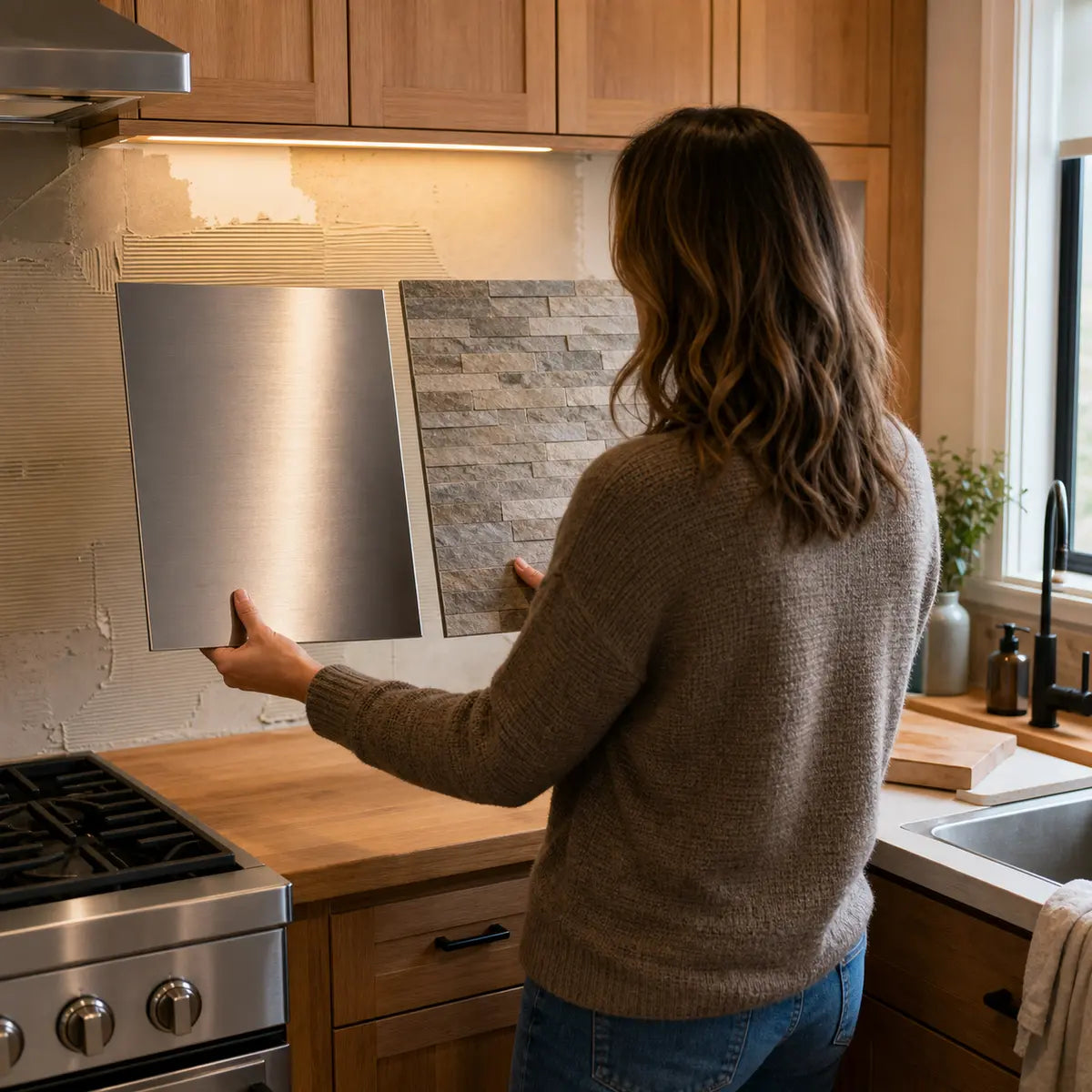
Compare two or three representative options vertically in the kitchen, beside the countertop and cabinets. View them under daylight, overhead light, and under-cabinet light. Include the proposed grout, seam, or edge color whenever possible.
Then verify the current substrate, adhesive, sealant, grout, joint, appliance, cleaning, installation, and warranty requirements for the exact products. The best-looking pairing is useful only when the selected materials also have a documented path for the actual location.
The final decision does not require a universal winner. It requires a clear relationship: read the countertop, choose match or contrast, control pattern and sheen, plan the transition, and compare real samples in the room.


Kommentar hinterlassen
Diese Website ist durch hCaptcha geschützt und es gelten die allgemeinen Geschäftsbedingungen und Datenschutzbestimmungen von hCaptcha.