




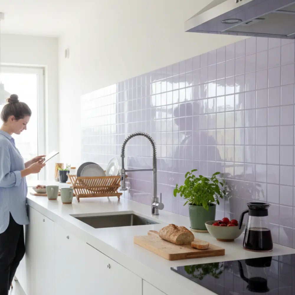
















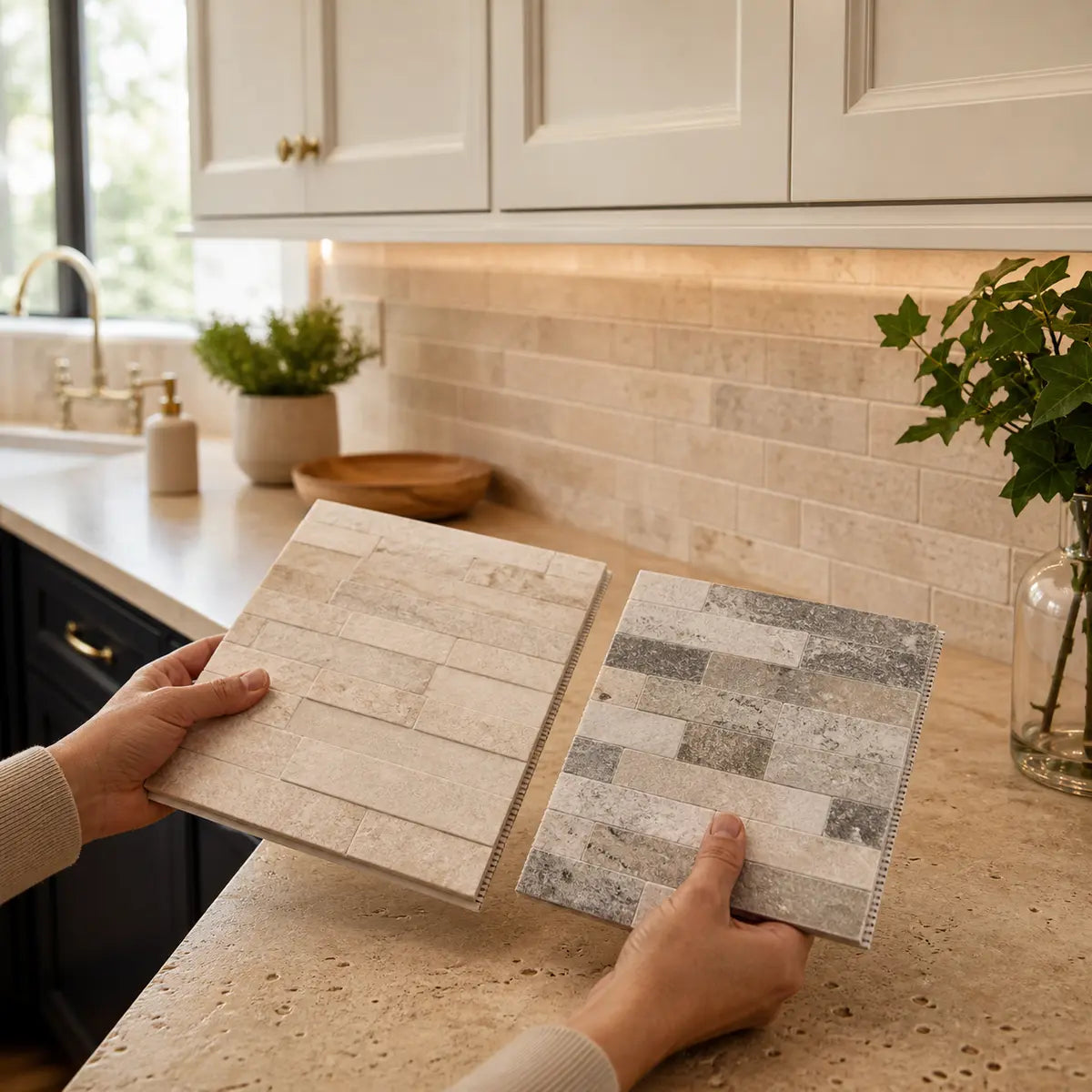
Travertine is rarely “just beige.” One countertop may read creamy and quiet; another may contain gold, rust, peach, pink, taupe, gray, strong linear bands, open pores, or contrasting filler. That variation is why the same backsplash can look calm beside one travertine countertop and sharply disconnected beside another.
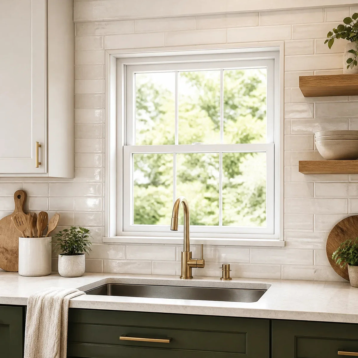
White can work, including white subway tile, but the temperature of the white matters. A soft ivory, almond white, creamy white, or muted warm white often relates more naturally to gold, beige, peach, and cream travertine than a blue-white tile. That is a starting direction, not a universal rule. Cabinets, lighting, grout, tile sheen, and the amount of pattern in the stone can change the result.
The practical goal is not to find a tile that matches every color in the countertop. It is to create a clear relationship among three large surfaces:
- The travertine countertop
- The backsplash
- The cabinets
Use two questions to narrow the backsplash first: What is the countertop’s persistent undertone, and how visually active is its pattern? Once you answer those, most unsuitable options become easier to reject.

What backsplash goes with travertine countertops?
A compatible backsplash usually does one of three things: it quietly supports the travertine’s undertone, creates controlled light-dark contrast, or introduces a restrained accent color already connected to the room. For busy travertine countertops, the lowest-risk starting point is a simple tile in warm white, cream, muted beige, soft taupe, or another color found repeatedly in the stone.
For quieter countertops, the backsplash can carry more character. You might consider handmade-looking ceramic, a subtle tonal variation, a larger geometric shape, softly colored glass, or a low-contrast mosaic. The key is establishing which surface should lead.
There is no requirement that the backsplash be lighter than the countertop. A lighter backsplash can brighten the wall and create visual breathing room. A deeper taupe, charcoal, muted green, or brown-gray tile can create definition, especially with pale cabinets and restrained travertine. Darker choices become less forgiving when the countertop already contains strong dark marks or when the room has limited light.
The two-answer shortlist finder
Choose an undertone and movement level to reveal a practical first shopping direction. This tool organizes the same conditional guidance shown in the complete table below; it does not replace physical sample testing.
How the result is determined: The finder combines the selected persistent undertone with the selected movement level. Quiet stone allows somewhat more variation or shape; active stone routes toward a plainer, lower-contrast field. These are visual starting directions rather than validated or universal pairings.
Choose the row that best describes your countertop, then use the result as your first shopping direction.
| Travertine undertone | Countertop movement | First backsplash direction | Secondary direction | Be cautious with |
|---|---|---|---|---|
| Cream or ivory | Quiet | Warm white or soft cream tile | Light handmade-look ceramic | Stark blue-white or strong yellow-beige |
| Cream or ivory | Active | Plain warm white with low-contrast grout | Quiet ivory tile in a larger format | Busy mosaics and highly varied imitation stone |
| Beige or tan | Quiet | Warm white, putty, mushroom, or muted beige | Soft green-gray or muted clay accent | Exact beige matching that makes one surface look dirty |
| Beige or tan | Active | Plain cream, ivory, or light taupe | Restrained subway or rectangular tile | Small multicolor mosaics with high grout contrast |
| Gold or orange | Quiet | Muted cream, almond white, or soft greige | Controlled blue-green or olive accent | Icy white and pink-beige combinations |
| Gold or orange | Active | Low-variation warm white or pale putty | Simple tile close to the lightest stone color | Amber glass, orange-brown mosaics, and extra gold veining |
| Peach or pink | Quiet | Soft ivory, muted blush-beige, or balanced taupe | Dusty green or gentle gray-green | Yellow cream that amplifies peach |
| Peach or pink | Active | Quiet off-white with a neutral-warm cast | Plain mushroom or pale taupe | Pink-beige tile chosen from a small sample |
| Taupe or gray-leaning | Quiet | Soft white, greige, mushroom, or muted gray | Slate blue, gray-green, or restrained charcoal | Strong yellow-cream unless it appears in the stone |
| Taupe or gray-leaning | Active | Plain soft white or pale greige | Low-contrast rectangular tile | High-variation gray tile that competes with the stone |
This finder produces a shortlist direction, not a final selection. If the stone contains several undertones, prioritize the one visible across the greatest area rather than the most dramatic streak.
The same two-axis approach also applies to other variable natural stones. Stickwoll’s natural-stone backsplash comparison framework explores undertone, movement, grout, finish, and changing light, though its soapstone-specific pairings should not be transferred directly to travertine.
How do you identify the undertone of travertine?
Undertone is the persistent color cast beneath a surface’s obvious light and dark marks. In travertine, it may read as cream, yellow, gold, orange, peach, pink, taupe, gray, or a mixture. The correct backsplash shortlist should respond to that repeated cast, not to one isolated vein.
Travertine is a terrestrial form of limestone, and material sold under the same broad name can differ substantially. The Natural Stone Institute travertine technical overview describes limestone and travertine as calcium-carbonate-based stones and reports a broad absorption range across the many varieties it discusses, from below 1 percent to above 10 percent. Those figures do not identify the properties of an individual countertop. They reinforce a more useful point: color, texture, absorption, finish, and care needs cannot be inferred from the word “travertine” alone.
True travertine can also contain formation-related voids. Depending on fabrication, visible voids may remain open or be filled with cementitious or resinous material. The filler can introduce its own beige, cream, gray, or translucent cast, which may contribute to the surface’s apparent pattern. The Natural Stone Institute travertine voids guidance explains these filled and unfilled conditions. Visible pores are not, by themselves, enough to judge the countertop’s durability or condition.

Use a four-reference observation
This is a practical visual comparison, not a scientific color test.
- Clear the counter. Remove cutting boards, appliances, towels, fruit bowls, and colored objects that may cast reflected color.
- Look at several countertop areas. Include a large open section, the area below upper cabinets, a corner, and the stone beside the sink or range.
- Place plain white paper nearby. The paper gives your eye a familiar reference. It may help reveal whether the stone appears creamy, yellow, pink, orange, gray, or muted by comparison.
- Compare the stone with the cabinet finish. White cabinets can expose yellow or peach in travertine. Wood cabinets may strengthen warm notes. Dark cabinets can make light areas in the stone appear brighter.
- Repeat under the room’s normal light. A color that seems balanced near a window may change under under-cabinet lighting.
- Write down repeated observations. Use phrases such as “mostly cream with gold marks” or “taupe base with pink-beige patches.” Avoid reducing the entire countertop to “beige.”
The white paper is a reference, not an objective measuring instrument. Its own whiteness may be warm, cool, bright, dull, or affected by surrounding light. What matters is the repeated relationship you observe across the actual kitchen.
Separate the base color from the accent colors
A countertop may have a cream base with rust accents. That does not automatically mean the backsplash should be rust-colored. Choosing a backsplash from the strongest accent can amplify a color that already feels dominant.
Most low-risk backsplash choices relate to the base or secondary color. Accent colors are usually better treated as optional inspiration for decor, hardware, textiles, or a restrained backsplash detail.
Signs that your initial label may be wrong
A tile that looked “perfectly beige” in a showroom may make the countertop appear orange at home. That often means the tile and stone have different undertones, even if both were marketed as beige.
Reassess the stone if:
- Cream samples make it look noticeably pink.
- Cool white makes it appear unusually yellow.
- Gray tile makes the stone look orange or muddy.
- Yellow-beige tile makes the countertop look dull and gray.
- A sample works beside one counter section but clashes beside another.
- The cabinets and backsplash look coordinated with each other but disconnected from the countertop.
The goal is not exact color duplication. Exact matching can fail because two near-matches often make their differences more obvious. A controlled relationship is usually easier to achieve than a perfect match.
How busy is your travertine countertop?
Classify the countertop as quiet, moderate, or active by looking at the whole visible run, not a close-up photograph. Movement means the amount of visible change created by veins, bands, pores, filler, color shifts, and contrast.
A quiet countertop may still be richly textured. “Quiet” simply means the pattern does not repeatedly pull your eye from a normal standing distance.
Quiet travertine
Quiet travertine tends to have:
- A fairly consistent base color
- Low-contrast bands
- Small or evenly distributed pores
- Limited shifts between cream, beige, and tan
- A honed or subdued appearance
- Few isolated dark or orange marks
This stone can often support a more expressive backsplash. Options may include a soft geometric tile, a restrained mosaic, handmade surface variation, vertical stacking, or visible grout.
Moderately varied travertine
Moderate movement may include:
- Clear bands or directional grain
- Several related warm colors
- Noticeable but not dominant pores
- Repeated gold, rust, taupe, or gray marks
- A polished finish that makes certain areas more visible
This category usually benefits from controlled pattern. A subway tile, square tile, elongated rectangle, simple hexagon, or lightly varied ceramic can work when the grout and tile variation are kept in check.
Active or busy travertine
Active travertine often has:
- Strong color changes across short distances
- High-contrast veins or bands
- Large visible pores or contrasting filler
- Repeated orange, pink, gold, brown, or gray areas
- Strong directional movement
- A polished surface that reflects light across the pattern
Start with a plain or lightly varied backsplash for busy travertine countertops. You can still create interest through tile proportion, finish, edge shape, or layout direction without adding another multicolor surface.

The pattern pressure test
Stand at the main kitchen entry and ask where your eye lands first.
- If the countertop already commands attention, give the backsplash a supporting role.
- If the countertop recedes into the room, the backsplash can carry more shape or contrast.
- If the cabinets are strongly figured wood, count them as another active surface.
- If the floor has a bold pattern, include it in the hierarchy even though it is farther from the backsplash.
- If every finish is competing, changing grout contrast may calm the composition more effectively than changing tile color alone.
Ceramic tile products may also have declared visual variation. The ANSI A137.1 ceramic tile summary identifies aesthetic variation classes from V0 through V4, representing increasing overall color and texture variation. A variation class is not a quality score and does not decide whether the tile will look good with travertine. It tells you that one display piece may not represent the full installation.
If a candidate tile has meaningful variation, inspect several pieces. A single pale sample may not reveal the darker, warmer, or more strongly marked pieces that will appear across the wall.
Which backsplash colors work with each travertine undertone?
Choose two or three color directions connected to the countertop’s base or secondary color. Do not try to represent every gold streak, gray pore, and rust mark in the backsplash.
Cream and ivory travertine
Cream travertine often works with warm white, ivory, soft almond, pale putty, muted mushroom, or a very light greige. The safest choice depends on whether the stone is clean cream, yellow cream, pink cream, or gray cream.
A warm white backsplash for travertine countertops should look intentionally lighter than the stone. If the tile is almost the same color but slightly cooler, the countertop may appear dirty or yellow beside it.
For a calm result, consider:
- Plain warm-white ceramic
- Ivory subway tile with low-contrast grout
- Pale cream square tile
- Light mushroom tile with a quiet finish
- A subtle handmade surface with limited color variation
For more contrast, a muted green-gray, dusty blue, or brown-gray can work if that cooler note appears elsewhere in the kitchen. Keep the saturation low so the backsplash does not make the stone’s warmth feel exaggerated.
Beige and tan travertine
Beige and tan stone usually offers several routes. Warm white can lighten it. Putty or mushroom can create a tonal bridge. Soft taupe can make the result feel more current without forcing the countertop into a cool palette.
Be careful with another beige surface. Two beiges that are close but not related can make one appear peach, green, pink, or dirty. If you want a tonal scheme, compare larger samples and look for a clear relationship:
- The backsplash is visibly lighter.
- The backsplash is visibly darker.
- The backsplash shares the undertone but has a different depth.
- The backsplash is quieter and less varied than the stone.
A near-match with no clear contrast is often harder to control than a purposeful light or dark difference.
Gold, yellow, or orange travertine
Gold and orange travertine usually needs a backsplash that reduces, balances, or deliberately accepts that warmth.
To reduce the visual temperature, test muted cream, pale putty, restrained greige, mushroom, or a softened green-gray. These colors should still relate to the stone; an icy gray may increase the orange appearance through contrast.
To accept the warmth, try almond white, ivory, or a pale neutral that contains a slight yellow or beige cast. Avoid stacking several amber materials unless you want a highly warm room. Golden travertine, honey wood cabinets, amber glass, yellow lighting, and brown grout can combine into a much stronger effect than any one sample suggests.
Peach or pink travertine
Peach and pink undertones are easy to miss because the countertop may be labeled beige. They often become visible only after a yellow cream, blue-white, or green-gray sample is placed beside the stone.
Useful starting directions include:
- Soft ivory without a strong yellow cast
- Muted blush-beige that is clearly lighter or darker
- Balanced mushroom
- Pale taupe
- Dusty green with restrained saturation
- Soft gray-green if the stone contains gray or taupe marks
Avoid choosing a pink-beige tile from a small chip. Across a full wall, a subtle pink cast can become much more visible. If you want to reduce peach, a balanced neutral is usually easier to control than a direct peach match.
Taupe or gray-leaning travertine
Some travertine reads more taupe, brown-gray, or gray-beige than gold. These countertops may work with soft white, pale greige, mushroom, muted gray, slate blue, dusty green, or restrained charcoal.
A warm backsplash is still possible if the stone contains cream or tan areas, but test it against the whole counter. Strong yellow cream may separate from a gray-leaning base.
Taupe travertine can be a good candidate for a modern backsplash because it can connect natural warmth with quieter contemporary colors. A simple vertical stack, large rectangle, soft square, or controlled geometric shape may update the room without making the countertop feel out of place.
Does white backsplash tile work with travertine?
Yes, provided the white is tested for temperature and contrast. “White” can mean bright blue-white, neutral white, warm white, ivory, almond, cream-white, or gray-white.
Use the following visual check:
- If the tile makes the travertine look strongly yellow, test a warmer or softer white.
- If the tile disappears into the cabinets but clashes with the counter, separate the backsplash from the cabinet white.
- If the tile looks dull beside the cabinets, test a cleaner white or a clearly intentional cream.
- If the stone has pink or peach undertones, avoid assuming yellow cream is the warmest and safest choice.
- If the stone is active, keep the white tile’s internal variation and grout contrast restrained.
White subway tile can work especially well because its shape is familiar and its repeated geometry is predictable. Its visual effect still changes with size, edge shape, finish, layout, and grout.
A plain offset subway with matching grout reads differently from a beveled subway with shadow lines, a handmade subway with varied edges, or a vertical stack with dark grout. The label “white subway tile” does not describe one appearance.
Which tile material, shape, and finish should you choose?
Choose the specific product by color, variation, surface, area-of-use rating, installation requirements, and full-wall appearance. Ceramic, porcelain, glass, matte, and glossy products cannot be ranked universally for every kitchen backsplash because their glazes, textures, coatings, joint counts, and installation systems differ.
| Option | What it can contribute beside travertine | What to inspect before choosing |
|---|---|---|
| Glazed ceramic | Broad color choice, handmade effects, simple field tile, familiar subway and square formats | Glaze variation, edge irregularity, relief, shade range, cleaning instructions, area of use |
| Porcelain | Thin or large formats, stone-look surfaces, consistent or intentionally varied designs | Product thickness, cutting needs, glaze or surface texture, declared use, adhesive requirements |
| Glass | Color depth, reflection, translucency, or a crisp visual contrast | Backing color, adhesive visibility, coating, edge finish, reflection, installation instructions |
| Subway tile | Predictable rectangular rhythm with many layout options | Actual white temperature, edge shape, size, layout, grout width, surface variation |
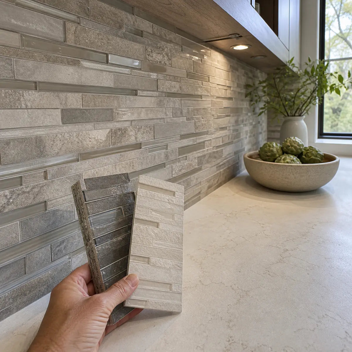
| Mosaic | Fine scale, color blending, texture, and detailed pattern | Sheet repetition, joint quantity, mesh alignment, grout contrast, competition with countertop movement |
| Geometric tile | Shape-driven interest without requiring multicolor pattern | Full repeat scale, cut pattern, outlet interruptions, grout visibility |
| Matte or low-sheen tile | Subdued reflection and a softer visual relationship | Surface texture, cleaning instructions, grease exposure, whether the finish looks flat beside polished stone |
| Glossy tile | Reflected light and a clearer surface highlight | Glare, reflected cabinet and countertop colors, rippling, edge shadows, visible splashes |
Porcelain is a type of ceramic tile defined in North American standards by water absorption of 0.5 percent or less under ASTM C373. The Tile Council of North America porcelain definition also stresses that non-porcelain ceramic covers a wide range of properties and that the specific product’s designated area of use should be checked. The absorption threshold alone does not prove that porcelain will be the best-looking, easiest-cleaning, or most suitable backsplash for your wall.
Ceramic and porcelain
For most visual decisions, focus on the face of the product and its documented intended use. A simple glazed ceramic may provide exactly the quiet color needed beside active travertine. A porcelain tile may offer a preferred size, thin profile, or surface effect. Neither category guarantees a particular maintenance or installation outcome.
Ask for:
- The manufacturer’s area-of-use statement
- Cleaning instructions
- Variation information
- Actual production samples
- Required setting materials
- Restrictions near heat, water, or grease exposure
- Edge and trim options
Glass
Glass can add clarity and light, but it can also introduce strong reflection or a translucent color effect. Warm travertine may be intensified by amber, bronze, or cream glass. Blue-green glass may create contrast, yet it can make orange areas in the stone look stronger.
Inspect glass against the wall or a backing material similar to the planned installation. The apparent color may depend on the tile’s backing, adhesive, coating, and surrounding light.
Subway tile
Subway tile is one of the most flexible choices because the shape can stay quiet while the color, finish, and layout do the design work.
For active travertine, try:
- A plain warm-white subway
- A larger rectangle with fewer visible joints
- Low-contrast grout
- A straight or offset layout
- Limited shade variation
For quiet travertine, you can test:
- Vertical stack
- Elongated proportions
- Handmade edges
- Contrasting grout
- A soft accent color
- Mixed matte and glossy surfaces within one restrained color
Stickwoll’s Almond White Subway Marble wall tile offers a grout-free subway-style direction with a 3D marble texture. Its almond-white color and surface pattern still need to be checked physically beside the actual travertine, cabinets, wall, and household lighting.
Hexagons and other geometric shapes
A geometric backsplash can work with travertine when the shape supplies the interest and the color remains controlled. Large, low-contrast hexagons will usually read more quietly than tiny hexagons with dark joints.
The full repeat matters. One hexagon sample does not reveal the pattern created across several feet of wall. Stickwoll’s Ivory Hexagons wall tile is a warm geometric direction worth testing at full repeat scale, particularly if the countertop is quiet or moderately varied. Beside active travertine, confirm that the repeated geometry does not create equal visual weight.
Matte versus glossy
Finish changes how color and pattern are perceived. A glossy tile can reflect windows, cabinet colors, dark appliances, and warm under-cabinet lighting. A matte tile may look quieter, but a highly textured matte surface can still create strong shadow and visual activity.

Compare finish as part of the full composition:
- Polished travertine plus glossy tile can create a luminous result, but reflections may amplify movement.
- Polished travertine plus matte tile can establish a clearer hierarchy.
- Honed travertine plus satin tile can maintain a soft, low-contrast character.
- Honed travertine plus high-gloss tile can make the backsplash the brighter surface.
- Textured tile can be busier than smooth tile even when both are the same color.
Do not choose finish from appearance alone. Review the product’s cleaning instructions and suitability for the intended wall area.
How do cabinets and lighting change the backsplash choice?
The backsplash should coordinate with both the countertop and cabinets. A tile that relates beautifully to travertine can still fail if it makes white cabinets look gray, dark cabinets look overly heavy, or warm wood appear unusually orange.

Travertine countertops with white cabinets
White cabinets create a strong reference point, so small differences among white, ivory, and cream become more visible.
You have three main routes:
- Connect to the cabinets: Choose a backsplash near the cabinet white, then verify that it does not make the travertine look yellow or dirty.
- Connect to the countertop: Choose ivory, almond, cream, or pale putty, allowing the backsplash to differ visibly from the cabinets.
- Bridge the two: Choose a softened white or light greige that sits between the cabinet white and stone.
Do not assume the backsplash must match the cabinets exactly. A purposeful difference often looks more coherent than an unsuccessful near-match.
If the cabinets are crisp white and the travertine is strongly golden, a soft transitional white may be easier to manage than either bright white or deep cream. If the cabinets are already warm white, an ivory backsplash may connect all three surfaces with less contrast.
Travertine countertops with dark cabinets
Dark cabinets can make travertine look lighter and more luminous. They also increase the importance of wall brightness, especially in a kitchen with limited daylight.
A light backsplash can create separation between the countertop and upper cabinets. A medium taupe or muted accent tile can produce a more enveloping result but may reduce the sense of openness.
For black, charcoal, espresso, and deep-brown cabinetry, compare:
- Warm white for maximum wall brightness
- Ivory or cream for a softer connection to warm stone
- Putty or mushroom for tonal depth
- Muted green-gray for controlled color contrast
- A dark backsplash only when the room, lighting, and desired mood support it
Stickwoll’s guide to backsplash choices for dark cabinets gives a closer look at cabinet undertones, countertop movement, room lighting, grout, and sheen.
Travertine with oak or honey-toned cabinets
Oak, honey wood, and golden travertine can reinforce each other. The backsplash can either accept that warmth or introduce a gentle balancing note.
Warm white, ivory, putty, muted green-gray, pale taupe, and soft blue-gray may be useful directions. Be cautious with orange-brown mosaics and strong yellow-beige tile, which can make the room feel more uniformly warm than the samples suggest.
The same three-surface logic is explored in Stickwoll’s oak cabinet backsplash guide, including distinctions among natural, honey, and red-orange oak.
Travertine with walnut cabinets
Walnut can introduce brown, gray-brown, red, or purple-brown undertones. A cream backsplash may connect to the travertine, while mushroom, greige, or muted gray-green may bridge the stone and wood.
Avoid choosing from the countertop alone. Place the sample against a vertical area where it can be seen beside both cabinet and stone. Stickwoll’s walnut cabinet backsplash comparison explains how one dominant pattern, grout, finish, and household lighting shape that three-surface relationship.
Use the three-surface scenario matcher
Identify your cabinet context and the result you want. The matcher returns the first direction to test while the complete table keeps every scenario visible.
Logic and limits: Cabinet depth and desired contrast determine the first direction, while the travertine still controls undertone compatibility. The result cannot account for an exact paint color, wood sample, room exposure, tile batch, or light source.
| Cabinet context | Desired result | Backsplash direction to test first | Why it may work |
|---|---|---|---|
| Crisp white | Bright and clean | Soft white that sits between cabinet and stone | Reduces the risk of a harsh jump from white cabinet to warm counter |
| Crisp white | Warm and relaxed | Ivory, almond, or pale putty | Connects more directly to cream or gold travertine |
| Warm white | Tonal and quiet | Related warm white with clear depth difference | Keeps the palette calm without requiring an exact match |
| Dark brown or espresso | Brighter wall | Warm white or light cream | Creates separation and reflects more available light |
| Black or charcoal | Controlled contrast | Ivory, mushroom, or muted taupe | Softens the transition into warm natural stone |
| Honey oak | Reduce warmth | Putty, pale greige, or muted green-gray | Introduces a quieter counterpoint to gold and orange notes |
| Red-orange wood | Reduce red and orange emphasis | Balanced ivory, taupe, or gray-green | Avoids repeating the strongest warm accent |
| Walnut | Connect wood and stone | Mushroom, cream, or brown-gray | Can bridge cream travertine and complex brown wood |
| Painted green or blue | Keep color dominant | Quiet warm white or pale neutral | Lets the cabinet color lead |
| Mixed cabinet colors | Unify the room | The quietest neutral shared by the major surfaces | Reduces the number of competing color statements |
After selecting a direction, place the candidate in the kitchen. If it helps the countertop but weakens the cabinet relationship, move to the secondary direction rather than forcing the first choice.
Lighting is part of the color
The apparent color of a surface changes with illumination. The NIST report on lighting and color perception describes color-matching work under different lighting conditions. It was not a kitchen-material study and did not identify ideal travertine pairings, but it supports the reason for evaluating actual samples under the light in which they will be seen.

Check samples with:
- Daylight entering the room
- Daylight when the sun is on a different side of the house
- Ceiling lights
- Under-cabinet lights
- Range hood lighting
- The normal evening combination of lights
You are looking for stability, not identical appearance. A good candidate may shift slightly while maintaining a coherent relationship. A weaker candidate may turn green, pink, blue, yellow, or gray in a way that separates it from the countertop.
Grout and finish are part of the pattern
Grout can make a simple tile feel calm or highly graphic. A lower-contrast grout usually makes the joint grid less prominent; a higher-contrast grout usually makes the tile shape and layout more visible. This is a visual tendency, not a guarantee, because joint width, edge shape, finish, lighting, and installed grout color all affect the result.
With active travertine, begin by testing grout close to the tile color. This allows the backsplash to read as a broader field rather than a strong grid.
With quiet travertine, contrasting grout can add definition. It may suit a subway, square, vertical stack, or geometric layout when you want the backsplash to become more noticeable.

Treat grout samples as approximate. Installed grout color can be affected by water ratio, partial-bag mixing, cleanup, curing, tile porosity, packing, and other product or workmanship variables. The Tile Council of North America grout color guidance describes these contributors and notes that no ANSI standard specifically governs grout color variation.
Do not use grout as the only moisture-protection strategy. Grout joints are not waterproof, so wall preparation and the complete assembly must address the actual exposure.
At the countertop-to-backsplash transition and inside corners, ask the installer how movement will be accommodated under the applicable tile and sealant guidance. These transitions should not be treated automatically as ordinary rigid field joints.
How can you modernize travertine countertops with a new backsplash?
A modern backsplash for travertine countertops does not have to hide the stone or imitate a newly installed all-white kitchen. The more convincing update usually edits the surrounding visual noise and gives the existing countertop a clearer role.
Use a simpler color field
Replacing a multicolor mosaic with a quiet warm white, cream, mushroom, or pale greige can reduce the number of competing colors. This often makes the countertop look more intentional because the eye can see its pattern without processing another detailed surface behind it.
Increase tile scale
A larger rectangle, square, or elongated subway can reduce the apparent joint count. Fewer visible divisions may calm a wall even when the tile has a handmade edge or subtle variation.
Scale should still be checked against outlets, cabinet heights, window returns, and short wall sections. A large tile that creates awkward slivers may look less resolved than a smaller format with a cleaner layout.
Use shape rather than multicolor pattern
A vertical stack, elongated rectangle, soft square, restrained hexagon, or other geometric form can create a current look without adding several new colors. This is especially useful when the stone already contains gold, cream, brown, and gray.
Control the grout grid
Changing from high-contrast grout to a grout closer to the tile color can make an existing style feel quieter. For a new backsplash, include grout in the first sample comparison rather than treating it as a final technical choice.
Let one contrast lead
A kitchen may already contain several contrasts: light stone against dark cabinets, warm countertop against stainless steel, matte wood against polished stone. The backsplash does not need to add another one.
Choose the main contrast deliberately:
- Light versus dark
- Warm versus cool
- Plain versus patterned
- Matte versus glossy
- Traditional shape versus modern layout
When one contrast is clear, the remaining choices can support it.
Retain the stone’s material character
Travertine’s pores, bands, filled areas, and tonal shifts are part of the material. A successful update does not require making the stone resemble uniform quartz.
Care for the countertop according to its actual finish and supplier guidance. Travertine belongs to the calcium-carbonate stone category, so acidic products can etch or alter it. The Natural Stone Institute care guidance recommends neutral cleaner, stone soap, or mild liquid dishwashing detergent and warm water, while cautioning against acidic and abrasive products. It also explains that an impregnating sealer can increase stain resistance for some stones, but does not make stone stain-proof, and not every stone necessarily requires sealing.
Confirm the countertop’s sealing needs, cleaner compatibility, and reapplication guidance with the stone supplier or sealer manufacturer. A backsplash update does not change the countertop’s acid sensitivity or specimen-specific care requirements.
How should you test backsplash samples before deciding?
Test the countertop, tile, grout, cabinets, and lighting as one vertical composition. A sample laid flat on the counter receives different light and creates a different viewing relationship from tile installed on the wall.
Build a vertical sample board
Mount or temporarily secure candidate tile pieces to a neutral, movable board. Include enough pieces to show the actual pattern, edge variation, and likely grout relationship.
For a plain tile, several pieces may be enough to reveal shade changes. For a mosaic, geometric pattern, or highly varied tile, use a larger section so you can judge the repeat. If the tile is supplied in sheets, examine sheet boundaries and alignment.
A three-layer sample board
Arrange the board so each decision remains visible at once. This is a planning aid, not a technical installation specification.
Material layer
Show enough tile pieces to reveal shade, edge, texture, sheet repetition, and full pattern scale.
Joint layer
Place the intended grout or joint-color reference beside the tile so the grid is evaluated with the face color.
Room layer
Move the board beside the countertop and cabinets at the sink, range, corners, windows, and under upper cabinets.
Include:
- Candidate tile
- A realistic grout sample or grout-color strip
- A note with the product name and finish
- A note about the planned layout
- More than one tile piece when variation is present
- A sample of the actual cabinet finish, if available
Move the board to several sections of the backsplash wall. Check it near the sink, range, corners, windows, and under upper cabinets.

Use a lighting observation log
Record what changes rather than relying on memory.
| Viewing condition | Candidate A | Candidate B | Candidate C |
|---|---|---|---|
| Morning daylight | Does the tile stay related to the stone? | Does the countertop appear more yellow, pink, or gray? | Does the cabinet relationship improve or weaken? |
| Afternoon daylight | Is glare or reflection distracting? | Does variation become stronger? | Does the tile still look intentional? |
| Ceiling lights | Does the backsplash look warmer or cooler? | Do grout lines become more visible? | Does the wall feel too dark? |
| Under-cabinet lights | Are shadows or surface ripples emphasized? | Does the tile pick up gold or green casts? | Does the sample remain coherent with the countertop? |
| Normal evening lighting | Which surface leads? | Is the room calmer or busier? | Would you accept this appearance every day? |
At each viewing, answer three questions:
- Does the backsplash relate to the countertop’s undertone?
- Does the backsplash leave a clear pattern hierarchy?
- Does it coordinate with the cabinets rather than only the stone?
A candidate that performs reasonably well across the room’s normal conditions is often a lower-risk choice than one that looks exceptional for a few minutes in one patch of sunlight.
Compare full variation before ordering
If the product declares meaningful shade or texture variation, one sample is insufficient. Ask to see several pieces or an opened carton. Before installation, compare shade and caliber information where applicable and review material from multiple boxes.
The Tile Council of North America installation guidance recommends dry layout, checking shade and caliber codes, shuffling tiles from multiple boxes, selecting tile and adhesive for the actual substrate and use, and following the applicable product instructions. Its tips are general guidance, not a complete installation specification.
Plan the layout before approving the tile
A tile can coordinate beautifully with the countertop and still create a poor finished wall if the layout leaves awkward cuts at outlets, cabinets, windows, or exposed edges.
Before ordering, identify:
- The backsplash start and stop points
- The most visible focal area
- Outlet and switch positions
- The tile centerline or primary alignment
- Edge and trim conditions
- Inside and outside corners
- The space between the countertop and upper cabinets
- Areas behind the sink and cooking appliance
- Pattern direction
- Likely cut sizes
Stickwoll’s kitchen backsplash layout guide explains how to map the wall, establish focal lines, dry-fit around outlets, control small cuts, and account for pattern direction before cutting.
If the countertop is being installed, repaired, or adjusted, measure the backsplash in its finished condition. The countertop-before-backsplash sequencing guide covers finished-condition measurement, substrate preparation, movement transitions, outlet coordination, and trade handoffs.
Separate visual approval from technical approval
A tile may look compatible without being suitable for the wall, adhesive, moisture exposure, or cooking area. Check the complete installation system after the visual shortlist is established.
Review:
- Wall condition and flatness
- Existing paint, coating, tile, or residue
- Tile backing or body
- Product area of use
- Required adhesive or setting material
- Grout or joint treatment
- Sink splash exposure
- Cleaning products used in the kitchen
- Edge treatment
- Movement at corners and material transitions
- Appliance instructions and required clearances
Do not assume that a tile face makes every adhesive, backing, coating, sealant, or wall assembly suitable behind every range or cooktop. Appliance instructions, product restrictions, the existing wall, and locally applicable requirements must be checked for the specific project.
For conventional or adhesive-backed backsplash planning, Stickwoll’s kitchen backsplash planning guide covers measurement, exposure, layout, surface finish, cleaning, cuts, edges, outlets, and wall preparation. For self-adhesive products, use the peel-and-stick tile project guide to review surface compatibility, wall condition, moisture and heat exposure, preparation, test patches, edge treatment, and care.
Mistakes to avoid with travertine countertops
The most expensive backsplash mistakes often begin with an incomplete comparison rather than a clearly bad tile.
Treating every travertine countertop as beige
Cream, gold, peach, pink, taupe, and gray travertine can react very differently to the same white or beige tile. Name the persistent undertone before shopping.
Matching the strongest vein
A rust, charcoal, or gold vein may be attractive, but repeating it across the entire wall can amplify a minor countertop color into a dominant room color.
Choosing from one small sample
A single tile does not show full shade variation, grout effect, sheet repetition, reflected color, or installed scale.
Comparing the tile only while it lies flat
The backsplash will be vertical. Mount samples vertically so they receive light and reflections in a more realistic way.
Ignoring the cabinets
A backsplash that works with the countertop but clashes with the cabinets does not solve the whole design problem.
Assuming all white tile is neutral
White has temperature. Bright blue-white, gray-white, warm white, ivory, and cream can each change how travertine appears.
Adding pattern through every variable
A backsplash can gain activity from color variation, small tile size, geometric shape, contrasting grout, textured relief, glossy reflection, and complex layout. Combining all of them may overwhelm active stone.
Treating grout as an afterthought
Grout controls how strongly the tile grid appears. It may also install differently from a printed chart or screen representation.
Assuming design compatibility proves installation compatibility
The tile, adhesive, grout or joint treatment, substrate, edges, movement transitions, moisture exposure, and appliance area must be reviewed as a complete project.
Frequently Asked Questions
Does white subway tile go with travertine countertops?
Yes. White subway tile can work when its temperature relates to the travertine and its grout does not create unwanted competition. Warm white, ivory, almond white, or softened neutral white are useful starting points for cream, beige, gold, and peach travertine. Gray-leaning stone may support a cleaner or cooler white.
Test the tile beside both cabinets and countertop. If it makes the stone appear strongly yellow, orange, pink, or dirty, try a softer white or a different neutral.
Should the backsplash be lighter or darker than travertine?
Either can work. A lighter backsplash usually creates more wall brightness and may calm active stone. A darker backsplash creates stronger definition and may suit pale cabinets or quiet travertine.
Choose based on the room’s light, cabinet depth, and desired contrast. A small, dim kitchen with dark cabinets may benefit from a lighter wall, while a bright kitchen with restrained stone may support a deeper color.
Can you use a patterned backsplash with busy travertine?
Yes, but the pattern needs a clear relationship to the countertop. A geometric shape in one quiet color may work better than a multicolor mosaic. A patterned tile can also be controlled through larger scale, lower grout contrast, restrained variation, and a simple layout.
View the full repeat from the kitchen entry. If both surfaces demand equal attention and that was not your intent, simplify one variable.
What grout color works with a backsplash for travertine countertops?
Start with grout close to the tile color when the countertop is active. This tends to reduce the visual prominence of the grid. If the countertop is quiet and you want the backsplash shape to stand out, test a more contrasting grout.
Compare the grout with the tile, stone, and cabinets. Do not rely on a screen image or dry sample as an exact prediction of installed color.
Can a peel-and-stick backsplash work with travertine countertops?
It can be visually compatible if the color, pattern, scale, and finish support the countertop. Technical suitability depends on the specific product, wall surface, preparation, exposure, edges, and appliance area.
Check the product instructions and use restrictions. A successful color pairing does not establish adhesive compatibility, moisture suitability, or heat suitability.
Build your final shortlist
There is no universal backsplash for every travertine countertop. The most defensible choice is the one that coordinates with your actual stone’s persistent undertone, gives the room a clear pattern hierarchy, and supports the cabinet color under normal household lighting.
Keep three distinct directions in view
Quiet neutral
Relates to the countertop’s base or secondary undertone and keeps grout contrast restrained.
Controlled contrast
Creates a purposeful light-dark or warm-cool distinction without disconnecting from the cabinets.
Character direction
Adds shape, finish, or muted color while preserving a clear hierarchy among the major surfaces.
Retain the complete candidates until they have been viewed vertically in normal daylight and artificial light. This card organizes the shortlist; physical comparison decides which direction remains coherent.
Retain two or three directions rather than committing to the first attractive tile:
- One quiet, undertone-compatible neutral
- One controlled contrast
- One optional shape, finish, or muted color direction
Mount realistic samples vertically with their proposed grout or joint treatment. View them in morning daylight, afternoon daylight, under-cabinet light, and the artificial lighting normally used at night. Record whether each candidate changes the apparent yellow, orange, pink, gray, or taupe character of the countertop.
Then choose the candidate that remains coherent across the whole kitchen, not the one that looked best on a product page or in one isolated moment. That final physical comparison is what turns a broad inspiration list into a backsplash shortlist you can defend.


Kommentar hinterlassen
Diese Website ist durch hCaptcha geschützt und es gelten die allgemeinen Geschäftsbedingungen und Datenschutzbestimmungen von hCaptcha.