





















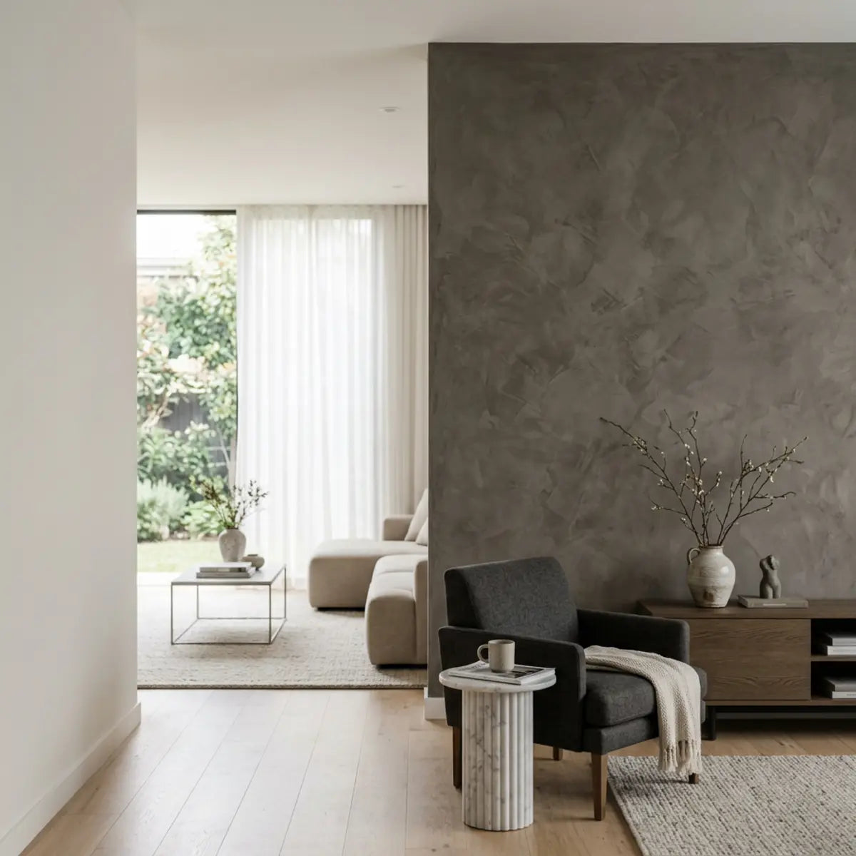
Faux Venetian-plaster peel-and-stick tile offers a prefinished, modular way to introduce a plaster-inspired appearance where the exact product is suitable. Real decorative plaster, microcement, wallpaper and rigid panels are different systems with their own preparation, skill, maintenance and removal requirements. Choose by the desired finish and the actual room rather than assuming one option delivers a fixed percentage of luxury at a fixed fraction of the cost.
Explore this guide
The appeal of a plaster effect is often its tonal movement: a wall that looks more varied than flat paint without demanding a strong printed motif. But plaster-inspired products can be smooth, textured, matte, satin or glossy. The name does not define one chemistry, one sheen or one installation method. A good comparison begins with the particular products being considered.
This guide explains those categories, develops a sample and layout process, and compares preparation, care and lifecycle effort. It does not report a Stickwoll-versus-plaster trial, calculate a measured luxury-return score or guarantee damage-free removal. Illustrations show design possibilities, not product certifications or completed case studies.
Define the finish rather than relying on a broad name
Venetian plaster is commonly used for a family of decorative troweled effects, but commercially available products can have different binders, aggregates and finishing techniques. A product described as lime-based is not necessarily identical to every other lime finish. Read the actual technical sheet rather than assuming a simple recipe from the name.
Microcement is another category of decorative coating systems, with product-specific layers, primers, reinforcement, sealers and application requirements. It should not be treated as ordinary plaster with a different color or automatically approved for every wet room. The complete system determines the intended use.
A peel-and-stick plaster effect is a prefinished decorative product. Its appearance may come from print, relief, coating or a combination. The face, support and adhesive are separate parts of the construction. Do not infer closed-cell PVC, a particular adhesive or a moisture rating without the actual product information.
Wallpaper and panels also vary. Some wallcoverings have physical texture rather than being entirely flat prints, and some panels use different attachment methods. A fair comparison should not dismiss every wallpaper as two-dimensional or every panel as requiring destructive construction adhesive.
| Category | What to identify | What the name alone does not tell you |
|---|---|---|
| Decorative lime or plaster finish | Binder, substrate, coat sequence and finishing method | Exact sheen, water exposure or repair process |
| Microcement system | Complete specified layers and intended use | Automatic waterproofing or suitability over every substrate |
| Plaster-effect adhesive tile | Face, backing, module, adhesive and permitted wall | Vapor behavior, acoustic benefit or guaranteed removability |
| Textured wallcovering | Material, texture and attachment system | Whether it is purely printed or physically raised |
| Rigid decorative panel | Support, attachment, joints and edge detail | One universal installation or removal method |
Authentic plaster is not necessarily matte
A polished or burnished plaster effect can be deliberately glossy. San Marco describes GRASSELLO DI CALCE as capable of a glossy decorative effect. That concrete example disproves the idea that real Venetian plaster always has a matte finish and that a reflective faux version must therefore be inauthentic.
The product's technical sheet also describes its particular air-hardening lime-based finish and application conditions. Those details belong to that formulation and process. They should not be copied as a universal coat count, drying time or performance rating for every plaster or for adhesive tile.
Decide which visual reference you prefer: polished depth, soft trowel movement, a chalkier appearance or a deliberately stylized texture. Compare samples produced by the relevant technique. A photograph labeled Venetian can show a very different finish from the one you have in mind.
Keep sheen, color and relief separate. A smooth burnished wall can have tonal depth without deep physical ridges, while a matte panel can have pronounced relief. Neither construction should be judged solely by how thick or expensive it appears in a close-up.
For a product comparison, ask the supplier or decorator how the sample was made and how closely the proposed installation can reproduce it. Application-dependent variation is a design characteristic to understand, not necessarily a defect or a guarantee of uniqueness in every material.

Decide which part of the plaster effect matters to you
Look at the sample from the normal room distance and at close range. Identify whether the attraction comes from background tone, irregular shading, a soft highlight, physical texture or the absence of a strong grid. This helps compare alternatives that use different methods to create a similar mood.
A modular product can show seams or repeating tonal patches. A troweled finish can show application marks and variation. Neither is automatically better; the question is whether those characteristics suit the room and your expectations. Do not promise that one system will look indistinguishable from another under every light.
Touch the sample only as appropriate and notice the physical surface separately from the printed appearance. A smooth product can suggest plaster visually, while a raised product may give more tactile interest. The touch does not establish waterproofing, insulation or sound absorption.
Compare the sample beside existing wood, metal, fabric and painted finishes. A texture that feels subtle in isolation can become dominant next to a very quiet room. Another may disappear beside strongly patterned stone. The surrounding composition matters as much as the sample itself.
Write a short design objective such as a quiet warm-toned wall behind the dining table. That is more useful than a claim that the finish must maximize luxury ROI. It lets you evaluate whether the extra preparation or a visible seam is worthwhile for the result you actually want.
Choose color using the room, not an orientation rule
Warm beige, greige, clay, taupe and off-white are useful possibilities, but no color family belongs automatically to one compass direction or room type. Window size, surrounding buildings, furnishings and artificial lighting all affect the actual appearance.
View samples beside the fixed elements and at the times the room is used. A color can look warmer beside one cabinet and cooler beside another. A name such as alabaster or sand does not guarantee a match between brands or materials.
Compare enough area to understand variation. A tiny chip may show the average color while missing the darker movement of a plaster effect. A full representative sample or several adjoining tiles can reveal whether the result feels quiet or patchy.
Do not expect one bulb color temperature to make every warm finish look correct. Output, direction, diffusion and surrounding colors matter too. A warm light can still create an uncomfortable reflection, and daylight can reveal a tone you did not notice in a store.
The finish comparison guide separates sheen and color reflectance from overall lighting. It can help you evaluate the sample without assuming matte means dim or glossy means bright.
Use lighting to reveal the finish without exaggerating it
Side or grazing light can emphasize relief and application marks. That can be attractive, but it can also reveal seams, ridges or wall irregularities you would not notice under broad light. Do not assume a new sconce always improves the finish or guarantees the appearance of thicker masonry.
Check the existing fixtures before designing additional lighting. The wall may look appropriate under the room's normal use without requiring a new installation. If changes are needed, use suitable fixtures and electrical work rather than placing improvised lights close to a surface without checking their requirements.
View from seated and standing positions. A polished plaster effect may reflect a lamp differently from each. Household members may have different visual preferences or needs, so include them in the sample review instead of deciding from one photographer's angle.
Keep appearance claims modest. A textured wall can make a room visually interesting without measurable acoustic or thermal benefits. If those performance properties matter, obtain relevant data for the exact product and assembly rather than inferring them from shadows or thickness.
A useful lighting record states which source was on, where the sample was placed and what you noticed. It is a practical design note, not a calibrated test of realism or a score of perceived property value.
Compare preparation requirements before comparing box prices
Inspect the actual wall: coating, flatness, damage, moisture history and previous repairs. Every finish needs an appropriate supporting surface, though the required preparation differs. A modular face does not automatically prevent defects from showing through, and a troweled coating does not repair every unstable wall.
For an adhesive product, confirm the accepted substrate, cleaning and conditioning requirements. A rough or weak surface may make the project impractical without preparation. For plaster, microcement or another coating, obtain the complete substrate and primer requirements rather than relying on a general statement that it can be applied over anything.
Do not disturb old or unknown coatings casually. EPA's lead-safe renovation guidance is relevant to potential paint hazards in US housing. It does not diagnose your wall, but it reinforces the need to assess the material before sanding or scraping.
Recent repairs and paint need their own curing and covering conditions. Do not prescribe a universal thirty-day wait, or assume that a dry surface is necessarily ready for the next layer. Keep the relevant product instructions together so the sequence is clear.
Ask what preparation is included in a quotation. One option may assume a ready wall while another includes significant leveling or repair. Those are different scopes, not a fair price comparison between materials.
Compare installation effort without caricaturing the alternatives
A prefinished adhesive format can reduce some on-site mixing and decorative finishing work, but measuring, cutting, fitting and surface preparation still take time. A no-grout product is not a zero-mess or zero-skill project, especially around irregular edges and fixtures.
A troweled finish can require practiced technique to achieve a particular sample, but not every application involves the same sanding, dust or number of coats. The actual system and desired effect determine the work. Ask a decorator to describe the process rather than assuming all plaster is available only to unlimited budgets.
Microcement and panel systems also vary. Their installation may require several coordinated products or specific attachment details. Do not choose them from a finished photograph without understanding what must happen underneath and around the visible surface.
Separate active work from elapsed time. A short application session may be followed by curing, coating or return-to-use conditions. Conversely, a modular installation may need substantial preparation before the pieces are placed. A realistic schedule names both kinds of time.
Consider what can be done safely within your skills and what calls for professional help. A smaller decorative wall may be manageable while a direct wet-area or complex historic substrate needs a different level of assessment. DIY friendliness is a relationship between the person, product and project, not a universal material rating.

Plan seams, repeats and transitions for modular finishes
Inspect the actual adjoining pieces and determine whether the pattern is intended to repeat, vary randomly or connect in a sequence. Do not assume all plaster-effect tiles should be staggered. A manufactured design may require a particular grid or overlap, and ignoring it can create both visual and installation problems.
Compare background tone as well as the darker trowel-like marks. Two pieces may have compatible movement but noticeably different base colors. A dry layout helps distribute the variation before adhesive is exposed.
Check allowed rotation and factory edges. A turned piece may look less repetitive while no longer matching the required overlap. Visual variation is useful only within the product's permitted installation method.
Plan exposed ends and corners deliberately. A trim, border or clear material transition can look more intentional than trying to make a modular covering appear entirely seamless. The correct detail depends on thickness, edge construction, exposure and attachment.
For techniques in sorting and labeling a patterned set, see the faux-marble layout guide. Its process can help organize a plaster-effect field, but the actual joining and print rules of the chosen product remain controlling.
Do not conceal a weak or damp area beneath a busy pattern. Seam planning should address appearance after the supporting wall is suitable, not disguise a condition that requires repair.
Measure quantity from installed coverage and the design
Draw the eligible area and note openings, cabinet edges, corners and visible terminations. Use the installed coverage of the selected product, including any overlap. A nominal sheet size is not necessarily the amount of wall it covers after joining.
For a hypothetical feature area three metres wide and 2.4 metres high, the face area is 7.2 square metres. If an eligible pack covers 0.6 square metres, the area-only quantity is twelve packs. Pattern matching, cutting and repair spares still need separate consideration. These numbers are an example, not a Stickwoll pack specification.
Compare the starting layout before ordering the final amount. A small change in the datum can improve end pieces, but do not assume a half-tile shift guarantees convenient cuts around every opening. Include the actual pattern repeat and factory-edge constraints.
Keep useful offcuts identified by orientation and face. A piece with enough area may still be unsuitable for a particular location if it lacks the required joining edge. Distinguish installation allowance from material retained for future repair.
For a troweled or coating system, quantity depends on the specified coverage, number of layers and substrate conditions rather than sheet arithmetic. Use that system's documents and an appropriate estimate. Comparing a bag, tub and box without their coverage assumptions can be misleading.
Distinguish vapor permeability, washability and wet-area suitability
Vapor permeability describes one aspect of how a material or assembly allows water vapor to pass. Washability concerns care of the surface. Direct-water suitability concerns the complete installation and exposure. These are different properties, and none should be inferred solely from a natural or synthetic label.
A specific lime finish may publish vapor-related data, but that does not make it a waterproof shower surface. A polymer face may repel droplets without establishing that seams and backing can tolerate continuous wetness. Read the actual system requirements rather than combining several properties into a general moisture-proof promise.
Schluter's explanation of shower assemblies illustrates why the visible finish is not the entire water-management system. A decorative plaster effect, whether applied or modular, should be used in a wet area only when the complete specified system accepts that exposure.
For kitchens and bathrooms, identify the actual zone: dry feature, occasional splash, repeated condensation or direct water. A general room label does not approve every part of that room. Keep appliance heat and steam requirements separate as well.
Do not cover active dampness, loose coating or an unresolved leak. A more washable-looking finish can make the surface easier to wipe while leaving the underlying issue unchanged. Repair and reassess before decorating.
Use plaster effects thoughtfully in bedrooms and living areas
A dry feature wall can be a good place to explore subtle texture, but dry does not mean no humidity, no contact or no preparation needs. Check the supporting coating, nearby heat sources and the way furniture touches the wall.
Behind a bed or sofa, consider the visible field after furniture is in place. A tonal movement centered on the whole wall may be mostly concealed. A smaller or shifted composition can be more effective without requiring full-room coverage.
Do not treat the decorative finish as the support for a headboard, shelf, lighting fixture or other load. Those items need suitable attachment to the supporting structure. The appearance of a substantial wall does not make an adhesive face load-bearing.
If sound absorption or thermal performance is an objective, obtain actual data for the product and assembly. A wall can look warm or soft without measurably insulating the room or improving sleep. Keep visual atmosphere separate from performance claims.
View the sample with bedding, upholstery and nearby wood tones. A subtle wall can work as a background rather than competing with every element. The success of the room does not need to be expressed as a numerical luxury score.
Plan cleaning before choosing a highly textured surface
Ask for the care instructions for the finished system, including any wax, sealer or topcoat. A troweled surface and a printed panel may need different methods even when their colors look similar. A cleaner suitable on ceramic or a sink is not automatically acceptable on either one.
Check whether the intended room's routine can be carried out within those instructions. A pronounced recess beside a cooking area may need more deliberate wiping than a smooth dry feature. That is a practical design consideration, not proof that texture is unhygienic or that smooth surfaces never need maintenance.
Use accepted tools and control liquid near joints and vulnerable surfaces. Inspect after drying before repeating a treatment. A darker wet patch or a temporary sheen change should not immediately be interpreted as permanent damage or successful restoration.
If the finish changes after a new cleaner, stop and record the product, method and dry appearance. Do not polish, sand or coat the whole wall to make it uniform without guidance. A local issue may call for a specific repair rather than a stronger cleaning process.
Keep the care note available to household members or cleaners. Product-specific instructions are most useful when the person maintaining the wall can actually find them.

Compare repair and removal realistically
A prefinished modular covering may allow local replacement under its instructions, but matching a new piece to an aged field can be difficult. Retain suitable spares and batch information. Do not assume every removable piece can be reused or that a later order will match perfectly.
A troweled finish can have its own repair or recoating options. Some local repairs may be visually challenging because technique and aging affect the result. That does not mean every change requires heavy demolition or new drywall. Ask the system supplier or decorator about the actual restoration route.
For adhesive removal, follow the exact product and substrate guidance. Do not apply one universal hairdryer time, solvent or pulling angle. A sound-looking paint film can still release, and a short sample cannot guarantee future behavior across the whole wall.
Where residue or torn paper remains, separate cleanup from repair. The drywall residue guide explains why product exclusions and the exposed wall layer matter. A natural-smelling remover is not automatically safe on every coating.
Keep permission and restoration expectations clear in a rental. A decorative product's removability does not decide a deposit outcome or make sanding and permanent trim automatically acceptable. Discuss the scope before the project, not only when it is time to remove it.
Build a fair cost comparison with transparent assumptions
List the complete scope for each option: wall assessment, repair, preparation, material, application, finishing, tools, labor, cleanup and future maintenance or removal. Do not compare the material-only price of adhesive tile with a fully installed artisan coating quote and call the difference a material advantage.
Separate confirmed quotations from provisional allowances. If a wall may need repair, show that uncertainty explicitly. A product that looks inexpensive can become a more involved project when the base is unsuitable, while another system may already include preparation in the quote.
For a hypothetical comparison, a modular project might have 300 currency units of material, 90 of preparation and supplies and 60 of trim, totaling 450 before any unlisted work. A quoted applied finish might total 1,100 for a different combination of preparation and skilled application. These are invented inputs to illustrate the worksheet, not market prices or a promised saving.
Compare the same eligible area and desired outcome. If one choice includes a full wall and another a small accent, state that difference. A smaller scope can be a sensible design decision, but it is not proof that one material is universally cheaper per equivalent result.
Do not calculate luxury ROI from an assumed percentage of visual depth or a promised increase in resale value. Enjoyment, style and reduced disruption can be legitimate reasons for a purchase without converting them into unsupported financial returns.
Consider the time you expect to keep the finish and how you would change it later. Use real product guidance rather than inventing a five-, ten- or twenty-year lifespan for the calculation. A transparent comparison is more useful than a precise-looking answer built from guessed durability.
Three example projects with different choices
A renter wanting a subtle dining-area feature
In this hypothetical case, the owner permits a limited decorative area and the chosen adhesive product accepts the existing coating. The tenant compares samples and includes restoration in the plan. A modular plaster effect may fit the scope without being described as identical to hand-applied plaster or guaranteed harmless to the paint.
A homeowner seeking a particular polished finish
A second owner wants the depth and application character of a specific burnished plaster sample. A qualified decorator provides a system and quote for that result. The owner chooses it for the desired appearance and understood process, not because every faux product is inferior.
A bathroom with recurring dampness
A third owner postpones both decorative options until the moisture problem is assessed. After repair, the actual zone and complete system requirements determine the finish. A breathable claim or a water-repellent face is not used as a shortcut around the underlying condition.
These are decision examples, not customer testimonials or product trials. They show why a fair comparison can lead to different sensible outcomes rather than a universal winner.
Use a sample-review record before the full order
Record the actual product, finish method where relevant, color, intended substrate, use restrictions and care requirements. Add observations from normal lighting and viewing positions. Keep mandatory suitability separate from aesthetic preferences so an attractive sample does not override an excluded application.
For modular products, include adjoining pieces and edge details. For applied finishes, ask how representative the sample is of the proposed work and what variation should be expected. A small polished board may not show every effect of a large wall.
Use plain-language observations such as noticeable repeat near the doorway, comfortable sheen from the sofa or a preferred warm tone beside the cabinets. Do not create a scientific-looking reversibility or luxury index from subjective judgments.
Keep the final sample or documented reference with the agreed scope. It helps the supplier, installer and household understand the intended result. The tile design guide and layout-direction guide can support the visual planning without replacing product acceptance.
The finished decision should be easy to explain: this system suits the wall, this appearance is what you want, the work and care are understood, and the future change plan is realistic. That is a stronger foundation than an unsupported claim of most of the luxury for a fraction of the cost.
Ask for comparable samples from different finish systems
A fair comparison needs samples that answer the same design question. A highly polished specialist plaster board, a tiny adhesive swatch and a photograph of textured wallpaper are not equivalent views. Ask for a representative area of each candidate, with its intended finish and edge condition visible.
For an applied finish, ask which substrate, primer, layers and finishing technique produced the sample. Confirm whether the quoted installation is intended to reproduce that effect and what variation is normal. A sample made with an extra wax or sealer should not be compared with a quote that excludes it without noting the difference.
For a modular product, include adjoining pieces and the exposed edge or planned trim. A single uninterrupted center sample can conceal the repeat and seam that will be present on the wall. Check the installed module rather than assuming the printed face extends continuously beyond its boundary.
View candidates upright beside the actual room finishes. Keep the lighting and position broadly comparable. A warm side-lit sample and a cool front-lit photograph may appear different for reasons unrelated to the material itself.
Record the appearance you prefer in concrete terms: softer movement, a particular highlight, less obvious repeat or a tone that works beside the cabinets. These observations help the supplier or decorator understand the goal without turning personal taste into a numerical luxury ranking.
A useful sample acceptance note
The note can identify the chosen product and color, the intended substrate and area, the sample date and the finish details included. Add a photograph for reference while recognizing that a screen is not a calibrated color standard. Keep the physical sample where practical.
Write down unresolved technical questions separately. A preferred appearance does not approve the product for a wet zone or establish that the existing coating is suitable. Resolve those questions before the sample becomes an order for the whole room.
Compare future changes as part of the original design
Ask what a small accidental mark, a local repair and a complete change of color would involve for each candidate system. These are different future tasks. A finish that is easy to refresh as a whole may be difficult to patch invisibly, while a modular product may allow local replacement but show a batch difference.
For an applied plaster effect, ask the decorator whether a local repair can be blended, whether recoating is possible and which preparation would be needed for a different future finish. Do not assume that every change requires demolition, but do not assume every patch will disappear either.
For an adhesive product, ask about removal and the likely restoration of the supporting coating. A removable face is not proof that it can be reused. Keep the product and batch information, suitable spare pieces and the preparation history so the future work begins with identifiable materials.
Consider fixtures and furniture that may change. A wall behind a current headboard or cabinet can become fully visible later, revealing untreated areas or a pattern boundary. Decide whether the project should cover the whole eligible field or form an intentional feature with a clear edge.
Keep performance expectations separate from appearance. Recoating or adding a wax can change care and surface behavior and may not be permitted for a modular face. Do not modify a product to imitate another finish without guidance about the resulting system.
For a hypothetical homeowner who likes to change colors frequently, a finish with a documented refresh route may be more suitable than one selected solely for its initial texture. Another owner may prefer a long-term specialist finish and accept professional maintenance. Both can be reasonable choices when the process is understood.
Budget those future options as possibilities rather than guaranteed costs. An allowance for restoration is not a prediction of damage, and an attractive material does not establish a resale return. The comparison should show what is known and which decisions remain dependent on future conditions.
This future-change discussion can also improve today's installation. Keeping service access, labeling spare material and documenting the underlying wall helps whichever finish comes next. A well-planned decorative project should leave a clear history rather than an unexplained stack of coatings and adhesives.
A final distinction: investment in enjoyment is not a measured financial return
You may reasonably value the atmosphere, craft or convenience of a finish without proving it increases the property's value. State those preferences directly. Claims such as nearly all the luxury for one-tenth the price require comparable evidence and should not substitute for actual quotes and samples.
Choose the system whose appearance, use and future work fit your priorities. A transparent decision can favor a modular tile, a troweled finish, wallpaper or paint without presenting the alternatives as universally inferior.
Check that the final order still matches the sample decision
Before paying for the full material or confirming the application work, compare the order with the accepted sample. Check the product version, color, finish treatment and scope of preparation. If a wax, sealer, trim or additional coating has changed, ask how that affects appearance and care. A similar style name is not proof that the revised system will reproduce the original sample. Keep any approved substitution in the project record and compare it in the room before proceeding where practical. This protects the clarity of the decision without promising identical hand-applied variation or an unchanged future product batch.
Frequently asked questions
Is real Venetian plaster always matte?
No. Some decorative plaster systems are deliberately burnished or polished to a glossy effect. Compare the actual product and application sample rather than assuming one sheen defines authenticity.
Are plaster-effect tiles made from real plaster?
Not necessarily. The phrase may describe the appearance rather than the composition. Ask for the face, backing and adhesive information for the exact product. Do not infer lime, PVC or a particular polymer from the style name.
Should every modular plaster pattern be staggered?
No. Follow the product's intended print and joining layout. Some designs use a grid or planned sequence. Compare adjoining pieces before changing orientation or removing factory edges.
Does breathability make a finish suitable for a shower?
No automatic approval follows. Vapor behavior and direct-water suitability are different properties. Use a complete system explicitly intended for the wet-area exposure and follow its details.
Will a textured wall improve acoustics?
Do not infer measured sound absorption or insulation from texture alone. Ask for relevant product and assembly data when acoustics matter. This guide discusses appearance, not a tested acoustic treatment.
Which option is cheapest?
Compare equivalent scopes using actual quantities and quotations, including preparation, labor, tools, trim and restoration. Material-only prices and fully installed quotes should not be treated as the same comparison.
Can peel-and-stick plaster effects be removed without damage?
Damage cannot be ruled out. The adhesive, wall coating, time and permitted removal method all matter. Obtain permission where relevant, check a suitable sample and keep a realistic repair plan.
Sources and their scope
- San Marco: GRASSELLO DI CALCE product description — Supports possible glossy burnished lime finish; authentic Venetian plaster is not necessarily matte.
- San Marco GRASSELLO DI CALCE: technical sheet, 2024-09-24 — A specific air-hardening lime finish with application-dependent appearance, coatability conditions and vapor permeability. Not every plaster product or decorative tile.
- US EPA: lead-safe renovations for DIYers — US guidance for potential lead paint disturbance; not a diagnosis or a universal international date rule.
- Schluter: waterproof shower assemblies — Tile and grout alone are not a complete shower waterproofing system.



Leave a comment
This site is protected by hCaptcha and the hCaptcha Privacy Policy and Terms of Service apply.