

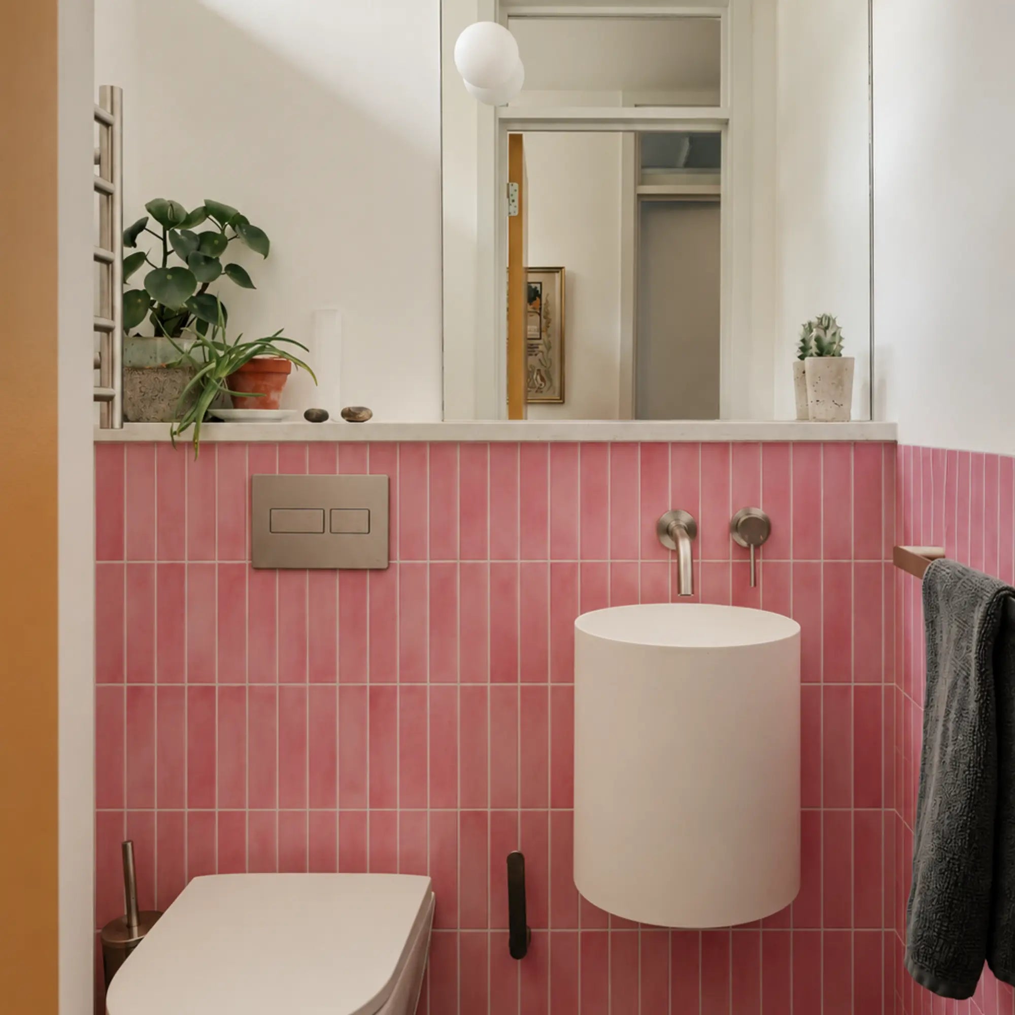
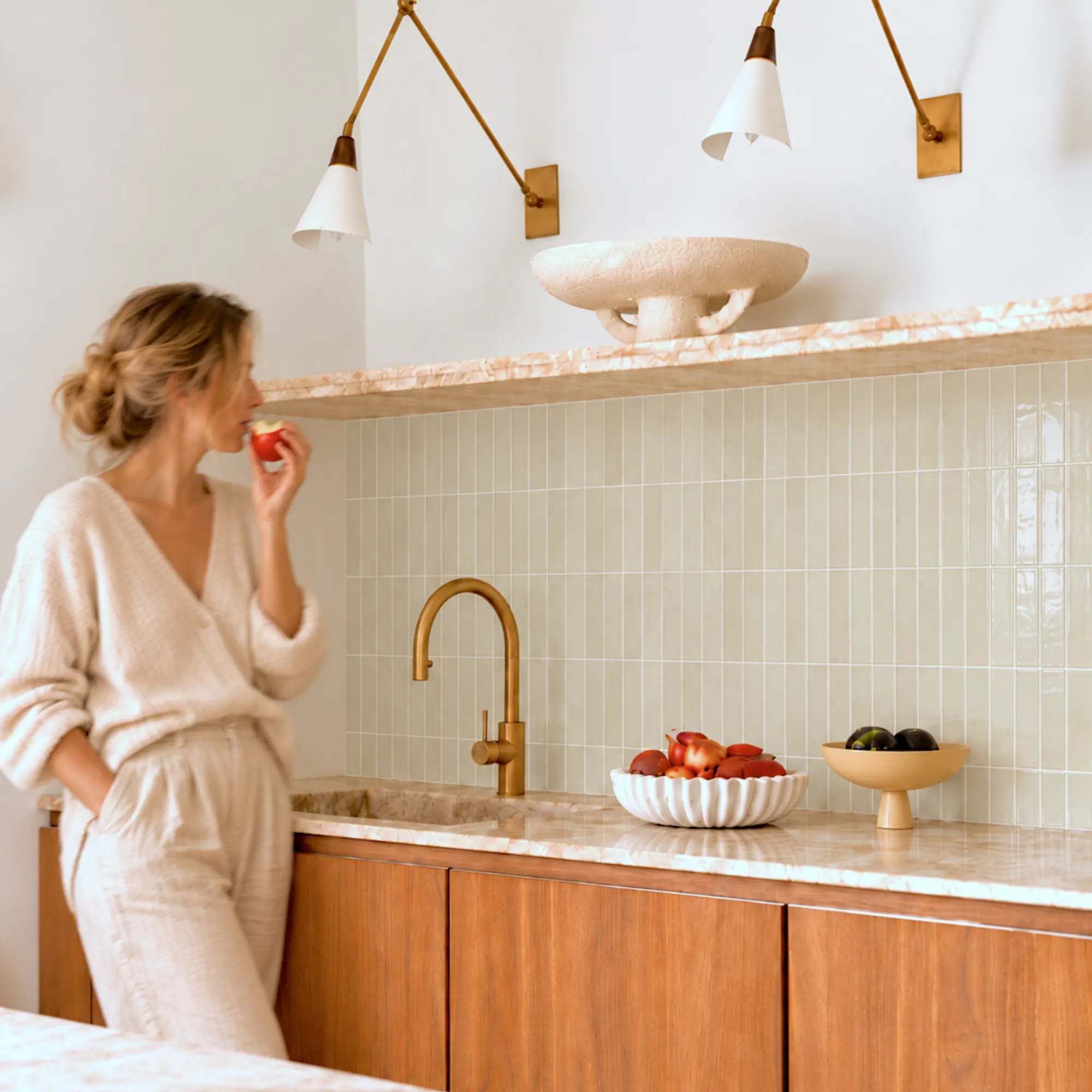


Introduction
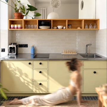
In August 2025, peel and stick tiles continue to dominate the home decor landscape, offering a revolutionary way to achieve stunning makeovers without the mess and expense of traditional tiling. This article was recently updated to ensure its timeliness and accuracy. Their enduring popularity stems from an unparalleled array of designs and the ease with which you can transform any space. Ready to refresh your interiors? Let’s explore the hottest peel and stick tile patterns currently elevating homes, whether you're envisioning a stylish backsplash or experimenting with bold, mix-and-match aesthetics.
Explore this guide
Pattern Directions to Compare
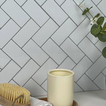
Chevron and Herringbone Patterns
- Classic yet modern appeal
- Perfect for various spaces
- Easy to install
Chevron and herringbone patterns have been popular for years and are making a grand comeback. They offer a classic yet modern appeal that can fit perfectly in any home. These patterns work well in kitchens, bathrooms, and even living rooms. They add a touch of elegance without being overwhelming.
The repetitive and angular designs make these tiles a timeless choice. You can easily install them yourself, saving on labor costs. For more ideas on incorporating these patterns into your home, check out our Modern Peel and Stick Tiles blog.
Geometric Shapes with Bold Colors
- Adds a pop of color
- Unique and eye-catching
- Versatile for different styles
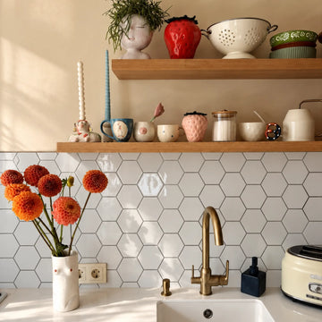
Geometric shapes combined with bold colors are a fantastic way to add a vibrant flair to your space. Whether you prefer squares, triangles, or hexagons, these shapes are sure to catch the eye.
The bold colors can be used to create an accent wall or a striking backsplash. It’s a versatile option that can adapt to various styles, from modern to bohemian. If you’re interested in how these tiles can transform your kitchen, visit our Peel and Stick Tiles for Kitchen guide.
Minimalist and Monochrome Styles
- Simplicity at its best
- Creates a clean and calming effect
- Ideal for small spaces
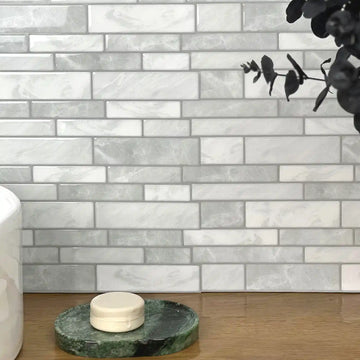
If you appreciate simplicity, minimalist and monochrome styles might be what you’re looking for. These styles focus on clean lines and a limited color palette, creating a calming and organized environment.
They are ideal for small spaces, making them appear larger and more open. To explore more minimalist design options, our Trendy Peel and Stick Tile Patterns blog offers some great insights.
How to Successfully Mix and Match
Guidelines for Pairing Multiple Patterns
- Choose a dominant pattern
- Keep a color scheme in mind
- Balance complexity with simplicity
Mixing and matching patterns can be tricky but rewarding. Start by choosing a dominant pattern as your focal point. It could be a bold geometric design or a classic herringbone.
Ensure that your patterns share a common color scheme to maintain harmony. Balance complex designs with simpler ones to avoid overwhelming the space. Our Applying Peel and Stick Tiles blog offers tips on how to layer different patterns effectively.
Balancing Bold and Neutral Tiles
- Mix vibrant tiles with neutral tones
- Create a dynamic yet cohesive look
- Perfect for transitional spaces
Balancing bold and neutral tiles can create a dynamic yet cohesive look. Use vibrant tiles as accents and neutral ones as the base. This approach adds interest without making the space feel cluttered.
It’s perfect for transitional spaces like hallways or entryways where you want a seamless flow. If you’re considering a stylish home renovation, our modern peel and stick tile ideas blog provides useful guidance.
Tips on Avoiding Design Overwhelm
- Start with a small area
- Stick to a limited palette
- Seek inspiration from design blogs
Design overwhelm is real, especially when there are so many options. Start with a small area, like a backsplash, to test your design. Stick to a limited color palette to prevent chaos.
Seek inspiration from design blogs and magazines, and consult our Peel and Stick Tile Maintenance Guide for tips on keeping your tiles looking fresh.
Advantages of Peel and Stick Tiles
Cost-Effectiveness Compared to Traditional Tiling
- Affordable alternative
- No professional installation required
- Variety of patterns and styles
Peel and stick tiles are an affordable alternative to traditional tiling. They eliminate the need for professional installation, saving you a significant amount of money.
You also have access to a wide variety of patterns and styles, allowing you to achieve high-end looks at a fraction of the cost. For a closer look at budget-friendly options, visit our budget-friendly peel and stick tile options blog.
Ease of Installation for DIY Enthusiasts
- Simple to install
- No special tools required
- Perfect for weekend projects
One of the greatest advantages of peel and stick tiles is their ease of installation. They are perfect for DIY enthusiasts who prefer doing their home projects over the weekend.
No special tools or skills are required, making them accessible to everyone. If you’re new to DIY home decor, our DIY peel and stick tile projects blog is a great place to start.
Versatility in Redecorating Without Commitment
- Easily removable
- Ideal for renters
- Frequent design updates
Peel and stick tiles are incredibly versatile, allowing you to redecorate without a long-term commitment. They’re easy to remove, making them perfect for renters.
You can update your design as often as you like without damaging the original surface. For more on renter-friendly tiles, check out our Removable Peel and Stick Tiles for Renters blog.
Advice from Interior Designers
Insights on Latest Design Trends
- Incorporate natural elements
- Focus on sustainability
- Mix old and new styles
Interior designers recommend incorporating natural elements and focusing on sustainability. Using eco-friendly materials and mixing old and new styles are also trending.
These trends not only make your home stylish but also environmentally conscious. Explore more about design trends in our latest peel and stick tile trends blog.
Innovative Pattern Combinations That Work
- Pair contrasting colors
- Use patterns as accents
- Blend textures for depth
Innovative pattern combinations can breathe life into any space. Pair contrasting colors or use patterns as accents to create interest.
Blending different textures can also add depth to your design. For more ideas on innovative combinations, check out our innovative peel and stick tile applications blog.
Common Mistakes to Avoid in Pattern Selection
- Avoid clashing colors
- Don’t overdo patterns
- Consider the room’s purpose
When selecting patterns, avoid clashing colors and overdoing patterns. Consider the room’s purpose and pick designs that complement it.
For example, a busy kitchen may benefit from a simpler backsplash, while a minimalist living room can handle a bold accent wall. If you’re interested in more home design tips, our peel and stick tile design tips blog has you covered.
Conclusion
As of August 2025, peel and stick tiles remain a true game-changer in home decor, continuing to offer boundless opportunities for creativity and personalized style. Whether you're a seasoned DIY enthusiast or a renter seeking flexible design solutions, these versatile tiles provide an exciting avenue for transformation. By exploring the latest patterns discussed and mastering the art of mixing and matching, you'll discover that elevating your living space is not only enjoyable but also incredibly cost-effective. Don't delay—embrace the vibrant world of peel and stick tiles and unleash your interior design potential today!
FAQs
1. Are peel and stick tiles durable?
Yes, peel and stick tiles are designed to be durable and long-lasting. They are made from high-quality materials that can withstand normal wear and tear. For more information on their durability, check out our Durable Peel and Stick Tiles blog.
2. Can I use peel and stick tiles in a bathroom?
Absolutely! Peel and stick tiles are perfect for bathrooms as they are water-resistant. They can easily be applied to walls, floors, and even shower areas. For more tips on bathroom tiles, visit our Peel and Stick Tiles for Bathroom blog.
3. How do I clean peel and stick tiles?
Cleaning peel and stick tiles is easy. Simply wipe them with a damp cloth and mild detergent. Avoid using harsh chemicals or abrasive materials. For more maintenance tips, refer to our Peel and Stick Tile Maintenance Guide.
4. Can peel and stick tiles handle heat from stoves?
Yes, there are specific peel and stick tiles designed to handle heat. They are perfect for areas near stoves or fireplaces. For more information, check our Heat-Resistant Peel and Stick Tiles blog.
Start with pattern scale, not the trend label
Herringbone, checkerboard, terrazzo, stone-look and geometric are broad visual categories. The same motif can feel calm at one scale and busy at another. Measure the visible wall, mark cabinets, furniture and openings, then compare several full repeats at actual size.
A product image usually crops out the repetition that dominates a finished wall. Tape a paper mockup or several real samples in place and view them from the room entrance, seating position and main work zone before ordering.
Identify the exact product construction
Pattern does not tell you whether the finish is printed vinyl, gel-faced, rigid composite or another construction. Record the face, backing or core, adhesive, dimensions, intended surfaces, room restrictions, cleaning instructions and removal guidance.
Two products can show nearly identical herringbone graphics while requiring different cutting tools and behaving differently at edges, seams and corners.
Judge color under the lighting you actually use
DOE lighting guidance is a useful reminder that light source and color rendering affect how finishes appear. Compare the real sample in daylight and under the room’s evening lamps.
Gloss, relief and metallic effects can create highlights or shadows that are absent in a flat screen image. Check the sample from several angles rather than only straight on.
Choose one dominant pattern
When a room already has veined stone, patterned flooring or busy textiles, another strong repeat can create visual competition. Decide which surface should lead and let the others support it.
A bold pattern often works best when the nearby finishes are quieter. A restrained wall pattern can instead support strong cabinet color or artwork.
Map the room exposure before choosing a material
A dry bedroom accent, kitchen backsplash and bathroom side wall have different moisture, grease, heat and cleaning conditions. Match the exact product to the real zone rather than assuming a pattern marketed for home decor belongs everywhere.
Recurring dampness or loose paint should be corrected before a decorative layer is added. EPA moisture guidance emphasizes fixing the source instead of covering symptoms.
Dry-layout the first and last cuts
Establish a level or plumb reference, then arrange enough pieces to see where the pattern lands at exposed edges. Moving the start line by part of a tile can avoid a narrow sliver or a visibly awkward motif cut.
If outlets, windows or trim interrupt the wall, include them in the mockup before exposing adhesive.
Treat directional patterns carefully
Chevron, herringbone, stripes and some stone prints have a clear direction. Mark the orientation on the backing before cutting so an offcut is not accidentally reversed.
Store spare pieces with the same orientation mark. A future repair looks more intentional when direction and print variation are understood.
Plan corners and terminations
An inside corner, open edge or doorway can reveal product thickness and backing color. Decide whether the exact system uses overlap, butt joint, trim or a clean stop.
A controlled vertical termination can look better than wrapping a pattern around every corner simply because material remains.
Use the real cleaning routine as a design filter
Raised textures and deep relief can collect dust or grease differently from flat finishes. Check which cleaner and tool the exact product permits.
If the room needs frequent wiping, a highly textured finish may be better on a lower-exposure feature wall than beside a cooking zone.
Calculate quantity from repeat and cuts
Use actual pack coverage, then inspect pattern matching, outlet cuts and edge waste. There is no universal extra percentage that fits every repeat.
Keep practical repair stock when possible and label it with the product name, lot information and direction.
Plan removal before a renter installation
Removable does not mean paint is assured to remain unchanged. Lease permission, paint condition, previous repairs, adhesive and time on the wall can all affect removal.
Photograph the wall before installation and keep the removal instructions with the project record.
Use a final pattern checklist
Proceed when the real sample works at full scale, the product is suitable for the wall and room, the layout is resolved and the cleaning routine fits. Pause when wall condition, heat, moisture or edge details are still uncertain.
The most useful trend is one that still works after installation, cleaning, repair and eventual change are considered.
Compare the pattern with permanent room features
Cabinet doors, floor boards, stone veining and window mullions already create lines in a room. Place the proposed tile pattern beside those features and look for conflicts in scale or direction. A diagonal herringbone can energize a simple room but may compete with a strongly veined counter or patterned floor.
Use the real room as the design board. A pattern is successful when it connects to fixed elements rather than looking attractive only on an isolated product card.
Use contrast intentionally
High-contrast black-and-white geometry, soft tone-on-tone texture and muted stone-look prints create different visual intensity. Decide whether the wall should be a focal point or background.
If the room contains several strong colors, a lower-contrast pattern may preserve visual hierarchy. If the fixed finishes are quiet, a stronger wall can carry more of the personality.
Think about repeat visibility at seams
Some self-adhesive sheets are designed to overlap or interlock while others butt together. The seam method can interrupt a printed repeat if the layout is not understood first.
Dry-fit multiple pieces and look for sudden changes in line thickness, color or motif at the joint before applying them to the wall.
Plan around furniture and movable objects
A feature wall may be partly hidden by a sofa, bed, console or shelving. Mark those heights before choosing the strongest part of the repeat.
A motif centered on an empty wall can disappear behind furniture and leave only awkward fragments visible.
Keep samples from different lots identifiable
When the product provides lot or batch information, compare delivered pieces before mixing them on the wall. Small differences in print, sheen or dimensions are easier to address before cutting.
Store the label with spare pieces so future local repairs can be matched more deliberately.
Use digital previews for composition, not performance
Room visualizers and mockups can help compare scale and color direction, but they cannot reproduce exact sheen, relief, edge visibility or material behavior.
Use them to narrow options, then confirm the final choice with the real product and technical instructions.
Plan a maintenance handoff
Write down the permitted cleaner, where spare pieces are stored and which edges should be watched. A pattern-heavy wall can hide a small lifted corner or stain until it becomes more noticeable.
A simple record helps household members maintain the finish without guessing.
Review the wall after ordinary use
After installation, observe the room through several normal cleaning and use cycles. Check whether glare, repeated contact, moisture or one difficult edge behaves differently from the rest.
If a local issue appears, investigate the condition there before assuming the entire pattern or material was the wrong choice.
Use one pattern family across connected rooms
If an open-plan kitchen, dining area and hallway are visible together, repeating every pattern can create visual noise. Choose one main family and let nearby rooms echo color or geometry more quietly.
A connected palette can create continuity without covering every wall with the same motif.
Plan around artwork and shelving
A strong geometric wall can compete with framed art or open shelves. Mark those objects on the mockup before choosing pattern density.
If the wall needs storage, leave enough calm area around shelves so the repeat does not make everyday objects look cluttered.
Check small-pattern fatigue
Tiny repeats can look sophisticated in a close sample but visually dense across a large wall. Photograph a full-size mockup and look at it from several feet away.
If the eye cannot settle on a focal point, reduce the covered area or choose a larger-scale repeat.
Use larger motifs carefully on narrow walls
Large terrazzo chips, oversized florals or broad geometric shapes can be cut awkwardly by a narrow backsplash. Plan where the motif begins and ends before ordering.
A partial large motif can still work, but the cut should look intentional rather than accidental.
Match pattern complexity to cleaning access
A wall that is difficult to reach should not depend on intricate relief that traps dust or grease. Consider maintenance when placing detailed textures above cabinets or behind fixed furniture.
A flatter version of the same visual pattern may be more practical in high or narrow locations.
Keep orientation notes with offcuts
When a directional pattern generates useful leftovers, label each offcut with top, left or pattern direction.
This makes later edge cuts and repairs much easier than trying to reconstruct orientation from a small fragment.
Use pattern changes as zone markers
A different repeat can define a dry dining niche or desk area without changing the entire room. Keep technical zones such as range and sink walls tied to materials documented for those exposures.
This lets design variation happen where the performance requirements are simpler.
Finish with a full-room readback
After installation, stand in the room with lights, furniture and everyday objects in place. Confirm that the pattern still supports the intended focal point rather than competing with everything else.
If one section feels too strong, simplify adjacent decor before adding more pattern.
Compare warm and cool versions of the same motif
A geometric pattern can read very differently in warm beige, cool gray, green or black. Place the sample beside flooring and fixed wood tones so undertones do not conflict.
Choose color from the room rather than from the trend name.
Use borders sparingly
A border can frame a pattern, but it also creates another line that must meet corners and openings cleanly. Mock it up before ordering.
When the room already has strong trim, a border may add unnecessary visual structure.
Plan the background around the feature wall
Paint, shelving and textiles near the patterned surface should support the focal point. Collect those samples together before finalizing the tile.
A wall pattern is part of a composition, not an isolated purchase.
Check the pattern in photographs and in person
A phone photo can reveal large-scale balance and repetition, while in-person viewing reveals texture and sheen. Use both perspectives.
Neither method replaces product documentation for performance or installation.
Keep the final design editable
Place stronger trends on surfaces that are easier to change and keep technically demanding walls more restrained when practical.
This lets future style changes happen without disturbing heat, moisture or service-critical zones.
Use ceiling height as context, not a rule
Tall walls expose more repeat and can make a small motif feel denser. Mock up enough vertical coverage to see the real rhythm.
Do not assume a vertical pattern automatically makes a ceiling feel higher.
Check transitions to painted walls
Where tile ends and paint begins, plan a clean line and inspect whether product thickness creates a visible step.
A deliberate transition makes mixed finishes look intentional.
Keep trendy color claims separate from availability
A color may be popular while the exact product is discontinued or varies by lot. Choose from samples you can actually purchase in sufficient quantity.
Store enough repair stock when continuity matters.
Use the pattern only where it earns the complexity
If a simple solid finish solves the room’s functional problem, do not add a complicated repeat solely because it is trending.
Pattern should contribute to the design rather than create unnecessary cuts and maintenance.
Use a final sample board
Mount the shortlisted pattern beside paint, counter, flooring and one hardware finish on a portable board. Move it around the room and compare it in different light before buying the full quantity.
A board makes undertone and scale conflicts easier to see than separate samples viewed at different times.
Keep the pattern record with the room
Save the product name, sample photo, cleaner and spare pieces together.
Future repairs and color changes are easier when the installed repeat can be identified precisely.
Keep the final wall easy to explain
If another person asks why this pattern was chosen, the answer should be clear: scale, color, room exposure and maintenance all fit the space.
That is a stronger basis than choosing only because the motif appeared on a trend list.
Keep the final choice tied to actual stock
Before ordering, confirm the sample matches the currently available product and enough quantity can be sourced for the planned wall.
A discontinued or changed pattern can make later repairs harder, so store a practical reserve when continuity matters.
Keep the decision visual and practical
Choose the pattern only after both the room mockup and the product limitations make sense together.
That final cross-check prevents style from overriding a wall or room constraint.
Final pattern note
Keep the sample and care instructions with the room record.
Close the pattern file
Keep the final SKU recorded.
Sources and scope
- US DOE: Color and Spectrum — Lighting and color-rendering context; not a material rating.
- 3M: Applying VHB Pressure-Sensitive Tape — General adhesive surface-preparation principles; not Stickwoll specifications.
- US EPA: Mold, Moisture and Your Home — Moisture-control guidance; not approval of a wall covering.



Leave a comment
This site is protected by hCaptcha and the hCaptcha Privacy Policy and Terms of Service apply.